How Typography Affects the Reader Experience
How Typography Affects the Reader Experience

Most people do not think much about typography when they open a book, scroll through a website, or read a magazine article. They focus on the words, the message, and the information being shared. Yet typography quietly shapes the entire reading experience. The style of text, the spacing between letters, the size of headings, and even the way paragraphs are arranged can change how readers feel, understand, and connect with content. Good typography feels almost invisible because it allows readers to move through the text naturally. Poor typography, on the other hand, creates frustration and confusion even when the content itself is interesting.
What is typography?
Typography is much more than choosing a pretty font. It is a form of communication that affects mood, readability, attention, and trust. Designers, writers, publishers, and marketers all use typography to guide readers and create certain impressions. A clean and organized layout can make readers feel comfortable and focused, while cluttered text can make them lose interest within seconds. In today’s digital world, where people consume information quickly and constantly switch between screens, typography has become even more important.
The connection
The connection between typography and reader experience can be seen everywhere. A student studying from a textbook, a customer browsing an online store, or someone reading news on a mobile phone all interact with typography in different ways. Their understanding and emotions are influenced not only by the content but also by how that content is visually presented.
Typography and Readability
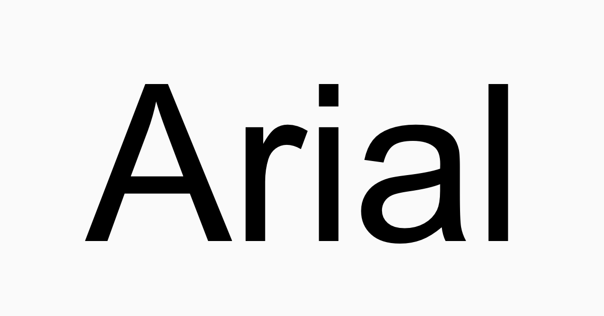
One of the most important roles of typography is improving readability. Readers should not struggle to understand text because of poor design choices. When fonts are too decorative, too small, or crowded together, reading becomes tiring. People naturally prefer text that feels easy on the eyes. Fonts like Times New Roman, Arial, and Georgia are popular because they are simple and familiar. Readers can move through these fonts smoothly without spending extra energy trying to recognize letters.
Readability also depends on spacing. The distance between letters, words, and lines affects how comfortably people read. If lines are too close together, readers may accidentally skip lines or lose their place. If the spacing is too wide, the text may feel disconnected and awkward. Good typography creates balance. It allows the eyes to travel naturally from one sentence to another.
Length of lines also matters. Extremely long lines can overwhelm readers because their eyes must travel too far across the page. Very short lines create unnecessary breaks and interrupt the flow of reading. Designers often use moderate line lengths because they support concentration and make information easier to process.
Photo by Rey Seven on Unsplash
Emotional Impact of Typography
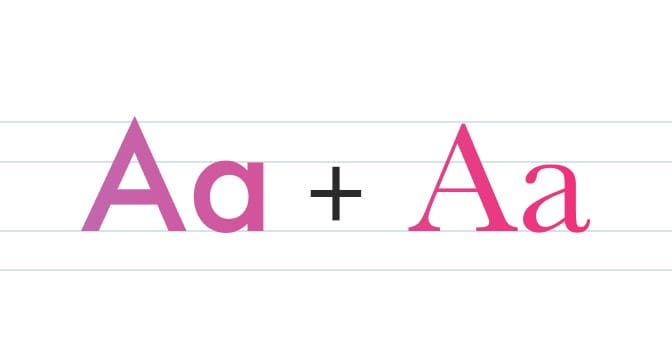
Typography also affects emotions and mood. Different fonts create different feelings. Serif fonts, which have small decorative strokes at the ends of letters, often feel traditional, professional, and trustworthy. This is why newspapers, academic books, and formal documents frequently use serif fonts. Sans-serif fonts, which have a cleaner appearance, usually feel modern, simple, and friendly. Technology companies and modern websites often prefer sans-serif fonts because they match a clean digital style.
Some fonts create excitement and creativity, while others appear serious or elegant. For example, a wedding invitation may use a stylish script font to create a romantic feeling. A horror movie poster may use sharp or irregular typography to build tension. Children’s books often use playful fonts to appear fun and approachable. Even before reading a single word, people form impressions based on typography.
This emotional influence is powerful because readers respond to visual cues very quickly. Typography sets expectations about the content. If a luxury brand uses elegant typography, customers may see the brand as expensive and high quality. If a health website uses clean and organized typography, readers may trust the information more. In contrast, messy typography can reduce credibility. People may question the professionalism of content that looks poorly designed.
Organizing Information Through Typography
Typography also helps organize information and guide attention. Readers rarely read everything on a page word by word. Instead, they scan for important details first. Headings, subheadings, bold text, and larger fonts help direct readers to key points. This visual hierarchy allows people to understand the structure of information quickly.
Imagine opening a website where all the text looks exactly the same. There are no headings, no spacing, and no differences in font size. Most readers would feel lost immediately. On the other hand, a well-structured page makes reading feel easier. Large headings introduce topics clearly, while smaller subheadings divide information into manageable sections.
This organization is especially important online because attention spans are shorter. Digital readers often skim content before deciding whether to continue reading. Typography helps keep them engaged by making information appear accessible and clear. Bullet points, highlighted quotes, and spacing between paragraphs all improve readability and prevent mental fatigue.
Photo by Brett Jordan on Unsplash
Typography and Accessibility
Another important aspect of typography is accessibility. Not all readers experience text in the same way. Some people have visual impairments, learning disabilities, or difficulties focusing on crowded content. Typography can either include or exclude these readers.
For example, small font sizes may be difficult for older adults or visually impaired readers. Low contrast between text and background can also create problems. Light gray text on a white background may look stylish, but it reduces readability. Accessible typography usually includes clear fonts, sufficient spacing, and strong contrast.
People with dyslexia may also benefit from thoughtful typography. Certain fonts and layouts make reading easier by reducing confusion between letters. Simple typography with clear spacing can improve comprehension and reduce frustration.
Accessibility matters because reading should be comfortable for everyone. Companies and publishers that ignore accessibility risk losing readers and limiting communication. Inclusive typography creates better experiences for wider audiences.
Influence on Memory and Understanding
Typography also influences memory and understanding. Studies have shown that presentation affects how well people process and remember information. Clear typography allows readers to focus on meaning rather than struggling with design issues. When text is organized and visually balanced, comprehension improves.
Educational materials provide a strong example of this effect. Students often learn better from textbooks with readable fonts, proper spacing, and organized layouts. If information appears cluttered, students may become distracted or overwhelmed. Teachers and designers therefore pay close attention to typography when creating learning materials.
In advertising and branding, typography plays a similar role. Companies use typography to create recognition and communicate identity. Think about famous logos such as Coca-Cola, Google, or Disney. Their typography has become part of how people recognize and remember the brands.
The typography used in advertisements also affects consumer behavior. Bold typography may create urgency during sales promotions. Minimal typography may suggest luxury and sophistication. Through typography, brands communicate personality without needing long explanations.
Photo by Shahadat Rahman on Unsplash
Typography in the Digital Age
Digital technology has changed typography in many ways. In the past, typography was mainly associated with printed books, newspapers, and magazines. Today, people read on smartphones, tablets, laptops, and smart devices. This shift has created new challenges for designers.
Screen reading differs from print reading. Fonts that look attractive on paper may not work well on small screens. Designers must consider different screen sizes, resolutions, and reading environments. Responsive typography has become important because text should remain readable on every device.
For example, websites often adjust font size automatically depending on screen size. Mobile users usually need larger text and more spacing because they read on smaller displays. Good digital typography improves user experience by reducing eye strain and making navigation easier.
Social media platforms also rely heavily on typography. Posts with clear and visually appealing text often attract more attention. Content creators use typography to make captions readable and engaging. Even memes and online graphics depend on typography to deliver humor and emotion effectively.
Typography and Reading Speed
Typography affects reading speed as well. When text is easy to read, people move through content naturally and stay engaged longer. Difficult typography slows readers down and increases frustration. This can be harmful for websites and businesses because users may leave quickly if content feels uncomfortable to read.
Reading speed is connected to comfort. Readers do not want to spend extra effort decoding text. Comfortable typography creates a smooth experience where information feels easy to absorb. This is one reason why professional publishers spend significant time selecting fonts and layouts.
Cultural and Historical Influence
Cultural and historical factors also shape typography. Different cultures associate certain styles with tradition, authority, or creativity. Historical periods have introduced typography trends that continue to influence modern design.
For instance, blackletter fonts may remind readers of old European manuscripts or newspapers. Minimalist typography often reflects modern design movements. Vintage typography may create feelings of nostalgia. Designers use these cultural associations intentionally to connect with audiences.
Typography trends also change over time. What looked modern twenty years ago may appear outdated today. However, readability usually remains the most important principle regardless of trends. Stylish typography may attract attention temporarily, but readers ultimately prefer text that feels clear and comfortable.
Psychological Effects of Typography
Another interesting aspect of typography is its psychological impact. Readers unconsciously judge information based on appearance. Research has shown that people may perceive well-designed text as more reliable and easier to understand. Even identical content can create different reactions depending on typography.
Photo by Unseen Studio on Unsplash
For example, a resume written in a professional font may create a stronger impression than one written in an overly decorative style. Academic papers usually use formal typography because it supports seriousness and credibility. Similarly, luxury brands use carefully designed typography to influence customer perception.
This psychological effect explains why typography matters in nearly every field. Businesses use it to build trust, educators use it to support learning, and media companies use it to improve engagement.
Despite its importance, typography often works quietly in the background. Readers may not notice good typography directly, but they definitely notice bad typography. Text that is too crowded, too small, or inconsistent can make readers leave a page quickly.
Designers therefore aim for balance. Typography should support the message rather than distract from it. Decorative fonts may look attractive in small amounts, but overusing them can reduce readability. Effective typography combines beauty with function.
In modern communication, where people are constantly exposed to information, typography has become a powerful tool for keeping attention. Readers decide very quickly whether they want to continue reading something. Typography influences that decision within seconds.
A clean layout with readable fonts invites readers to stay longer and explore content further. Organized typography reduces stress and makes reading enjoyable. In contrast, confusing typography creates barriers between the message and the audience.
The importance of typography can also be seen in professional writing. Journalists, authors, marketers, and web designers all depend on typography to communicate effectively. Even the best-written content may fail if readers struggle to engage with it visually.
Ultimately, typography shapes how people experience written communication. It affects comfort, understanding, trust, emotions, and attention. Good typography creates a smooth connection between readers and content. It allows information to flow naturally while supporting the purpose of the message.
As technology continues to evolve, typography will remain an essential part of communication. Whether in books, websites, advertisements, or social media, typography influences how people read and respond. Readers may not always notice typography consciously, but it quietly guides their experience every step of the way.

Role of PaperCraft publishers
At Paper Craft Publishers,the support for authors extends beyond the printing process. In addition to providing a platform for authors to bring their manuscripts to life, they also offer assistance in selling their books through online store, located at www.papercraftpublishers.com. Through the user-friendly online platform, authors can showcase their works to a global audience, reaching readers far and wide.
Conclusion
In conclusion, typography is far more important than many people realize. It is not simply decoration but a vital part of communication design. Through font choices, spacing, organization, and visual style, typography shapes how readers feel and understand information. Good typography improves readability, builds trust, supports accessibility, and creates emotional connections. Poor typography can damage even strong content by making reading uncomfortable and confusing.
The reader’s experience depends not only on what is written but also on how it is presented. Typography acts as the bridge between words and readers. When used thoughtfully, it creates clarity, comfort, and engagement. In a world filled with information, effective typography helps messages stand out and makes reading a more meaningful experience.
CONTACT PAPER CRAFT PUBLISHERS LAHORE OFFICE 3rd Floor 140cc DHA Phase 5 Lahore ISLAMABAD OFFICE Plot 11, Main Markaz, Office No 1, First Floor, Quraish Plaza, Pakistan Town Phase 1 Islamabad CONTACT NUMBER 03104272465 WEBSITE www.papercraftpublishers.com
메타데이터
- post_id
- 41bc949908c3
- slug
- how-typography-affects-the-reader-experience-41bc949908c3
- url
- https://medium.com/@sairafarooq/how-typography-affects-the-reader-experience-41bc949908c3
- canonical_url
- https://medium.com/@sairafarooq/how-typography-affects-the-reader-experience-41bc949908c3
- author_url
- https://medium.com/@sairafarooq
- status
- ok
- fetched_at
- 2026-06-09 15:37:30