AI can make your charts. It may not make them work
Notes from CHI 2026 on the future of data visualization, in business and practice
AI can make your charts. It may not make them work
Notes from CHI 2026 on the future of data visualization, in business and practice
Every organization now produces data visualizations. Dashboards, reports, social media posts, investor decks: data has become the default language of business communication. And with generative AI entering the workflow, the assumption is spreading that visualization is becoming a commodity: describe what you need, get a chart, move on, repeat.
CHI 2026, the world’s largest conference on human-computer interaction (held this April in Barcelona, with nearly 1,700 papers presented) tells a different story. The research emerging from this community doesn’t just matter to academics. It directly concerns anyone using data to inform decisions, communicate with stakeholders, or reach a public audience, and anyone designing those communications professionally.
AI knows the rules (that’s both the good news and the problem)
Let’s get the AI question out of the way first. A study by Kim, Ahn, Myers and Bach, first published in ACM Transactions on Computer-Human Interaction and presented at CHI 2026, tested how well ChatGPT performs as a visualization design advisor, comparing its responses to those of human experts. The finding: ChatGPT excels at breadth and clarity. It generates a wider range of suggestions, faster, and in a well-structured format. If you need a quick answer to “what chart type should I use for this data?”, it’s reliable.
But practitioners in the same study preferred the human experts. It doesn’t mean the AI was wrong, it just couldn’t do what a good consultant does: read the situation, push back on the question itself, or recognize that the real problem isn’t the chart, it’s the message. AI models know the catalogue, know the conventions, the standard chart types, the rules that 53 organizations codified in their style guides (more on that below, and here). What it doesn’t know is when to break them.
This has a practical implication for any team integrating AI into their data communication workflow. AI is an excellent quality-control layer, catching inconsistencies, suggesting alternatives, enforcing a style guide. It’s a poor substitute for the judgment calls that determine whether a visualization actually works: what to leave out, what to emphasize, how to frame a message for a specific audience in a specific context. The organizations that treat AI as an accelerator for their existing design capability will produce better work. The ones that treat it as a replacement for design thinking will produce more charts, faster, that say less.
For practitioners: this is also a positioning question. If AI handles the standard catalogue fluently, the value of a visualization professional shifts toward what the model can’t do: contextual judgment, message strategy, the ability to push a client’s brief beyond the obvious solution. The teams that compete on execution speed will lose to the machine. The ones that compete on interpretation will not.
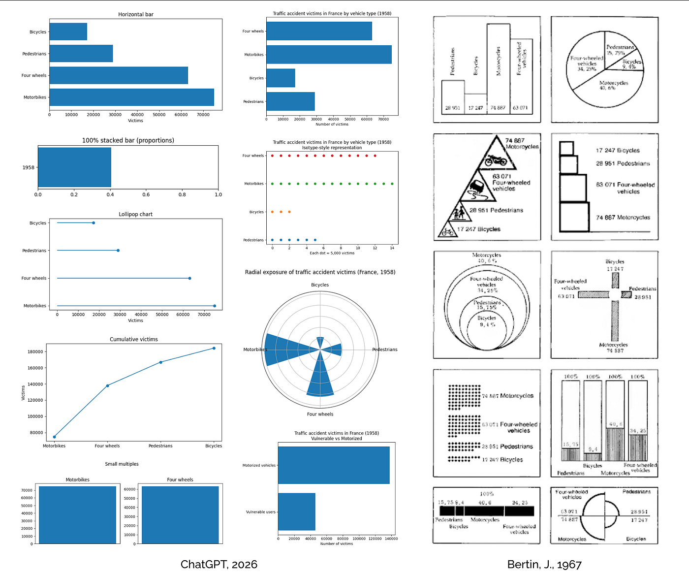
Speaking about conventions and standard chart types, in his “Semiology of Graphics” (orig. ed. 1967) Bertin proposes 10 different visualizations of the distribution of traffic accident victims according to type of vehicle (a two-columns, four-rows table). I asked ChatGPT to perform the same exercise (“visualize the following dataset”), the 4 blue charts in the middle is what I got, proposed as “a few directions, ordered from most straightfoward to more expressive” (!). The first 4 charts came after asking for more directions. Are those the standards for AI nowdays? Does it know how to produce something more or different?
Your charts are making decisions (and you didn’t authorize them)
Do data visualizations embed values? A paper I found in the proceedings seems to confirm they do, and here is why it may matter.
Alvitta Ottley at Washington University in St. Louis analyzed 53 publicly available visualization style guides, from newsrooms, government agencies, tech companies, NGOs, and corporations, and found something that should concern anyone responsible for how their organization communicates data. These documents encode priorities, behind or before the prescription of design choices, and those priorities might be heavily skewed. Across all guides, clarity is the dominant stated value: 92% of guidelines address it. Efficiency comes next at 40%. Accuracy? Only 28%. Accessibility? Just 25% of guides address it substantially.
What this means in practice: the charts your team produces are optimized to be “easy to read”, not necessarily “accurate”, “honest”, or “accessible”. Even when nobody made a deliberate decision to deprioritize accuracy, the tools, templates, and conventions that shape everyday chart-making may carry those priorities invisibly. When a dashboard truncates an axis to make a trend look dramatic, or when a report uses a pie chart that makes 30% look like 45%, the style guide didn’t flag it, because the style guide was built for clarity, not integrity. Do you know what your design system was designed for (if you have one)?
For organizations that use data to communicate with investors, regulators, clients, or the public, this is a governance issue, with some clear questions: does the design system make its values explicit? Do they align with the organization’s actual commitments?
For practitioners: Ottley’s dataset is now public, and the companion Guidelines Explorer lets you browse consensus and contradictions across all 53 guides. If you maintain a style guide or a design system for your team or your clients, this might be a useful benchmark: what are you recommending, what’s the rationale, and where do you diverge from the emerging cross-industry consensus? Making values explicit also helps to depersonalize critique and make design reviews more productive.

Eni’s information design library redesigned and expanded by The Visual Agency following a brand identity refresh. The system was updated to align with new brand guidelines and WCAG AA accessibility standards, introducing comprehensive documentation, dedicated frameworks for embedding data visualizations within editorial content, and protocols for interactive widgets.
Designing for platforms vs. designing for people (and connected risks)
Schuster, Gregory, Möller and Koesten interviewed 21 professional producers of public-facing data visualizations. These are the people making the charts we see in newspapers, on social media, in company reports. The central finding is both obvious and alarming: practitioners say that understanding the audience is essential, but in practice, almost none of them can describe their audience beyond “the general public.” The actual design driver is the platform. Print allows complexity. Web is mobile-first. Social media demands standalone visuals with one message, large fonts, bold colors, and three seconds to make an impression. Design seems to follow the container more than the reader.
For businesses, this has consequences. If your data communication strategy is “publish the dashboard and share the link,” you’re assuming that people will invest the effort to understand what you built. The research says otherwise. In a feed-based environment (and increasingly, every environment is feed-based) the first task is capturing attention. With a clear message, beyond decoration. The practitioners in this study converge on a specific technique: the title should state what the reader “learns”, not what the chart “shows”. That’s a small change that seems to transform whether anyone stops scrolling.
For practitioners: the same study surfaces a persistent evaluation gap that should be uncomfortable. Formal user testing is almost nonexistent in visualization practice, replaced by peer feedback, editor gut, and social media metrics. “You yourself are not the measurement,” one interviewee warns, yet the field runs on professional intuition validated by likes. If you’re producing work for clients, building even lightweight feedback loops, a five-second test with three non-experts before delivery, puts you ahead of what the research says most teams do.
![A data card from a policy report for PoliS Lombardia [design by The Visual Agency]. The title states the takeaway, the chart then provides the evidence. This is the kind of message-first approach that practitioners in the Schuster et al. study converge on as the most effective strategy for reaching broad audiences.](https://miro.medium.com/v2/resize:fit:1400/1*HgKLxlseCfFSw3vuAq10jw.jpeg)
A data card from a policy report for PoliS Lombardia [design by The Visual Agency]. The title states the takeaway, the chart then provides the evidence. This is the kind of message-first approach that practitioners in the Schuster et al. study converge on as the most effective strategy for reaching broad audiences.
Accessible visualization as a market (beyond the mandate)
Among the 114 data visualization-related contributions at CHI 2026, only 6 papers addressed accessibility for people with disabilities. That’s surprisingly thin, also considering the mission of the conference, but the work itself is remarkable, and it points to an emerging market.
*GeoVisA11y, by Li, Pang, Heer and colleagues at the University of Washington, won Best Paper for a system that lets screen-reader users ask questions about maps in natural language. [GraphWhisper](https://dl.acm.org/doi/10.1145/3772363.3799030)*, from Stony Brook University, does the same for chart images: no structured data required, just a JPEG or PNG. These systems use large language models to make visual information conversationally accessible to the estimated 285 million people worldwide who are blind or have low vision.

GeoVisA11y is an AI-based question-answering system for geovisualizations designed for screen-reader users. (A) On load, users see a visualization overview and example questions. (B) Location queries auto-focus the map; keyboard navigation also available. © Contextual queries answer based on current map focus, with automatic state-to-county level changes. (D) Pipeline showing how queries are classified, refined, assessed for scope, and processed to generate responses.
For businesses, the opportunity is twofold. First, regulatory pressure around digital accessibility is increasing across the EU, the US, and beyond. Organizations that produce inaccessible dashboards and reports are exposed, both ethically AND legally. Second, the tools to close the accessibility gap are maturing fast, what remains open is more an organizational challenge and less a technical one. I see a broader point here, too. Accessibility isn’t only about disability. It’s about the difference between a visualization that assumes a skilled, attentive reader and one that actually meets people where they are: on a phone, in a hurry, with varying levels of data literacy. The same design principles that make a chart accessible to a screen-reader user (clear structure, explicit labels, a stated message) may make it work better for everyone.
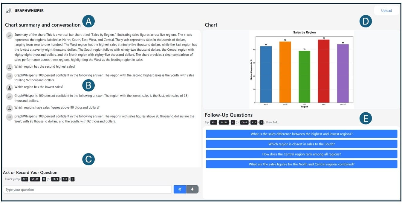
GraphWhisper user interface showing (A) automatic chart summary, (B) conversation area with confidence indicators, (C) chart visualization, (D) follow-up question suggestions, and (E) multimodal input.
For practitioners: the accessibility systems presented at CHI 2026 raise a design question worth considering. Tools like GraphWhisper and GeoVisA11y use AI to generate summaries, suggest follow-up questions, and determine what counts as a “pattern” in the data, effectively deciding what the user pays attention to. This is powerful, but it also means the system is steering the analysis. When you design for accessibility, consider whether you’re giving users access to the data or access to the system’s interpretation of the data. The distinction matters, and it’s the same distinction that separates a dashboard that informs from one that steers without showing it.
A few (additional) takeaways
Audit your style guide and design system (or create one): If your organization produces data visualizations, those visualizations carry implicit rules. Making them explicit is the first step toward consistency, quality, and accountability. A good style guide or design system are about why and not just what to do, and names the value it’s aiming for.
Use AI for consistency (not for judgment): Let it check your color palettes, flag axis truncation, suggest alternative chart types. Don’t let it decide what story your data should tell. That decision requires understanding your audience, your context, and your message: the things AI handles worst.
Design for the scroll (or not): If your data reaches people through screens (and often it does) treat the first impression as a design problem. A clear, message-forward title is not dumbing down. It’s the difference between a chart that gets seen and one that gets scrolled past.
Take accessibility seriously (before you’re forced to): The tools exist. The regulatory landscape is tightening. And the users you’re excluding aren’t a niche: they include everyone on a small screen, everyone in a rush, everyone who didn’t take a statistics course.
Invest in people (not just tools): The most consistent finding across CHI 2026’s visualization research is that design judgment (the ability to read a situation, choose what to emphasize, decide when simplicity serves the audience and when it misleads), still remains primarily a human capability. AI amplifies what the team already knows, it doesn’t replace what they need to learn.
While AI is reducing visualization, and the data behind it, to a commodity, we need to elevate it to infrastructure: the layer through which organizations inform decisions, communicate, make their case, and are held accountable. It looks like yet another design decision, a timely and crucial one for any organization to make.
메타데이터
- post_id
- 428286bf9d71
- slug
- ai-can-make-your-charts-it-may-not-make-them-work-428286bf9d71
- url
- https://medium.com/center-for-design/ai-can-make-your-charts-it-may-not-make-them-work-428286bf9d71
- canonical_url
- https://medium.com/center-for-design/ai-can-make-your-charts-it-may-not-make-them-work-428286bf9d71
- author_url
- https://medium.com/@pciuccarelli
- status
- ok
- fetched_at
- 2026-06-13 16:00:06






