5 Professional Resume Templates for Every Industry (And Where to Build Yours in Minutes)
You’ve sent out forty applications. You meet the requirements for most of them. And yet your inbox stays quiet.
5 Professional Resume Templates for Every Industry (And Where to Build Yours in Minutes)
You’ve sent out forty applications. You meet the requirements for most of them. And yet your inbox stays quiet.
It’s easy to assume the problem is your experience. Most of the time, it isn’t. It’s the layout carrying that experience. Recruiters make split-second judgments, and hiring software filters out resumes before a human ever opens them. If your formatting works against you, none of your accomplishments get a fair read.
Doresume.careers
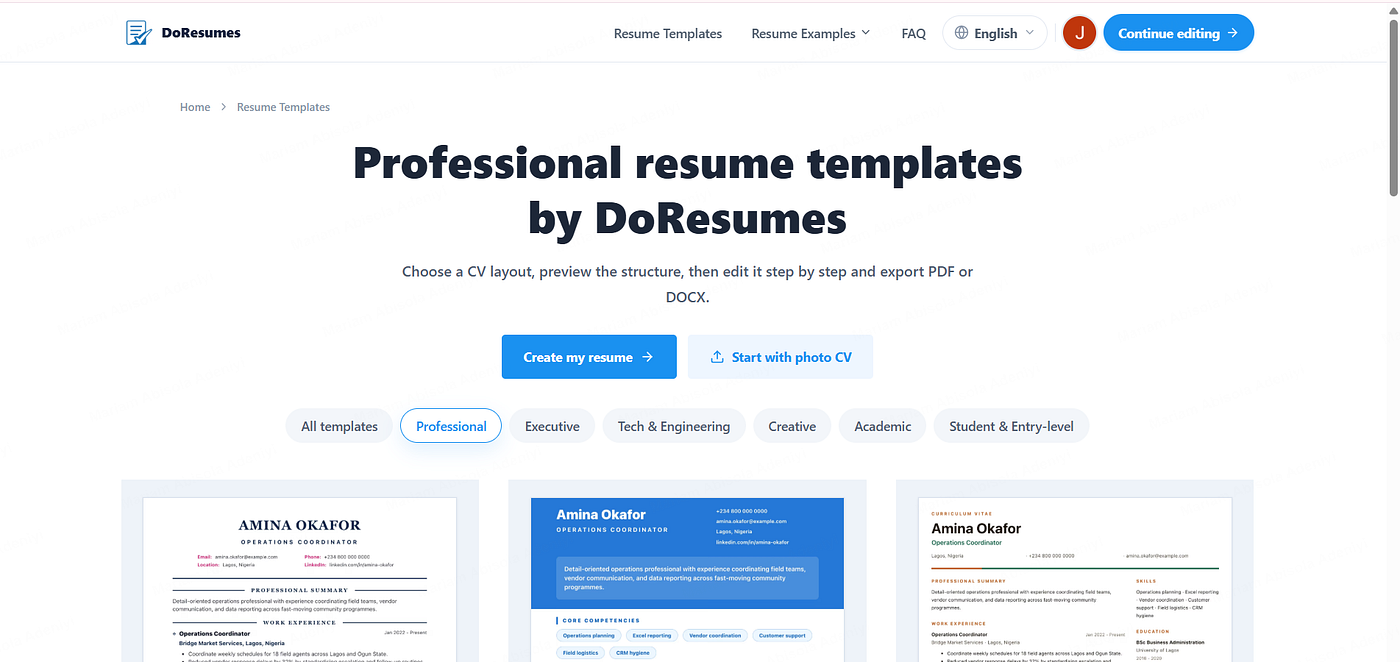
This article walks through five resume templates that consistently perform well across industries, grouped into the three environments where job seekers actually apply: corporate settings, creative fields, and tech careers. You’ll see why each format works, what an ATS-friendly resume needs to include, and how to build one without spending a weekend fighting with margins in Word. By the end, you’ll know exactly which layout fits your field and where to find ready-to-use resume examples that skip the guesswork.
Why Resume Templates Matter
A resume’s structure does more work than most job seekers realize. Before a recruiter reads a single bullet point, the layout has already shaped their first impression.
First impressions form fast. Early eye-tracking research from TheLadders found that recruiters spent only about six seconds on an initial resume review, a figure that later research put closer to 7.4 seconds. Roughly 80% of that time went to just a handful of data points: name, current and past job titles, employment dates, and education. More recent eye-tracking work has kept turning up the same F-shaped scanning pattern, where recruiters sweep across headers and down the left margin before reading closely. If your key information isn’t sitting where their eyes naturally land, it risks being missed entirely, no matter how strong it is.
Software reads before people do. Software now stands between almost every applicant and a human recruiter. Industry usage reports have found a detectable ATS on the overwhelming majority of large-company career pages, and broader surveys put ATS adoption at somewhere around nine in every ten recruiting teams, including a majority of small businesses too. If your formatting includes tables, columns, or graphics that confuse this software, your information can get misread or dropped, and a qualified candidate never makes it to the next stage. One widely cited estimate suggests that a plain, single-column document has a parsing accuracy in the 90s, while two-column and graphic-heavy layouts fail far more often.
Structure signals professionalism. A clean, organized layout tells a recruiter you’re detail-oriented before they’ve read a word of your experience. Cramped spacing, inconsistent fonts, or a cluttered page suggest the opposite, even when the underlying work history is strong.
Readability builds trust. Generous spacing and clear section breaks make it easier for a recruiter to actually absorb what you’re saying, rather than skimming past it because the page feels overwhelming.
The right layout saves time. Once you have a solid structure, updating it for a new role becomes a matter of swapping details, not rebuilding from scratch every time you apply somewhere new. It also matters because the numbers are not in your favor: a typical online job posting draws well over 200 applications, and often only a handful move on to an interview.
Key takeaways: software and humans both judge your resume’s structure before they judge your experience, a large majority of employers now filter applications through some form of ATS, and getting the format right the first time saves you from repeated headaches down the line.
Before diving into each format, here’s a quick text-based overview of how the five templates map to industry, design level, and ATS risk:
- Classic ATS Template — Best for banking, HR, admin, and high-volume corporate roles. Design level: minimal. ATS risk: very low.
- Modern Professional Template — Best for managers, consultants, marketers, and healthcare professionals. Design level: light. ATS risk: low.
- Student & Entry-Level Template — Best for graduates, career-changers, and NYSC members. Design level: minimal to light. ATS risk: very low.
- Creative Template — Best for design, content, social media, and UI/UX roles. Design level: higher, but intentional. ATS risk: moderate.
- Tech & Engineering Template — Best for software, data, DevOps, product, and cybersecurity roles. Design level: moderate and functional. ATS risk: low to moderate.
With that overview in place, let’s look at each group in more depth, starting with the templates built for corporate environments.
Templates for Corporate Jobs
Corporate hiring, whether it’s banking, HR, operations, consulting, or management, rewards predictability. Recruiters in these fields are scanning fast, and screening software is doing a first pass before anyone reads a word. Three of the five templates fall into this category, each suited to a slightly different stage of career or level of formality: the Classic ATS template, the Modern Professional template, and the Student & Entry-Level template.
1. Classic ATS Template
This is the safest structure available, and it’s the one worth defaulting to whenever you’re unsure. It uses standard headers like Experience, Education, and Skills in a single column, with no design elements that could confuse screening software or slow down a recruiter’s read.
Best for: HR, banking, sales, customer service, operations, and administration, or any high-volume corporate hiring process.
Why it works: Recruiters in these fields expect this exact structure, so it feels familiar instead of distracting. It’s also the format most reliably parsed by applicant tracking software. One recent analysis of rejected resumes found that plain, single-column documents in a standard file format had failure rates in the low single digits, while resumes built around text boxes, tables, or multi-column designs failed far more often, and that roughly a quarter of systems skip over contact information placed in a header or footer.

Classic ATS Template
Common mistake: People try to make this layout “stand out” by adding a headshot, a colored border, or a decorative line, and end up making it harder for software to read cleanly. Simple isn’t boring here, it’s functional.
2. Modern Professional Template
For managers, consultants, and finance or healthcare professionals slightly further along in their careers, a bit more visual polish is appropriate: a well-organized header, generous white space, and a touch of color used sparingly. This is the modern resume template most people picture when they imagine a “nice” resume without it tipping into anything risky.
Best for: Managers, consultants, finance professionals, marketers, and healthcare workers.
Why it works: Whitespace isn’t wasted space. It gives a recruiter’s eye room to rest, which means they actually process what they’re reading instead of feeling buried in text. This structure also lets you project seniority and clarity at the same time, useful when you’re trying to show measurable impact rather than just a list of duties.
Corporate hiring rewards consistency, so whichever of the first two formats you choose, the goal is the same: make it effortless for a recruiter to find your titles, dates, and results in seconds.

doresumes.careers
3. Student & Entry-Level Template
Fresh graduates, career-changers, and anyone without years of formal work history face a different problem: the layout has to foreground potential rather than a long job history. This format leads with education, coursework, internships, projects, and transferable skills, and keeps the whole document to a single page.
Best for: Recent graduates, students, NYSC members, and anyone making a first serious application document or switching fields entirely.
Why it works: A recruiter reviewing an entry-level application isn’t expecting a decade of titles. They’re looking for signals of capability: relevant coursework, a strong GPA if it helps your case, internships, class projects, volunteer leadership, or certifications. Putting education near the top rather than at the bottom, and giving projects their own section, makes those signals easy to find instead of forcing a recruiter to hunt for them.
Common mistake: Padding the page with irrelevant summer jobs or generic soft skills to make it “look full.” A tightly written, single-page document with a clear focus consistently reads better than a stretched-out one that’s trying to look more experienced than it is.

On DoResumes, all three of these corporate-friendly layouts are ready to fill in, so you’re not manually adjusting spacing or guessing whether your headers will parse correctly, regardless of whether you’re a first-time applicant or a decade into your career.
Templates for Creative Roles
Creative fields are the one place where a bit more visual personality is expected, but the format still needs to function, not just look good on a screen.
4. Creative Template
Designers, social media managers, copywriters, content creators, and UI/UX professionals benefit from a layout that clearly guides the eye from name, to role, to portfolio link, using typography and color intentionally rather than decoratively.
Best for: Designers, social media managers, copywriters, content creators, and UI/UX designers.
Why it works: Recruiters in creative fields want to see personality and skill in the same glance, but they still need to find your name, your most recent role, and your portfolio link within seconds. A strong visual hierarchy achieves both.
Where people go wrong: Heavy graphics, multi-column layouts, or unconventional fonts might look striking to a human eye, but they can confuse the systems screening your application before a person even sees it, causing sections to get scrambled or dropped. The safest approach is to keep the visual flair contained to color and typography choices, not structural complexity.
Portfolio links matter more than usual here. For creative roles, your body of work often carries more weight than your job history, so that link should be impossible to miss, ideally placed near the top, not buried at the bottom.

Creative Template
This is one of the formats where DoResumes tries to strike a real balance: enough design to feel distinct, without the structural risk that comes from building something too elaborate in a tool like Canva. If you’ve ever tried to hand-build a two-column creative resume in Word and watched your bullet points shift every time you edited a line, you already know how much time a pre-built structure saves.
Templates for Tech Careers
Tech hiring has its own logic. Recruiters and hiring managers expect specific, scannable signals, and they expect to find them fast.
5. Tech & Engineering Template
Software engineers, data analysts, DevOps professionals, cybersecurity specialists, and product managers all benefit from a structure that puts technical stack, certifications, and project work front and center.
Best for: Software engineers, data analysts, DevOps professionals, cybersecurity specialists, and product managers.
What it needs to include:
- A clear, clickable space for GitHub or a portfolio link, since many tech recruiters click through before reading your bullet points.
- A dedicated skills section listing your programming languages, frameworks, and tools, rather than burying them inside paragraphs.
- Certifications given their own visible line, especially for cloud and security-focused roles.
- A projects section, which can carry real weight for newer engineers or anyone transitioning into tech without years of formal experience behind them.

Tech & Engineering Template
Why this matters more here than elsewhere: Tech recruiters often filter by keyword before reading anything in depth. Industry surveys suggest that the overwhelming majority of recruiters lean on keyword filters inside their ATS to shortlist candidates, so if your technical stack isn’t clearly labeled and easy to locate, you risk being passed over even when you have the right skills.
Manually keeping this balance, dense enough to be informative, clean enough to stay scannable, is one of the more tedious parts of building a tech-focused document by hand. DoResumes structures this layout so your stack, certifications, and links slot into place automatically, without you needing to redesign the page every time you add a new tool or finish a new certification.
ATS-Friendly Templates
Every format above needs to clear one more hurdle before a human ever sees it: applicant tracking software. Understanding what makes an ATS resume work is worth its own section, because it affects every category above, not just one.
What “ATS-friendly” actually means
Applicant tracking software scans your document for structured information, job titles, dates, skills, and keywords, and tries to organize it for a recruiter. The catch is that this software struggles with anything visually complex. Tables, columns, text boxes, graphics, and unusual fonts can all cause information to be misread or dropped entirely.
What consistently works well:
- Single-column layouts with clear, standard section headers (Experience, Education, Skills).
- Reverse-chronological work history, so your most recent role appears first.
- Standard fonts and consistent formatting throughout.
- Keywords pulled directly from the job description, worked naturally into your bullet points.
- A widely supported file format rather than an unusual one, since some parsing engines still handle certain formats poorly.
What consistently causes problems:
- Multi-column designs that fake a “modern” look but confuse parsing order.
- Icons or graphics used in place of text, like a star rating for skill level.
- Headers and footers containing important information, which some systems skip entirely.
- Unusual section titles that don’t match what the software expects to see, like “My Journey” instead of “Experience.”
The safest approach:
If you’re applying to a large company, prioritize the simplest layout available. If you’re applying somewhere smaller or more design-forward, you have a bit more room, but it’s still worth checking that your document remains readable if converted to plain text. Given that a large majority of employers say they’ve likely lost strong candidates to ATS-related formatting problems, this isn’t a minor detail, it’s one of the highest-leverage things you can get right.
This is really the throughline across every category above: whether it’s a corporate layout, a creative portfolio, or a technical one, the structure still has to survive the software gate before a human ever reads it. That’s the exact problem DoResumes was built to solve. Every template on the platform is already structured to stay readable by screening systems, so you’re not stress-testing your formatting after the fact.
Common Mistakes Worth Avoiding
A handful of small errors can undercut even a strong layout choice, regardless of which of the five templates you choose:
- Graphics and icons that screening software can’t interpret, causing information behind them to disappear.
- Tables or columns that scramble the reading order once parsed.
- Overly colorful designs that distract rather than communicate professionalism.
- Tiny fonts used to cram in more content, which hurts readability for both software and humans.
- Cramped spacing that makes even strong content feel overwhelming to scan.
- Grammar mistakes, which quietly undermine credibility regardless of experience.
- Vague opening statements like “seeking a challenging role,” which say nothing specific about fit.
- Submitting the same document everywhere, missing keywords that a specific posting is looking for.
- Contact information hidden in a header or footer, which a meaningful share of ATS platforms simply don’t read.
Most of these mistakes happen during manual formatting, one shifted table, one resized font, one collapsed section. It’s a large part of why more job seekers are moving away from building documents by hand and toward an online resume builder that keeps the structure locked in from the start.
Choosing the Right Resume Template
With five strong options on the table, picking the right one comes down to a few practical questions rather than personal preference alone.
What industry are you applying to? Conservative fields like banking, law, and operations favor simple, predictable structures. Creative and design-forward fields allow more visual personality.
What’s your seniority level? Entry-level candidates benefit from a format that foregrounds education and transferable skills. Senior professionals need layouts that make leadership and measurable results easy to spot at a glance.
How large is the company? Bigger companies are more likely to rely heavily on screening software, so a simpler, more classic layout is usually the safer bet. Smaller companies and startups may review applications manually, giving you a bit more design flexibility.
What does the job description emphasize? If a posting leans heavily on technical skills, your layout should foreground your stack and certifications. If it emphasizes leadership or client relationships, your structure should make accomplishments and results easy to find early.
What’s your company culture fit? A government role and a creative agency have very different expectations. Matching your format’s tone to the company’s culture, formal versus expressive, can make a subtle but real difference in how your application lands.
None of these questions have a universally “correct” answer, they depend entirely on where you’re applying. That’s part of why having several ready-made resume examples to choose from, rather than building one from scratch each time, makes the process considerably less stressful. On DoResumes, you can switch between layouts depending on the role you’re applying to without starting over each time.
Key takeaways: match your template to the industry, your seniority, company size, and the specific job description, not just personal taste. When in doubt, choose the simpler layout.
Why Build Your Resume Online?
Microsoft Word is familiar, but it’s also where formatting problems usually start. Margins shift between devices, adding a bullet point can throw off an entire section, and converting to PDF sometimes scrambles a layout you spent hours getting right.
Google Docs improves on some of this, but its design options are limited, and certain layouts still trip up screening software, especially ones using tables or text boxes to fake a multi-column look.
Canva looks polished on screen, but many of its designs lean heavily on graphics and complex layouts. What looks great to your eye might read as blank or jumbled to the software actually screening it first.
This is the exact gap a dedicated resume builder is meant to close. Instead of manually adjusting formatting and hoping it holds up, you choose a template that’s already built to stay readable, fill in your information, and the rest takes care of itself. That’s the idea behind DoResumes, an online resume builder and CV maker: select a layout suited to your field, enter your details, and walk away with a document built to get past software filters without you having to think about spacing or fonts at all.

Build Your Resume Online with Doresumes.careers
FAQs
What’s the best template to use?
There isn’t one single best option, it depends on your industry and experience level. A simple, single-column layout suits corporate and administrative roles, while a more visual structure works better for design and content fields.
Are ATS-friendly templates actually worth prioritizing?
Yes. Since the large majority of mid-size and large companies now screen applications with software before a person sees them, choosing a layout built to stay readable by that software meaningfully lowers your risk of being filtered out over formatting rather than qualifications.
Which format works best for fresh graduates or entry-level candidates?
A structure that foregrounds education, coursework, and projects works best here, since it highlights potential and transferable skills instead of relying on years of experience you may not have yet. This applies well to students, recent graduates, and NYSC members building their first serious application document.
Can I reuse the same layout for every job I apply to?
You can reuse the same structural style, but avoid submitting an identical document for every role. Adjusting keywords and emphasis for each posting improves your odds with both screening software and the human reviewing it afterward.
What actually makes a layout compatible with screening software?
Avoiding graphics, tables, and unconventional fonts, while sticking to clear section headers and a predictable structure, is the biggest factor. This is exactly the kind of detail an online resume builder like DoResumes handles automatically, so you don’t have to double-check it yourself.
Where can I put one of these together without starting from scratch?
DoResumes lets you choose a layout suited to your field and fill in your information directly, without manually building or troubleshooting the format yourself.
Conclusion
Getting more interviews usually isn’t about rewriting your work history, it’s about removing the formatting friction standing between your experience and the person meant to read it. If you need a classic ATS resume template, a modern professional format, a student-friendly layout, a creative portfolio-style structure, or a tech-focused document, the right structure, paired with one built to survive software screening, removes most of the guesswork.
If you’re ready to stop rebuilding your layout by hand every time you apply somewhere new, head over to DoResumes. Choose the template that fits your field, fill in your details, and get a document ready to work for you, not against you, the next time you hit apply.
메타데이터
- post_id
- 475aaee542e9
- slug
- 5-professional-resume-templates-for-every-industry-and-where-to-build-yours-in-minutes-475aaee542e9
- url
- https://medium.com/@mariam.adeniyi001/5-professional-resume-templates-for-every-industry-and-where-to-build-yours-in-minutes-475aaee542e9
- canonical_url
- https://medium.com/@mariam.adeniyi001/5-professional-resume-templates-for-every-industry-and-where-to-build-yours-in-minutes-475aaee542e9
- author_url
- https://medium.com/@mariam.adeniyi001
- status
- ok
- fetched_at
- 2026-07-08 00:36:00