Designing and Communicating Interventions
Project 1, Communication Design Studio Fall 2025: MDES, CMU School of Design
Designing and Communicating Interventions
Project 1, Communication Design Studio Fall 2025: MDES, CMU School of Design
Aug 27, Week 1 | Investigating AI today
Black Box AIs
As a society, our reliance on AI has moved far beyond simple daily food recommendations. We now turn to it for complex advice that is emotional, medical, and even financial. This shift raises a critical question: how do we trust it?
Image: zdnet
When we talk to another person, whether we know it or not, we understand that their words come from their lived experiences, personal opinions, and individual histories. With AI, however, that certainty isn’t the same.
Advanced AI systems can process enormous amounts of data, yet their workings remain opaque and invisible to users. Since the outputs come directly from the training data that isn’t made by the developers, the creators themselves can’t fully comprehend how it works. We see the input and output, but there is no transparency of how the AI system got there. Some of the most widely used tools today, including ChatGPT, Gemini, and Llama, are examples of black box AIs.
The opaqueness of the working of such AI systems raises crucial and valid concerns of trust, reliability and accountability. How do we trust something we don’t see? AI models are used today to assist doctors with medical advice, filter through resumes for jobs, evaluate employee performance and provide financial advice. The implications of this phenomenon are direct, even frightening in some cases. This lack of transparency also creates a gap in our understanding of how these AI systems interact with humans and the impact they have on the real world.
To address this, researchers are exploring the concept of Explainable AI (XAI). Explainable AI typically refers to processes that help humans understand how a machine learning algorithm reaches its decisions; essentially breaking down the reasoning behind an AI system’s output. Two main approaches have emerged in this domain: decision trees and linear models.
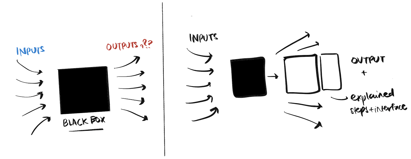
Where does the communication exist?
The communication around this exists in several overlapping spaces. The nature of this phenomenon is not purely technical, but also social, regulatory and ethical. It exists in tech media and news outlets, in academic communities (ML, AI research), and industry spaces (tech companies, documentation).
What are the different perspectives around this?
There are different perspectives on this phenomenon. One is that black box AIs aren’t ethical but they are necessary. Many argue that these models can handle data of extreme complexity, the kind that simpler, interpretable models can’t tackle. Because there are still very few real-world examples of explainable AI, a lot of entities end up relying on black box systems.
An opposing point of view challenges this idea. Some argue that fully interpretable models are fully capable of handling the same data (backed by experiments). The conversation is still evolving, but it makes me wonder — do we need black box AIs? If so, when? And will we continue to use them even with this awareness?
The role of design
As designers, we can play a huge role in this conversation. It raises the question: What responsibility do we carry when we design with AI? XAI is seen as critical in high-stakes fields, but I could argue that it’s just as important in everyday tasks. Most AI users are still unaware of the fact that they are in the dark about how their AI tools produce their outputs.
How can we design for explainability and push users to ask hard questions about trust and transparency?
Sept 1, Week 2 | Interpreting information
Preface: This week, we delved into two concepts in communication design — Schemas and the relationship between form and content. These inform how people interpret information, making it an anchor of our design decisions. We also discussed what constitutes style, what it communicates to the user and its life cycle. A recurring idea that came up is that design shapes society and is also shaped by society. The push and pull of these roles, sometimes simultaneously is pivotal to a designer’s work — in situating it in the current context, thinking about the longevity and the intention behind it.
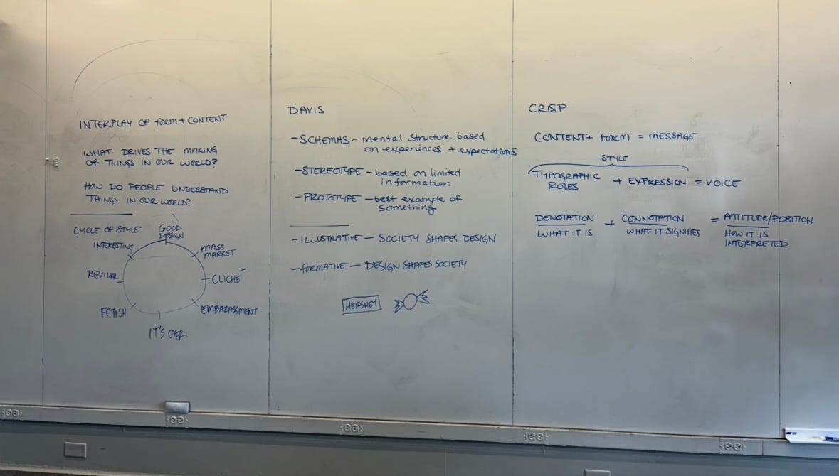
Whiteboard in class.
Schemas
A schema is a mental framework as a result of our past experiences that help us organize and perceive information. This is what lends itself to recognizability or certain patterns of behavior with information.
The concept of schemas helped me understand and articulate the invisible part of a user’s behavior and perception. I understood it better as I tried to connect the discussions to our activities on day 1 — playing with wind-up toys. We clearly associated the wind-up key to the toys we grew up with. We foresaw the kind of movement they would make based on animals/shapes they resembled. We made assumptions about a toy’s quality and age based on material (sometimes incorrectly).
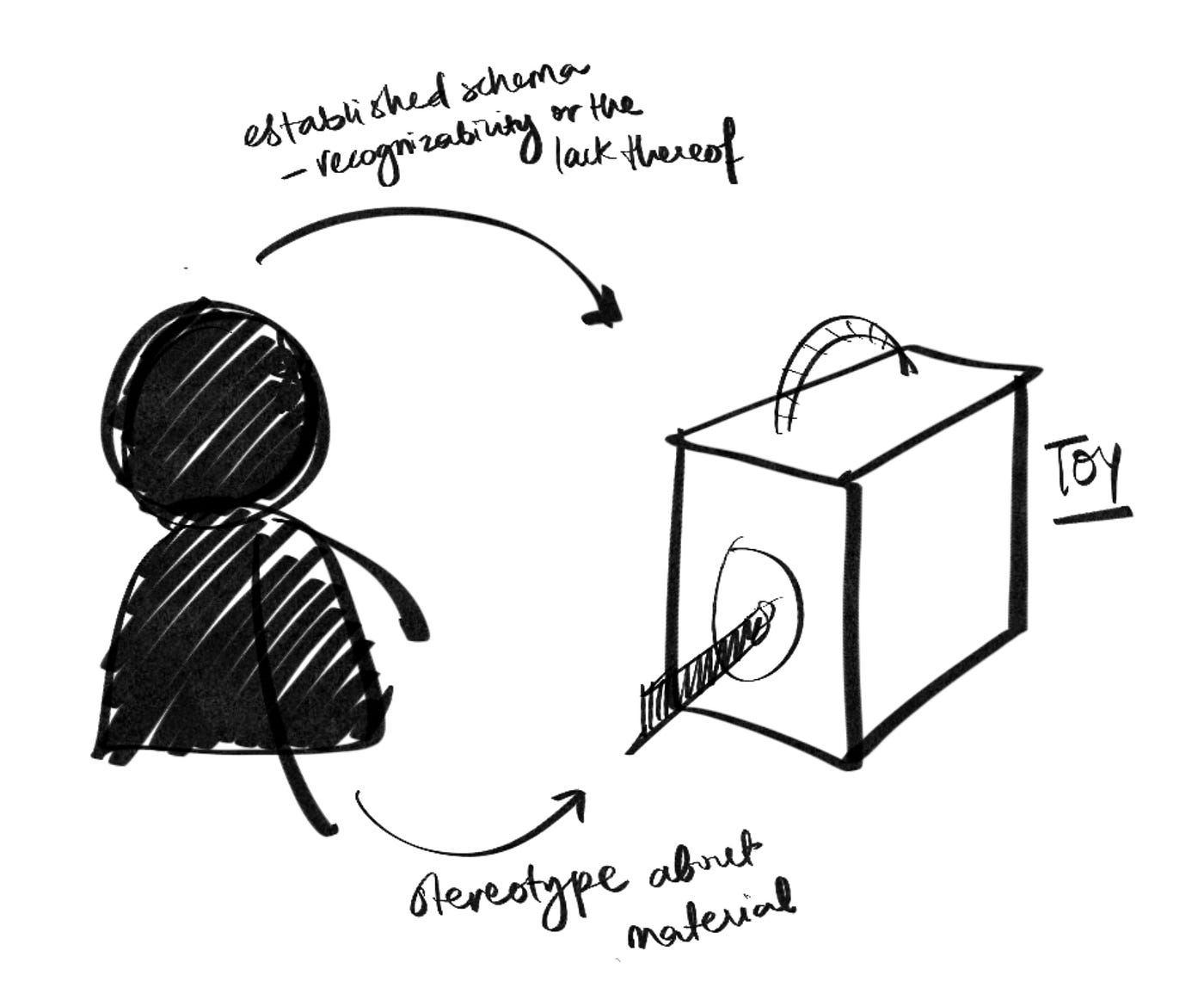
Sketch of how we interacted with the toys in front of us.
Schemas shape how we see the world. They can be be applied in our process in two ways:
1. Thinking from the user’s perspective
- What assumptions/stereotypes might users have about something?
- What do users think of as the prime or best example when a product or service is mentioned?
2. Application in our designs
- Are we making assumptions based on limited information about users?
- Are we feeding into a stereotype that shouldn’t be reinforced? Do we need to break away from it?
- How can we challenge or gratify a user’s schema?
These questions could become guard rails of a design inquiry.
My learnings: To create something impactful, we need to re-examine our biases at multiple stages during the creation with the help of questions along these lines.
Relationship between form and content
Form and content have been interconnected since humans began to perceive information. Reading Denise Crisp’s text about the anatomy of a message reminded me of Marshall McLuhan’s idea “the medium is the message”, where he argues that the form or the medium of communication should be the sole focus, as it shapes the message entirely.
I found Crisp’s perspective on the interplay between form and content to be more nuanced. We learned that:
- Connotation is what it is (the content)
- Denotation is what it signifies (which can also be thought of as form)
Both of these not only need to be present, but also aligned. If they aren’t, the result can be confusing or unrecognizable — possibly going against a well-established schema in most users.
My learnings: We exist within multiple “contexts” at once and our assumptions are a result of these. What our design connotes or denotes must align not just with each other, but also our schemas.
Tools that we interact with on the daily, like ChatGPT, Gemini and Llama are actively creating a schema in users. How we expect an assistant or a bot to work, respond and interact with us is developing in real-time. As designers, whether we work with AI or are critical of it, its imperative to question their impact.
Sept 8, Week 3 | Design interventions
AI in learning
After my brief exploration of transparency in AI, I started to look at how AI has impacted learning. AI tools are a constant presence in today’s learning landscape. AI has become a tool that students or learners use for everything ranging from editing essays to forming complex arguments. Our dependence (bordering on over-dependence) on AI is leading to the offloading of critical thinking and decision making tasks to it — a phenomenon that is termed as cognitive offloading. As a result, we are starting to bypass the “deep-thinking” that we need to do. So, what happens if we continue to rely on AI as we move into the future? We rationalize its use by saying its for higher productivity, but is it eroding our critical thinking abilities in the process?
The usual prescription for AI over-reliance is to “balance its use.” But what does balance really mean? Are we capable of it when the tool sits so conveniently on every device? AI is as opaque as it is powerful, making it hard to understand how we use it and how it impacts us. However, as designers, we have the power to make people ask this question to themselves.
What is a design intervention?
I often hear the term “intervention” thrown around loosely. A website, an app, a bus stop, a museum space — its been applied to almost anything. So naturally, when we started to talk about what a “design intervention” was, I realized I had no definition for it. Is it anything that intervened in my daily routine? As we watched the transformed “piano stairs” in a Subway station in Sweden emit piano sounds upon contact, I was fascinated by how a simple tweak naturally urged people to take the stairs. It wasn’t telling people what to do, but they did it anyway, because it was different — it stood out.
Through examples we talked through in class and reading Anthony Dunn and Fiona Raby’s writing on Critical Design, I began to form an understanding of it. A successful design intervention is anything that sparks an action, a question, or even a thought.
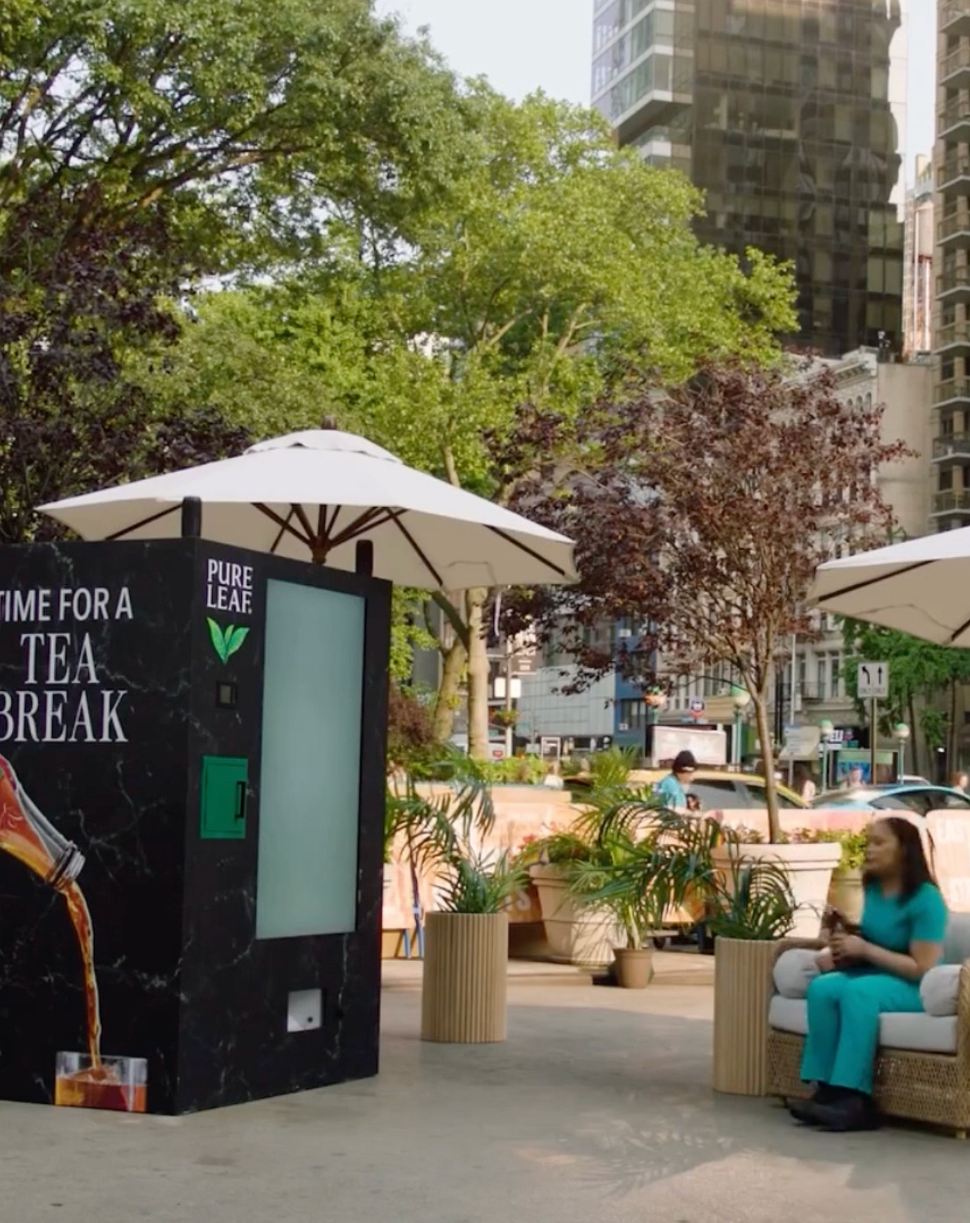
Pure Leaf’s Tea Break intervention
A vending machine in New York makes people take a 10-minute break by taking their phone away, while they wait for it to give them the tea they paid for. This is a great example of what an intervention is supposed to do. It uses people’s existing schema to get them to interact with the vending machine, pick out a tea and pay for it. But to their surprise, it takes their phones away , thereby forcing them into a 10-minute break. How people respond to this is completely up to them. Anger, frustration, confusion, relief — it doesn’t tell you how to react. There is just a couch placed next to it. People automatically found their way it. Another thing this intervention does, is nudge people to think about their phone usage for a second. Are they glued to their phones? When was the last time they took a break? These are higher level questions that the intervention wants people to think about.
What can we achieve through them?
A design intervention doesn’t just nudge a user to behave differently, it also sparks critical thinking. In Speculative Everything, Dunn and Raby talk about how designers are actually not as influential as we may seem. It’s people who hold the power to incite change. So, what can we do as designers? We have the power to provide people with the food for thought. Our role is to experiment, create, and make, so that people can respond.
In the context of my exploration of AI in learning, I can see how design interventions can be used to nudge people to think about how they use the tool today.
How do they use an AI tool’s response?
Do they critique/verify/fact-check it?
What tasks do they use it for?
Where do they draw the line with AI tool usage while learning?
What if..?
What if students’ over-reliance on AI to solve even the most basic of tasks impacts the development of critical thinking?
AI can make the process of learning efficient, but what happens if we stop thinking critically? It could lead to the loss of agency in high-stakes fields like law, medicine, or scientific research. Alternatively, humans could also learn how to leverage AI to communicate at a much higher level. This could encourage more transparency about AI use in general, with a clear demarcation between work done by AI and a human. However, if AI makes an error, who is accountable?
What if learning environments become fully facilitated by AI and students are encouraged to have more individual and personalized learning?
With this scenario, there could be an entire restructuring of global education systems. It could lead to the loss of jobs and infrastructure. A positive outcome could also be that “AI teachers” might be more analytical, logical and fair, with no human biases. But peer-to-peer learning and holistic development could become secondary. Ethical dilemmas like if parents can trust an AI to educate their child also could arise.
What if failing in an AI-enriched learning environment leads to far reaching consequences for those unable to adapt to the system?
In a world where learning is completely AI-driven, what happens when students “fail” or mess up, despite all the assistance? How severe are the consequences? A positive outcome could be the ability to identify and address a student’s specific weaknesses in real-time. But a failure to engage with it could also cause being left behind in a market that increasingly values proficiency in these, exacerbating social divides. It could also potentially give rise to an “anti-AI” approach, which could become a sort of a fringe element that’s frowned upon in regular society.
Sept 15, Week 4 | Design Jam and Peer Review
We began the class with discussing Crisp’s Context reading and Rawsthorn’s piece on Attitudinal Design. Context is the underlying current behind everything. It dictates how information should be designed and how it is perceived. Crisp outlines some key factors that influence how a design is communicated — the initiator, the audience, the form of the artifact and the larger context. We took these concepts into our process of framing our interventions.
As for Rawsthorn, she communicates this idea that design is not just a profession but an attitude. She talks about designers as socially conscious agents, whose role is to challenge the status quo, question the norms of today and incite change. Rawsthorn stresses that designers have the moral responsibility to be change-makers. It’s important to think about our role and what we want to do with it. I often question whether we truly have the power to incite systemic change with our work, but I’d like to explore ways in which I could attempt it.
The Design Jam
Taking from these conversations, we dove into our Design Jam activity. We had to visualize our design intervention in whatever way possible — but now considering aspects like the initiator, the audience, the physical context, what experience we wanted the audience to have and what feelings we wanted to incite.
As we began, we realized that there were many unanswered questions and we began to unblock by making.
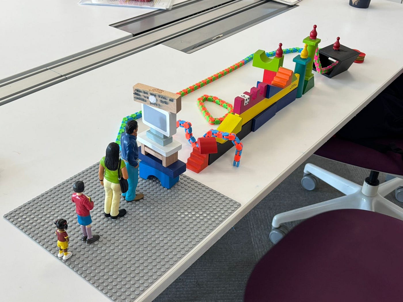
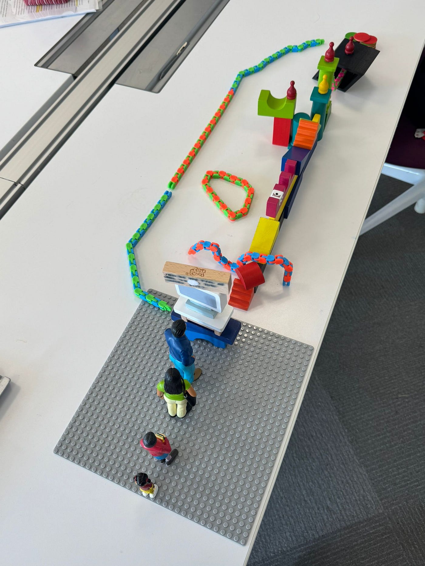
Our design jam model: Shows users interacting with a system. The blocks represent the experience of being pushed to think critically by AI
Using blocks, legos, jenga blocks and human figurines, we built a rough visualization of our intervention. We wanted our audience to interact with a system or an interface that would give them the experience of thinking critically with the help AI. The user would be prompted by AI to think deeper about an question instead of being fed immediate answers. But since this was at an early stage, we still hadn’t figured out what we wanted the user to leave with. What thought did we want to incite? The feedback session brought up interesting suggestions — to make the user feel the difference between using AI and not using AI while thinking; or getting more clarity on the nitty-gritty of the experience.
Ideating Post-Jam
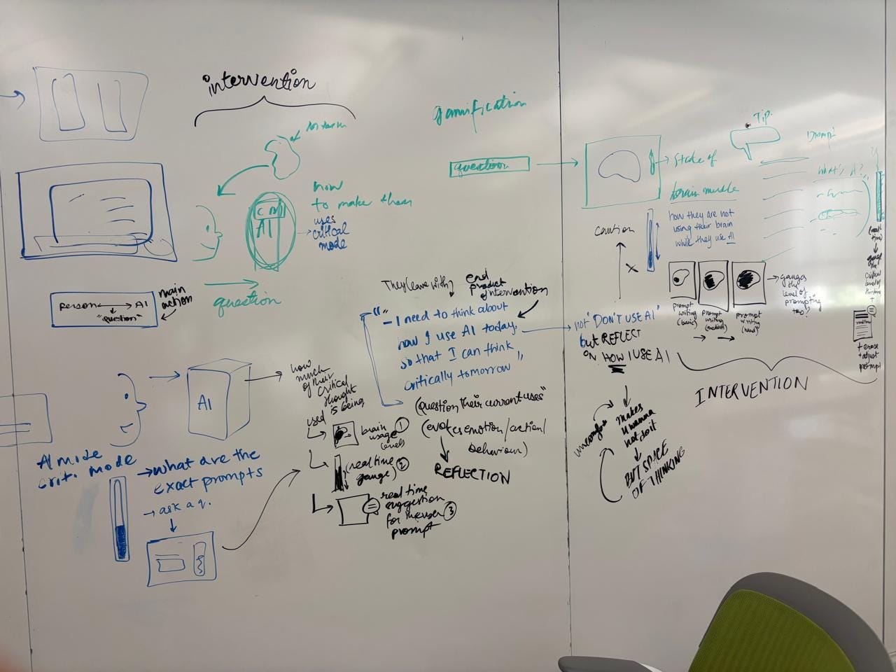
Whiteboard: Brainstorming the intervention after the Design Jam
Post the Design Jam, our first step was to zero in on what our imagined future looked like —
In a future where AI is ubiquitous and deeply embedded in our daily lives, what if humans need to consciously train our brain muscles to retain its ability to think critically?
Humans have evolved from having naturally physical lifestyles to becoming sedentary and desk-bound. This has led us to the rise of gym culture — training our bodies to retain physical health and fitness. Similarly, our brains are also muscles that need activity to retain function. Our current trajectory of AI use is pointing towards a deep over-reliance on AI to complete all kinds of tasks. So what if this is what our future looks like?
Our intervention
With our design intervention, we want our audience to question how much they rely on AI today and if they are aware of the impact it has on their critical thinking. In addition to this, we also want to think about how we can reimagine how AI is designed?
How can AI be designed differently so that it is better suited to actually help us and not just give us all the answers?
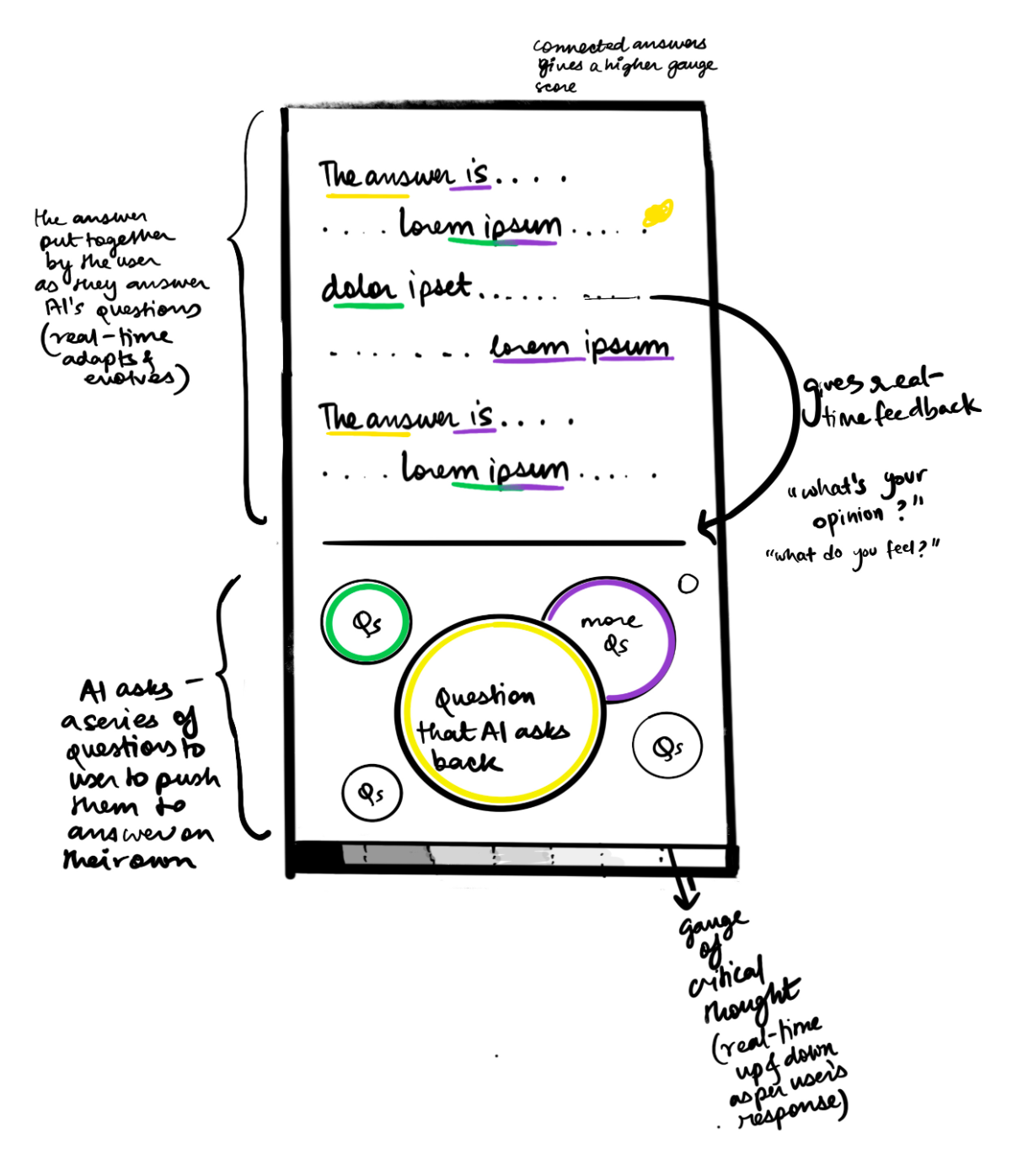
A sketch of our intervention (one possible mechanism): AI prompting users rather than answering without friction
We spoke about concepts like Design Friction (deliberately adding friction for a better user experience) and Ruinous Empathy (coined by Kim Scott; a communication style where you care about someone and don’t want to hurt their feelings but fail to challenge them in the process). Is the convenience offered by AI actually helping users or failing to challenge them?
Our intervention began to take shape. Our users would interact with a Brain Gym or a Brain training session. This would mimic our current schema of “working out” our physical bodies but use it in the context of training your brain muscles instead, to ensure that you are still able to think independent of AI. Through this session, users would be prompted by AI to continually think deeper about a topic. During this, they would also be shown “stats” of some kind that would visually depict how much they are thinking critically, what areas need improvement, and so on.
“Speed Dating” with our peers
Next, we each pitched our intervention to a group of peers, effectively getting feedback from everyone in class. We walked away from this activity with some insightful suggestions:
- To use the context of the gym to incite surprise/discomfort/confusion in users. This urged us to think about how we could incorporate aspects of the metaphor throughout our experience (A classmate specified using training jargon as an example)
- Contextualize users into the experience well so that they are aware of the future context before-hand
- Try to use over-the-top props like headgears or helmets to make the experience feel more uneasy
- To think more deeply about the nature of the questions/prompts asked to the users
Sources
Crisp, D. G., & Temple, W. (2012). Typography (Graphic Design in Context). Thames & Hudson.
Rawsthorn, A. (2018). Design as an attitude. Thames & Hudson.
Scott, K. (2017). Ruinous empathy and radical candor in management. Harvard Business Review, 95(3), 115–121.
Sept 22, Week 5 | Design Jam and Peer Review
Narrowing down through the readings
Through the readings and spending more time with the idea, we were able to refine the goal and narrow down the scope of our intervention.
Norman’s “Fitting the Artifact to the Person” talks about cognitive artifacts through two lenses: the personal view and the system view. A personal view changes the task but doesn’t influence the person, while a system view is when the artifact and the person work together to create something greater than what either could do alone. Building on this, we were able to articulate what we were trying to convey with our Mind Gym intervention: how can we make our audience think about their relationship with the technology they’re using? We wanted them to question whether it was simply changing their task, requiring no effort from them, or is it enabling something more collaborative?
We also discussed the Appropriateness principle, which states that any representation should provide exactly the amount of information required for the task — nothing more, nothing less. This got us thinking about how much we could communicate to users through form, context, setting, and messaging. Initially, we sketched out the Mind Gym in a very detailed manner, almost replicating the exact interaction from the future. But by the end of the session, we realized that most of it was either implied or unnecessary to convey. For instance, instead of a lengthy initiation into the experience, we could set the same context through the form of the intervention itself — in our case, the design of the booth/capsule (its name, messaging, position and style).
From there, we began stripping away the excess fluff from our intervention map and revising the journey. The plan is to situate the capsule/booth in the Cohon University Center — the hub for student facilities on campus. As a team, we agreed that the focus should be less on the specifics of the future interaction and more on what the audience takes away from the experience. Our next steps are to break down the messaging, condense the steps of the experience to keep it simple and effective, and zero in on how we want the audience to leave the experience.
The Journey Map
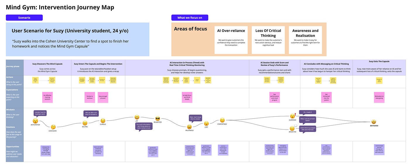
Intervention Journey Map
Our plan is to replicate a quick, almost crash course-like Mind Gym, where users train a specific part of their thinking to counter their reliance on AI. What we hope draws the audience in is the very idea of a Mind Gym itself, framed as something from the future.
The journey will start with the audience being prompted to wear a wearable (maybe headgear), after which the AI recaps their “workouts.” We want to push the audience in a little blind so that, by the end, they’re left questioning: “Why is this a thing?”, “It feels strange, I already know how to think,” or “I don’t want to train my mind in the future.” To make the link to AI dependence more explicit, we’re adding an AI hint/assistance system within the training (like intensity levels in a workout). This was missing earlier.
The demo video will follow this user, Suzy on this journey. It will show her through this experience and at the end, incite the ones watching to think about what they get from this and what its communicating to them.
Context and Media
To make this intervention impactful, we realized it needs to lean into being campy, futuristic, almost Black Mirror–esque. Part of that is the physical aspect — using some form of headgear (like an EEG device) and designing the booth itself (for which we are hoping to use an existing study booth or pod on campus). For the experience inside, we wanted to make it an immersive experience (maybe with augmented reality elements). The interaction itself will be a combination of voice and gestures.
Sept 29, Week 6 | Planning the Demonstration video
Course-correcting
Over the week, our discussions led our team to pivot slightly toward a simpler intervention that was both fun and effective. To help people experience AI’s impact on our cognitive abilities, we moved away from the Mind Gym (which seemed too future-focused and complex for a short period of time) and instead drew from familiar metaphors from daily life — ultimately choosing Jenga as our base model.
The Mind Jenga
Our intervention is a simple card game with the Jenga tower as a prop representing the mind. The tower has three colored blocks — yellow (creative thinking), blue (analytical reasoning), and pink (problem-solving), and players draw matching question cards. Each card offers the option to ‘Flip to use AI,’ revealing the answer. But this also requires the player to remove some blocks from the tower. Players earn coins for correct answers (which is the goal of the game), but the more they rely on AI, the weaker the tower becomes. The goal is to highlight, in a playful way —
How easy wins with AI can slowly destabilize our own thinking, and what that could mean going forward.
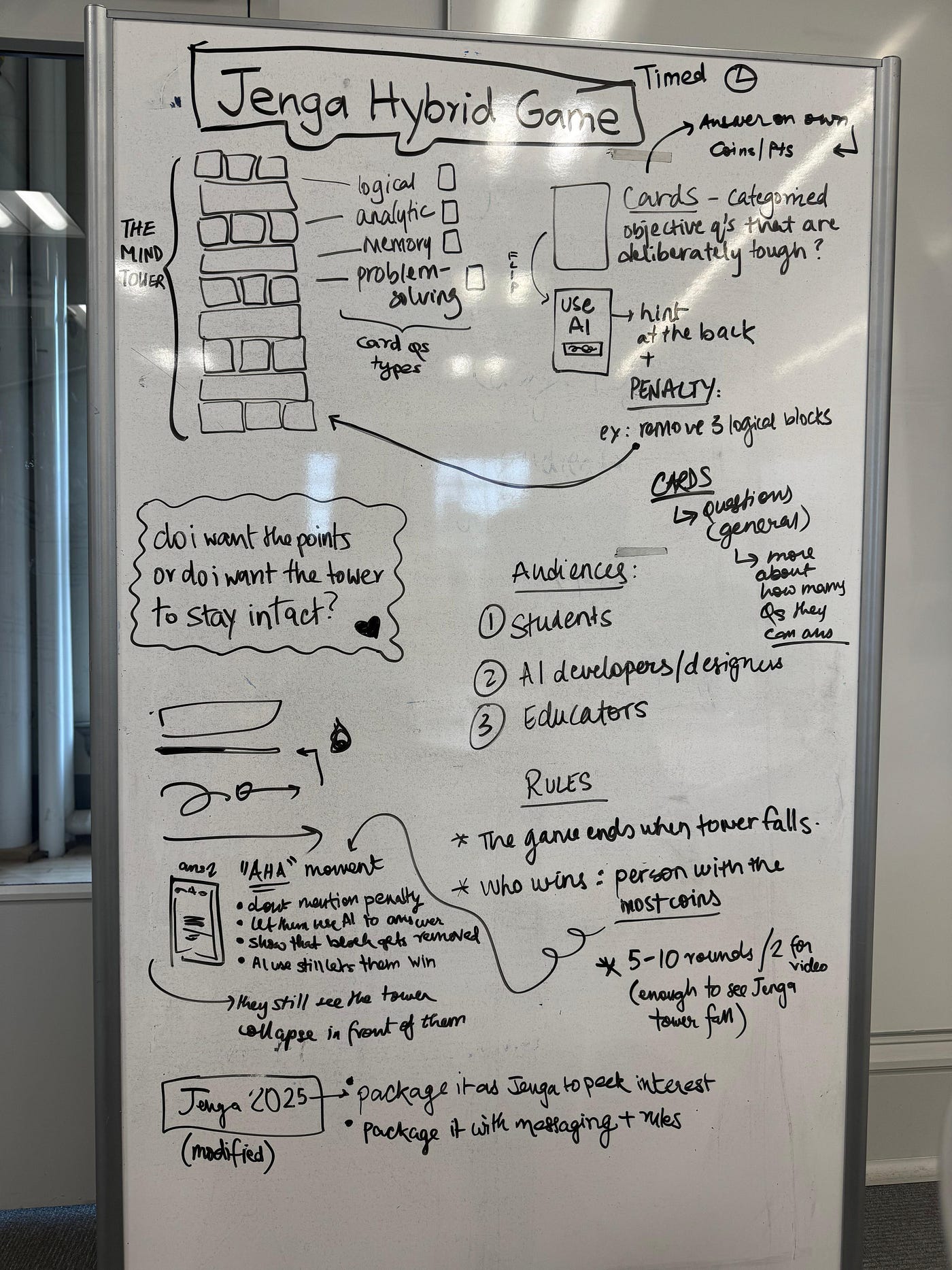
White boarding: Planning out the game and what we wanted to convey
Defining the mood of the communication
I decided to go ahead with Students as the audience for my pitch video. Since this is a game and for a younger audience, the mood for the video is playful, approachable and fun. The visual language will be inspired by the Jenga block-style and its colors. I plan to make the pace quick (tik-tok-like). The video will mainly observe people playing interspersed with probes (without being preachy) to slightly guide the audience’s thinking and support the visuals. It will start off almost as a demo of the game, but leave them with questions to provoke their thought.
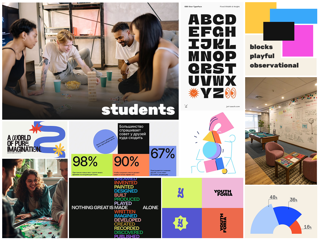
Mood board for demo video (Students)
Making the game
We quickly made the different components of the game — the cards, the packaging, the rules and the sleeve. We deliberately did not spend too much time in this process and used an existing Jenga box as our base, and stuck our designs on it.
We quickly came up with 5–6 questions for the cards (under each of the categories of thinking). There were deliberately tricky to encourage people to want to use AI in the game.
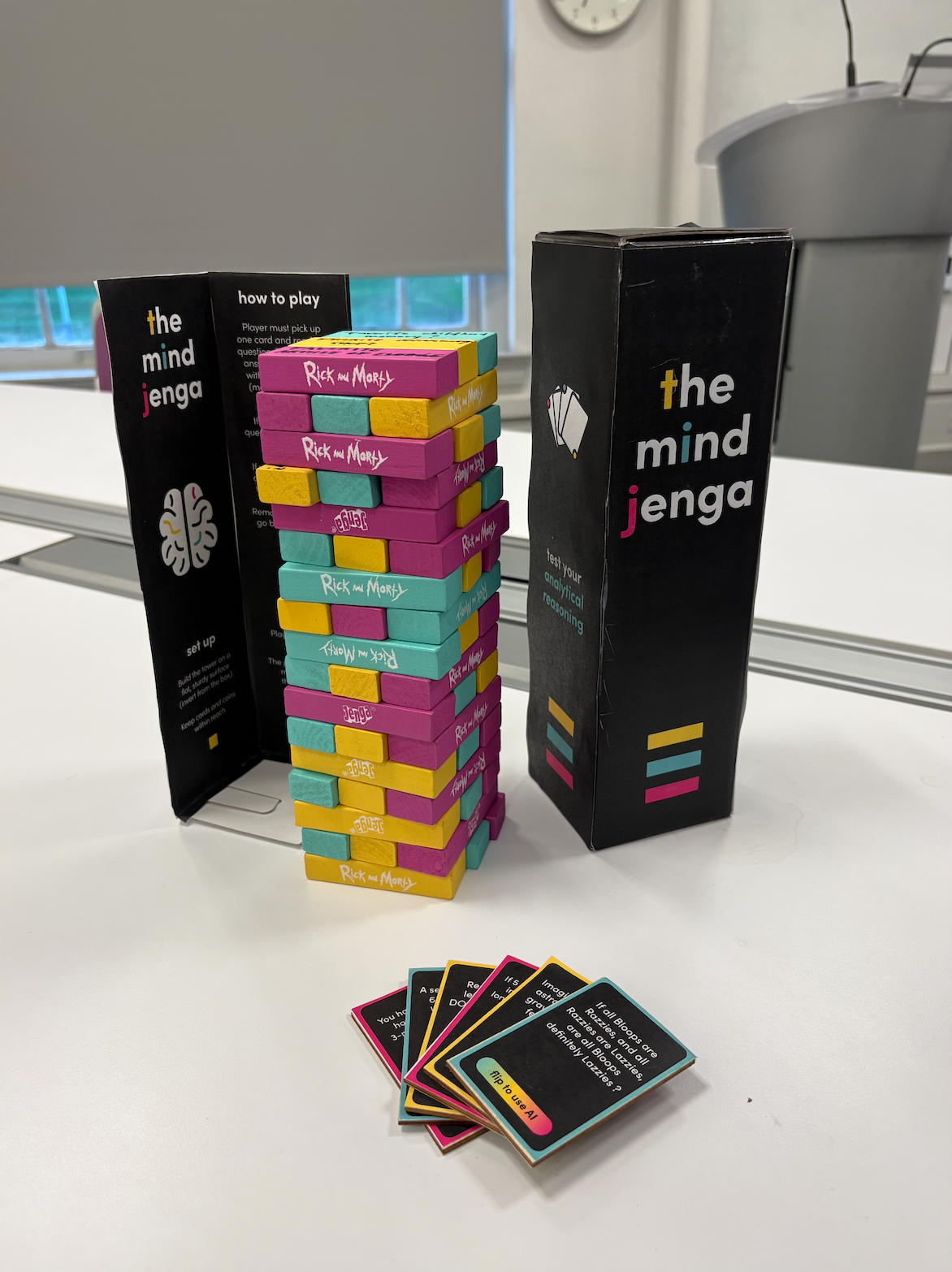
Colour coordinated Jenga blocks and question cards, outer packaging and sleeve labelled “The Mind” with the rules.
Storyboarding the demo video
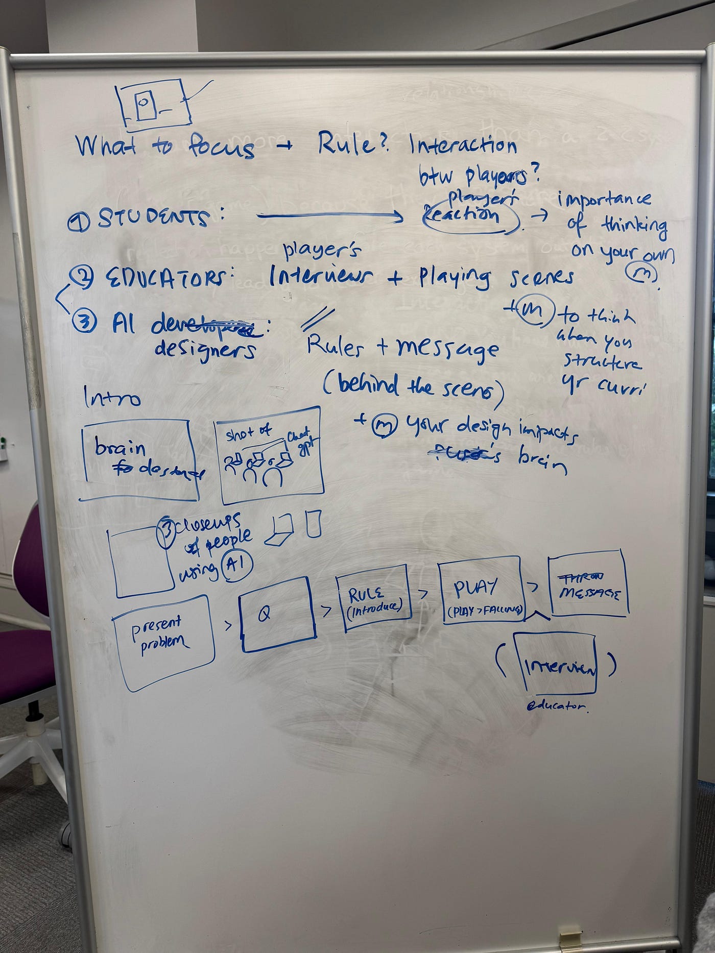
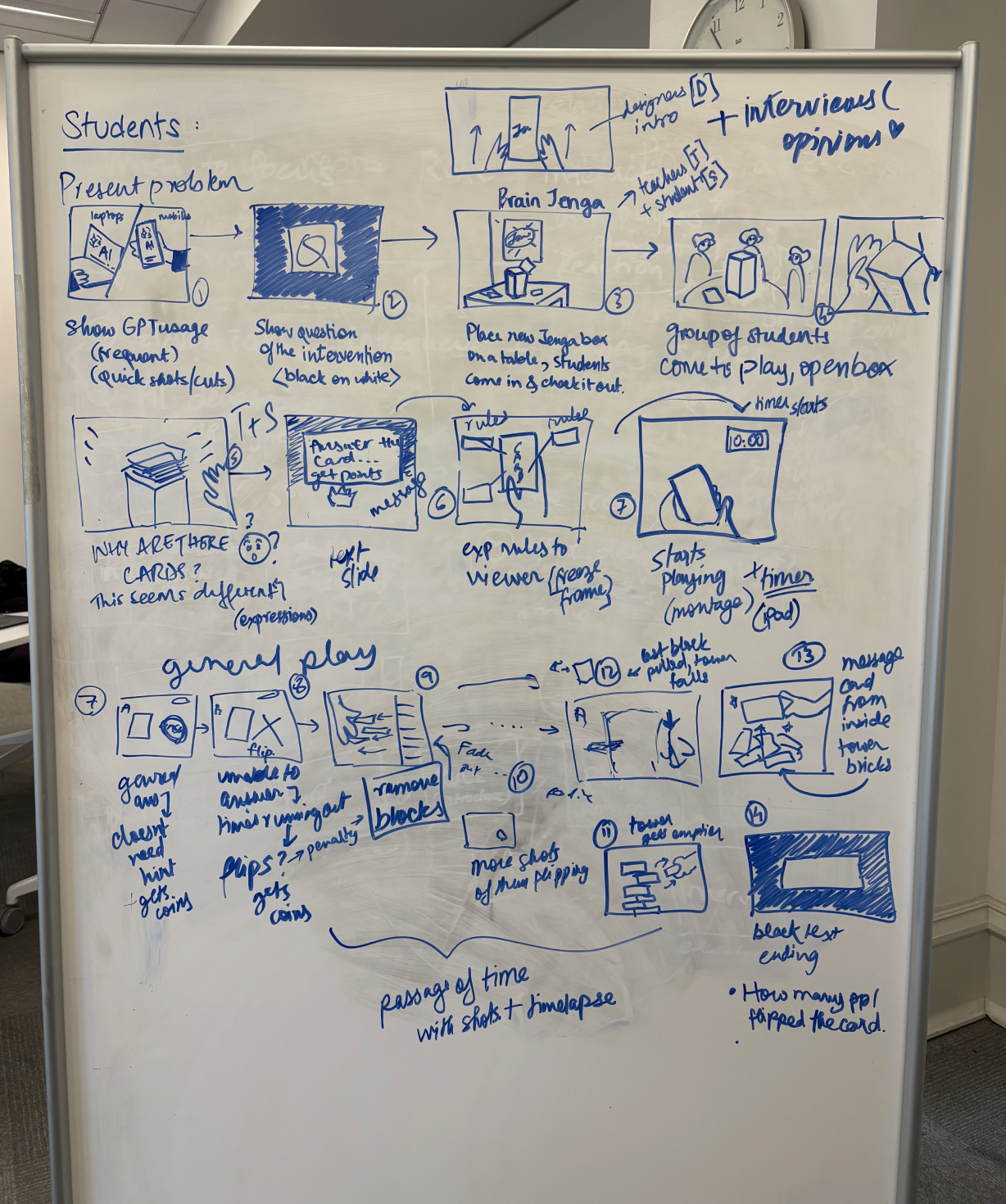
Demo video planning: Focus areas for each audience (left), Footage/shots plan (right)
Based on our collective storyboarding, I started to formulate a plan of the aspects I wanted to emphasize on in the video -
- The present problem: People instantly turning to AI when faced with something complex or challenging to hook people in.
- Parts of the game: Quick shots of players seeing the tower, trying to answer questions, flipping to use AI, removing blocks, tower falling, finding the hidden probe card
- Feelings while playing: Capturing the confusion when answers are handed easily, any reactions to winning coins while the tower destabilizes/falls, reactions after reading the final hidden probe in the tower (the AHA! moment)
- Reactions post-game: Sound bites of players talking about what it made them feel, and what they are thinking about.
The journey map would also focus on the same emphasized points as above, with the phases probably being — context, introduction to the game, gameplay, probe, reflection.
Text in Demo video
The text in the video would be concise, pointed and playful. Here are a few draft ideas:
The Opening (present context):
How many times have you used AI today?
Gameplay:
The goal of the game? Get the most number of coins.
But wait.. just flip and use AI!
Just remove some blocks with it. No big deal.
Closing (probe):
Are you getting all the answers? At what cost?
At the end, I want people to leave with some questions about how easy it is to get answers with AI today, how it impacts them and what the future of that could look like.
Oct 6, Week 7 | Peer Review
Getting feedback on my video draft
This week, we got to have our video drafts reviewed by our peer groups and get feedback on them. I had a prototype cut of about 70% of my video that I shared with my group.
I found the session to be really useful and it and it helped me a lot in streamlining my video plan. The main feedback I got was that I was going into too much detail into the video. Since our intervention was a game of Jenga (with a twist), even though I had storyboarded my video, I was spending a lot of time explaining the rules. Because of this, the central focus of the video was getting lost. Getting a few fresh eyes to see it helped me remove the fluff and focus on the core aspects to communicate my intention:
- Drawing the connection between the Jenga tower and the mind is a must.
- I need to show a person answering a question without AI first for two reasons — to highlight the contrast with answering using AI, and to make it clear that the game doesn’t require people to flip to AI.
- There is no need to explain that you can win gems after using AI, since the point comes through without it.
- The flow from the problem introduction (students using AI tools) to the game feels abrupt.
- The video can seem more fun since its targeted towards students.
Refining based on feedback
Based on the feedback I received, I took the following steps to revise my video:
- I made a fresh storyboard that was crisp and not convoluted with messaging about rules.
- I began minimizing text on the slides, conveying the most important rules for context through video clips and brief, interspersed text instead.
- I added in a section that introduced the metaphor of the mind being the tower.
- Lastly, I kept the end of the video on for longer and refined my final question into — So, what does it cost you?
However, I was still struggling with transitioning from introducing the problem to presenting the game. Stacie gave me useful feedback — I could simply mention that we designed an intervention or invited students to play a game with us. This allowed me to provide the necessary context without breaking the flow into gameplay.
Oct 8, Week 7 | Reflecting on the Project
The Intervention
My final intervention was The Mind Jenga — a reimagined Jenga where players answer questions to win gems. The tower represents the mind. Players can answer on their own or with AI, still winning a gem. But each use of AI requires removing blocks, gradually weakening the tower. The game ends with a hidden card: ‘You got all the answers, but at what cost?’
Through this intervention, I wanted people to reflect on how much they rely on AI, and what its implications are. The game is structured in a way that using AI is not difficult at all, its simply a flip. And there are seemingly no consequences (they still win points), reflective of how AI use can feel in real life. The real collateral damage is the tower, or the mind. The hidden card in the tower incites the aha moment for people to wonder — am I weakening my mind by constantly using AI?
The audience I chose for my project was Students. I targeted both my demo video and journey map to them.
Demo Video
Creating a demo video for a specific audience really helped me understand how important it is to decide the tone of your messaging. I had to focus on putting the message across in a way that was appropriate to their context and also left them with the right questions. I found that the gameplay did a lot of the talking, so I used the text to simply set up the clips.
[embed]Demo Video: targeted towards students
Journey Map
To restructure the journey map as a communication tool for Students, I changed the format slightly and added a ‘Behind the Game’ section — which is sort of represents my voice talking to them through the stages. I used this to pose questions or reinforce some reflection.
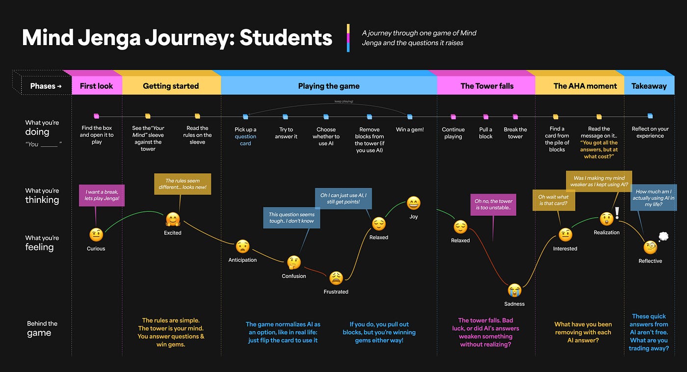
The Mind Jenga Journey Map: For Students
Next steps
If I were to continue working on this, I would refine the gameplay to feel more natural. While the intervention was quite effective and conveyed the point, combining question cards with Jenga confused some people because of their well-established mental model of Jenga. I think this mental model could actually be useful (which was our intention), since we want to convey that breaking the tower represents the real loss. However, the question cards need to be framed more convincingly as the main focus at the start of the game. I could do this by testing some versions with users.
I’d also stylize my demo video more, exploring formats like reels or TikToks, to match the current language of video storytelling. I think what works best with younger audiences is something that feels natural, authentic and fun (can be conveyed through the style of recording and editing).
My reflections
Through the course of this project, I came away with a better understanding of how to design to make people think. Designing a solution seems a lot easier to me, cause the research and user inputs pave the way, leading you towards the right direction. However, to make people question, you have none of that. I learned that to navigate such a process, it’s important to keep anchoring the work in the core goal and almost reverse-engineer from there.
In such cases, I think there is great value in using metaphors that people have an established understanding of. I realize now how we intuitively applied what we learned from our readings on schemas and prototypes from the first two weeks. The key is striking the balance between creating messaging that nudges users to think about something specific, without telling them what to think, is tough.
I also learned how not to instruct users. I think that our designs often work best when they create space for the user’s own experience and thought process. It’s about viewing our designs not as something that must be used a certain way, but as equal partners in the exchange — between the user and the thing.
Every aspect of the outcome feeds into this — the colors, the speed of the text, the background music, or the angles of the video clips. Taking this forward, I want to consider how these small details can shape the designs I create (even if they are solutions), helping people not mindlessly use something, but intentionally experience it through feeling, emotion, critical thinking and memory.
메타데이터
- post_id
- 49aecf85bfbf
- slug
- communication-design-studio-fall-2025-49aecf85bfbf
- url
- https://medium.com/@sahanasundar161/communication-design-studio-fall-2025-49aecf85bfbf
- canonical_url
- https://medium.com/@sahanasundar161/communication-design-studio-fall-2025-49aecf85bfbf
- author_url
- https://medium.com/@sahanasundar161
- status
- ok
- fetched_at
- 2026-07-17 22:55:58