Understanding and Reading Chord Diagrams
Data Visualization Frameworks
Understanding and Reading Chord Diagrams
Data Visualization Frameworks
1. Overview & Origins
A Chord Diagram is a graphical method used to visualize the interrelationships, flows, or dependencies between different entities in a network.
Historical Context
- Origins in Genomics: While circular layouts have existed in various forms for centuries, the modern interactive chord diagram was popularized in 2009 by Martin Krzywinski. He introduced it via a software package called Circos, which was originally designed for visualizing genomic data (such as comparing structural variations across different chromosomes).
- Transition to Technology & Networking: Because of its unique ability to show complex, many-to-many relationships without creating a tangled “hairball” graph, the format was quickly adopted by data scientists and network engineers. Today, it is a standard tool for mapping high-density data center traffic, software-defined networking (SDN) paths, BGP peering relationships, and matrix-based matrix flows.
2. Anatomy of a Chord Diagram
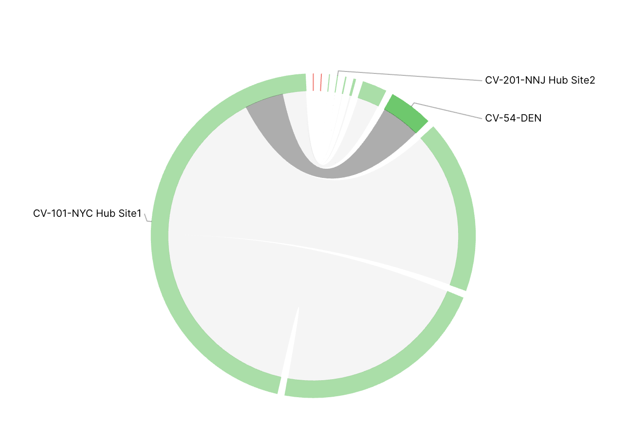
When analyzing a diagram like the one in shown below, the visualization is broken down into three primary components:
A. The Outer Ring (Nodes/Entities)
- What it is: The circular perimeter represents the total set of nodes, sites, or endpoints in the environment.
- Proportional Scaling: The length of each segment along the circumference is proportional to that node’s total volume, capacity, or bandwidth footprint.
- Example Analysis: In our specific screenshot,
CV-101-NYC Hub Site1dominates the circumference, indicating it represents the vast majority of the total network capacity or traffic volume in this dataset.
B. The Inner Chords (Flows/Ribbons)
- What they are: The curved bands or ribbons crossing the center of the circle represent the active relationships or data paths between two points.
- Volume Thickness: The width of the ribbon at its base indicates the size or volume of the connection. A thick ribbon means a heavy data flow; a thin ribbon means a minor connection.
- Directionality: By tracing a ribbon from one side of the circle to the other, you can instantly see which remote sites (such as
CV-54-DENorCV-201-NNJ Hub Site2) are peering or communicating with the primary hub.
C. Color Coding (Status/Health)
- Structural/Traffic Paths: The grey ribbons across the center map the established paths and traffic distributions running across the fabric.
- State Metrics: The outer ring fragments use color to denote status. Green indicates a healthy, active, or allocated state. Red lines (visible as small slivers at the top center) serve as immediate visual flags for alerts, downed interfaces, or failed connection attempts.
3. Best Practices
- Use Case: Use chord diagrams when you need to audit multi-site fabrics, identify asymmetric routing, or find top-talkers in a highly centralized network.
- Limitation: Chord diagrams are excellent for high-level relationship overviews, but they can become difficult to read if there are too many small, overlapping connections. When analyzing dense graphs, leverage interactive filtering (hovering over a single node) to isolate specific traffic paths.
🙏 Thank you 🙏 for being a part of the SDNTechForum community! 💖🤖💖
Before you go, don’t forget to leave some claps 👏👏👏 (≥50 would be amazing 😉) and follow me ️🙏.
For further reading, explore my in-depth analysis on Medium and YouTube.
메타데이터
- post_id
- 4a2a48a6be62
- slug
- understanding-and-reading-chord-diagrams-4a2a48a6be62
- url
- https://medium.com/@sdntechdemo/understanding-and-reading-chord-diagrams-4a2a48a6be62
- canonical_url
- https://medium.com/@sdntechdemo/understanding-and-reading-chord-diagrams-4a2a48a6be62
- author_url
- https://medium.com/@sdntechdemo
- status
- ok
- fetched_at
- 2026-07-11 19:25:18