Angular Dialog Box ( Modal Popup) without Library Components
Certain use cases do not always require a third party library component. Bootstrap CSS should just be enough.
Angular Dialog Box ( Modal Popup) without Library Components
Certain use cases do not always require a third party library component. Bootstrap CSS should just be enough.
Photo by Florian Olivo on Unsplash
In the first few days of every web app development, there might be a debate on choosing which third-party libraries to use in their project. There are a lot of advantages in using these libraries. We don’t need to re-invent the wheel for complex components. We can just re-use these well-defined components under third-party libraries. But, there are also instances where we never need to use these components with all the features.
A little bit of CSS and some imagination will help us build some simple components without relying on third-party library components.
A good example is a Modal popup. Most of the scenarios use the modal popup to show additional info or get user input. It is almost always attached to a parent component or page.
[embed]
The First step is I went to the bootstrap documentation to see how the bootstrap modal works. This is what I found.
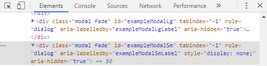
Modal Parent div — Before Modal being triggered

Modal Parent div — After Modal being triggered
Modal Backdrop, Fade and Show classes
As for the Modal backdrop, the following code gets added to the bottom of the page.
<div class="modal-backdrop fade show"></div>You can inspect the classes (modal-backdrop, fade and show) to see the .show class controls the opacity and the .fade class controls the transition property ( on the opacity)
.fade {
    opacity: 0;
    transition: opacity .15s linear;
}
.modal-backdrop.show {
    opacity: .5;
}
.modal-backdrop.fade {
    opacity: 0;
}
.fade.show {
opacity: 1;
}We need to be able to cover all these to come up with a simple Dialog Modal Popup.
First Approach
Have the modal popup exactly the same way as specified in the bootstrap documentation. Here.
Second Approach
I wanted to control all aspects of the modal without any help from bootstrap js.
Let’s dive into creating a working Modal popup with just CSS and Angular ( Angular 9 as of now..). I am using bootstrap (4.5.0) in my package.json.
[embed]
We can also remove the data- attributes associated with the buttons since we no longer need those to toggle the modal view.
<button type="button" class="btn btn-primary" (click)="open()">
    Launch demo modal
</button>
The above modal will not respond to the ESC key as well as the background will be static as well.
// background for my modal with opacity 0.5. Attached to my modal div. Refer to HTML code above..my-modal {
display: block;
background: rgba(0, 0, 0, 0.5);
height: 100vh;
width: 0;
}The above class should be sufficient in handling the task of the .modal-backdrop class.
We can control the opening and closing of the modal popup from our component like below.
[embed]Angular Controller Code
The setTimeout() at the close provides the animation effect for the closing of the Modal. We can directly set width, if we wish to avoid animations.
Conclusion
There is no one way to generate/develop a component. It is always better to review usage/needs of a particular component in your page before you decide to re-use a component from a third-party library. There might be cases where it would prove an asset to re-use a component from a library, as well as cases where it's not really needed.
Resources
The list of properties that can be transitioned is available at MDN: https://developer.mozilla.org/en-US/docs/Web/CSS/CSS_animated_properties
메타데이터
- post_id
- 4b28daedc9d1
- slug
- angular-dialog-box-modal-popup-without-library-components-4b28daedc9d1
- url
- https://medium.com/front-end-weekly/angular-dialog-box-modal-popup-without-library-components-4b28daedc9d1
- canonical_url
- https://medium.com/front-end-weekly/angular-dialog-box-modal-popup-without-library-components-4b28daedc9d1
- author_url
- https://medium.com/@aneeshmani
- status
- ok
- fetched_at
- 2026-07-30 12:16:26