Why is US healthcare so bad?
Paying more, getting less
Why is US healthcare so bad?
Paying more, getting less
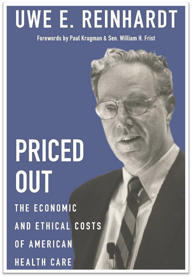
Uwe Reinhardt was a PhD economist who focused largely on healthcare. His claim to fame may have been persuading the Taiwanese government to adopt universal healthcare in 1989, for which he received their Presidential Prize in 2014. In the US, Reinhardt served on the Governing Council of the Institute of Medicine between 1979 and 1982 and advised Congress on healthcare throughout his career. His last book, 2017's Priced Out, housed the regular refrain “to what extent should we be our poor and sick brothers’ and sisters’ keepers in health care?” As the book's subtitle suggests, Reinhardt was critical of the US’s failure to adopt a universal health care system.
Much of the information presented here comes from Reinhardt’s book, and he himself relied on data from the Organisation for Economic Co-operation and Development. The OECD is a group of 38 countries with a similar manifesto: democracy and market economies. Thus, we can compare the US to countries like it to determine how its healthcare measures up globally. While the data in Priced Out is almost a decade old, as a comparison between countries, it still paints a decent picture of American healthcare in 2026.
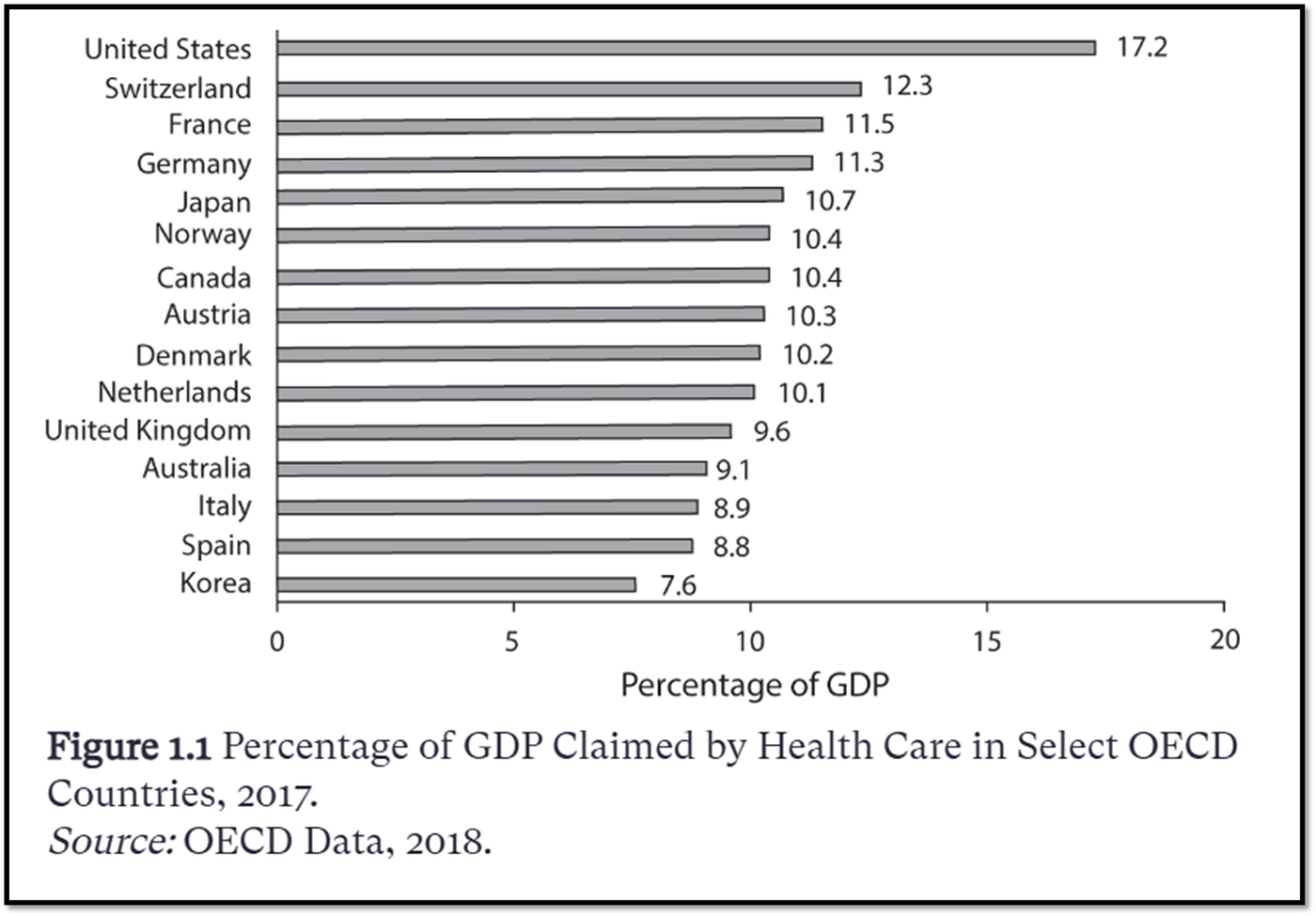
From “Priced Out”
This first graph tells all: The US spends more of its resources on healthcare than any other country. As of 2024, OECD data still puts this at about 18% GDP. Yes, I have railed against GDP as a datapoint in the past, but this is when it’s used to justify the “well-being” of a country over time. Which is to say, growth in GDP shouldn’t be understood to indicate an increase in well-being for all a country’s citizens. However, here GDP is a useful way to compare the productive capacity of a country’s resources with those of similar countries. This graph then indicates the US is spending more of its “productive capacity” on healthcare.
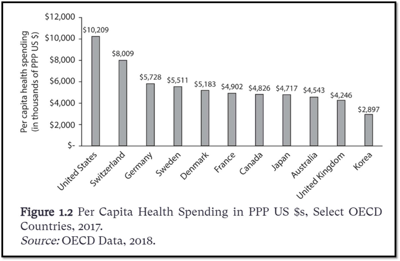
From “Priced Out”
Similarly, if we look at spending on healthcare per person in the US, it’s also the highest of all OECD countries. Current OECD data for US healthcare spending is at about $15k per person.
Okay, so we spend more. But maybe that’s because healthcare in the US is just that much better?
When looking at data from the OECD’s 2025 *Health at a Glance, *the US is average at best. Our life expectancy is 78 compared to the OECD average of 81. Preventable and treatable mortality, defined as causes of death among people under 75 that can be mainly avoided, as well as suicide, is higher in the US than the average. The US does have a lower percentage of poor self-reported health, fewer daily smokers, and less air pollution than the average. Obesity rates are higher, but this could reflect the genetic makeup of the US population compared to other countries (for a further explanation of this, see my series on the flaws of measuring obesity with BMI). Our vaccination rates are on par with OECD average, and our 30-day mortality after stroke or heart attack is lower, while our avoidable hospital admissions are among the highest. Some of our measures are good, some are average, and some are bad. But in none of these are we the best.
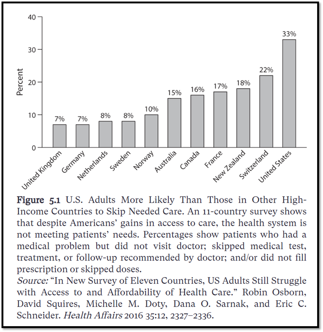
From “Priced Out”
Add to all this survey data showing that US adults are more likely to forgo medical care than adults in other countries. We skip more recommended tests, treatments, and follow-ups, as well as more prescription fills and refills. This reflects a stereotypical American way of dealing with health problems, which is to wait until things get so bad that we end up in the hospital.
If we’re not getting better outcomes, then why do we spend almost double on healthcare? Could it be our aging population?
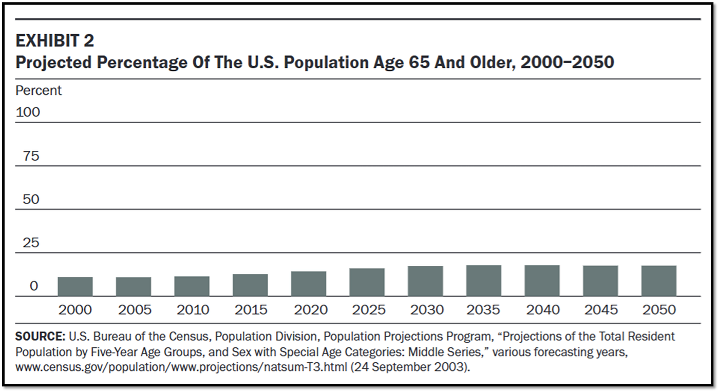
From Reinhardt, U. E. (2003). “Does the aging of the population really drive the demand for health care?” Health Affairs, 22(6), 27–39.
In 2003, Reinhardt published a paper projecting that the percentage of the US population over 65 would level out at about 20% by 2030. It currently sits at about 18%, as was also projected then.
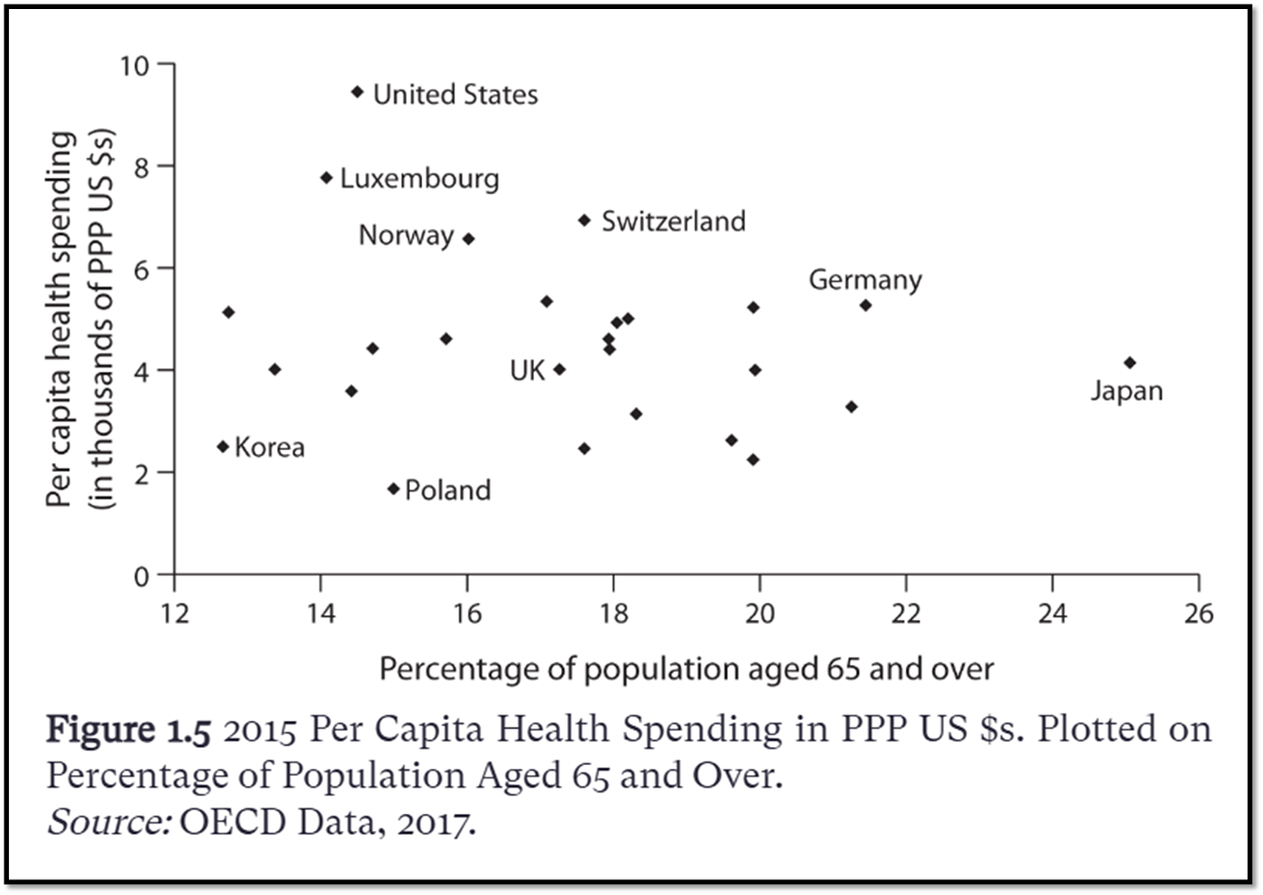
From “Priced Out”
But the US is actually somewhat young compared to other countries. Japan has a much older population, yet it still spends less on healthcare. If anything, this graph shows that population age and healthcare spending aren’t correlated. So if it’s not an older population and it’s not better outcomes driving costs, what is it?
The following comes from the International Federation of Health Plans 2024 International Healthcare Cost Comparison Report.
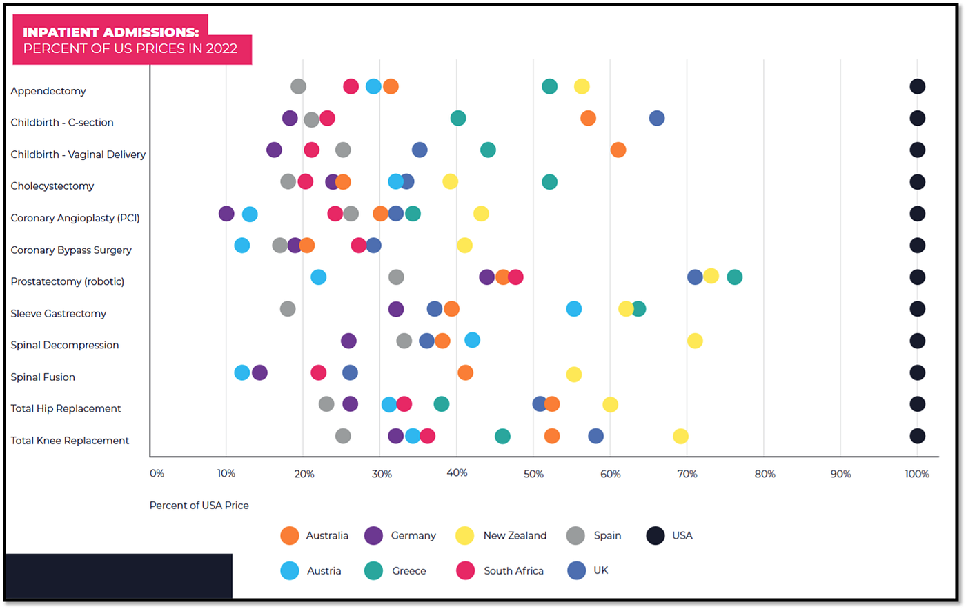
From IFHP 2024 International Healthcare Cost Comparison Report
This first figure analyses the costs of 12 common inpatient procedures in nine countries in 2022. It’s predicated on the fact that the eight other countries’ costs are a fraction of the US costs for all 12 procedures. If we look at some of these procedures specifically, we’re talking a difference in tens of thousands of dollars. The report notes inpatient costs in the US are driven by its “fee-for-service” payment model, incentivizing quantity of services provided instead of quality, like in an outcomes-based payment model. Reinhardt echoed this argument ten years earlier in Priced Out.
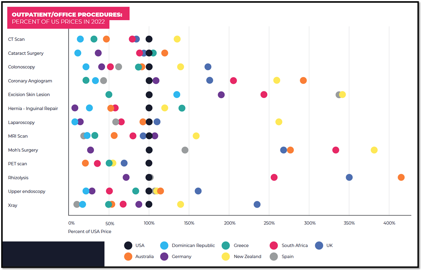
From IFHP 2024 International Healthcare Cost Comparison Report
Looking at outpatient procedures, we see the US is somewhat more competitive but still sits at the higher end of prices.

Figure 3.1 from “Priced Out,” with my highlights
But it’s not just that the US had high prices. It’s also that the exact price for these procedures in the US is unclear and really depends on who’s paying. Here is the data Reinhardt presents from a 2018 paper looking at the difference between what hospitals charge, the price negotiated with insurance, and Medicare reimbursement. Reinhardt describes it best here:
“Charge” [yellow highlights] in figure 3.1 refers to the list prices each hospital has in its “charge master.” These list prices often are so high as to defy reason. Each hospital composes its own charge master, using methods that remain a mystery to outsiders. The charge masters of different hospitals do not even have a common structure and nomenclature. Only a few state governments have the temerity to require hospitals to post their charge masters on their websites. However, uninsured patients with some means typically are charged these high list prices. Hospitals then use any means, including debt collectors and the courts, to collect on bills at these high charges. … Medical bills based on charges can easily bankrupt a family. Usually private health insurers negotiate the prices [green highlights] they will pay hospitals in the form of discounts off the hospital’s charge master … They are averages, with huge variations within these averages. Finally, Medicare prices [blue highlights] are those paid by Medicare. In principle, they are set to cover the average cost of hospitals, although for some hospitals there is a shortfall of Medicare prices from costs, while for other hospitals Medicare’s prices may yield a positive profit margin. A fascinating feature of U.S. prices for health care is not only that they vary so much across this huge country, but also that they vary just as much within localities, for example, within a city, county, or state.” — Priced Out, p49
From “Priced Out”
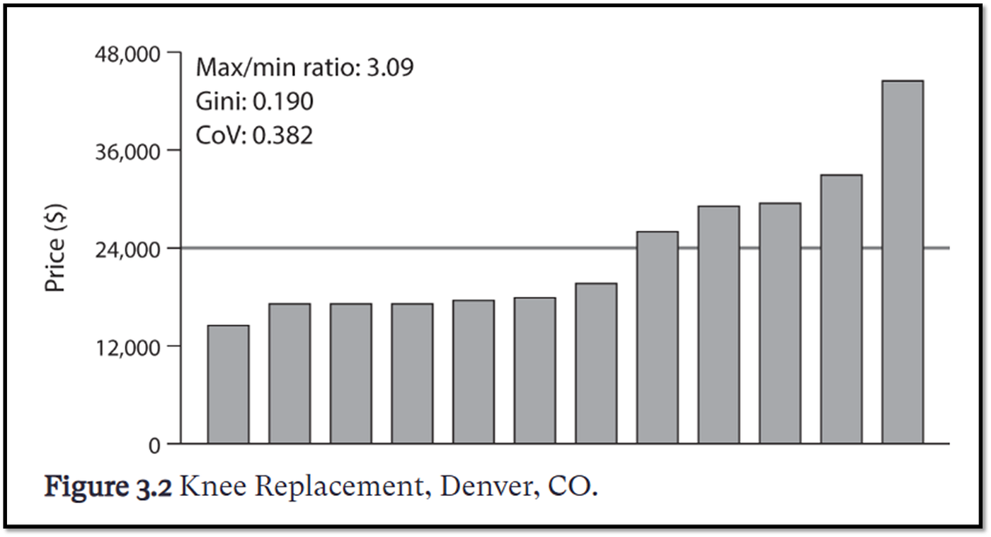
For this last point, Reinhardt presents Figure 3.2, coming from the same paper, showing the large variability in pricing for just a knee replacement in Denver. The highest price was about three times the lowest, resulting in a difference of tens of thousands of dollars FOR JUST ONE PROCEDURE IN THE SAME COUNTRY IN THE SAME STATE IN THE SAME CITY. As Reinhardt says, “… total chaos reigns.” (Priced Out, p. 48)
Basically, health care providers and drug manufacturers charge the ‘highest price they can get away with,’ knowing that some insurers will pay some part of it, some people will pay it out of pocket, Medicare reimbursement may or may not cover it, and that they’ll lose money on some people who will never be able to pay it.
From “Priced Out”
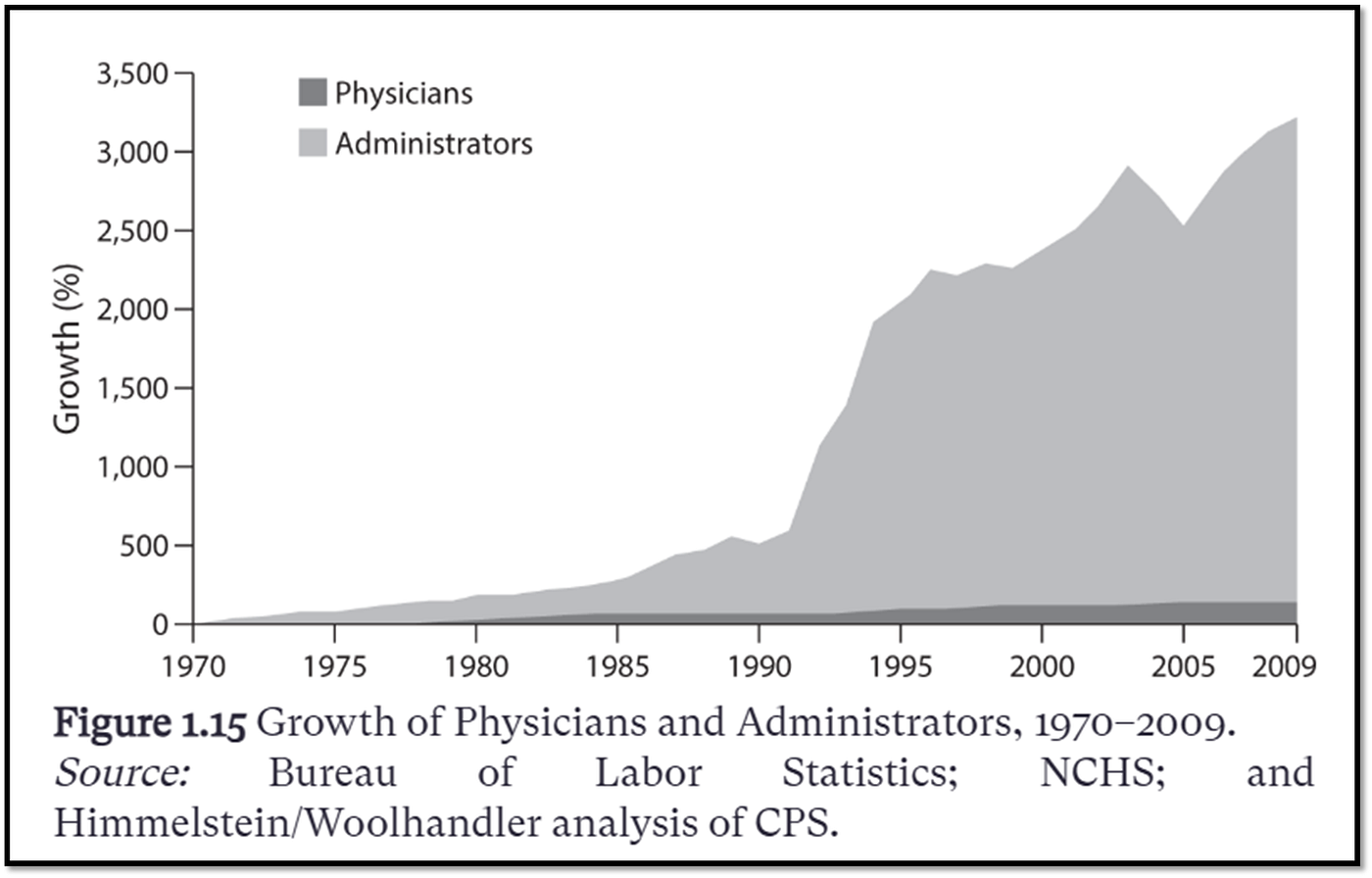
And here we can see where some of the value from this “profit of obfuscation” has gone: a growth in healthcare administrators an order of magnitude greater than that of doctors over the 40 years from 1970 to 2010.
From “Priced Out”
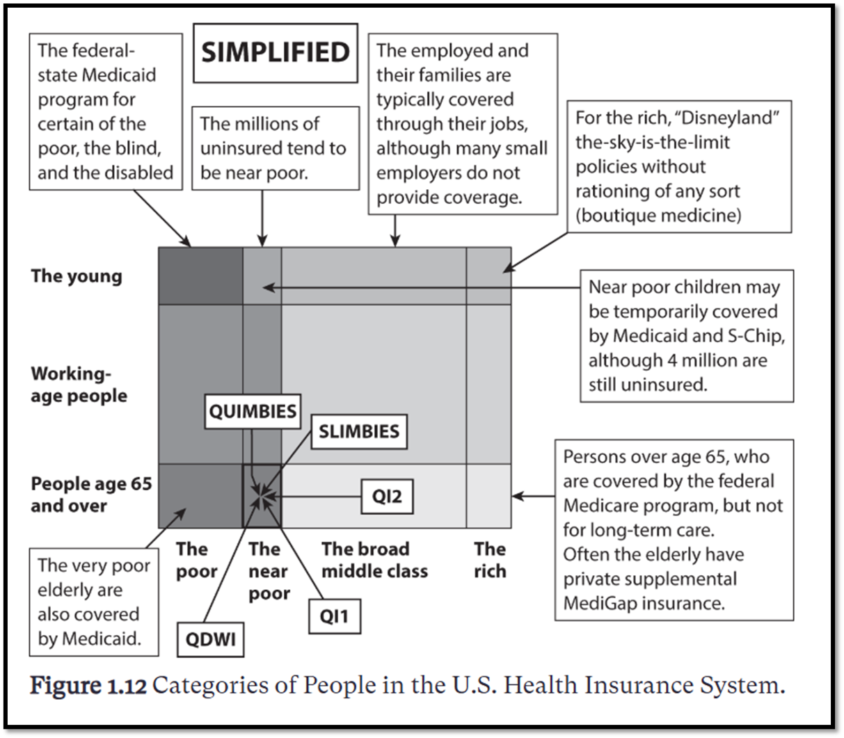
This isn’t to paint healthcare administrators as greedy value vacuums. They’re a necessary part of the US healthcare system BECAUSE of its complexity, as depicted here. Whereas most countries group their citizens into the same pool of insureds, the US, in deference to “consumer choice,” divides its insureds by age and income. If you’re below a certain income, you get Medicaid, which can combine with Medicare if you’re over a certain age. If you work, you and your family are covered by one of the over 1000 different health insurance companies. If you’re what this figure calls “the near poor,” that is, not meeting the Federal Poverty Level (FPL) for Medicaid but not lucky enough to have a job with health insurance benefits and/or to make enough money to purchase your own health insurance, then you might be a) part of the millions of uninsured Americans; b) a child of the uninsured who MAY qualify to be temporarily covered by Medicaid; or c) in the box of Medicare eligible (over 65) but not Medicaid eligible (below a certain income), but c.1) eligible with an income of up to 100% the FPL as a Qualified Medicare Beneficiary (or Quimbie) to have your Medicare expenses covered; or c.2) eligible with an income of 100% — 120% the FPL as a Slimbie or Specified Low-income Medicare Benefciary which only pays for the monthly Medicare Part B premium. Medicare Part B covers like the non-hospital things that Medicare Part A covers, but not drugs cus that’s Medicare Part D, except Medicare Part B does cover some drugs and also vaccinations, but not all vaccinations. Oh and there’s also QI1 and 2 which have something to do with Slimbies between 120% and 135% FPL but I don’t know how that works and I also don’t know what QDWI means and half this stuff I had to look up because Reinhardt doesn’t even tell you what they are or even what the acronyms stand for and the other half I have to know because its part of my job.
So yeah, you can see why we might need so many healthcare administrators.
From “Priced Out”
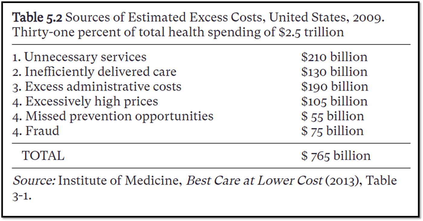
Reinhardt references a 2013 Institute of Medicine report that these “excess administrative costs” made up about a quarter of the estimated excess costs in healthcare spending in 2009. Interestingly, despite our human tendency to rail on bad actors, fraud here only accounted for 10% of costs, which at $75 billion isn’t insignificant, but we clearly have a much bigger issue going on with US healthcare at a systems level, with a financing structure that incentivizes unnecessary services, higher administrative costs, higher healthcare provider and drug manufacturer prices, and fragmented, inefficiently delivered care while dis-incentivizing public health prevention measures. These excess costs accounted for about 30% of US healthcare spending in 2009.
Speaking of drug manufacturers, we haven’t called them out yet.
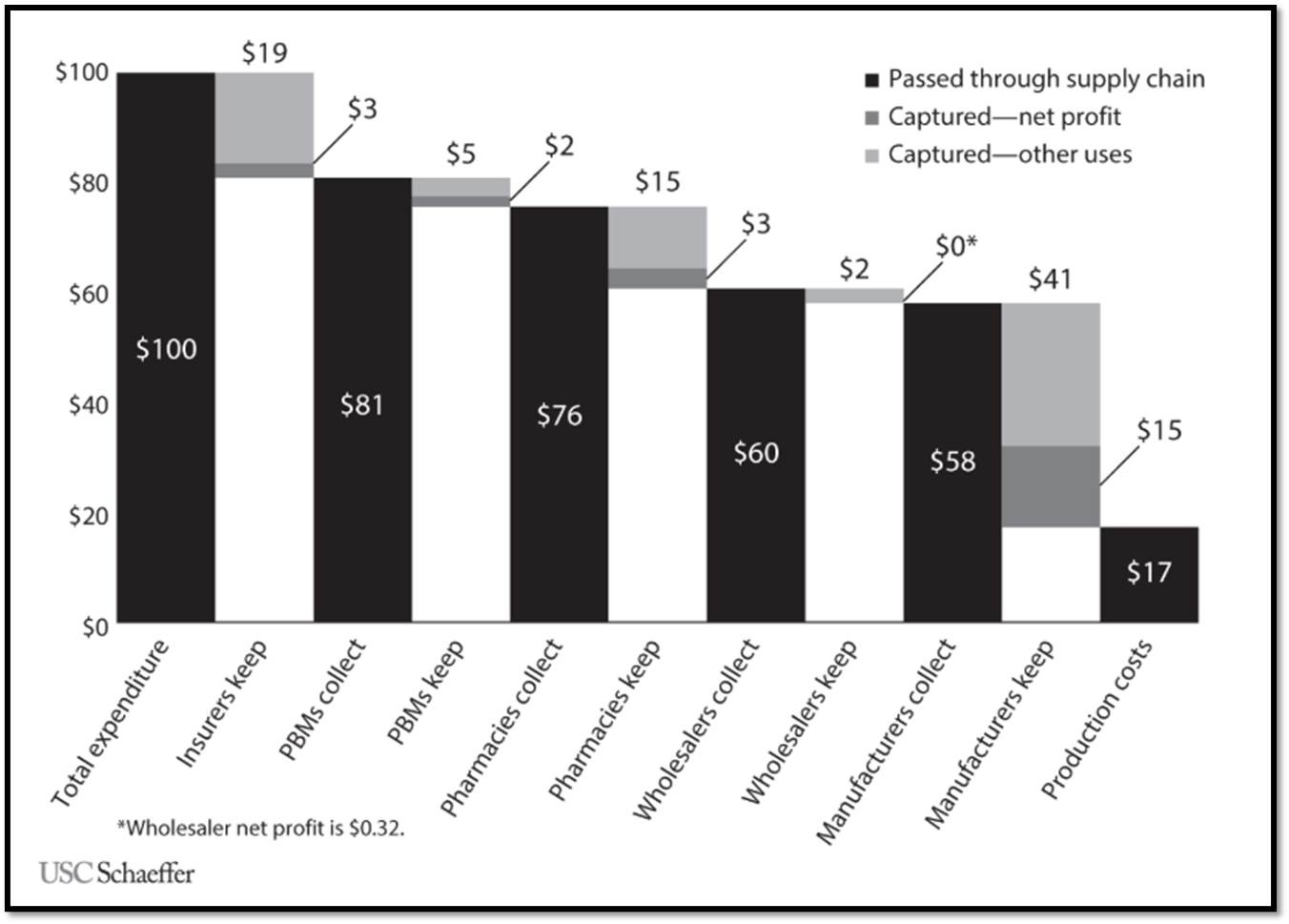
From “Priced Out”
For those of you with private insurance, here’s a figure Reinhardt includes estimating where $100 you spend on drugs (through premiums and copays) might go. About $16 is gonna go toward marketing and admin for your health insurance plan. Pharmacy Benefits Managers, the middlemen between your insurance company and drug manufacturers, take $5 of that for ostensibly negotiating lower drug prices, but really, they suck at this and have weird secret rebate systems no one knows about. Another $15 is gonna go toward profit for drug manufacturers, with only 17 of those $100 spent going toward the production costs of the drug itself.
How do other countries deal with all this obfuscation?
They don’t. Instead of thousands of different insurance pools, most OECD countries pool large groups, if not their entire population, together to not only simplify things, which lowers costs, but also to bring a greater bargaining power to the table when negotiating with healthcare providers and drug manufacturers. The IFHP’s suggestion to the US is thus to centralize price negotiations a la a single payer system, or at least not a thousand payer system, and to shift toward outcome-based payments rather than fee-for-service.
Having contextualized the US healthcare system and its flaws with the rest of the world, we can now consider: what would universal health care look like for the US? And is such a thing even possible?
[embed]My video
The author is solely responsible for all images and media included in this article. By submitting to this publication, the author confirms ownership of the images or that they have obtained the necessary rights, permissions, or licenses in accordance with Medium’s publishing rules. The publication, operated by volunteer editors, accepts no liability for copyright or intellectual property claims.
메타데이터
- post_id
- 4b719e26427f
- slug
- why-is-us-healthcare-so-bad-4b719e26427f
- url
- https://medium.com/illumination/why-is-us-healthcare-so-bad-4b719e26427f
- canonical_url
- https://medium.com/illumination/why-is-us-healthcare-so-bad-4b719e26427f
- author_url
- https://medium.com/@s_sowell
- status
- ok
- fetched_at
- 2026-07-13 22:18:33