Plotly with Streamlit, Dash or Flask
Which is the best framework for your data science apps
Data Visualization
Plotly with Streamlit, Dash or Flask
Which is the best framework for your data science apps
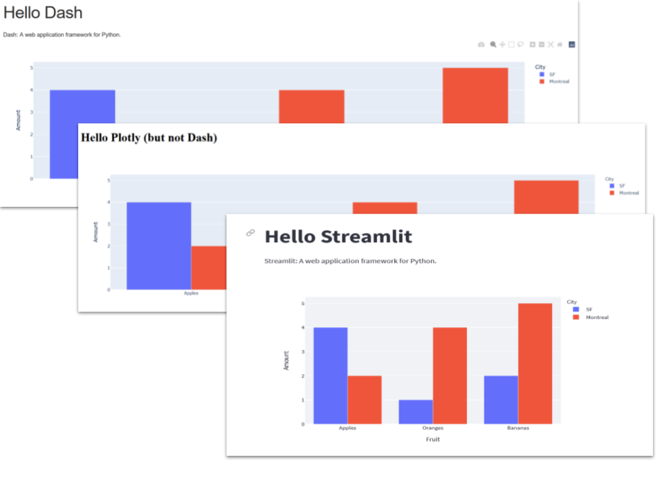
Image by author
What would you say if I were to say that you could reduce the size of an app by half simply by swapping the framework you use.
I’ve conducted a quick experiment by coding the same simple app in Dash, Flask and Streamlit, and the results are illuminating.
Dash
The app is copied from the Dash documentation Here is the code:
import dash
import dash_core_components as dcc
import dash_html_components as html
import plotly.express as px
import pandas as pd
app = dash.Dash(__name__)df = pd.DataFrame({
'Fruit': ['Apples', 'Oranges', 'Bananas', 'Apples', 'Oranges', 'Bananas'],
'Amount': [4, 1, 2, 2, 4, 5],
'City': ['SF', 'SF', 'SF', 'Montreal', 'Montreal', 'Montreal']
})fig = px.bar(df, x='Fruit', y='Amount', color='City',
barmode='group')app.layout = html.Div(children=[
html.H1(children='Hello Dash'),
html.Div(children='''
Dash: A web application framework for Python.
'''),
dcc.Graph(
id='example-graph',
figure=fig
)
])if __name__ == '__main__':
app.run_server(debug=True)Code reproduced courtesy of Plotly — Copyright © 2019 Plotly, MIT License
It’s not terrifically difficult to follow: first we import the libraries, then set up the Flask app, next we define the dataframe, this is followed by the line that actually draws a figure. The app.layout part is essentially HTML written inside Dash and the final line runs the app.
It produces a web page that looks like this:
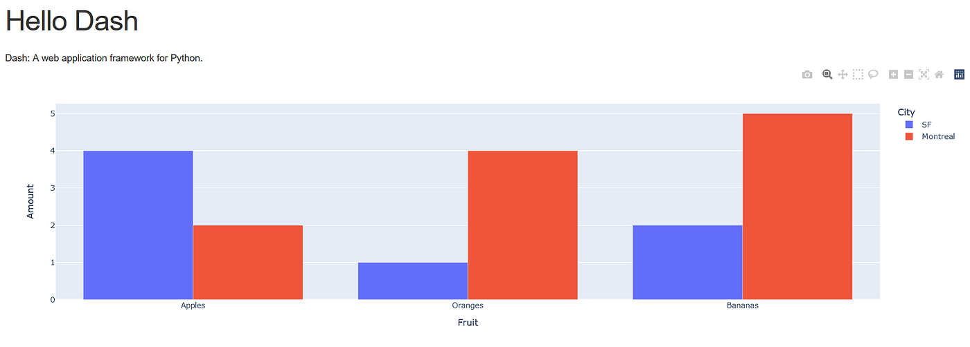
Image by author
Since Dash is fundamentally a Flask app that uses Plotly, I wrote an equivalent app constructed with Flask and Plotly (see my article *Web Visualization with Plotly and Flask) *and compared this to the Dash version.
My personal opinion was that my Flask/Plotly app was easier to write and more flexible (your opinion may differ).
A simple Flask + Plotly app
There are two parts to this app: the Flask app itself and an HTML template. The Flask app does a similar job to the Dash app but without building the actual web page. The web page is an HTML template and we pass the Plotly data to it from the Flask app so it can display the charts.
The Flask part has a similar structure to Dash:
from flask import Flask, render_template
import pandas as pd
import json
import plotly
import plotly.express as pxapp = Flask(__name__)@app.route('/')
def notdash():
df = pd.DataFrame({
   'Fruit': ['Apples', 'Oranges', 'Bananas', 'Apples', 'Oranges', 'Bananas'],
   'Amount': [4, 1, 2, 2, 4, 5],
   'City': ['SF', 'SF', 'SF', 'Montreal', 'Montreal', 'Montreal']
})
fig = px.bar(df, x='Fruit', y='Amount', color='City',
barmode='group')graphJSON = json.dumps(fig, cls=plotly.utils.PlotlyJSONEncoder)return render_template('notdash.html', graphJSON=graphJSON)The template is the web page that will be displayed. It is the equivalent of the layout from the Dash app but we write it in an HTML file.
<!doctype html>
<html>
 <body>
  <h1>Hello Plotly (but not Dash)</h1>
  <div id='chart' class='chart'”></div>
</body>
<script src='https://cdn.plot.ly/plotly-latest.min.js'></script>
<script type='text/javascript'>
var graphs = {{graphJSON | safe}};
Plotly.plot('chart',graphs,{});
</script></html>You can find a description of the app in the original article.
Here is what it looks like:
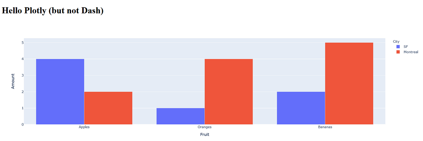
Image by author
Pretty similar to the original.
Streamlit + Plotly
Since I wrote that earlier article, I’ve discovered Streamlit. Streamlit is a very easy to use framework that lets you write data science apps incorporating charts, dataframes, some very easy to use UI elements such as select boxes, buttons, text fields and so on.
And it is 100% Python.
Here is the equivalent app written in Streamlit:
import pandas as pd
import streamlit as st
import plotly.express as px
df = pd.DataFrame({
"Fruit": ["Apples", "Oranges", "Bananas", "Apples", "Oranges",
"Bananas"],
"Amount": [4, 1, 2, 2, 4, 5],
"City": ["SF", "SF", "SF", "Montreal", "Montreal", "Montreal"]
})fig = px.bar(df, x="Fruit", y="Amount", color="City",
barmode="group")st.title('Hello Streamlit')
st.write('''
Streamlit: A web application framework for Python.
''')
st.plotly_chart(fig)And what you should notice is the absolute simplicity. Apart from the last three lines the code is pretty much the same as the other apps — it has to be as it is the Python code for declaring the Pandas dataframe and drawing the Plotly figure.
But the rest of the app, the bit that renders the web page is only three lines of code!
It does look slightly different to the other apps and this is because Streamlit imposes a view on what your app should look like by default.
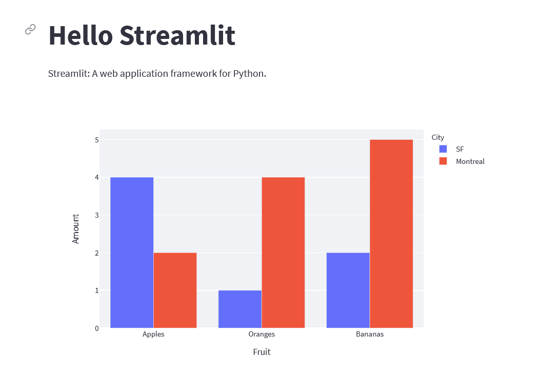
Image by author
It has to be said that the Streamlit is more restrictive in terms of web page design because it doesn’t allow you the full power of HTML like Dash or a Flask app. But there are very nice looking apps made with Streamlit and the code for this very simple app is half the size of the other versions. It may not be the solution in every case but is certainly worth considering.
As ever, thanks for reading. This was a very brief look at the advantages of Streamlit for creating data science apps and you can find the code in my Github repo.
You can find other articles about Streamlit and other topics on my website:
메타데이터
- post_id
- 4d78fa025ea2
- slug
- plotly-with-streamlit-dash-or-flask-4d78fa025ea2
- url
- https://medium.com/codefile/plotly-with-streamlit-dash-or-flask-4d78fa025ea2
- canonical_url
- https://medium.com/codefile/plotly-with-streamlit-dash-or-flask-4d78fa025ea2
- author_url
- https://medium.com/@alan-jones
- status
- ok
- fetched_at
- 2026-06-10 08:17:25