Production Planning Gantt Chart Simple Step-by-Step Guide
If you manage a production floor, you already know the feeling — too many jobs, not enough visibility, and someone always asking “when will…
Production Planning Gantt Chart Simple Step-by-Step Guide
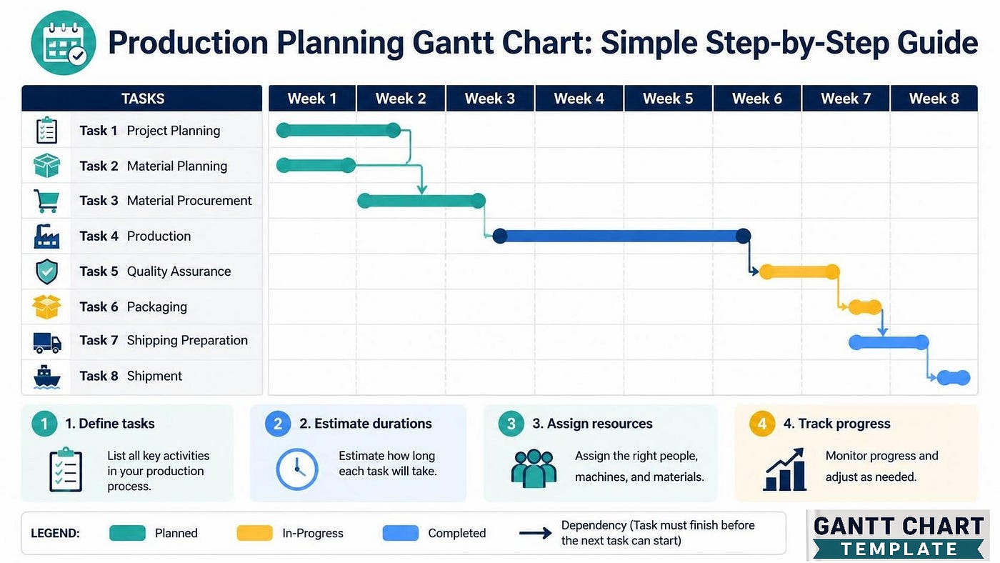
Image Generated by Ai
If you manage a production floor, you already know the feeling — too many jobs, not enough visibility, and someone always asking “when will it be done?” A GanttChart doesn’t solve every problem, but it gives you one thing that most production environments desperately lack: a shared picture of time.
This guide walks through how to build and use a Gantt chart specifically for ProductionPlanning — not the generic project management version you find in business school textbooks, but something that actually works on a shop floor or in a manufacturing scheduling context.
What Is a Production Gantt Chart (And Why It’s Different)
Most people have seen a Gantt chart in a ProjectManagement context. A launch timeline. A software sprint. A construction schedule. The concept is the same: tasks on the vertical axis, time on the horizontal, with bars showing when each task runs.
But a GanttChartForManufacturing has a few quirks that general project management tools don’t always handle well.
First, you’re not just scheduling tasks — you’re scheduling resources. Machines, operators, workstations. If Machine A is already running Job 12 on Tuesday, you can’t put Job 15 there too, regardless of what the calendar says.
Second, sequences matter more rigidly. In a typical project, tasks can sometimes be reordered. In production, if a part needs to be cut before it gets welded, that’s non-negotiable. The chart has to respect process order, not just deadlines.
Third, you’re often dealing with recurring jobs — weekly production runs, standard orders that come in every month. The ManufacturingSchedule isn’t a one-time document; it’s something you update constantly.
These differences don’t make Gantt charts harder to use in manufacturing — they just mean you need to set them up with the right structure from the beginning.
When to Use a Gantt Chart in Production
Not every production environment needs one. If you’re running a single-product line with no variability, a simple daily output target works fine. But a Gantt chart becomes genuinely useful when:
- You have multiple jobs running simultaneously on shared equipment
- Your lead times vary by product or order size
- You’re managing different work centers that each have their own capacity
- Customers or stakeholders need visible delivery commitments
- You want to identify bottlenecks before they happen, not after
For anyone doing PlanningAndScheduling at a mid-sized manufacturer, a well-maintained Gantt chart is often the difference between controlled chaos and actual OperationsManagement.
Step 1 — List Your Jobs and Work Centers
Before you draw a single bar, you need two lists.
List 1: Your jobs (production orders)
Write down every active job that needs to be scheduled. Include:
- Job ID or order number
- Product name or description
- Quantity to produce
- Required completion date
Don’t overthink this. Even a handwritten list works at this stage. You’re just getting everything out of your head and onto paper.
List 2: Your work centers or machines
These become your rows in the Gantt chart. In LeanManufacturing setups, these often correspond to value stream steps. In a more traditional setup, they might just be machine names: Laser Cutter, Press Brake, Welding Station, Assembly, QC.
If operators are your constraint rather than machines, list operators instead. The chart structure is the same.
Step 2 — Define Your Time Horizons
One of the most common mistakes in production Gantt charts is using the wrong time scale.
For a high-mix, low-volume shop with jobs ranging from one day to two weeks, a daily or half-day grid usually works best. You can see exactly which machine is busy on which day.
For longer production cycles — say, a manufacturer running monthly builds — a weekly grid is more practical. Hourly bars would be too detailed to be readable.
As part of your ProductionEfficiency effort, the right time scale is the one your team will actually update. A beautiful hourly Gantt chart that nobody maintains is worse than a rough weekly chart that gets updated every Monday morning.
Decide on your horizon — typically 4 to 8 weeks — and stick to it. You can extend the chart as new orders come in.
Step 3 — Map Out Process Steps and Durations
For each job, you need to know:
- Which work centers it passes through (in order)
- How long it spends at each work center
This is your routing and your cycle time data. If you don’t have it formally documented, this step will take the most time — but it’s also the most valuable part of the exercise. You’ll learn a lot about your own process just by sitting down and mapping it out.

Total: 14 hours of touch time, but that doesn’t account for queue time between steps. That gap — waiting time between operations — is one of the biggest contributors to extended lead times and a major target for LeadTimeReduction.
When you plot this on the Gantt chart, you’ll start to see where jobs are sitting idle versus where they’re being actively worked.
Step 4 — Build the Chart (Excel, Board, or Software)
You have three main options, and the right one depends on your situation.
Option A: Whiteboard or Physical Board
For small shops scheduling 5–15 jobs at a time, a physical board with sticky notes or magnetic strips still works. It’s fast to update, visible to everyone on the floor, and requires zero training. The downside is it doesn’t scale well and has no history.
Option B: Excel Gantt Chart
For most manufacturers, an ExcelTemplate is the sweet spot. It’s flexible, your team already knows how to use it, and it’s easy to share.
Here’s a basic setup for ExcelForBusiness:
- Column A: Work Center name
- Column B: Job ID
- Columns C onward: One column per day (or half-day)
- Cells: Color-coded bars (using conditional formatting or manual cell fill) to show when each job is at each work center
You can add a second sheet for the job list and use VLOOKUP or INDEX/MATCH to pull job details into the schedule. A bit of setup time upfront saves a lot of manual work later.
If you want to go further, Excel’s conditional formatting can automatically highlight cells based on the job status — green for on schedule, yellow for at risk, red for overdue.
Option C: Dedicated Scheduling Software
Tools like Katana, Fishbowl, or even the scheduling modules in larger ERP systems can generate Gantt charts automatically from your production orders. This makes sense once you’re managing 50+ concurrent jobs and updating the schedule multiple times per day.
The tradeoff: these tools require more setup, more data discipline, and more training. For many small and mid-sized operations, a well-maintained Excel schedule beats a poorly adopted software tool every time.
For a ProductionManager evaluating tools, the honest question is: will your team actually use this, or will the whiteboard in the corner become the real schedule again?
Step 5 — Schedule Jobs and Check for Conflicts
Now you place your jobs on the chart.
Start with due date priority — jobs due soonest get scheduled first. Then work backwards from the due date or forwards from today, depending on whether you’re doing backwards scheduling (start from deadline) or forwards scheduling (start from now).
As you place each job, check for conflicts:
- Is the work center already occupied at that time?
- Does the operator have enough time to switch between jobs?
- Are materials available when the job is set to start?
This is where WorkflowOptimization actually happens — not in theory, but in the act of building the schedule. You’ll quickly see which machines are the bottlenecks, which jobs are fighting for the same resource, and where you have slack.
When you find a conflict, you have three options:
- Delay one of the jobs (adjust the start date)
- Split the job across available time slots
- Add capacity (overtime, outsourcing, or additional equipment)
There’s no magic formula here. It’s judgment — and the Gantt chart is just the tool that makes your judgment visible and discussable.
Step 6 — Add Buffer Time and Setup Time
Raw touch time almost never equals calendar time. Two things always eat into your schedule: setup time and unexpected delays.
Setup time is the time it takes to configure a machine or workstation for a new job — changing tooling, cleaning, calibrating, doing a test run. In some shops this is 15 minutes; in others it’s 4 hours. Whatever yours is, it needs to show up on the schedule, or you’ll constantly be asking operators why the job is running late when really the schedule was wrong from the start.
Buffer time is deliberate slack built into the schedule to absorb variability — machine breakdowns, quality issues, material delays. The right amount of buffer depends on your environment, but a general starting point is 10–20% of total job time.
If you’re working toward LeanManufacturing principles, you might push back on buffer time — the argument being that you should fix the root causes of variability instead of planning around them. That’s valid as a long-term goal. In the short term, a schedule with no buffer is a schedule that’s wrong by noon on day one.
Step 7 — Review and Update the Schedule Regularly
A Gantt chart is not a document you make once and print on the wall. It’s a living tool.
Daily: At the start or end of each shift, mark what was completed. Note any jobs that fell behind and why.
Weekly: Do a full review. Update due dates if new orders came in. Re-sequence if priorities shifted. Check your resource loading — are some work centers overloaded next week while others are idle?
When something breaks (literally): When a machine goes down or a supplier misses a delivery, pull up the schedule and immediately assess the impact. Which jobs are affected? Can any of them be moved to a different work center? Does the customer need to be notified?
The real value of a Gantt chart for OperationsManagement isn’t the initial planning — it’s having a fast way to answer “what’s the impact?” when things don’t go according to plan. And on a production floor, things rarely go exactly according to plan.
How to Read Your Gantt Chart for Insights
Once you’ve been running the chart for a few weeks, you’ll start to see patterns.
Consistent overloading on one machine: That’s your capacity constraint. Consider whether a second shift, outsourcing, or equipment investment makes sense. This is exactly the kind of data that makes a business case for capital expenditure.
Lots of gaps between operations for the same job: Queue time is killing your lead time. Investigate why jobs are waiting — is it machine availability, operator availability, or material readiness? This is a classic LeadTimeReduction opportunity.
Jobs frequently finishing late even when they started on time: Your duration estimates are probably off. Go back to Step 3 and recalibrate your cycle times based on actual data.
Some jobs always get bumped: You may have a priority problem, not a capacity problem. Who decides which job wins when two need the same machine at the same time? If that’s not documented, it will always be the loudest person in the room.
Common Mistakes to Avoid
Scheduling to 100% capacity. If every machine is planned at 100% utilization, one breakdown causes a cascade. Leave room.
Not including setup time. Every job changeover costs time. If it’s not in the chart, it’s a hidden source of delay.
Updating the chart but not the floor. The schedule has to reach the operators. A digital Gantt chart that only the planner can see isn’t helping the person at the machine.
Making it too detailed too soon. A chart with 15-minute increments and 40 jobs is impossible to maintain. Start simple. You can add complexity later once the habit is established.
Ignoring material availability. A job can’t start just because the machine is free. Materials, components, and tooling all need to be confirmed before a job goes on the schedule.
Gantt Charts and Lean Manufacturing
There’s sometimes a tension between Gantt chart scheduling and LeanManufacturing principles. Lean emphasizes pull systems and flow — ideally, production is triggered by customer demand, and work moves through the system continuously without batching or queuing.
In a pure pull environment with very stable demand and short cycle times, a Gantt chart may be overkill. A Kanban system or simple visual management might serve better.
But most real manufacturing environments aren’t pure. They have mixed products, variable lead times, customer-specific requirements, and shared equipment. In that context, Gantt chart scheduling and lean thinking aren’t opposites — they work together. The chart handles the complexity; lean principles guide how you respond to what the chart reveals.
Quick-Start Checklist
Here’s a condensed version you can act on today:
- List all active production jobs with due dates
- List all work centers and their available hours per day
- Gather routing and cycle time data for each job
- Choose your time scale (daily, half-day, weekly)
- Build your chart template (whiteboard, Excel, or software)
- Schedule jobs by due date priority, checking for conflicts
- Add setup time and buffer to each work center
- Share the schedule with the production team
- Set a daily and weekly review cadence
- Track actuals vs. planned and adjust
Finally
A Gantt Chart for production planning isn’t a complicated tool. What makes it hard isn’t the chart itself — it’s the discipline to keep it current, the willingness to update it when reality diverges from the plan, and the conversations it forces about priorities and capacity.
Start simple. Get the basic structure working. Let the team see it and use it. The chart will improve as you improve it.
For anyone serious about ProductionEfficiency and better PlanningAndScheduling, the Gantt chart isn’t the end goal — it’s the tool that makes the real work visible. And visible problems are solvable problems.
메타데이터
- post_id
- 4d924db2b863
- slug
- production-planning-gantt-chart-simple-step-by-step-guide-4d924db2b863
- url
- https://medium.com/@taskgrid12/production-planning-gantt-chart-simple-step-by-step-guide-4d924db2b863
- canonical_url
- https://medium.com/@taskgrid12/production-planning-gantt-chart-simple-step-by-step-guide-4d924db2b863
- author_url
- https://medium.com/@taskgrid12
- status
- ok
- fetched_at
- 2026-06-23 17:05:31