Python Excel Chart Creation Guide: Column, Pie, Line & Bar
Data visualization is a powerful way to present insights, and Python makes it easy to generate professional Excel charts programmatically…
Python Excel Chart Creation Guide: Column, Pie, Line & Bar
Data visualization is a powerful way to present insights, and Python makes it easy to generate professional Excel charts programmatically. In this guide, we’ll explore how to create column, pie, line, and bar charts in Excel using a Free Python Excel library.
- Install Required Library
- Steps to Create Charts in Excel Using Python
- Example 1. Create a Column Chart
- Example 2. Create a Pie Chart
- Example 3. Create a Line Chart
- Example 4. Create a Bar Chart
- Wrap Up
Install Required Library
Before getting started, install Free Spire.XLS for Python via pip:
pip install spire.xls.freeThis library provides a simple yet powerful API for Excel automation, including chart creation.
Steps to Create Charts in Excel Using Python
- Step 1. Import the Spire.XLS Module
Import the required classes from the Spire.XLS library to enable Excel file manipulation:
from spire.xls import *
from spire.xls.common import *- Step2. Create a Workbook and Access a Worksheet
Initialize a new workbook and select the worksheet where data will be added:
workbook = Workbook()
sheet = workbook.Worksheets[0]- Step3. Add Data to the Worksheet
Enter relevant data into the worksheet, including headers and values organized in designated cells to ensure clarity and structure:
sheet.Range["A1"].Value = "Product"
sheet.Range["A2"].Value = "Laptop"
sheet.Range["B1"].Value = "Sales"
sheet.Range["B2"].NumberValue = 5000- Step 4. Add and Configure the Chart
Create a chart of the preferred type (e.g., ColumnClustered, Pie, Line) using the Charts.Add method, then specify its data range and position on the worksheet:
chart = sheet.Charts.Add(ExcelChartType.ColumnClustered)
chart.DataRange = sheet.Range["A1:B5"]
chart.LeftColumn = 5 # Positioning- Step 5. Customize Chart Elements
Enhance the chart’s appearance by adjusting elements such as the title, series colors, axis labels, and data labels to improve clarity and visual appeal:
chart.ChartTitle = "Sales Report"
chart.Series[0].Format.Fill.ForeColor = Color.get_Blue()- Step 6. Save the Workbook to a New Excel File
Save the completed workbook in .xlsx format:
workbook.SaveToFile("ChartDemo.xlsx", ExcelVersion.Version2016)
workbook.Dispose()
Example 1. Create a Column Chart
Column charts are ideal for comparing categories. Below is a complete example visualizing smartphone sales by brand:
from spire.xls import *
from spire.xls.common import *

# Create a Workbook object
workbook = Workbook()

# Get the first sheet
sheet = workbook.Worksheets[0]

# Set chart data
sheet.Range["A1"].Value = "Brand"
sheet.Range["A2"].Value = "iPhone"
sheet.Range["A3"].Value = "Samsung"
sheet.Range["A4"].Value = "Google Pixel"
sheet.Range["A5"].Value = "OnePlus"

sheet.Range["B1"].Value = "January"
sheet.Range["B2"].NumberValue = 1200
sheet.Range["B3"].NumberValue = 950
sheet.Range["B4"].NumberValue = 600
sheet.Range["B5"].NumberValue = 800

sheet.Range["C1"].Value = "February"
sheet.Range["C2"].NumberValue = 1500
sheet.Range["C3"].NumberValue = 1100
sheet.Range["C4"].NumberValue = 750
sheet.Range["C5"].NumberValue = 900

sheet.Range["D1"].Value = "March";
sheet.Range["D2"].NumberValue = 1800
sheet.Range["D3"].NumberValue = 1300
sheet.Range["D4"].NumberValue = 850
sheet.Range["D5"].NumberValue = 1000

# Set cell style
sheet.Range["A1:D1"].RowHeight = 15
sheet.Range["A1:D1"].Style.Color = Color.get_Gray()
sheet.Range["A1:D1"].Style.Font.Color = Color.get_White()
sheet.Range["A1:D1"].Style.VerticalAlignment = VerticalAlignType.Center
sheet.Range["A1:D1"].Style.HorizontalAlignment = HorizontalAlignType.Center
sheet.AllocatedRange.AutoFitColumns()

# Add a column clustered chart to the sheet
chart = sheet.Charts.Add(ExcelChartType.ColumnClustered)

# Set data range of chart
chart.DataRange = sheet.Range["A1:D5"]
chart.SeriesDataFromRange = False

# Set position of the chart
chart.LeftColumn = 5
chart.TopRow = 1
chart.RightColumn = 14
chart.BottomRow = 21

# Set chart title
chart.ChartTitle = "Monthly Smartphone Sales"
chart.ChartTitleArea.IsBold = True
chart.ChartTitleArea.Size = 12

# Set axis title
chart.PrimaryCategoryAxis.Title = "Brand"
chart.PrimaryCategoryAxis.Font.IsBold = True
chart.PrimaryCategoryAxis.TitleArea.IsBold = True
chart.PrimaryValueAxis.Title = "Sales"
chart.PrimaryValueAxis.HasMajorGridLines = False
chart.PrimaryValueAxis.TitleArea.IsBold = True
chart.PrimaryValueAxis.TitleArea.TextRotationAngle = 90

# Set overlap, gap width and data labels
series = chart.Series
for i in range(len(series)):
    cs = series[i]
    cs.Format.Options.Overlap = -50
    cs.Format.Options.GapWidth = 350
    cs.DataPoints.DefaultDataPoint.DataLabels.HasValue = True

# Set different color for each data series
series[0].Format.Fill.ForeColor = Color.get_Orange()
series[1].Format.Fill.ForeColor = Color.get_Blue()
series[2].Format.Fill.ForeColor = Color.get_GreenYellow()

# Set legend position
chart.Legend.Position = LegendPositionType.Top

# Save the document
workbook.SaveToFile("ClusteredColumnChart.xlsx", ExcelVersion.Version2016)
workbook.Dispose()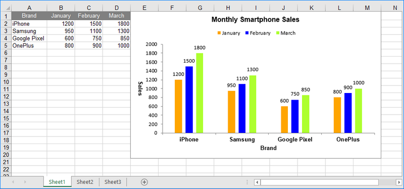
Column Chart
Example 2. Create a Pie Chart
Pie charts show proportions, like market share distribution:
from spire.xls import *
from spire.xls.common import *

# Create a workbook
workbook = Workbook()

# Get the first sheet
sheet = workbook.Worksheets[0]

# Set values of the specified cells
sheet.Range["A1"].Value = "Platform"
sheet.Range["A2"].Value = "Facebook"
sheet.Range["A3"].Value = "Instagram"
sheet.Range["A4"].Value = "TikTok"
sheet.Range["A5"].Value = "Twitter (X)"
sheet.Range["A6"].Value = "LinkedIn"

sheet.Range["B1"].Value = "Market Share"
sheet.Range["B2"].NumberValue = 0.45
sheet.Range["B3"].NumberValue = 0.25
sheet.Range["B4"].NumberValue = 0.15
sheet.Range["B5"].NumberValue = 0.08
sheet.Range["B6"].NumberValue = 0.07

# Format the cells
sheet.Range["A1:B1"].RowHeight = 15
sheet.Range["A1:B1"].Style.Color = Color.get_Gray()
sheet.Range["A1:B1"].Style.Font.Color = Color.get_White()
sheet.Range["A1:B1"].Style.VerticalAlignment = VerticalAlignType.Center
sheet.Range["A1:B1"].Style.HorizontalAlignment = HorizontalAlignType.Center
sheet.Range["B2:B6"].Style.NumberFormat = "0%"
sheet.AllocatedRange.AutoFitColumns()

# Add a pie chart
chart = sheet.Charts.Add(ExcelChartType.Pie)

# Set data range of chart
chart.DataRange = sheet.Range["A1:B6"]
chart.SeriesDataFromRange = False

# Set position of chart
chart.LeftColumn = 4
chart.TopRow = 1
chart.RightColumn = 12
chart.BottomRow = 19

# Chart title
chart.ChartTitle = "Social Media Market Share (%)"
chart.ChartTitleArea.IsBold = True
chart.ChartTitleArea.Size = 12

# Get the first series
cs = chart.Series[0]

# Set categoray labels for the series
cs.CategoryLabels = sheet.Range["A2:A6"]

# Set values for the series
cs.Values = sheet.Range["B2:B6"]

# Show vales in data labels
cs.DataPoints.DefaultDataPoint.DataLabels.HasValue = True

# Set different color for each data point
cs.DataPoints[0].DataFormat.Fill.ForeColor = Color.get_Orange()
cs.DataPoints[1].DataFormat.Fill.ForeColor = Color.get_Blue()
cs.DataPoints[2].DataFormat.Fill.ForeColor = Color.get_GreenYellow()
cs.DataPoints[3].DataFormat.Fill.ForeColor = Color.get_OldLace()
cs.DataPoints[4].DataFormat.Fill.ForeColor = Color.get_Gray()

# Save the workbook to an Excel file
workbook.SaveToFile("PieChart.xlsx", ExcelVersion.Version2016)
workbook.Dispose()
Pie Chart
Example 3. Create a Line Chart
Line charts track trends over time, such as temperature changes:
from spire.xls import *
from spire.xls.common import *

# Create a Workbook instance
workbook = Workbook()

# Get the first sheet and set its name
sheet = workbook.Worksheets[0]

# Add chart data to specified cells
sheet.Range["A1"].Value = "City"
sheet.Range["A2"].Value = "New York"
sheet.Range["A3"].Value = "Tokyo"
sheet.Range["A4"].Value = "London"

sheet.Range["B1"].Value = "Jan"
sheet.Range["B2"].NumberValue = 2
sheet.Range["B3"].NumberValue = 5
sheet.Range["B4"].NumberValue = 4

sheet.Range["C1"].Value = "Feb"
sheet.Range["C2"].NumberValue = 3
sheet.Range["C3"].NumberValue = 6
sheet.Range["C4"].NumberValue = 5

sheet.Range["D1"].Value = "Mar"
sheet.Range["D2"].NumberValue = 8
sheet.Range["D3"].NumberValue = 10
sheet.Range["D4"].NumberValue = 9

sheet.Range["E1"].Value = "Apr"
sheet.Range["E2"].NumberValue = 15
sheet.Range["E3"].NumberValue = 16
sheet.Range["E4"].NumberValue = 12

sheet.Range["F1"].Value = "May"
sheet.Range["F2"].NumberValue = 20
sheet.Range["F3"].NumberValue = 21
sheet.Range["F4"].NumberValue = 16

sheet.Range["G1"].Value = "Jun";
sheet.Range["G2"].NumberValue = 25
sheet.Range["G3"].NumberValue = 25
sheet.Range["G4"].NumberValue = 20

# Format the cells
sheet.Range["A1:G1"].RowHeight = 15
sheet.Range["A1:G1"].Style.Color = Color.get_Gray()
sheet.Range["A1:G1"].Style.Font.Color = Color.get_White()
sheet.Range["A1:G1"].Style.VerticalAlignment = VerticalAlignType.Center
sheet.Range["A1:G1"].Style.HorizontalAlignment = HorizontalAlignType.Center

# Add a line chart to the worksheet
chart = sheet.Charts.Add(ExcelChartType.Line)

# Set data range for the chart
chart.DataRange = sheet.Range["A1:G4"]

# Set position of chart
chart.LeftColumn = 4
chart.TopRow = 5
chart.RightColumn = 12
chart.BottomRow = 21

# Set and format chart title
chart.ChartTitle = "Average Monthly Temperatures (2023)"
chart.ChartTitleArea.IsBold = True
chart.ChartTitleArea.Size = 12

# Set the category axis of the chart
chart.PrimaryCategoryAxis.Title = "Month"
chart.PrimaryCategoryAxis.Font.IsBold = True
chart.PrimaryCategoryAxis.TitleArea.IsBold = True

# Set the value axis of the chart
chart.PrimaryValueAxis.Title = "Temperature"
chart.PrimaryValueAxis.HasMajorGridLines = False
chart.PrimaryValueAxis.TitleArea.TextRotationAngle = 90
chart.PrimaryValueAxis.MinValue = 0
chart.PrimaryValueAxis.TitleArea.IsBold = True

# Show data labels for data points
for cs in chart.Series:
    cs.DataPoints.DefaultDataPoint.DataLabels.HasValue = True

# Set legend position
chart.Legend.Position = LegendPositionType.Top

# Save the document
workbook.SaveToFile("LineChart.xlsx", ExcelVersion.Version2016)
workbook.Dispose()
Line Chart
Example 4. Create a Bar Chart
Bar charts compare values across groups, like regional sales:
from spire.xls.common import *
from spire.xls import *

# Create a Workbook instance
workbook = Workbook()

# Get the first sheet and set its name
sheet = workbook.Worksheets[0]

# Add chart data to specified cells
sheet.Range["A1"].Value = "Product"
sheet.Range["A2"].Value = "Laptops"
sheet.Range["A3"].Value = "Smartphones"
sheet.Range["A4"].Value = "Tablets"
sheet.Range["A5"].Value = "Smartwatches"

sheet.Range["B1"].Value = "North America"
sheet.Range["B2"].NumberValue = 12000
sheet.Range["B3"].NumberValue = 25000
sheet.Range["B4"].NumberValue = 8000
sheet.Range["B5"].NumberValue = 15000

sheet.Range["C1"].Value = "Europe"
sheet.Range["C2"].NumberValue = 15000
sheet.Range["C3"].NumberValue = 18000
sheet.Range["C4"].NumberValue = 6000
sheet.Range["C5"].NumberValue = 12000

sheet.Range["D1"].Value = "Asia"
sheet.Range["D2"].NumberValue = 20000
sheet.Range["D3"].NumberValue = 30000
sheet.Range["D4"].NumberValue = 12000
sheet.Range["D5"].NumberValue = 10000

# Format the cells
sheet.Range["A1:D1"].RowHeight = 15
sheet.Range["A1:D1"].Style.Color = Color.get_Gray()
sheet.Range["A1:D1"].Style.Font.Color = Color.get_White()
sheet.Range["A1:D1"].Style.VerticalAlignment = VerticalAlignType.Center
sheet.Range["A1:D1"].Style.HorizontalAlignment = HorizontalAlignType.Center
sheet.Range["A2:A5"].Style.HorizontalAlignment = HorizontalAlignType.Center
sheet.Range["B2:D5"].Style.NumberFormat = "\"$\"#,##0"
sheet.AllocatedRange.AutoFitColumns()

# Add a clustered bar chart to the sheet
chart = sheet.Charts.Add(ExcelChartType.BarClustered)

# Set data range of the chart
chart.DataRange = sheet.Range["A1:D5"]
chart.SeriesDataFromRange = False

# Set position of the chart
chart.LeftColumn = 5
chart.TopRow = 1
chart.RightColumn = 14
chart.BottomRow = 21

# Set and format chart title
chart.ChartTitle = "Annual Product Sales by Region (2023)"
chart.ChartTitleArea.IsBold = True
chart.ChartTitleArea.Size = 12

# Set and format category axis
chart.PrimaryCategoryAxis.Title = "Product"
chart.PrimaryCategoryAxis.Font.IsBold = True
chart.PrimaryCategoryAxis.TitleArea.IsBold = True
chart.PrimaryCategoryAxis.TitleArea.TextRotationAngle = 90

# Set and format value axis
chart.PrimaryValueAxis.Title = "Sales"
chart.PrimaryValueAxis.HasMajorGridLines = False
chart.PrimaryValueAxis.MinValue = 1000
chart.PrimaryValueAxis.TitleArea.IsBold = True

# Show data labels for data points
for cs in chart.Series:
    cs.DataPoints.DefaultDataPoint.DataLabels.HasValue = True

# Set different color for each data series
chart.Series[0].Format.Fill.ForeColor = Color.get_Orange()
chart.Series[1].Format.Fill.ForeColor = Color.get_Blue()
chart.Series[2].Format.Fill.ForeColor = Color.get_GreenYellow()

# Set legend position
chart.Legend.Position = LegendPositionType.Top

#Save the result file
workbook.SaveToFile("ClusteredBarChart.xlsx", ExcelVersion.Version2016)
workbook.Dispose()
Bar Chart
Wrap Up
In this blog post, we demonstrated how to automate Excel chart creation using Python and the Free Spire.XLS library. We covered various chart types, including column, pie, line, and bar charts, providing detailed code examples for each. With these tools, you can effortlessly enhance your data presentations!
Liked what you read? Show some love with a clap 👏 — it only takes a second but means a lot! Much appreciated! 💙
메타데이터
- post_id
- 4db79358928a
- slug
- python-excel-chart-creation-guide-column-pie-line-bar-4db79358928a
- url
- https://medium.com/@alexaae9/python-excel-chart-creation-guide-column-pie-line-bar-4db79358928a
- canonical_url
- https://medium.com/@alexaae9/python-excel-chart-creation-guide-column-pie-line-bar-4db79358928a
- author_url
- https://medium.com/@alexaae9
- status
- ok
- fetched_at
- 2026-06-29 22:44:20