TIME SERIES FORECASTING ANALYSIS FOR CORPORATION FAVORITA
Image Source: iStock
TIME SERIES FORECASTING ANALYSIS FOR CORPORATION FAVORITA

Image Source: iStock
Author’s Note: This time series regression project was completed as part of Azubi Africa’s Data Analysis Professional program in July 2023. All the codes executed to achieve success on this project can be found on the Jupyter Notebook on my GitHub repository.
Project Description The primary focus of this project is to utilize time series regression analysis to forecast sales for Corporation Favorita, a prominent grocery retailer based in Ecuador.
The objective is to develop a robust model capable of accurately forecasting future sales by leveraging the extensive time series data of thousands of products sold across various Corporation Favorita locations. The resulting forecasts will provide valuable insights to the store’s management, enabling them to formulate effective inventory and sales plans.
I utilized the CRISP-DM framework to execute the project and will use same for this article. Read more about the CRISP-DM framework on the article of my previous project.
Business Understanding Sales is the primary parameter for measuring the success of any business, and Corporation Favorita is no exception. The business has the data of its sales from 2013 to 2017 across its stores located in different cities in Ecuador.
During this time period, there have been holiday events, increases in oil price, and an earthquake in Ecuador. The grocery store management will like to know the impact of these occurrences on its sales. The management also wants to know the sales performance of its stores across different store types, clusters, cities and states.
Furthermore, the management will like to know if there is a trend in the sales data, as well as the occurrence of seasonality to help identify the buying patterns of customers and prepare adequately for periods in the future where peak sales usually occur. The impact of promotion on sales is another key factor the business wants to derive insights on.
This project is aimed at providing these business insights by performing regression analysis using the available time-stamped historical data. In addition, series stationarity will be verified using statistical testing, and an optimal time-series regression model will be trained to predict future sales. This prediction will ensure strategic decision-making in the future.
My goal in this project is to support the management team of Corporation Favorita in extracting meaningful insights from their vast data, optimizing operations and ultimately achieving sales growth, and driving data-informed decision-making.
Hypothesis Null Hypothesis: There is no significant difference in sales before and after promotion. Alternate Hypothesis: There is a significant difference in sales before and after promotion.
Analytical Questions 1. Is the train dataset complete (has all the required dates)? 2. Which dates have the lowest and highest sales for each year? 3. Did the earthquake impact sales? 4. Are certain groups of stores making more sales than others? (Cluster, city, state, type) 5. Are sales affected by promotions, oil prices and holidays? 6. What analysis can we get from the date and its extractable features? 7. What is the difference between RMSLE, RMSE, MSE (or why is the MAE greater than all of them?) 8. What is the total sales made each year by the corporation?
Data Understanding The data was collected from Azubi Africa’s SQL Server, GitHub Repository and OneDrive, then saved in the root folder of this project’s GitHub Repository for easy access.
The datasets were saved in different csv formats as follows: holiday.csv, stores.csv, oil.csv, transactions.csv, train.csv, test.csv, and sample_submission.csv to easily identify the type of information they contain.
Here is a brief description of the datasets and their conents:
-
holidays.csv This file contains the holidays and events, with metadata. There is a transferred column which identifies holidays that are transferred. A holiday that is transferred officially falls on that calendar day but was moved to another date by the government. A transferred day is more like a normal day than a holiday. To find the day that the holiday was observed, look for the corresponding row where type is Transfer. For example, the holiday Independencia de Guayaquil was transferred from 2012–10–09 to 2012–10–12, which means it was celebrated on 2012–10–12. Days that are type Bridge are extra days that are added to a holiday (e.g., to extend the break across a long weekend). These are frequently made up by the type Work Day which is a day not normally scheduled for work (e.g., Saturday) that is meant to payback the Bridge. Additional holidays are days added to a regular calendar holiday, for example, as typically happens around Christmas (making Christmas Eve a holiday).
-
stores.csv This file contains store metadata, including the city, state, type, and cluster of the stores. These features make up the columns in the dataset. A cluster is a grouping of similar stores.
-
oil.csv This file contains the daily oil price which includes values during both the train and test data timeframes. Ecuador is an oil-dependent country and its economical health is highly vulnerable to shocks in oil prices.
-
transaction.csv This file contains the ‘date’ column, ‘store_nbr’ column and ‘transaction’ column which contains the transactions made on a specific date.
-
train.csv The training data, comprising time series of features store_nbr, family, and onpromotion as well as the target sales. The ‘store_nbr’ column identifies the store at which the products are sold. The ‘family’ column identifies the type of product sold. The ‘sales’ column gives the total sales for a product family at a particular store at a given date. There are fractional values in this column since products can be sold in fractional units (1.5 kg of cheese, for instance, as opposed to 1 bag of chips). The ‘onpromotion’ column gives the total number of items in a product family that were being promoted at a store at a given date.
-
test.csv The test data, having the same features as the training data to be used to predict the target sales for the dates in the file. The dates in the test data are for the 15 days after the last date in the training data.
-
sample_submission.csv This file contains a sample submission file in the correct format.
Exploratory Data Analysis The datasets were explored by loading the first five rows, checking their shapes, columns, column datatypes, and the presence of missing values and duplicates. The data exploration process helped in identifying some preprocessing steps as follows: · The datasets need to be merged together for better analysis. The oil dataset has 43 missing values on the ‘dcoilwtico’ column which should be filled after merging the datasets. This column represents the oil price in Ecuador during the time period the data was gathered. The column name should be changed to ‘oil_price’ for easier identification and understanding of it’s features. · There is need to create an extra column to precisely identify the days in which there were holidays and days in which there were no holidays. This column will be created after merging and named ‘holiday_status’ as it will be important for our analysis. · The ‘date’ columns of each dataset have an object datatype and should be changed to datetime datatype after merging.
**Data Preparation
- Merging the datasets** The datasets were merged together using their common columns as shown below, without duplicate rows in the resulting DataFrame.
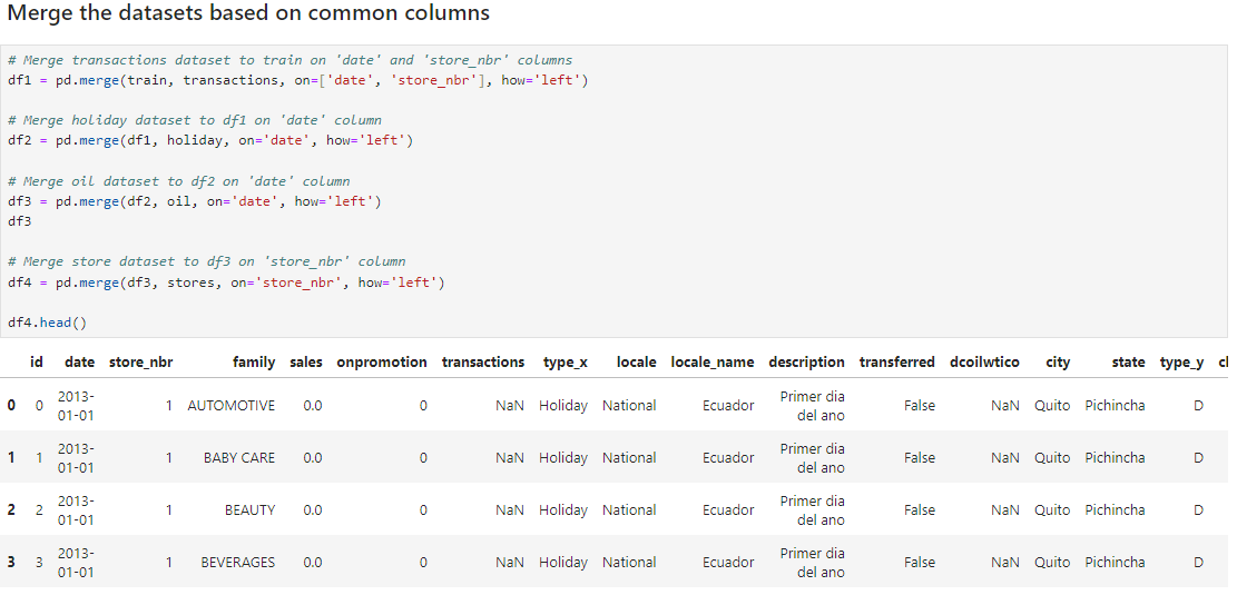
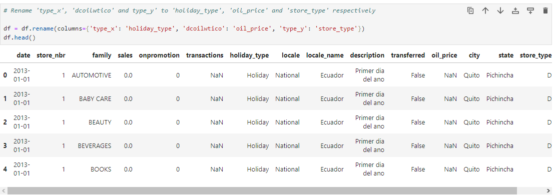
2. Renaming columns The ‘type_x’ and ‘type_y’ columns in the merged DataFrame were identified to be the ‘type’ column of the holiday dataset and store dataset respectively. These columns were renamed to ‘holiday_type’ and ‘store_type’ respectively, and the ‘dcoilwtico’ column was also renamed to ‘oil_price’ to easily identify their contents. This is as shown below.
3. Filling missing values The columns with missing values were identified as shown below.
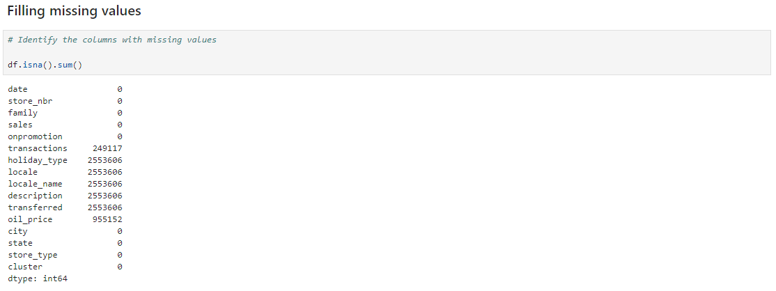
The ‘transaction’ column was filled with ‘0’, as the missing values indicate that there was no transaction value for those dates. The ‘holiday_type’, ‘locale’, ‘locale_name’, ‘description’, and ‘transferred’ columns were filled with ‘no holidays’ as these missing values indicate that these dates are absent on the holiday dataset, meaning that there was no holiday on those dates.
The trend of the ‘oil_price’ column was visualized before filling as shown below to understand if the oil price variations have a trend.
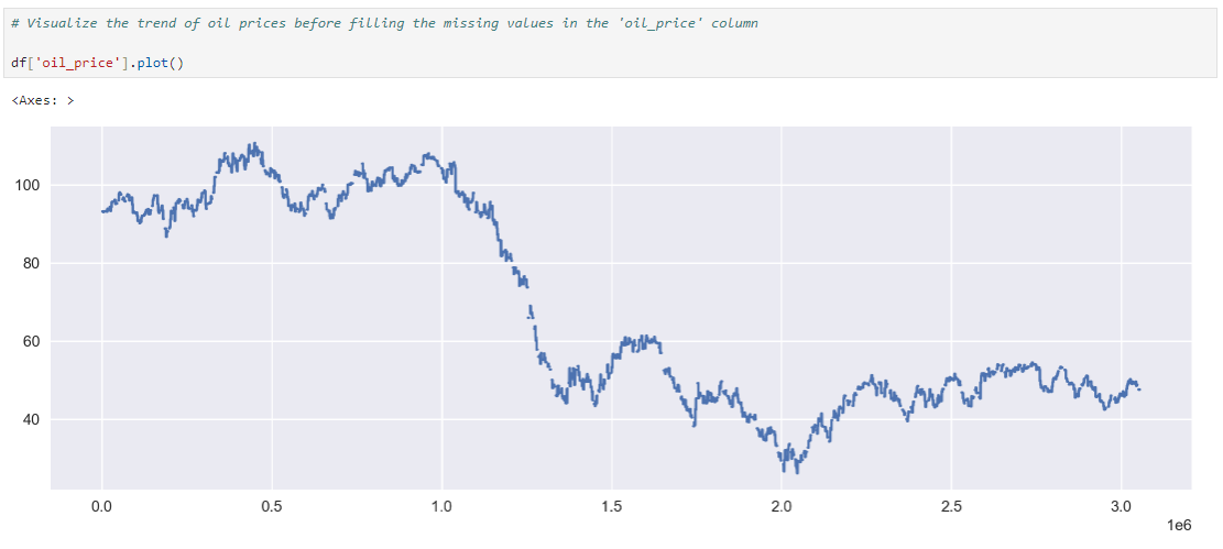
Trend of ‘oil_price’ column before filling
As shown in the image above, there is a trend in the oil price variations. For this reason, the missing values in the ‘oil_price’ column will be filled with the ‘backward fill’ method as shown below in order to maintain the trend in oil price variations.
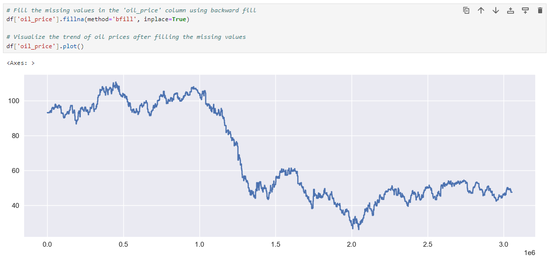
Trend of ‘oil_price’ column maintained after filling
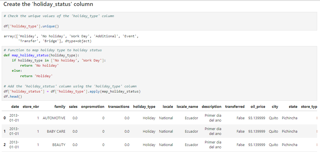
4. Create the ‘holiday_status’ column The ‘holiday_status’ column, which will be very important for our analysis was created to specify the dates a holiday was observed and the dates no holiday was observed, as shown below.
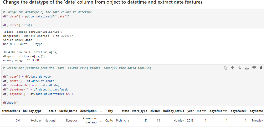
5. Change the datatype of the ‘date’ column from object to datetime and extract date features As shown below, the datatype of the ‘date’ column was changed to datetime, then date features were extracted to be used in analysis. Afterwards, the ‘date’ column was set as the index of the DataFrame.
Visualizations The visualizations below were carried out to further analyze the DataFrame.
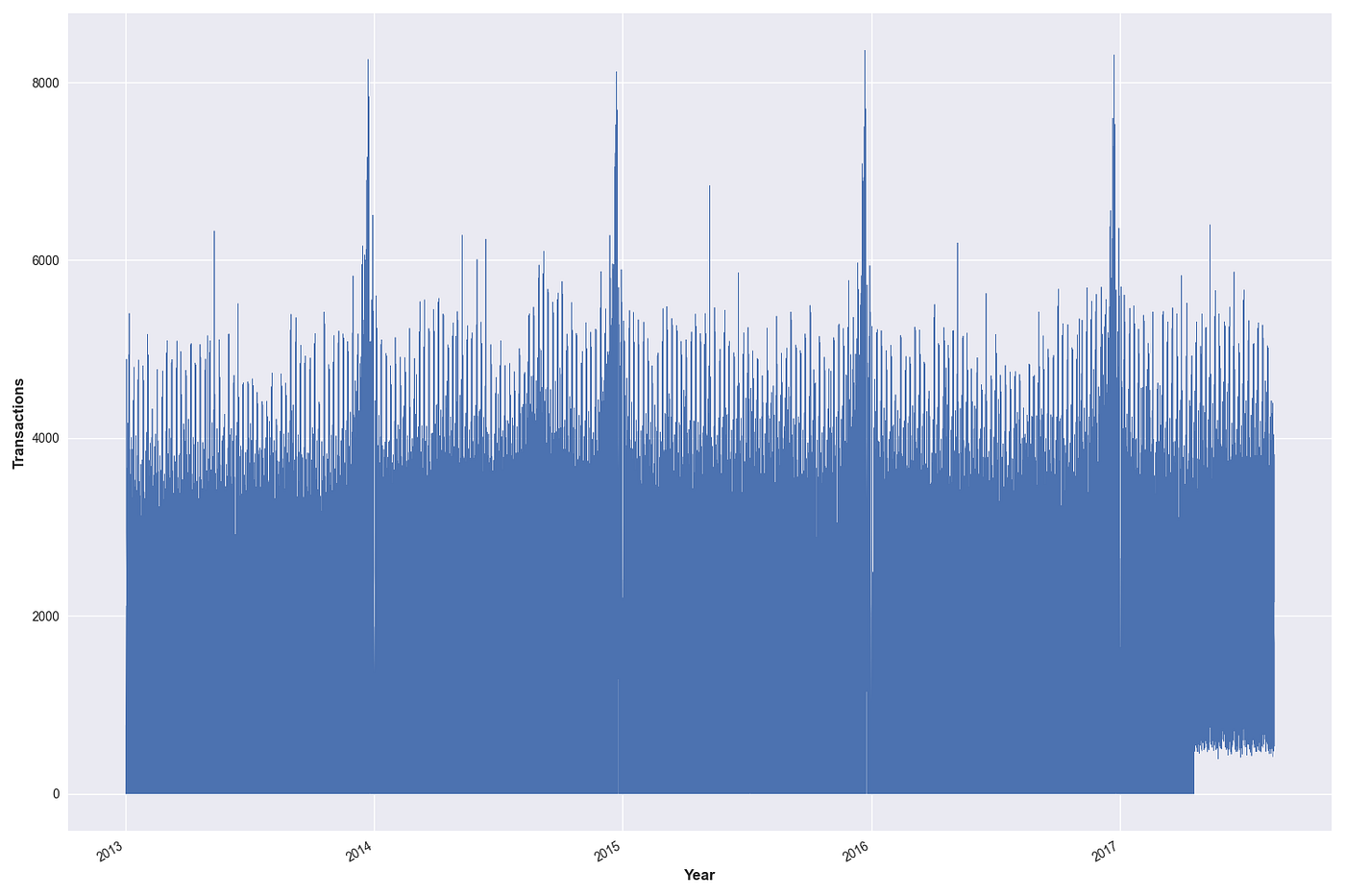
Visual analysis of the transactions column
The plot above reveals that transactions trend to peaks in different occasions, but the peaks are always highest at the end of each year. This reveals seasonality in the transaction volume.
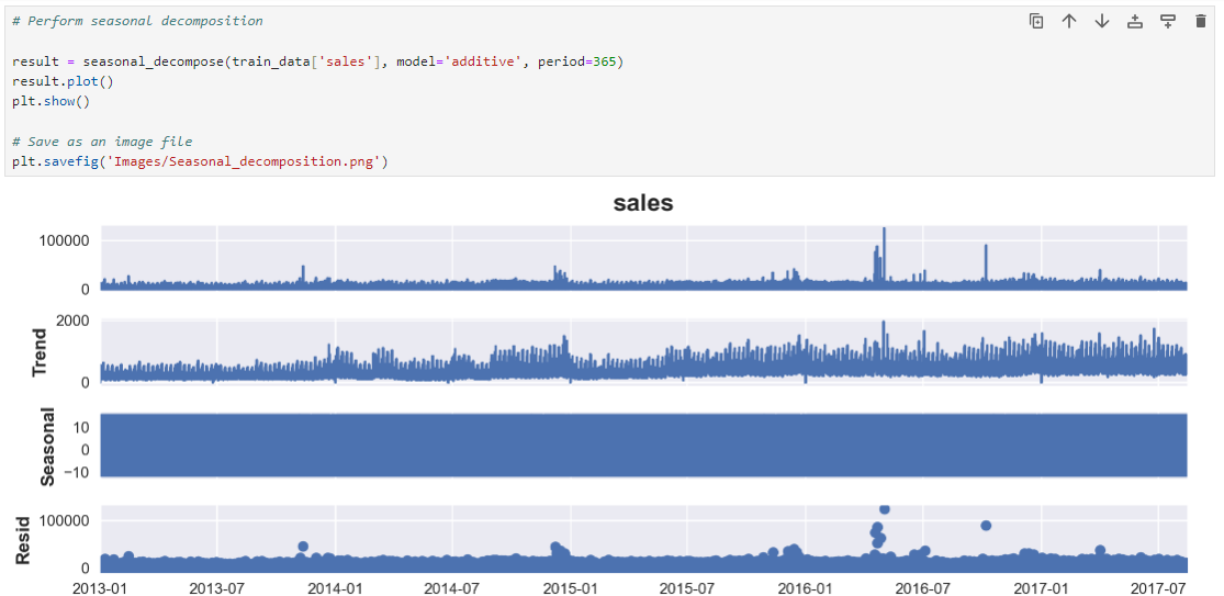
Seasonal decomposition
Seasonal decomposition is a technique used in time series analysis to gain a better understanding of the underlying structure and patterns within the time series dataset by breaking down the dataset into its constituent components, which are typically the following:
Trend Component: This component represents the long-term movement or direction in the data. It captures the underlying pattern in the data that persists over time. For example, in a retail sales time series, the trend component might represent the overall growth or decline in sales over multiple years. For this analysis, the trend component shows an overall growth in sales over the years as there is a generally upward trending pattern in sales.
Seasonal Component: The seasonal component captures the repeating patterns or fluctuations in the data that occur at fixed intervals, such as daily, weekly, monthly, or yearly. These patterns are often associated with external factors like seasons, holidays, or other recurring events. For this analysis, the fully colored seasonal component indicates prominent recurring patterns at fixed intervals, likely due to seasonal factors influencing sales.
Residual Component (or Error): The residual component represents the unexplained or random variations (noise or irregularities) in the data after removing the trend and seasonal components. For this analysis, the residual component shows less random behavior.
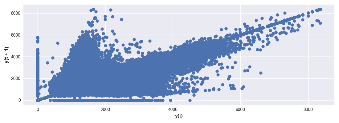
Lag plot of ‘transactions’ column
A lag plot is a graphical tool used in time series analysis to examine the autocorrelation or serial correlation in a dataset. Autocorrelation refers to the correlation between a time series and a lagged version of itself, which can provide valuable insights into the underlying structure of the data. The lag plot helps in visualizing autocorrelation, identifying seasonality, assessing stationarity, model selection, detecting serial correlation, and checking residuals.
The lag plot above reveals that there is clustering, linearity, and a few pattern deviations in the plot.
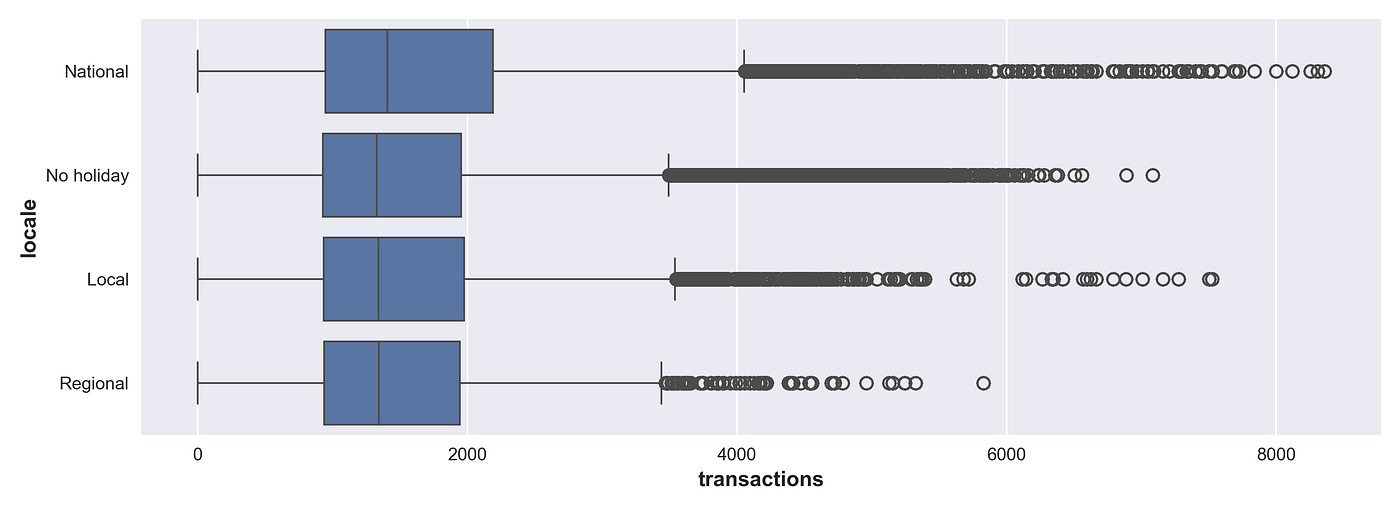
Boxplot of ‘transactions’ column grouped by ‘locale’
For the box plot above, the median (the line within the box) shows the central tendency of the data and is highest for ‘National holidays’. Also, the length of the boxes show that ‘transactions’ on National Holidays have the greatest variability as it has the longest box. The data points that fall outside the whiskers of all the boxes indicate extreme values (outliers) or anomalies with ‘National holidays’ having the most extreme values.
Based on the boxplot, there is evidence of significant variations in transaction patterns between locales.
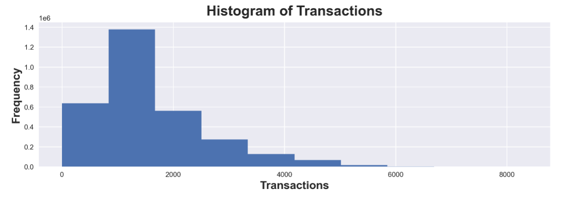
The histogram suggests that most transactions fall within a certain range, around 800 to 1800, indicating a central trend. However, the presence of outliers may need further investigation. There is also a steady fall in the frequency of the transactions suggesting a steady transaction pattern.
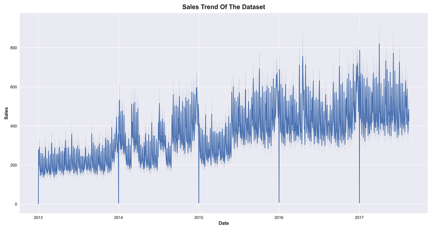
The sales trend above shows that there is an upward trend in the sales recorded by the retail store over the years. It also shows that there are more sales at the end of each year compared to the beginning. At the very start of each year, there are zero sales which most likely is as a result of a usual holiday break for all the retail store staff on the first day of each year.
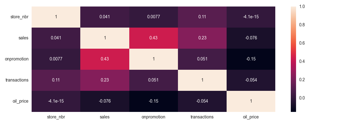
The correlation matrix above summarizes and visualizes the strength, direction of linear relationships, and patterns between the data variables.
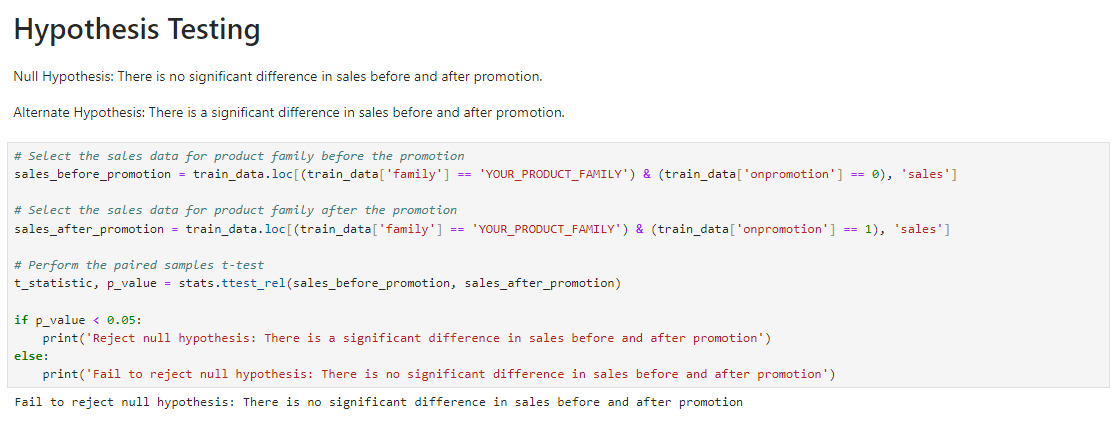
Hypothesis Testing Null Hypothesis: There is no significant difference in sales before and after promotion. Alternate Hypothesis: There is a significant difference in sales before and after promotion. As shown below, the null hypothesis is accepted as there is no significant difference in sales before and after promotion.
Answering Analytical Questions 1. Is the train dataset complete (has all the required dates)? 2. Which dates have the lowest and highest sales for each year? 3. Did the earthquake impact sales? 4. Are certain groups of stores making more sales than others? (Cluster, city, state, type) 5. Are sales affected by promotions, oil prices and holidays? 6. What analysis can we get from the date and its extractable features? 7. What is the difference between RMSLE, RMSE, MSE (or why is the MAE greater than all of them?) 8. What is the total sales made each year by the corporation?
Question 1: Is the train dataset complete (has all the required dates)? This question was answered by compiling the missing dates in the dataset using the ‘date_range’ feature as shown below.
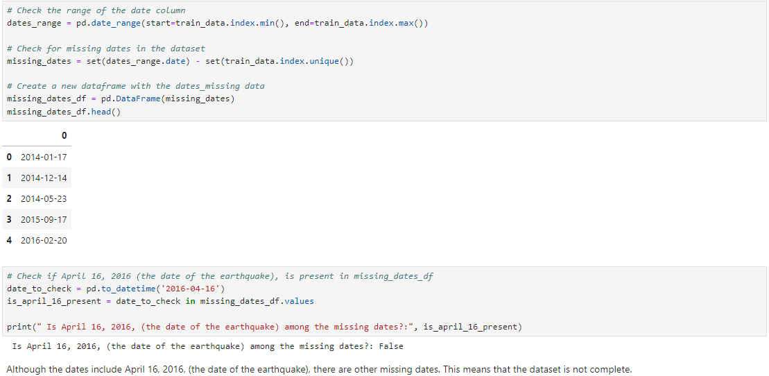
Missing dates in the dataset
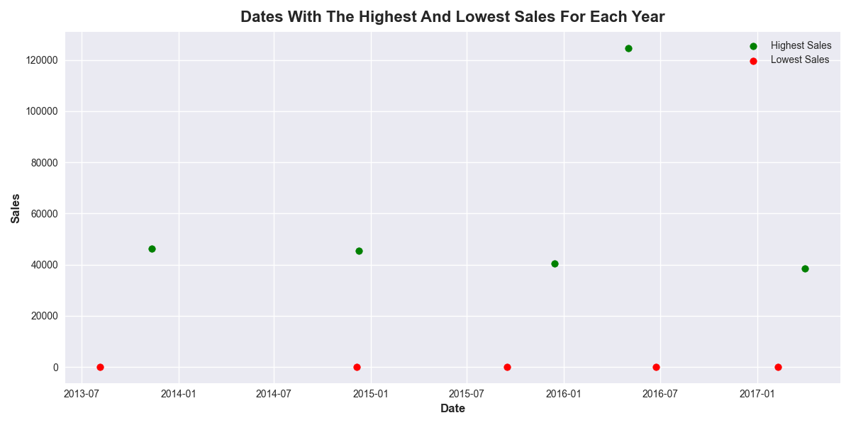
Question 2: Which dates have the lowest and highest sales for each year? The dates where the sales made is 0 are most likely the dates that the outlets of the retail store were not open. Such days are not considered as dates with the lowest sales because the store was not even open for sales at all. The images below show the dates with the lowest and highest sales for each year.
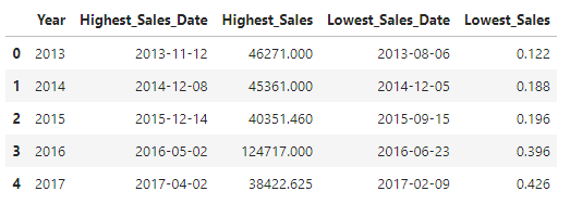
Dates with the lowest and highest sales for each year
Question 3: Did the earthquake impact sales? The earthquake occured on the 16th of April, 2016. It’s impact on the sales of the retail store is as shown in the image above.
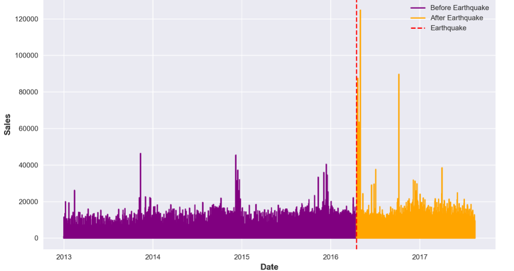
Sales trend before and after the earthquake
The date of the earthquake is marked with the red dash line. As observed on the chat, there was a huge increase in sales immediately after the earthquake. This could be because people needed to stock up food stuffs to be able to stay indoors after the earthquake. Another reason could be that hospitals and emergency corporations needed to buy large amounts of materials to cater for the earthquake victims. It is clear, therefore, that the earthquake impacted the sales of the retail store.
Question 4: Are certain groups of stores making more sales than others? (Cluster, city, state, type) In summary, there are groups of stores across the clusters, cities, states, and store types that are making more sales than others. This is shown in the images below.
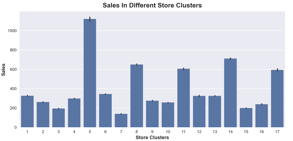
The plot above shows that stores in cluster 5 are making more sales than the stores in other clusters, followed by stores in cluster 14, while stores in cluster 7 made the least sales. It further shows that the stores in different clusters are making different volume of sales, with some stores making more sales than others.
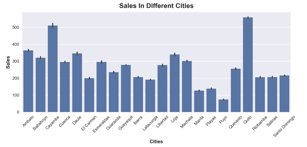
The plot above shows that stores in Quito are making more sales than stores in other cities, followed by stores in Cayambe, while stores in Puyo made the least sales. It further shows that the stores in different cities are making different volume of sales, with some stores making more sales than others.
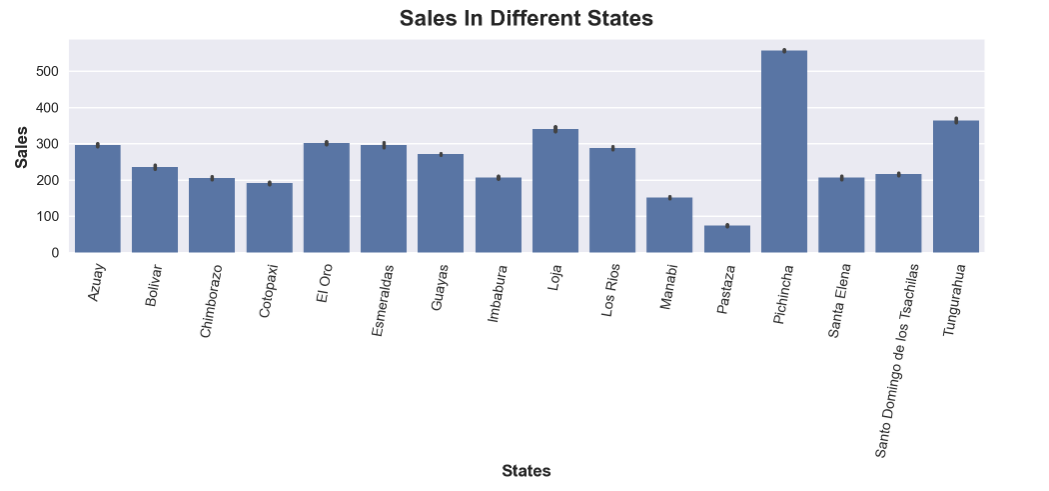
The plot above shows that stores in Pichincha are making more sales than stores in other states, followed by stores in Tungurahua, while stores in Pastaza made the least sales. It further shows that the stores in different states are making different volume of sales, with some stores making more sales than others.
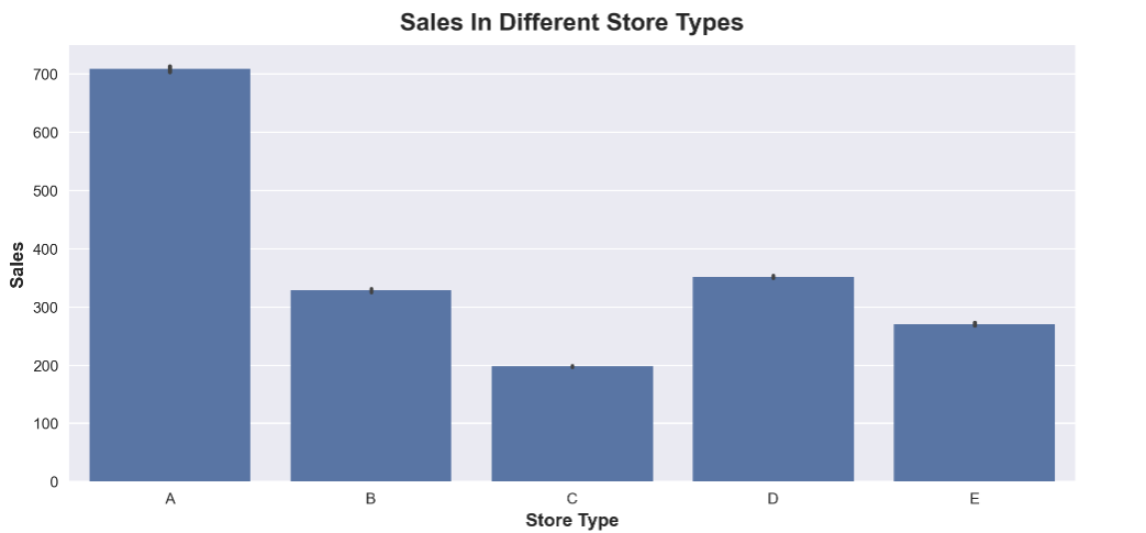
The plot above shows that stores in Store type A are making more sales than stores in other store types, followed by stores in Store type D, while stores in Store type C made the least sales. It further shows that the stores in different store types are making different volume of sales, with some stores making more sales than others.
Question 5: Are sales affected by promotions, oil prices and holidays? Sales were affected by promotions, oil prices and holidays. This is shown in the images below.
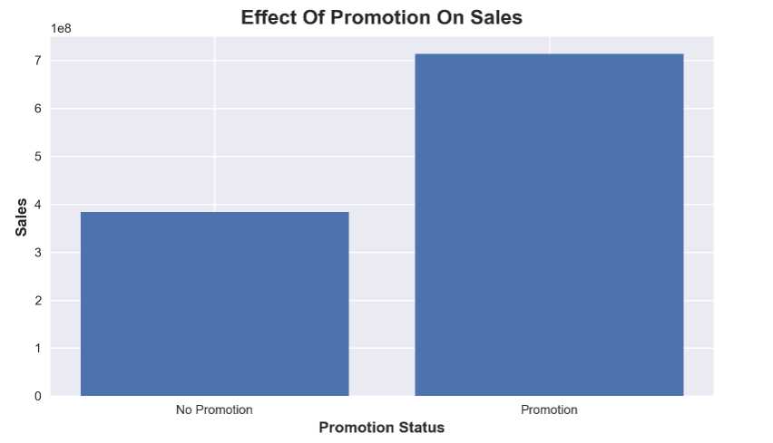
The plot above shows that sales was affected by promotion. Product families with items on promotion are being sold more than product families with no item on promotion.
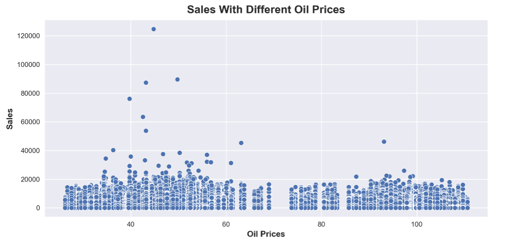
The plot above shows that sales are affected by the oil prices. As shown, there are more number of sales at lower oil prices than at higher oil prices. The outliers shown represent occasions where huge volumes of sales occurred. These huge volume trades occurred more frequently at lower oil prices than at higher oil prices.
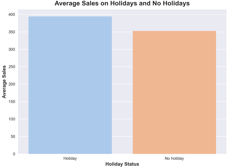
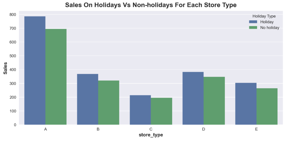
In the first image above, there are higher sales on holidays than no holidays. This is because more people are free to go out for shopping on holidays than no holidays when they have to be at work or school. In the second image, there are more sales on holidays than no holidays across all the store types. For these reasons, we conclude that sales are affected by holidays.
Question 6: What analysis can we get from the date and its extractable features? Recall that we previously extracted features, example the ‘dayname’ bearing the names of the days of the week, from the ‘date’ column after changing the datatype to datetime. These daynames can be used to identify the day of the week with the most and least sales in the retail store. This is shown below.
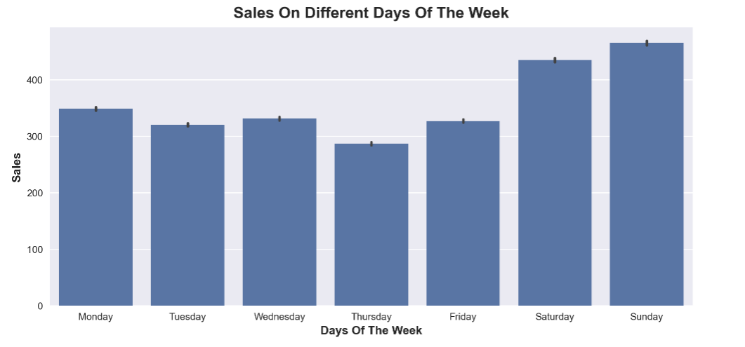
The sales on the different days of the week, as shown in the image below, reveals that there are more sales during the weekends with peak sales on Sundays, followed by Saturdays. This could be because generally many people do not go to work (or only work few hours) during the weekends, and thus would have more time to shop during weeekends than weekdays. The least sales were on Thursdays, a quite busy day at at the middle of the week.
Question 7: What is the difference between RMSLE, RMSE, MSE (or why is the MAE greater than all of them?) — MAE (Mean Absolute Error) measures the average absolute difference between predicted and actual values. It is less sensitive to outliers but generally larger than RMSE and MSE. — MSE (Mean Squared Error) measures the average squared difference between predicted and actual values. It gives more weight to large errors, making it sensitive to outliers. — RMSE (Root Mean Squared Error) is the square root of MSE and has the same sensitivity to outliers as MSE but is more interpretable. — RMSLE (Root Mean Squared Logarithmic Error) is useful when relative errors matter more than absolute errors and is less sensitive to outliers in the target variable. — MAE is generally greater than RMSE and MSE because it does not penalize larger errors as heavily as squared-error metrics.
Question 8: What is the total sales made each year by the corporation? The sales made by the corporation was grouped into their respective years, and then the total sales calculated for each of the years. The sales made each year was then plotted and is shown in the image below.
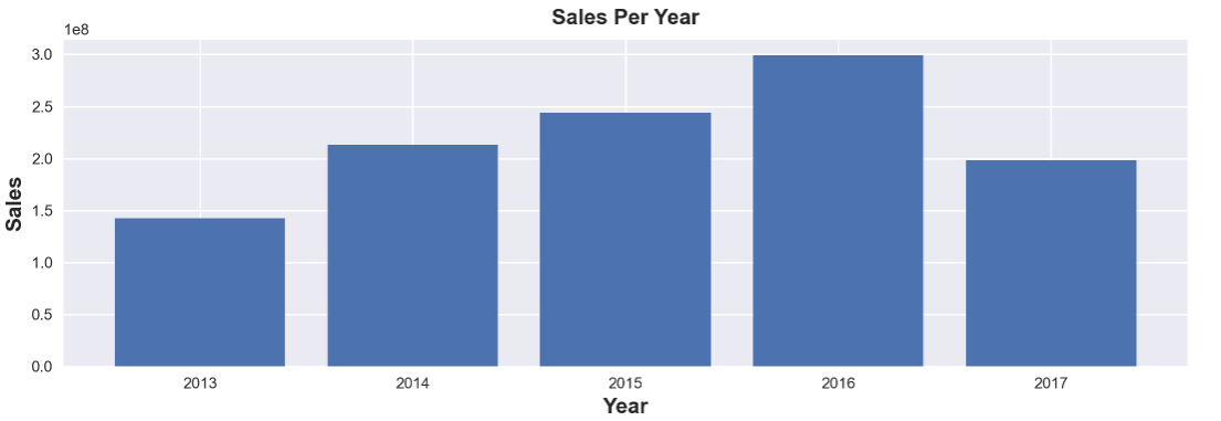
The image above displays the total sales made each year by Corporation Favorita. It reveals that Corporation Favorita made it’s lowest sales in 2013 and its highest sales in 2016.
Recall that the earthquake occured on 16th April, 2016 (2016–04–16), and it led to a huge increase in sales. This increase in sales as a result of the earthquake in 2016 contributed enormously to the sales of Corporation Favorita, enabling Corporation Favorita to record it’s highest sales in 2016 across the years captured in the entire data collected.
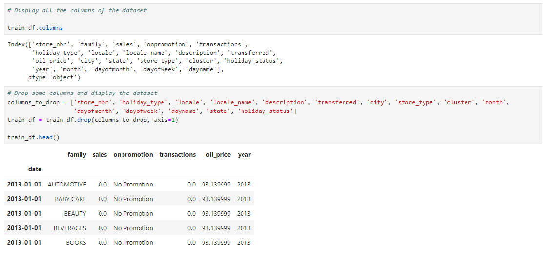
Feature Engineering Feature engineering processes include feature selection, data splitting, feature encoding, feature scaling etc. These processes are required to prepare the dataset for modelling. Feature selection: This process was used to remove unnecessary columns from the DataFrame, leaving only the columns that are important for modelling. This is as shown below.
Data splitting: The DataFrame was splitted to the training set and validation set in order to train the models and validate them. This was done using the years, as rows that fall between 2013 and 2016 made up the training set, while rows for 2017 made up the validation set.
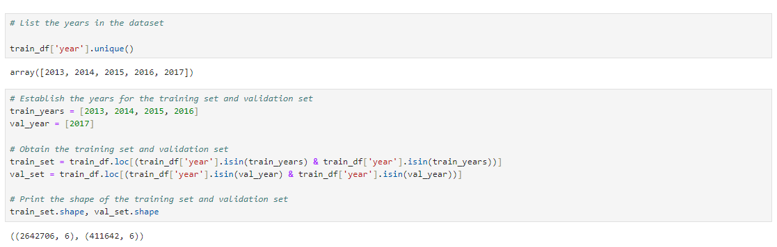
Data splitting is important as it provides a different dataset for training and for validation, which will effectively help to identify the best performing model for hyperparameter tuning. Data splitting was done before feature encoding and feature scaling to prevent data leakage from the training set to the validation set during encoding and scaling. Feature encoding: The categorical columns of the training and validation sets were encoded using OneHotEncoder. To obtain a dense output and to avoid multicollinearity, the OneHotEncoder parameters were adjusted to sparse=False and drop=’first’ respectively as shown below.

Feature scaling: The numerical columns of the training and validation sets were scaled using MinMaxScaler. MinMaxScaler is suitable for time series data because it preserves the relative differences between data points and maintains the temporal information.

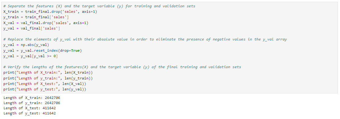
After carrying out these processes, the features (X) and the target variable (y) of the training and validation sets were obtained for modelling as shown below.
Modelling The six models listed below were trained using the training set and validated with the validation set.
- Linear Regression
- XGBoost
- CatBoost
- AutoRegressive (AutoReg)
- AutoRegressive Integrated Moving Average (ARIMA)
- Seasonal AutoRegressive Integrated Moving Average (SARIMA)
Evaluation The following evaluation metrics were used to evaluate the performance of the models. — Mean Absolute Error (MAE) — Mean Squared Error (MSE) — Root Mean Squared Error (RMSE) — Mean Squared Logarithmic Error (MSLE) — Root Mean Squared Logarithmic Error (RMSLE) The primary evaluation metric for selecting the best performing model is the Root Mean Squared Logarithmic Error (RMSLE).
A results DataFrame was created to store the scores of the evaluation metrics used to evaluate these models. After training each model, the model will be evaluated and the scores of the evaluation metrics saved in the results DataFrame accordingly. At the end of the process, the scores of the evaluation metrics were collected in the results DataFrame as shown below.
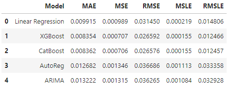
From the result table above showing the evaluation metrics of all the models after training and validation, it is observed that CatBoost model has the lowest score for all the evaluation metrics except the MAE. The evaluation metrics of Catboost model is as shown below:
- Mean Absolute Error (MAE): 0.008362
- Mean Squared Error (MSE): 0.000706
- Root Mean Squared Error (RMSE): 0.026576
- Mean Squared Logarithmic Error (MSLE): 0.000155
- Root Mean Squared Logarithmic Error (RMSLE): 0.012457
Since the primary evaluation metric for selecting the best performing model is the Root Mean Squared Logarithmic Error (RMSLE), the best performing model being the one that has the lowest score for this metric, the best performing model is CatBoost model.
Hyperparmeter Tuning CatBoost model, being the best performing model, was tuned to optimize it’s efficiency, trained on the training set and evaluated. The scores of it’s evaluation metrics were collected and added to the result’s DataFrame to compare the scores with that of the other models. This is shown below.
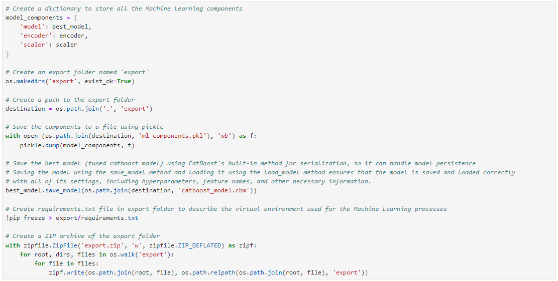
Exportation The key Machine Learning objects such as the best model, encoder, and scaler will be exported and used later to build an app. The exportation process is shown in the image below.
Deployment The model was embedded into a streamlit app and deployed for public usage. This was done in this GitHub repository: Embed-Corporation-Favorita-Timeseries-Model-To-Streamlit. The deployment process was discussed in this medium article: BUILDING A USER-FRIENDLY SALES PREDICTION APP USING STREAMLIT AND HUGGINGFACE.
Conclusion In this time series forecasting project, we embarked on a journey to predict sales for Corporation Favorita, a retail store in Ecuador, using it’s historical sales data. Our aim was to build an effective predictive model that could provide accurate sales forecasts to assist the company in making informed decisions and optimizing their operations.
After preparing the data, analyzing it and carrying out features engineering, six different models were trained and their evaluation metrics were compared on a results table. It was observed that CatBoost model had the lowest score for all the evaluation metrics except MAE. Our primary evaluation metrics being the Root Mean Squared Logarithmic Error (RMSLE), CatBoost model had the lowest score (0.012457) for this metric, making it our best performing model.
Hyperparameter tuning was performed on CatBoost model using cross-validation to find the best configuration for the model. The selection of appropriate hyperparameters was crucial to prevent overfitting and achieve optimal predictive performance, enabling us to obtain our best model for prediction.
Finally, the best model and related components were saved and exported for app deployment. The save_model method was also used to save the best model to maintain serialization and handle model persistence. Saving the model using the save_model method and loading it using the load_model method ensures that the model is saved and loaded correctly with all of its settings, including hyperparameters, feature names, and other necessary information.
Key Takeaways:
- There is an upward trend in the sales recorded by the retail store over the years, with zero sales on the first day of each year.
- Transactions and sales are highest in the retail store at the end of each year.
- The earthquake that occured in Ecuador on 16th April, 2016 impacted sales. It caused an increase in sales for the retail store.
- Stores in some clusters had more sales than others. This is also the case for stores in cities, states and store types.
- Sales were affected by promotion, oil prices and holidays. Promotions led to increase in sales, increase in oil price led to general decrease in number of sales and sales volume while holidays resulted in more sales for the retail store.
- The corporation recorded more sales during weekends than weekdays. It had the most sales on Sundays, sharply followed by Saturdays. The lowest sales for the days of the week were made on Thurdays.
- The corporation had the most sales in 2016 (which is the year of the earthquake). The huge increase in sales immediately after the earthquake contributed in making 2016 the year with the highest sales. The lowest sales was recorded in 2013.
This project highlights the holistic process of developing a time series forecasting solution for Corporation Favorita, from data preparation to model selection, training, and deployment. By implementing the strategies and techniques discussed, accurate sales forecasts can be made, enabling the retail company to optimize its operations and make data-driven decisions for growth and success.
Appreciation I am grateful to the entire Azubi Africa team for their commitment to both teaching students and guiding them to success in their tech careers. Read articles by Azubi Africa here and take a few minutes to visit this link to learn more about Azubi Africa’s life-changing programs.
Final Notes Thank you so much for reading. I will love to receive your comments, advice, suggestions and recommendations. You can leave a comment here or find me on Twitter (@iameberedavid) and LinkedIn (Chidiebere David Ogbonna). I am also open to collaborating on projects.
DataScience #DataAnalytics #AdvancedAnalytics #TimeseriesAnalysis #Timeseries #AzubiAfrica #MachineLearning #SARIMA #ARIMA #CorporationFavorita #RetailStore
메타데이터
- post_id
- 4e43df145e50
- slug
- time-series-forecasting-analysis-for-corporation-favorita-4e43df145e50
- url
- https://medium.com/@eberedavid/time-series-forecasting-analysis-for-corporation-favorita-4e43df145e50
- canonical_url
- https://medium.com/@eberedavid/time-series-forecasting-analysis-for-corporation-favorita-4e43df145e50
- author_url
- https://medium.com/@eberedavid
- status
- ok
- fetched_at
- 2026-07-25 12:44:45