How to Make YouTube Thumbnails People Actually Click
Your video can be amazing, but if the thumbnail doesn’t stop the scroll, nobody will ever know. Here’s how to design thumbnails that earn…
How to Make YouTube Thumbnails People Actually Click
Your video can be amazing, but if the thumbnail doesn’t stop the scroll, nobody will ever know. Here’s how to design thumbnails that earn attention and clicks.
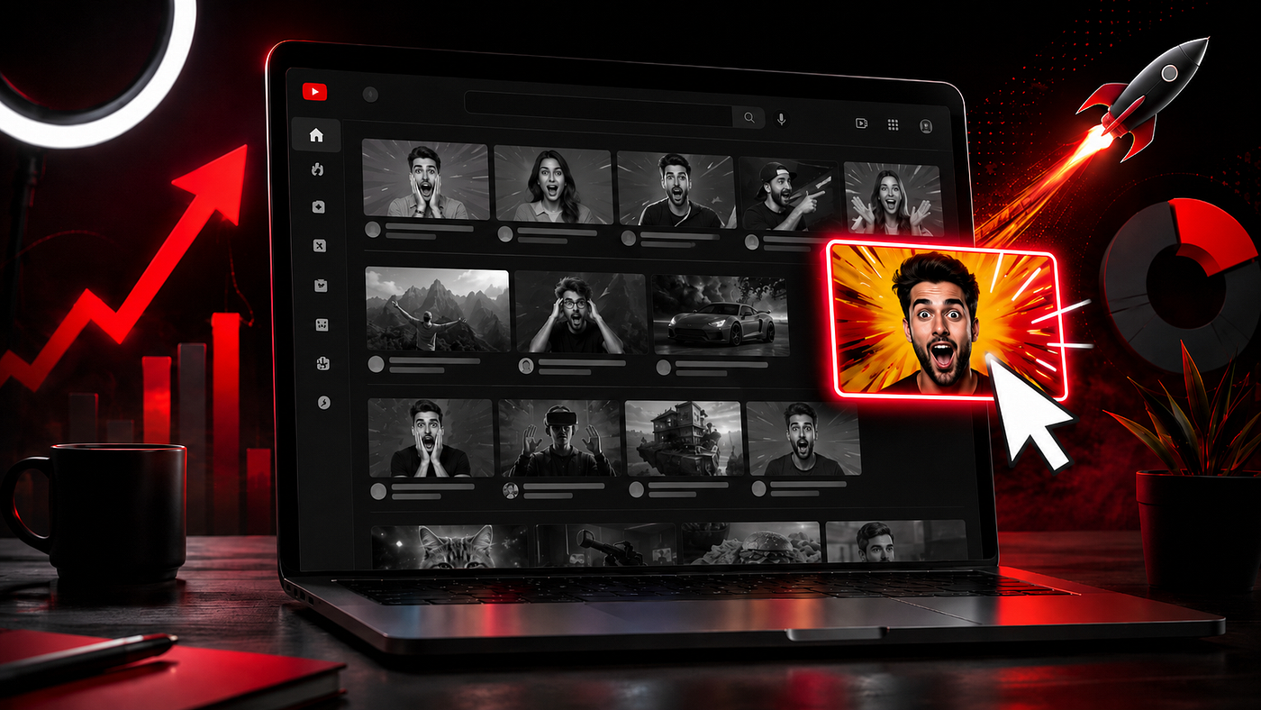
You could spend hours researching a topic.
Another few hours writing the perfect script.
Then editing the video until every second feels right.
And still get barely any views.
Sometimes, the problem isn’t the video.
It’s the click.
Before someone watches your content, they first have to make a tiny decision:
“Is this video worth clicking?”
Your thumbnail and title make that decision easier — or harder.
That’s why learning how to create better thumbnails is one of the highest-leverage skills a YouTube creator can develop.
Your Video Starts Before Someone Presses Play
Think about how you personally use YouTube.
You open the homepage.
You scroll.
Dozens of videos compete for your attention.
You probably don’t carefully read every title or analyse every thumbnail. Something catches your eye first, then you decide whether you want to know more.
That is the real job of a thumbnail.
It doesn’t have to explain your entire video.
It has to make someone stop, understand and become curious.
A beautiful thumbnail that gets ignored is ineffective.
A simple thumbnail that makes the right viewer curious is doing its job.
Start With the Right Thumbnail Size
Before thinking about fonts, colours or expressions, get the technical foundation right.
YouTube currently recommends making custom long-form thumbnails as large as possible, with:
- Recommended resolution: 3840 × 2160 pixels
- Aspect ratio: 16:9
- Minimum width: 640 pixels
- Common formats: JPG, GIF or PNG
- Mobile upload limit: 2 MB for video thumbnails
- Desktop upload limit: up to 50 MB
For most regular YouTube videos, stick with a 16:9 aspect ratio and design everything so it remains clear when the thumbnail is very small.
That last point matters more than most beginners realise.
You may design your thumbnail on a large monitor, but viewers will often encounter it as a tiny rectangle inside their feed.
So zoom out before exporting.
If you can’t understand the thumbnail almost instantly, simplify it.
What Actually Makes Someone Click?
Clickable thumbnails aren’t necessarily complicated.
In fact, the best ones are often surprisingly simple.
1. Give the Eye One Place to Look
Avoid trying to show five ideas at once.
Choose one dominant element:
- A person
- A product
- A number
- A result
- A screenshot
- An unusual object
- A powerful visual contrast
The viewer should know what matters almost immediately.
If everything is important, nothing looks important.
2. Create Curiosity Without Creating Confusion
There is an important difference between curiosity and vagueness.
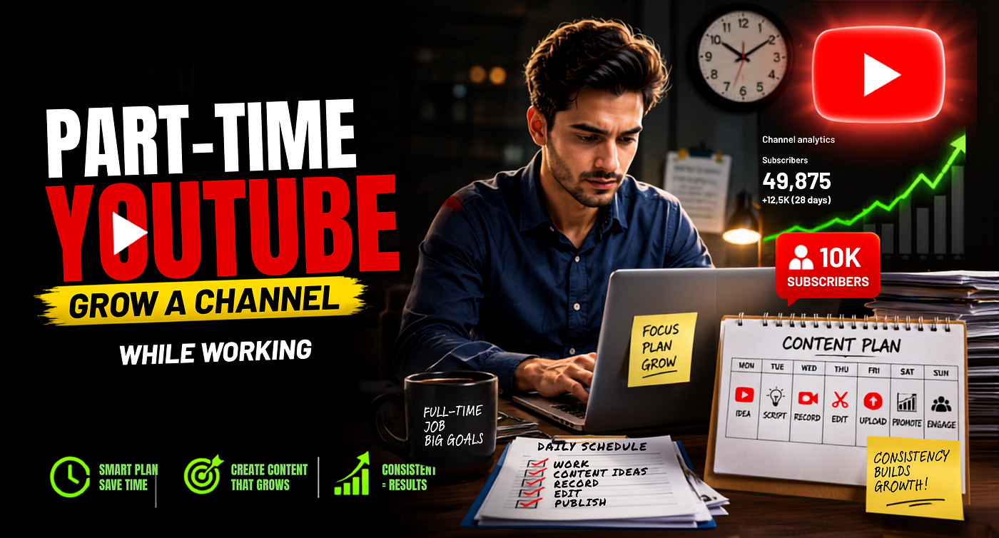
Imagine a video about growing a YouTube channel.
A thumbnail saying:
“How to Grow on YouTube”
explains the topic, but doesn’t create much curiosity.
Something like:
“0 → 100K”
combined with the right visual could make the viewer wonder:
How did that happen?
That unanswered question gives the title room to complete the story.
The goal isn’t to hide what the video is about.
The goal is to reveal just enough to make someone want the rest.
3. Keep Thumbnail Text Short
Your thumbnail isn’t a PowerPoint slide.
Long sentences force people to read.
And people scrolling through YouTube usually aren’t looking for something else to read.
Try using only a few highly meaningful words.
Instead of:
“How I Started Making Money With My YouTube Channel”
try something such as:
“₹0 → ₹1L”
or:
“It Finally Worked”
The title can explain the context.
The thumbnail should deliver the visual punch.
4. Use Contrast Intentionally
Contrast doesn’t simply mean making everything extremely bright.
It means making the important part easy to distinguish.
If your subject blends into the background, separate it.
If your headline disappears over an image, simplify the image or strengthen the text treatment.
If everything uses equally loud colours, reduce the visual noise.
Your thumbnail should still work at a glance.
5. Make the Thumbnail and Title Work Together
This is one of the easiest improvements you can make.
Don’t use the thumbnail to repeat the title word for word.
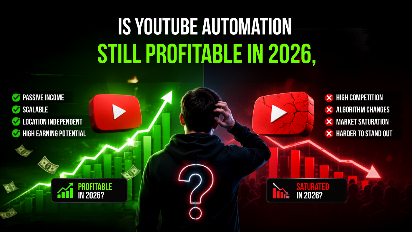
Imagine the title says:
I Tried YouTube Automation for 30 Days — Here’s What Happened
The thumbnail doesn’t also need to say:
“I Tried YouTube Automation for 30 Days.”
It might instead say:
“₹87,420?”
Now the two pieces work together.
The thumbnail creates the question.
The title provides the context.
The viewer clicks for the answer.
Think of your title + thumbnail as one piece of packaging, not two separate tasks.
Three Ways to Create YouTube Thumbnails
You don’t need to be a professional graphic designer anymore.
There are several practical ways to make strong thumbnails depending on your skill level and workflow.
Method 1: Use AI to Create the First Concept
AI has made the blank-canvas problem much easier.
Instead of designing everything manually, you can give an AI image tool:
- Your video topic
- Desired emotion
- Reference thumbnails
- Your face or subject
- Important visual objects
- Brand colours
- Composition instructions
Then generate multiple directions quickly.
But don’t treat the first AI output as the finished thumbnail.
AI-generated thumbnails can still have:
- Incorrect text
- Strange facial details
- Too many elements
- Generic compositions
- Inconsistent branding
A better workflow is:
Generate → Select → Simplify → Brand → Test
Use AI for speed.
Use human judgement for the final decision.
Method 2: Design Manually for Maximum Control
Photoshop or a similar professional design tool still gives you the greatest control.
You can precisely adjust:
- Subject cutouts
- Shadows
- Lighting
- Text hierarchy
- Background blur
- Colour balance
- Composition
- Branding
This makes manual design especially useful if you’re building a recognisable visual identity across dozens of videos.
The downside?
It takes longer and requires more design skill.
For creators publishing at scale, that extra time matters.
Method 3: Create Thumbnails on Your Phone
You don’t need an expensive setup to start.
Tools such as Canva and other mobile design apps can handle most beginner thumbnail requirements.
The fundamentals remain exactly the same:
Choose one focal point.
Keep the text short.
Use clear contrast.
Remove unnecessary elements.
Check the design at a small size.
A simple thumbnail built on a phone can outperform a complicated Photoshop design if the idea behind it is stronger.
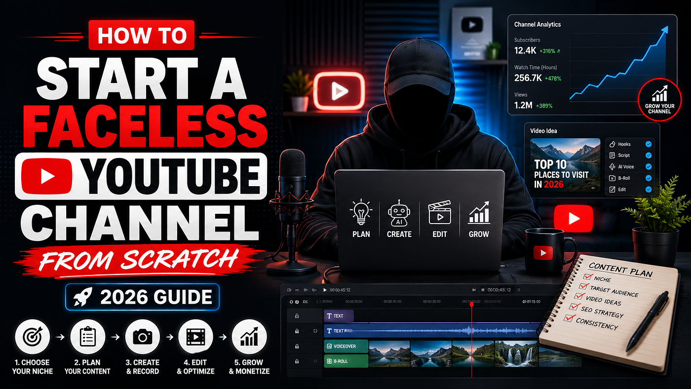
What About Faceless YouTube Channels?
This is where many creators get stuck.
They assume thumbnails need exaggerated facial expressions to perform.
They don’t.
Faceless channels simply need different attention triggers.
You can use:
- Recognizable objects
- Before-and-after visuals
- Numbers
- Screenshots
- Illustrations
- Money or data visuals
- Arrows used strategically
- Strong visual transformations
- Unexpected combinations
For example, instead of putting a face beside the text:
“$10,000/month”
you could show a clean analytics screenshot with one number enlarged.
The principle doesn’t change.
Give the viewer one clear reason to become curious.
Consistency Matters More Than Making Every Thumbnail Completely Different
One mistake faceless creators make is changing their thumbnail style every week.
One video is red.
The next is neon green.
The next looks minimal.
The next looks like a gaming channel.
Individual thumbnails may look good, but the channel never develops a recognizable identity.
Instead, create a loose visual system:
- Similar font family
- Consistent text treatment
- Repeatable composition
- Familiar colour palette
- Similar object or image treatment
You don’t need identical thumbnails.
You need recognisable thumbnails.
Over time, viewers should start identifying your videos before they even read your channel name.
Thumbnail Mistakes That Kill Good Videos
Too Much Text
If somebody has to stop scrolling and read a paragraph, you’ve probably already lost them.
Simplify.
Too Many Elements
A face, three arrows, five logos, two screenshots, fire emojis and six lines of text aren’t making your thumbnail more persuasive.
They’re competing with each other.
Tiny Details
A detail that looks beautiful at 100% zoom may disappear completely in the actual YouTube feed.
Design for the final viewing size.
Misleading Clickbait
Curiosity is useful.
Breaking the promise of the thumbnail isn’t.
You may earn an initial click with an exaggerated claim, but disappointing viewers is not a sustainable channel strategy.
Your video must eventually deliver what the packaging promised.
Designing the Thumbnail After Finishing Everything Else
Many creators treat the thumbnail as the final five-minute task before uploading.
Try reversing the process.
Before producing the video, ask:
“What would make someone click this idea?”
If you can’t imagine a compelling title and thumbnail, the underlying video concept may need improvement too.
AI vs. Manual Thumbnail Design: Which Is Better?
Neither wins automatically.
AI is excellent for:
- Speed
- Brainstorming
- Variations
- Testing concepts
- Creators without design experience
Manual design is stronger for:
- Precise brand control
- Unique styles
- Detailed compositing
- Consistent visual systems
For many creators, the best option is a hybrid workflow.
Use AI to create ideas quickly.
Then manually refine the strongest concept.
That gives you speed without sacrificing identity.
Don’t Guess. Test.
Sometimes the thumbnail you personally love won’t be the one viewers prefer.
That’s why testing matters.
YouTube currently provides tools for testing and comparing thumbnails and also supports title-and-thumbnail testing features.
The lesson is simple:
Your audience gets the final vote.
Try changing one major variable at a time:
- Focal point
- Expression
- Background
- Text
- Colour contrast
- Number
- Composition
Over enough uploads, patterns start appearing.
Those patterns become your channel’s thumbnail playbook.
Better Packaging Makes Every Video More Valuable
Suppose you spend ten hours creating a video.
If poor packaging keeps people from clicking, most of that effort never gets a chance to perform.
Improve the thumbnail, and you’re improving the opportunity for the same content to reach more people.
That’s what makes thumbnail design so valuable.
It improves the return on everything else you’re already doing:
Research.
Scripts.
Editing.
Voiceovers.
SEO.
Content strategy.
You don’t necessarily need more videos.
Sometimes you need to package your existing videos better.
A Simple Thumbnail Checklist
Before publishing your next video, ask:
Can I understand the thumbnail instantly?
Is there one obvious focal point?
Is the text readable when the image is small?
Does the thumbnail create curiosity?
Does the title add information instead of repeating it?
Does the video actually deliver what the thumbnail promises?
If you can answer yes to all six, you’re already ahead of many creators.
Final Thought: Design the Click Before You Design the Video
Your video doesn’t begin at 0:00.
For the viewer, it begins in the feed.
The thumbnail creates attention.
The title creates context.
The video delivers the promise.
Get all three working together and even simple content gets a much better opportunity to perform.
So before making another thumbnail, don’t ask:
“Does this look good?”
Ask:
“Would I stop scrolling for this?”
That question changes everything.
Originally published by Rudra Pratap Singh, Founder & YouTube Automation Expert at New Money Matrix.
Want to learn the complete system behind building and monetising faceless YouTube channels? Explore the New Money Matrix resources and 3-hour Faceless YouTube Masterclass.
메타데이터
- post_id
- 4e80d41cadeb
- slug
- how-to-make-youtube-thumbnails-people-actually-click-4e80d41cadeb
- url
- https://medium.com/@rudyyt/how-to-make-youtube-thumbnails-people-actually-click-4e80d41cadeb
- canonical_url
- https://medium.com/@rudyyt/how-to-make-youtube-thumbnails-people-actually-click-4e80d41cadeb
- author_url
- https://medium.com/@rudyyt
- status
- ok
- fetched_at
- 2026-08-15 05:26:37