Calculating classification metrics in Power BI
From notebooks to dashboards: Evaluating ML models in Power BI
Calculating classification metrics in Power BI
From notebooks to dashboards: Evaluating ML models in Power BI
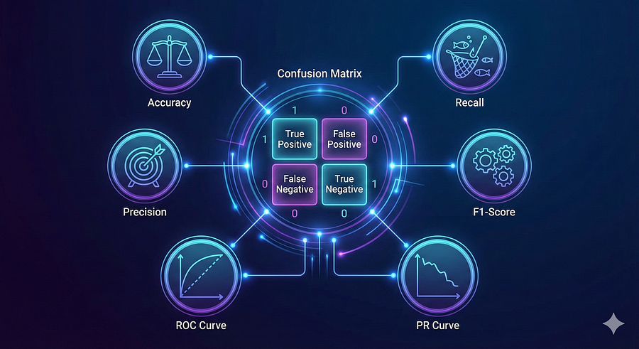
Created using Nano Banana
Five years ago, I wrote an article on the role of scientists and engineers in society. Scientists take the world from 0 to 1 — they ideate, experiment, and publish. Engineers take it from 1 to 99 — they scale, operationalize, and distribute. The framing stuck with me because it describes a handoff problem that recurs across every discipline, and machine learning is no exception.
Model evaluation is where data scientists live. Classification reports, confusion matrices, F1 scores — these are the instruments they use to decide whether a model is ready to ship. But once the model ships, evaluation does not stop. Monitoring models post-deployment is necessary for detecting data drift, concept drift, and triggering continual learning. And yet most of this evaluation stays locked in notebooks, visible only to the people who can run them.
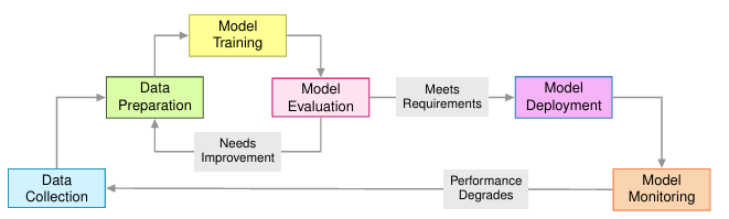
Machine learning life cycle. Adapted from Machine Learning Systems Book.
Even experiment tracking frameworks like MLFlow — excellent as they are — require a technical audience. The product manager who needs to know whether the model degraded last month or the support lead wondering why predictions feel off lately cannot open a Python environment to find out. That is the gap this article addresses.
Power BI is not traditionally thought of as an ML tool. But it sits precisely at the intersection of where model outputs live (structured data) and where business stakeholders operate (self-service dashboards). This article walks through the complete pipeline: training a classifier in Python, validating that Power BI reproduces the same metrics, and then arriving at the key insight — that Power BI’s filter context gives it a distinct advantage for temporal monitoring that Python cannot match without additional engineering.
The dataset
A sentiment-analysis dataset provides the evaluation data. Customer reviews are classified as Positive, Negative, or Neutral using TF–IDF features fed into a Random Forest. Crucially, each prediction carries a timestamp — the date the review was posted. This is what transforms the evaluation from a static report into a monitoring system. The question is not only “How accurate is the model?” but “Is accuracy holding up over time?”
Step 1: Get predictions out of Python
The bridge between Python and Power BI is a CSV file containing one row per prediction, with columns for the actual label, the predicted label, and — for production monitoring — a timestamp.
import os
import pandas as pd
from sklearn.model_selection import train_test_split
from sklearn.ensemble import RandomForestClassifier
from sklearn.feature_extraction.text import TfidfVectorizer
from sklearn.preprocessing import LabelEncoder

PROJECT_ROOT = os.path.dirname(os.path.dirname(os.path.abspath(__file__)))
DATA_DIR     = os.path.join(PROJECT_ROOT, 'data')

# Fine-grained labels collapsed to three categories
POSITIVE = ['Positive', 'Joy', 'Excitement', 'Contentment', 'Gratitude', ...]
NEGATIVE = ['Negative', 'Anger', 'Anxiety', 'Fear', 'Sadness', 'Despair', ...]
NEUTRAL  = ['Neutral', 'Ambivalence', 'Curiosity', 'Nostalgia', 'Boredom', ...]

def categorize_sentiment(sentiment):
    sentiment = sentiment.strip()
    if sentiment in POSITIVE: return 'Positive'
    if sentiment in NEGATIVE: return 'Negative'
    if sentiment in NEUTRAL:  return 'Neutral'
    # fallback: keyword heuristic
    s = sentiment.lower()
    if any(k in s for k in ['sad','anger','fear','hate','bad','pain']): return 'Negative'
    if any(k in s for k in ['joy','happy','love','good','excite','hope']): return 'Positive'
    return 'Neutral'

df = pd.read_csv(os.path.join(DATA_DIR, 'sentimentdataset.csv'))
df.columns = df.columns.str.strip()
df['Sentiment'] = df['Sentiment'].str.strip()
df['Sentiment_Category'] = df['Sentiment'].apply(categorize_sentiment)

df['Timestamp'] = pd.to_datetime(df['Timestamp'])
df['Date']  = df['Timestamp'].dt.date
df['Year']  = df['Timestamp'].dt.year
df['Month'] = df['Timestamp'].dt.month
df['Week']  = df['Timestamp'].dt.isocalendar().week
df = df.dropna(subset=['Text', 'Sentiment_Category'])

label_encoder = LabelEncoder()
df['sentiment_label'] = label_encoder.fit_transform(df['Sentiment_Category'])

tfidf = TfidfVectorizer(max_features=5000, stop_words='english', ngram_range=(1, 2))
X = tfidf.fit_transform(df['Text'].astype(str))
y = df['sentiment_label']

X_train, X_test, y_train, y_test, idx_train, idx_test = train_test_split(
    X, y, df.index, test_size=0.2, random_state=42, stratify=y
)

model = RandomForestClassifier(n_estimators=100, random_state=42, n_jobs=-1)
model.fit(X_train, y_train)
y_pred = model.predict(X_test)

test_df = df.loc[idx_test].copy()
test_df['predicted_sentiment'] = label_encoder.inverse_transform(y_pred)

test_results = test_df[['Text', 'Sentiment_Category', 'predicted_sentiment',
                         'Timestamp', 'Date', 'Year', 'Month', 'Week',
                         'Platform', 'Country']].copy()
test_results.columns = ['Text', 'actual_sentiment', 'predicted_sentiment',
                         'Timestamp', 'Date', 'Year', 'Month', 'Week',
                         'Platform', 'Country']

test_results.to_csv(os.path.join(DATA_DIR, 'sentiment_test_results.csv'), index=False)
For a production system, prediction_date is not a timestamp of when the evaluation was run — it is the timestamp of when each individual prediction was made. Log every prediction your model makes in production, save it to this table, and refresh Power BI. The monitoring layer updates automatically.
The sentiment dataset has this naturally: Each row carries the date of the review the model scored, which means the dataset spans from 2026–01–05 to 2026–04–19. This is what makes temporal monitoring possible.
A brief metrics primer
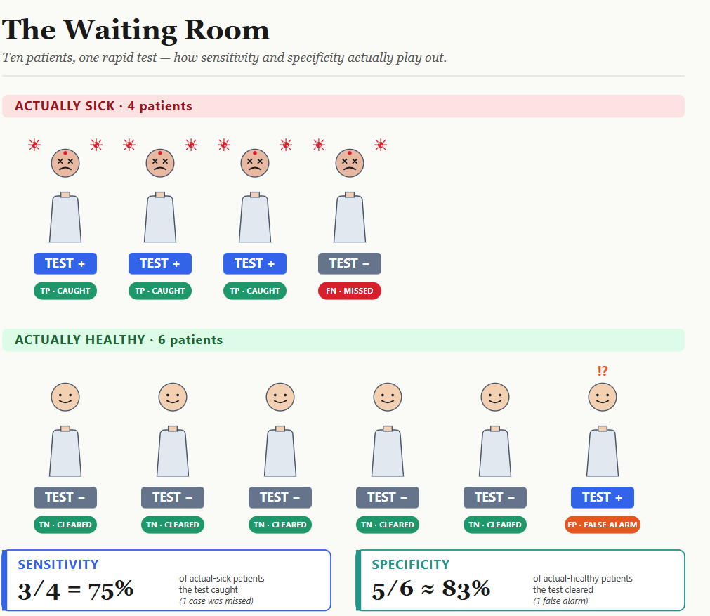
Before writing DAX, the metrics are worth defining precisely, because the definition turns out to matter when comparing Python and Power BI.
Accuracy is the fraction of predictions that were correct. Intuitive, but dangerous on imbalanced data — a model that always predicts “Positive” on a 90 percent positive dataset will score 90 percent accuracy while being completely useless.
Precision for a class measures how reliable the model’s predictions of that class are: TP / (TP + FP). High precision means few false alarms.
Recall measures how well the model finds all actual instances of a class: TP / (TP + FN). High recall means few misses.
F1 Score is the harmonic mean of precision and recall — it penalizes extreme imbalance between the two and is a more honest single-number summary than accuracy alone.
For multi-class problems, macro-averaging computes each metric per class and then averages across classes, giving equal weight to every class regardless of how common it is. This matters enormously in practice: If neutral sentiment is rare in your training data, a macro average will surface the model’s weakness on that class even if it performs well on the majority classes.
Step 2: Write the DAX measures
Loading the CSV into Power BI’s semantic model is mechanical. The interesting work is writing measures that compute metrics dynamically — not static numbers imported from Python, but formulas that recalculate over whatever subset of data is currently filtered.
Accuracy
Accuracy =
DIVIDE(
    COUNTROWS(FILTER(
        'sentiment_test_results',
        'sentiment_test_results'[actual_sentiment] = 'sentiment_test_results'[predicted_sentiment]
    )),
    COUNTROWS('sentiment_test_results'),
    0
)
Macro precision and recall
Both follow the same pattern: Iterate over each distinct class using SUMX, compute TP and FP (or FN) for that class, compute the per-class ratio, and then average.
Macro Precision =
VAR ClassTable = DISTINCT(sentiment_test_results[actual_sentiment])
VAR NumClasses = COUNTROWS(ClassTable)
VAR PrecisionSum =
    SUMX(ClassTable,
        VAR CurrentClass = sentiment_test_results[actual_sentiment]
        VAR TP = CALCULATE(COUNTROWS(sentiment_test_results),
            sentiment_test_results[actual_sentiment]    = CurrentClass,
            sentiment_test_results[predicted_sentiment] = CurrentClass)
        VAR FP = CALCULATE(COUNTROWS(sentiment_test_results),
            sentiment_test_results[predicted_sentiment] = CurrentClass,
            sentiment_test_results[actual_sentiment]   <> CurrentClass)
        RETURN DIVIDE(TP, TP + FP, 0)
    )
RETURN DIVIDE(PrecisionSum, NumClasses, 0)
Macro Recall follows the same structure, replacing FP with FN.
Macro F1 — and a subtle trap
The intuitive DAX for F1 is to take the harmonic mean of the two macro averages you just computed:
-- Natural but subtly wrong
Macro F1 = DIVIDE(2 * [Macro Precision] * [Macro Recall],
                  [Macro Precision] + [Macro Recall], 0)
This is a legitimate calculation, but not the one sklearn computes. The difference comes down to aggregation order. sklearn computes a per-class F1 for each class and then averages those F1 scores. The DAX above computes macro precision and macro recall first, and then takes their harmonic mean. The two operations commute only when every class has identical precision and recall — which never happens on real data.
On the sentiment dataset: the naive DAX returns Macro F1 = 0.7209, while sklearn returns 0.7198. The gap is 0.0011 — small, but consistent and reproducible across every re-run.
The fix is to push the F1 computation inside the SUMX loop, computing the F1 of each class before averaging:
Macro F1 Score =
VAR ClassTable = DISTINCT(sentiment_test_results[actual_sentiment])
VAR NumClasses = COUNTROWS(ClassTable)
VAR F1Sum =
    SUMX(ClassTable,
        VAR CurrentClass = sentiment_test_results[actual_sentiment]
        VAR TP = CALCULATE(COUNTROWS(sentiment_test_results),
            sentiment_test_results[actual_sentiment]    = CurrentClass,
            sentiment_test_results[predicted_sentiment] = CurrentClass)
        VAR FP = CALCULATE(COUNTROWS(sentiment_test_results),
            sentiment_test_results[predicted_sentiment] = CurrentClass,
            sentiment_test_results[actual_sentiment]   <> CurrentClass)
        VAR FN = CALCULATE(COUNTROWS(sentiment_test_results),
            sentiment_test_results[actual_sentiment]    = CurrentClass,
            sentiment_test_results[predicted_sentiment] <> CurrentClass)
        VAR ClassP = DIVIDE(TP, TP + FP, 0)
        VAR ClassR = DIVIDE(TP, TP + FN, 0)
        RETURN DIVIDE(2 * ClassP * ClassR, ClassP + ClassR, 0)
    )
RETURN DIVIDE(F1Sum, NumClasses, 0)
With this correction, every metric matches sklearn to six decimal places.
The confusion matrix
The confusion matrix is the most information-dense view of a classifier. In Power BI it is a Matrix visual driven by a single DAX measure. The key is ALLSELECTED(), which clears the row/column filters the Matrix imposes at each cell while preserving any slicer context the user has applied:
CM Count =
VAR ActualClass    = SELECTEDVALUE(sentiment_test_results[actual_sentiment])
VAR PredictedClass = SELECTEDVALUE(sentiment_test_results[predicted_sentiment])
RETURN
    COUNTROWS(FILTER(
        ALLSELECTED(sentiment_test_results),
        sentiment_test_results[actual_sentiment]    = ActualClass &&
        sentiment_test_results[predicted_sentiment] = PredictedClass
    ))
Step 3: Verify the numbers match
Before trusting a Power BI report, verify it. Let’s compare it with sklearn metrics, using Python visuals in Power BI.
Below are the classification metrics computed with Python and reproduced with DAX in Power BI respectively.
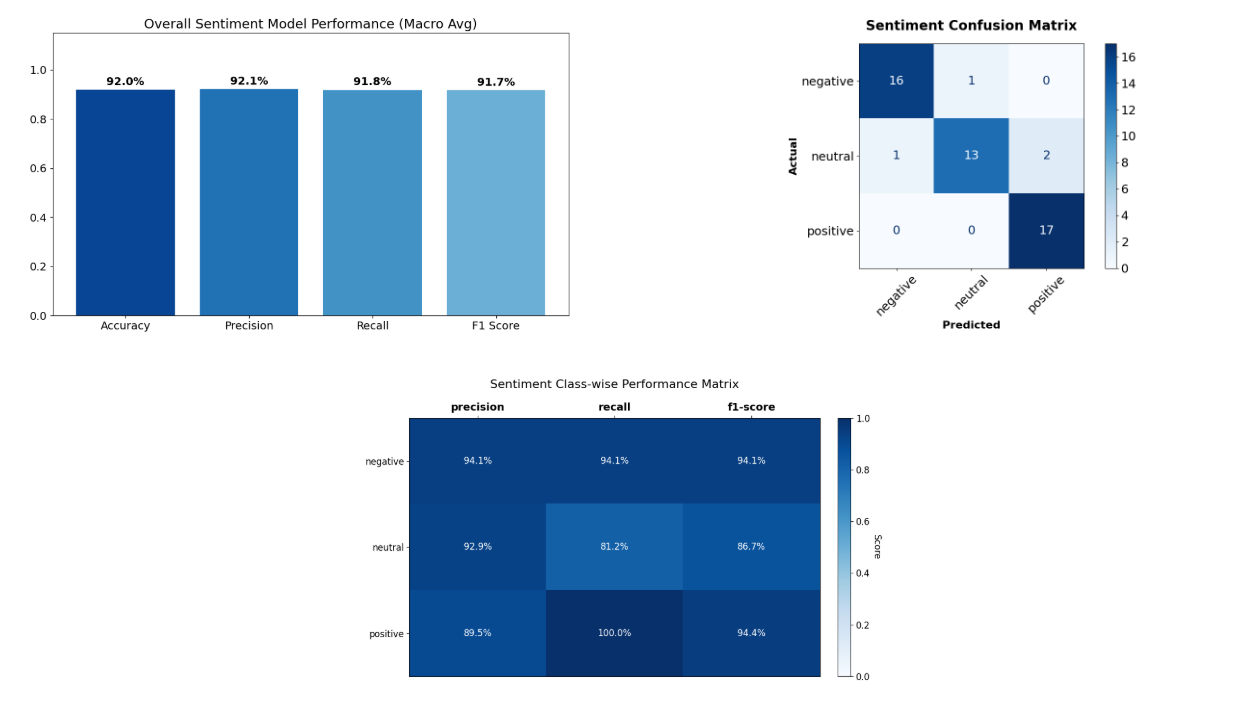
Python script

DAX calculations
The model handles Positive and Negative confidently. Neutral leaks occur in both directions — a common failure mode, because genuinely ambiguous text borrows vocabulary from both poles.
The verification step is not bureaucratic. Once you trust that the numbers are the same, you can hand the Power BI report to a stakeholder and know they are looking at the same truth as the notebook.
The distinct advantage: Filter context
Here is the thing about those DAX measures: none of them contains a single word about time.
The Macro F1 measure computes F1 over whatever rows are currently visible in the model. When the data is unfiltered, it returns the overall F1. When a date slicer is active, it automatically returns F1 for that date range. The measure does not need to know which time window the user selected — Power BI’s filter context handles that transparently.
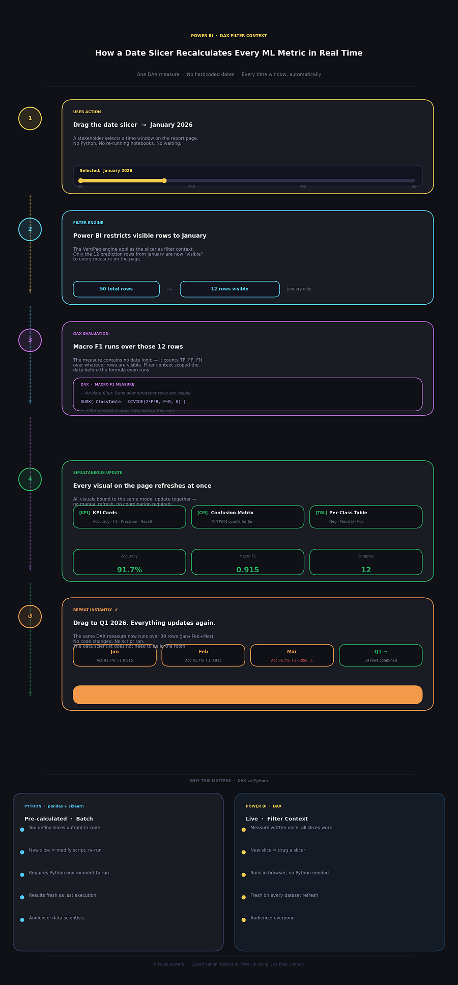
No code changed. No script ran. The data scientist does not need to be in the room.
What this looks like in practice
The sentiment dataset has timestamps across four months of 2026. The monthly breakdown tells a meaningful story:
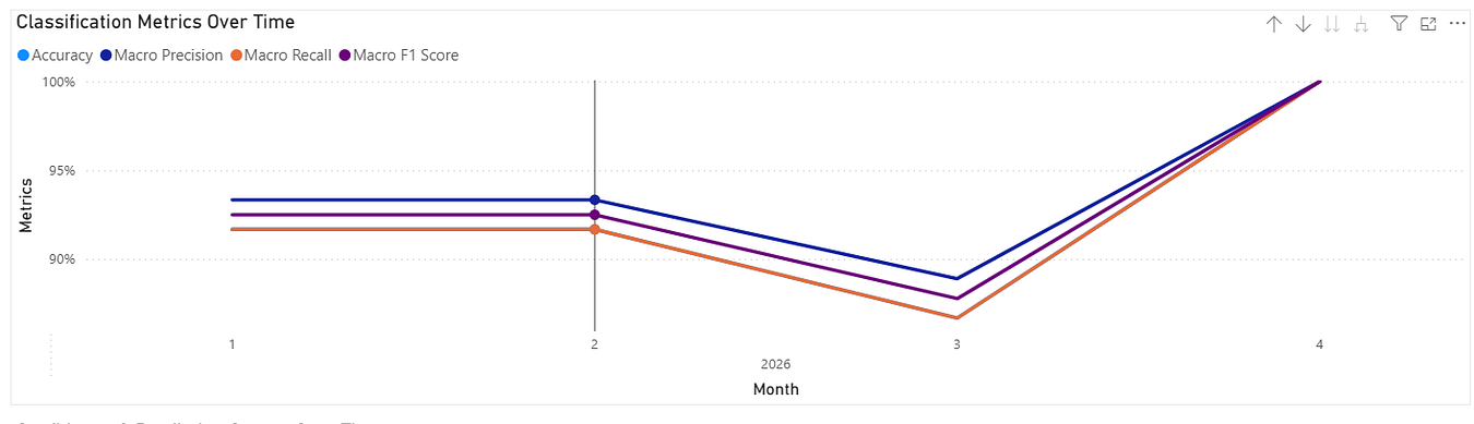
A product manager looking at this on a Monday morning does not need to ask a data scientist to compute these numbers. They drag the slicer to March, the confusion matrix updates to show exactly which classes were confused, and they have what they need to decide whether to investigate further.
Python can compute this too — but it’s pre-calculated
Python is not incapable of time-sliced metrics. The code is straightforward:
import pandas as pd
from sklearn.metrics import f1_score, accuracy_score

df = pd.read_csv('data/sentiment_test_results.csv')
df['prediction_date'] = pd.to_datetime(df['prediction_date'])
df['month'] = df['prediction_date'].dt.month
def compute_metrics(group):
    a, p = group['actual_sentiment'], group['predicted_sentiment']
    return pd.Series({
        'accuracy': accuracy_score(a, p),
        'macro_f1': f1_score(a, p, average='macro', zero_division=0),
        'n': len(group)
    })
monthly = df.groupby(['year', 'month']).apply(compute_metrics, include_groups=False)
This produces the same monthly table.
But here is the structural problem with Python’s approach: it is batch and explicit. You decide upfront which time windows matter, write code to compute them, run the script, and hand over a static table or chart. If a stakeholder wants a slice you did not anticipate — “What about just the second half of February?” or “Filter to negative-sentiment reviews only” — they need to come back to you, and you need to change code and re-run.
The DAX measures, by contrast, are dynamic and implicit. The measure recalculates over any combination of filters a user applies. Slicing by time, by class, by platform, by any column in the data — all of it works without touching the DAX code. The computation happens at render time, driven by whoever is operating the report.
Making Python interactive (and why it still falls short)
It is possible to bring DAX-style interactivity to Python. Streamlit is the most direct path:
import streamlit as st
import pandas as pd
from sklearn.metrics import f1_score, accuracy_score

df = pd.read_csv('data/sentiment_test_results.csv')
df['prediction_date'] = pd.to_datetime(df['prediction_date'])
start, end = st.date_input(
    "Date range",
    [df['prediction_date'].min().date(), df['prediction_date'].max().date()]
)
filtered = df[(df['prediction_date'] >= pd.Timestamp(start)) &
              (df['prediction_date'] <= pd.Timestamp(end))]
a, p = filtered['actual_sentiment'], filtered['predicted_sentiment']
st.metric("Macro F1",  f"{f1_score(a, p, average='macro', zero_division=0):.4f}")
st.metric("Accuracy",  f"{accuracy_score(a, p):.4f}")
Plotly Dash and Panel offer richer layouts. ipywidgets brings the same idea into a Jupyter notebook. The output can look nearly as polished as Power BI.
The catch is infrastructure. Every Python interactive dashboard requires a Python process to be running somewhere — a server, a container, a cloud VM. The moment that process stops, the dashboard goes dark. A published Power BI report runs entirely in the browser. A product manager in a different time zone checking in on a Sunday morning does not need a data engineering team to have kept a Python server alive.
That operational gap — not capability, not visual quality, but runtime dependency — is the practical reason to reach for Power BI for the monitoring layer.
The right tool at each stage
The false framing is to treat this as a competition. Python and Power BI are optimized for different phases of the ML lifecycle.
During model development, Python is irreplaceable. You are asking questions you cannot anticipate, slices change with every discovery, and the ability to inspect individual misclassified rows — not just aggregate counts — is essential. A df.loc[mask] call that surfaces the specific text the sentiment model got wrong is ten seconds of work. No BI tool matches that for debugging.
During post-deployment monitoring, Power BI’s filter context becomes the superpower. The Macro F1 measure written once — with no knowledge of time, no hardcoded date ranges, no pre-aggregated lookup tables — automatically answers “What is F1 this week?” and “What is F1 this quarter?” without any code changes. The stakeholders who need to act on those numbers do not need to know Python exists.
The workflow that follows from this is natural. Python handles training, evaluation during development, and generating the prediction log that becomes the data source. Power BI sits on top of that log and surfaces degradation to the people who decide whether to retrain.
Conclusion
Model evaluation should not stay locked in notebooks. The metrics that data scientists compute are exactly the metrics product managers, ML engineers, and operations teams need to make decisions — about retraining schedules, about rollback, about where to focus labelling effort.
The pipeline described here is modest: Export a prediction log CSV from Python, load it into Power BI, write a handful of DAX measures. The numbers match sklearn’s output to six decimal places (with one small correction to the F1 aggregation order). The confusion matrix is identical.
What Power BI adds is not the numbers themselves — Python can compute those. What it adds is that the same DAX measure works over every possible time window, every possible class filter, and every possible cross-filter combination, without modification, for any stakeholder who opens the report. That is the handoff from 1 to 99. Scientists compute the metrics; engineers — and the tools they choose — distribute them.
All code, DAX measures, and Power BI project files are available in the ml-eval-powerbi repository.
Prasad Kulkarni is on LinkedIn.
메타데이터
- post_id
- 4f9f3a2583df
- slug
- calculating-classification-metrics-in-power-bi-4f9f3a2583df
- url
- https://medium.com/data-science-at-microsoft/calculating-classification-metrics-in-power-bi-4f9f3a2583df
- canonical_url
- https://medium.com/data-science-at-microsoft/calculating-classification-metrics-in-power-bi-4f9f3a2583df
- author_url
- https://medium.com/@data4v
- status
- ok
- fetched_at
- 2026-06-15 20:49:13