Color Token Naming: What Works, What Fails & The Best Approach for Your Design System
How to structure color tokens for clarity, scalability, and cross-team adoption without falling into common pitfalls.
Color token naming: what works, what fails & the best approach for your design system
How to structure color tokens for clarity, scalability, and cross-team adoption without falling into common pitfalls.

Photo by Vadim Babenko on Unsplash
This article will explore the challenges of naming color tokens in design systems, examine common pitfalls, and provide actionable strategies to create a scalable and maintainable naming convention tailored to your team’s needs.
Key assumptions
To get the most out of this article, I assume you have an understanding of design tokens and design system structures. This article assumes you:
- ✅ Understand what design tokens are and how they function in a design system.
- ✅ Already have a defined set of global color tokens mapped to raw color values
- ✅ Are designing for scalability, meaning multi-brand theming, dark mode, vertical/business area theming, and/or platform variations are relevant concerns.
- ✅ (Optional) Work in a cross-functional team where both designers and developers rely on structured color tokens for consistency.
If any of these concepts are unfamiliar, you may want to review introductory design token resources before diving into the details.
Although spacing, typography, and component structure are crucial to user interface design, color are the most frequently used and arguably the most critical. A poorly structured naming system that doesn’t fit your team can lead to inconsistencies, scalability issues, and confusion among teams.

Photo by Omar Flores on Unsplash
Why Naming Color Tokens Is Challenging
Global color tokens provide a foundation, but the real challenge is translating them into component-level styles that are intuitive for:
- You. The design library maintainer, to craft efficiently.
- Other product designers who consume published colors to use in daily design work
- Engineers, to translate the color system to their front-end frameworks in a proper and scalable way.
Depending on your (team’s) reality, without proper consideration, teams commonly face issues like:
- Overly generic names that make it unclear where/how the color is used
color-accent-1(Is it for text? A background? Borders? A hover state?)surface-light(Is it for the body, a card, a modal, or a specific section?) Is it even relevant to know this? - Balancing Specificity and Reusability: Finding the right level of detail so tokens are specific enough for their needs but also reusable across the system.
button-primary-hover-border-disabled(Highly specific and may not be reusable elsewhere).primary-bg(Doesn’t clarify usage, could apply to multiple elements). - Balancing Verbosity and Simplicity: Avoiding names that are overengineered and too long while still being descriptive.
button-primary-background-color-light-theme(Too verbose)bg-1(Too simple. Lacks context and meaning). - Supporting Multiple Themes: Creating tokens that work seamlessly across light, dark, and custom themes without duplication.
button-light-bg,button-dark-bg,button-brand1-bg,button-brand2-bg(Too many theme-specific tokens) VSbutton-bg→ Defined at the theme level (theme.light.button-bg,theme.dark.button-bg). - Scaling with the System: Designing a naming structure that grows with the design system without becoming unwieldy. Watch out for token bloat.
- Functional redundancy, for example:
modal-overlay-bgandoverlay-background(overlapping usage). - Handling Component States: Accounting for hover, active, disabled, and other states without overcomplicating the system.
- Compatibility across teams and their technologies: Aligning designers, developers, and other stakeholders on a naming convention that adapts well to the tools they use.
Finding the Right Naming Convention for Your System
There’s no single best approach to naming color tokens. The “ideal” system is one tailored to your team’s specific design and development workflow and reality. This is crucial!
*⚠️ *Avoid blindly adopting naming methods from seminars or blog posts! Instead, take those insights with a grain of salt and adapt them to fit your team’s reality. It’s okay if your system doesn’t look like it was created by Jon Ivy. Your system should reflect your specific needs, not an idealized model. Even the largest companies use diverse approaches
Exploring the options
To help you choose the right naming convention, let’s explore the most common approaches used by design systems. I researched, listed, and examined many of the methods used by various design systems. At a high level, I can categorize color token naming methods into the following key groups. Each method serves a purpose and aligns with specific use cases, scalability needs, and implementation strategies.
1 Component-Specific Naming: Primarily bases color tokens on a combination of specific component names e.g. button and their graphical parts e.g background. In many cases this method makes use of intermediary alias tokens which provide mid level grouping between the global tokens and the component level token
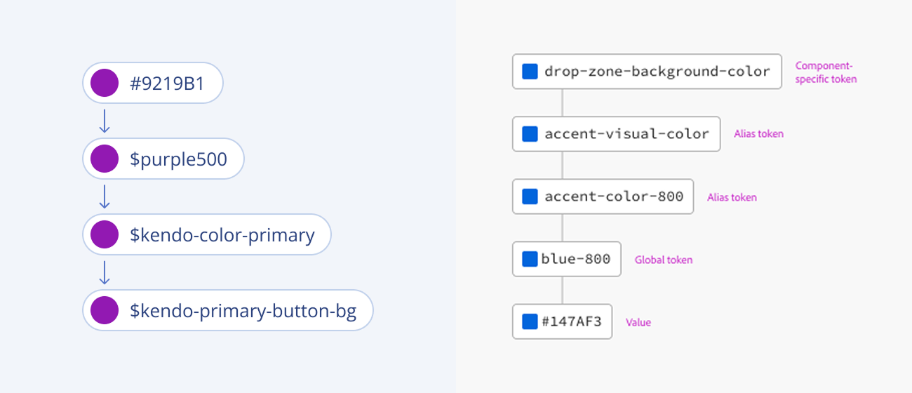
(left) Telerik — Progress DS & (right) Adobe — Spectrum DS. Each makes use of different levels of aliases in Component Specific Naming
2 Shade & Intensity-Based Naming: Categorizes color tokens by gradation of intensity, typically using numerical values or descriptive shade labels.
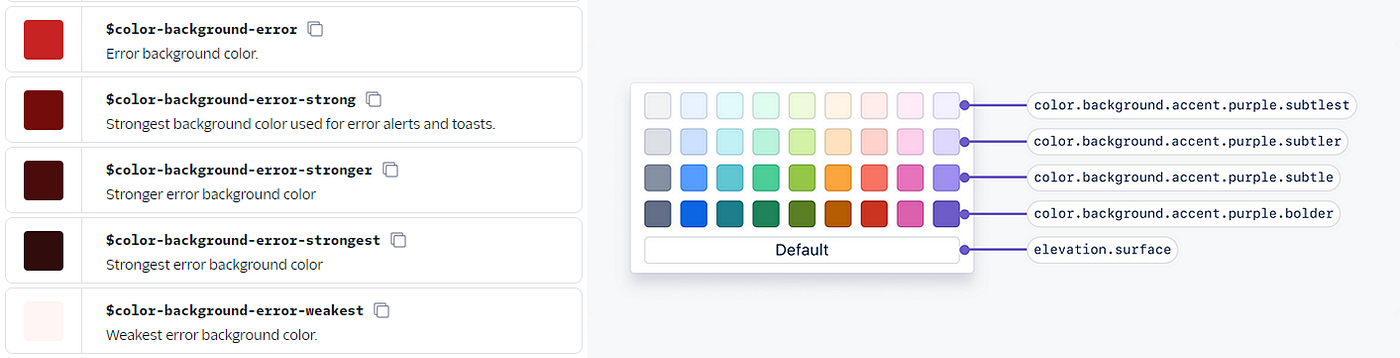
(left) Twilio — Paste DS & (right) Atlassian DS
3 Depth & Layer-Based Naming: Organizes tokens based on UI depth hierarchy, ensuring layered elements have distinct relationships.
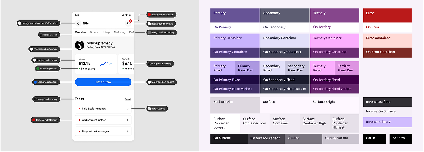
(left) eBay — Playbook DS & (right) Material design 3
4 Functional Role-Based Naming: Focuses on the function, high-level category, or role of the token (e.g., action/interaction, feedback/status, form decoration, surface) rather than the component itself.
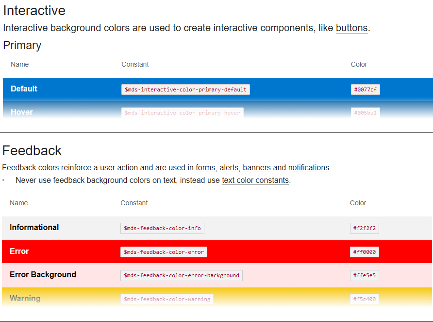
Morningstar Design System
5 Utility-Based & Global Referential Naming: Uses more generic, multi-use color tokens that work at different layers of theme abstraction rather than direct component mappings.
Below is a structured comparison of color token naming conventions, with, real-world examples, ideal use cases, pros, and cons.
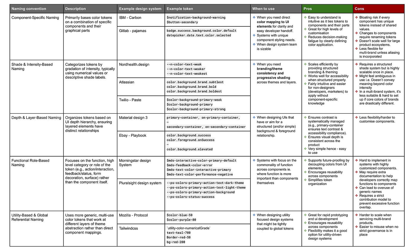
See source table document→ Comparison of Color Token Naming Conventions
Note
- While not included in the comparison, some design systems use hybrid approaches, combining multiple naming methods. Component-specific naming was often incorporated alongside other token structures for added flexibility.
- Interaction states, variants and name space are not accounted for in the comparison.
- Some of the information above is sourced from technical documentation. The design library within the design system may follow a different approach if not fully aligned.
Key Factors to Consider When Choosing a Naming Convention
Before choosing a naming convention, create a table or matrix to assess the options against the following questions.
- Design System Team Size and Maintenance — How many people will maintain and update the system and how sustainable it is for you/them over time on both design & development ends? How will new tokens be added, updated, and deprecated while maintaining consistency?
- Business Complexity & Theming — How many brands, product lines, and theme variations (light/dark/multi-brand) need support and the what is the level of visual variation between them.
- Integration, Engineering Collaboration & Tech Stack — How well does the naming system integrate with existing tools(e.g., CSS, JavaScript (frameworks), design tools)? How closely do design and engineering teams need to align? Will some third party or custom tool be needed to aid this sync?
- Flexibility vs. Consistency — How much creative freedom & flexibility do product designers need when using the tokens or overriding presets?
- Adoption & Usability — How easy is it for teams to understand, implement, and integrate the naming system?
- Cross-Team Adoption — Will other teams (marketing, brand, motion, accessibility, etc.) rely on these tokens now or in the near future?
My take
- Through my career, I have primarily used Component-Specific, Shade/Intensity-Based, and Utility-Based Naming, with a slight preference for Shade & Intensity-Based Naming.
- After establishing a theme layer, I strongly discourage product designers and engineers from directly using global tokens. Exceptions should be handled by extending the theme layer with fixed subsets of colors mapped to the global values.
- In respect to tooling/technology, I try to stay as close as possible to tools that are well established & tested, preferably already used in everyday work by the team. When introducing a new tool — especially a smaller one — I ask: If this ceases to exist, will it drastically break how-we-work?
Naming color tokens is a critical aspect of building a scalable and maintainable design system. By understanding the challenges, exploring different naming conventions, and considering your team’s specific needs, you can create a system that ensures consistency, flexibility, and ease of use. I’m enjoying the fast evolution of design technology and like you, learning and refining along the way. If you have any thoughts or questions, feel free to share them
Some useful resources:
- Tokens in Design Systems by Nathan Curtis
- Creating a flexible design token taxonomy for Intuit’s Design System by Nate Baldwin
- How to define color usage through semantic sets for DS by Katie Cooper
- Mastering Design Tokens by Bettina D’ávila
메타데이터
- post_id
- 50f844d25f01
- slug
- color-token-naming-what-works-what-fails-the-best-approach-for-your-design-system-50f844d25f01
- url
- https://www.designsystemscollective.com/color-token-naming-what-works-what-fails-the-best-approach-for-your-design-system-50f844d25f01
- canonical_url
- https://www.designsystemscollective.com/color-token-naming-what-works-what-fails-the-best-approach-for-your-design-system-50f844d25f01
- author_url
- https://medium.com/@Ojanti
- status
- ok
- fetched_at
- 2026-07-17 15:34:10