Not Another Social App: What My First 24-Hour Hackathon Taught Me About Design
Team: Me & Teammate from Hong Kong My Role: UX Research & Design Duration: 24 hours (more like 12 hours…we had to get some sleep)
Not Another Social App: What My First 24-Hour Hackathon Taught Me About Design
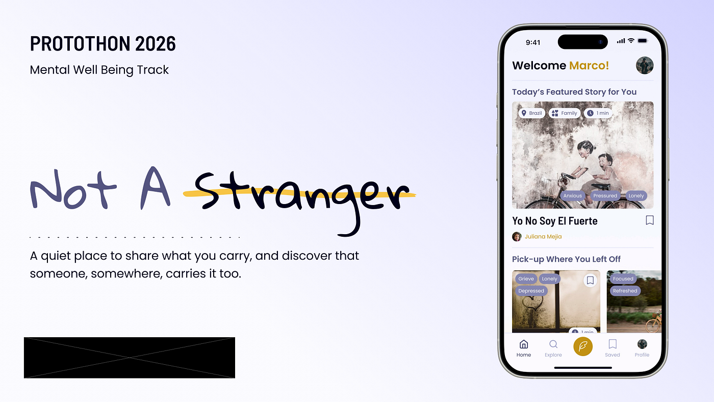
Team: Me & Teammate from Hong Kong My Role: UX Research & Design Duration: 24 hours (more like 12 hours…we had to get some sleep)
Ten hours into my first 24-hour hackathon, my teammate had already built most of the UI while I was still debating the user journey.
That was the moment I realized something uncomfortable: I overthink design.
The hackathon, hosted by Dubstech, offered multiple challenge categories, including mental wellbeing, travel, enterprise, and classic product design. My team chose the Mental Wellbeing Track.
My team initially started with four people, but eventually became a two-person collaboration between me and another designer from Hong Kong who had previous 24-hour hackathon experience.
Feedback from the judges
When the judging results came back, the feedback confirmed many of the concerns I’d been wrestling with throughout the hackathon.
User Journey: Needs Improvement UI Design: Needs A Lot Of Improvement Solves Problem Statement: Needs A Lot Of Improvement Presentation: Excellent
What worked
- Strong overall presentation and storytelling; the How might we, problem statement, and pain points are clearly defined.
- UI feels clean and polished.
What to improve
- Don’t lead with onboarding before showing value — let users explore the product first, then ask them to commit.
- Make anonymity a per-post choice with a clear default, and allow users to switch easily (without making it hard to change later).
- The “Create story” flow currently feels like a multiple-choice form; make it feel more natural by enabling direct typing and/or voice recording on the main screen.
My Initial Concerns
As someone who is very big on mental well being, I knew (while designing) that I wouldn’t use the app we designed. This was what caused me to overthink because I kept arguing with myself about the user journey.
While my teammate led most of the visual design execution, I found myself focused on product strategy, user flows, research, and defining the experience itself.
We planned to just go with a basic design and iterate later, based on my findings/research, but it was hard to do that with barely a few hours left to submission (and we also had to create presentation slides).
My Teammate from Hong Kong
While my teammate moved incredibly fast: creating typography systems, colors, and layouts within an hour, I was still deep in research mode, exploring references, thinking through flows, and mentally iterating through multiple versions before even touching the design. It made me realize how differently designers approach problem-solving under pressure.
Our challenge was designing a global storytelling app focused on empathy and human connection. Very early on, we had to make an important product decision: what actually mattered for the MVP?
After repeatedly returning to the brief, we realized the core experience boiled down to two things:
- sharing stories
- reading stories
Everything else was secondary.
That decision became one of the biggest lessons of the hackathon for me.
In product design, especially under tight constraints, clarity matters more than feature quantity.
Our Process
1–2 hours
During the first few hours, we immersed ourselves in products like Medium, Spotify, Slowly, Wattpad, and Tumblr. We weren’t trying to reinvent storytelling. We were trying to understand what made people feel comfortable enough to share vulnerable experiences online.
I found myself thinking deeply about discovery systems, onboarding friction, emotional pacing, and how vulnerable storytelling should feel inside an app.
This led us to come up with the first features in our mind (as you can see, it’s way too much; we eventually focused on the bolded features:
- Onboarding
- Story Creation / Sharing
- Story Discovery / Home Feed
- Story Reading Experience
- Post Share Affirmation/Impact Screen
- Profile (Simple MVP)
- Global Connection Features (Light MVP)

User Flow
2–4 hours
I tried to create a wireframe for the onboarding, as I felt it was a crucial part of the user experience and journey. my team mate decided to start up on the design system (colors, typography, etc). We also had a little mood board we created…

Branding

Moodboard
4–8 hours
I was done with a lo-fi version of onboarding and started working on the home screen. My teammate decided to take a break and sleep for a few hours.

User flow
8–10 hours
My team mate came back and decided to work on the main flows (sharing stories and reading stories). We decided that I’d iterate on designs when she was done.

10–12 hours
We spent the last 2–3 hours working on Figma slides, that was a core part of the submission. Unfortunately, I didn’t have time to iterate on the designs.


What I learned
The experience exposed a personal weakness I’ve struggled with in design: overthinking layouts and possibilities before committing to direction.
I realized that sometimes momentum matters more than perfection, especially in hackathon environments.
Another major lesson was that: good product design is not about cramming in as many features as possible. It’s about getting the core experience right. Even one thoughtful feature executed well is more valuable than an ambitious but confusing user journey.
By the end of the hackathon, I walked away with more than just a prototype. I left with a clearer understanding of:
- how I work under pressure
- where my strengths naturally lean
- how important prioritization is in product design
- and how essential it is to balance thinking with execution
At the same time, I learned the importance of being proactive, not just working together, but understanding each other’s strengths early. Unfortunately, I didn’t have enough time to feed my teammate with my all my research, UX thinking, and wireframes, but she was also more experienced in UI, so I let her have control of Design Systems and hi-fi screens.
Looking back, the prototype wasn’t the biggest outcome of the hackathon.
The bigger outcome was learning how I behave when time becomes a constraint.
I discovered that my instinct is to explore every possibility before committing to a direction. In a real product environment, that can be valuable. In a hackathon, it can become a bottleneck.
The challenge now isn’t learning how to think better. It’s learning when to stop thinking and start building.
And that’s a lesson I’ll be taking into my next hackathon.
메타데이터
- post_id
- 52bbe2ca14ed
- slug
- not-another-social-app-what-my-first-24-hour-hackathon-taught-me-about-design-52bbe2ca14ed
- url
- https://medium.com/@pixellensdesign/not-another-social-app-what-my-first-24-hour-hackathon-taught-me-about-design-52bbe2ca14ed
- canonical_url
- https://medium.com/@pixellensdesign/not-another-social-app-what-my-first-24-hour-hackathon-taught-me-about-design-52bbe2ca14ed
- author_url
- https://medium.com/@pixellensdesign
- status
- ok
- fetched_at
- 2026-06-09 15:37:30