The UX Decisions Hiding in Your Code
A user opens your signup form. Name, email, password. Nothing complicated. Twelve seconds later they close the tab and never come back.
The UX Decisions Hiding in Your Code

A user opens your signup form. Name, email, password. Nothing complicated. Twelve seconds later they close the tab and never come back.
You didn’t lose them to a competitor’s better product. You lost them to a text input that didn’t tell them why their password got rejected.
Link for free (non-member) readers
This happens millions of times a day, on forms and buttons and menus that engineers spent real time building. The code works. Nothing throws an error. And still, people leave. That gap, between “the code works” and “the person could use it,” is what UX actually is. This article walks through why that gap costs more than most teams think, using real cases and code you can run.
Every code block below has a working twin at the bottom of this article, go break it.
The fork: two signup forms
Here’s a form that looks like a hundred forms in production right now.
<form id="signup-form">
  <input id="email" type="text" placeholder="Email" />
  <input id="password" type="password" placeholder="Password" />
  <button type="submit">Sign up</button>
  <p id="error"></p>
</form>
<script>
document.getElementById('signup-form').addEventListener('submit', async (e) => {
  e.preventDefault();
  const email = document.getElementById('email').value;
  const password = document.getElementById('password').value;
  const res = await fetch('/api/signup', {
    method: 'POST',
    body: JSON.stringify({ email, password }),
  });
  if (!res.ok) {
    document.getElementById('error').textContent = 'Invalid input';
  }
});
</script>
Nothing here is broken. It’s also nearly unusable under real conditions. If the password fails a hidden rule (needs a number, needs 8 characters, whatever the backend decided), the user sees “Invalid input” and has to guess which field, and why. There’s no loading state, so a slow network makes it look like the button did nothing, and a fair number of people will click it two or three more times. There’s no client-side validation, so every mistake costs a full round trip to the server.
Now the same form, rebuilt around what the user actually experiences:
<form id="signup-form" novalidate>
  <label>
    Email
    <input id="email" type="text" />
    <span id="email-error" role="alert"></span>
  </label>
  <label>
    Password
    <input id="password" type="password" />
    <span id="password-error" role="alert"></span>
  </label>
  <button type="submit" id="submit-btn">Sign up</button>
  <p id="form-error" role="alert"></p>
</form>
<script>
const form = document.getElementById('signup-form');
const submitBtn = document.getElementById('submit-btn');
function validate(email, password) {
const errors = {};
if (!/\S+@\S+\.\S+/.test(email)) errors.email = 'Enter a valid email address.';
if (password.length < 8) errors.password = 'Password needs at least 8 characters.';
return errors;
}
function clearErrors() {
document.getElementById('email-error').textContent = '';
document.getElementById('password-error').textContent = '';
document.getElementById('form-error').textContent = '';
}
form.addEventListener('submit', async (e) => {
e.preventDefault();
clearErrors();
const email = document.getElementById('email').value;
const password = document.getElementById('password').value;
const errors = validate(email, password);
if (errors.email) document.getElementById('email-error').textContent = errors.email;
if (errors.password) document.getElementById('password-error').textContent = errors.password;
if (Object.keys(errors).length > 0) return;
submitBtn.disabled = true;
submitBtn.textContent = 'Creating account...';
try {
const res = await fetch('/api/signup', {
method: 'POST',
body: JSON.stringify({ email, password }),
});
if (!res.ok) {
const body = await res.json();
document.getElementById('form-error').textContent =
body.message || 'Something went wrong. Try again.';
}
} finally {
submitBtn.disabled = false;
submitBtn.textContent = 'Sign up';
}
});
</script>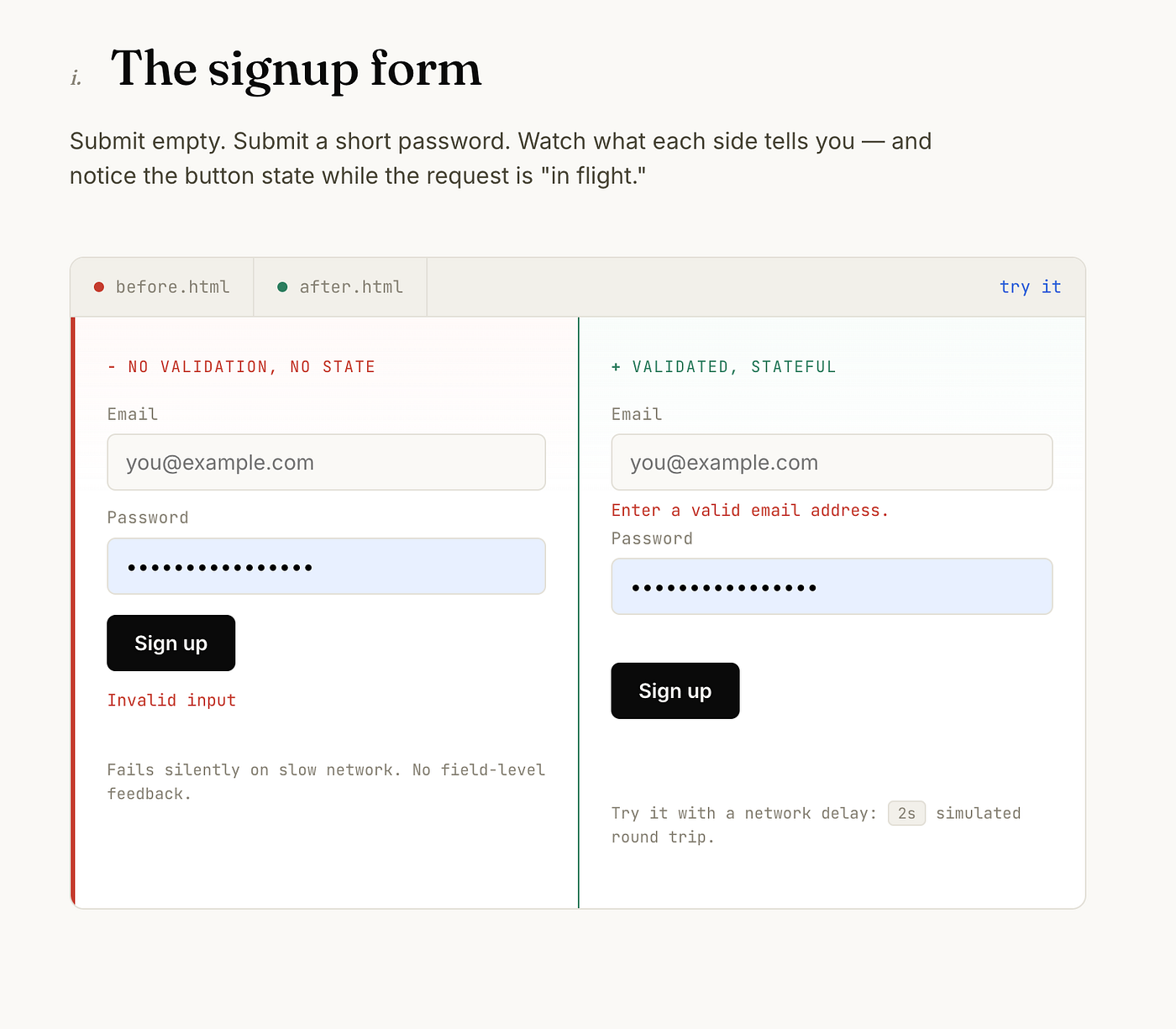
Sign up form both panes together
Same fields, same backend, roughly the same amount of code. The difference is that every failure state tells the user something specific, the button can’t be double-clicked while a request is in flight, and mistakes get caught before they cost a network round trip. This is the whole article in miniature: UX isn’t a coat of paint over a form. It’s a set of decisions about what happens when things go wrong, and most of the time, things go wrong.
Four things UX spends or saves
Every UX decision moves one of four things: time, trust, mental effort, or money. Worth looking at each with a real case instead of a general claim.
Time
Amazon patented 1-Click ordering in 1999: a returning customer buys something using stored payment and shipping details with a single click instead of the multi-page checkout that was standard at the time. It got contested for exactly this reason. It covered something that felt obvious once it existed but wasn’t standard practice before Amazon built it. Amazon sued Barnes & Noble over a similar feature in 1999, and Apple licensed the method for its own storefronts starting in 2000. The patent expired in 2017, and one-click checkout spread across the industry almost immediately after.
The lesson isn’t “add a button.” It’s that removing steps between intent and completion was worth litigating over for two decades. Every unnecessary field, click, or page load in a flow is time a user spends instead of getting what they came for, and there’s a limit to how much of that time they’ll spend before they leave.
Trust
Trust breaks in a specific, repeatable way: a design that gets someone to do something they didn’t mean to do. A checkbox pre-selected to opt into marketing email. A cancellation flow that takes eleven clicks when signup took one. A countdown timer on a discount that resets when you refresh the page. Each of these works, in the narrow sense that it produces the metric someone wanted.
Each one also teaches the user that the interface isn’t on their side, and that lesson generalizes. Once someone suspects a product is designed to work against them, they start reading every button with suspicion. That suspicion doesn’t stay contained to the one feature that earned it.
Cognitive load
This one has a name in psychology: Hick’s Law, the finding that decision time increases with the number and complexity of choices available. You can feel this directly. Compare a plain HTML select with fifty unsorted options:
<select>
  <option>Afghanistan</option>
  <option>Albania</option>
  <option>Algeria</option>
  <!-- ...47 more, alphabetical, no search -->
</select>
against a searchable version:
<div>
  <input id="country-search" placeholder="Search countries..." />
  <ul id="country-list" role="listbox"></ul>
</div>

<script>
const countries = ['Afghanistan', 'Albania', 'Algeria' /* ...47 more */];
const searchInput = document.getElementById('country-search');
const listEl = document.getElementById('country-list');
function renderList(query) {
  const filtered = countries.filter((c) =>
    c.toLowerCase().includes(query.toLowerCase())
  );
  listEl.innerHTML = filtered
    .map((c) => `<li role="option">${c}</li>`)
    .join('');
}
searchInput.addEventListener('input', (e) => renderList(e.target.value));
renderList('');
listEl.addEventListener('click', (e) => {
  if (e.target.matches('li')) {
    console.log('selected:', e.target.textContent);
  }
});
</script>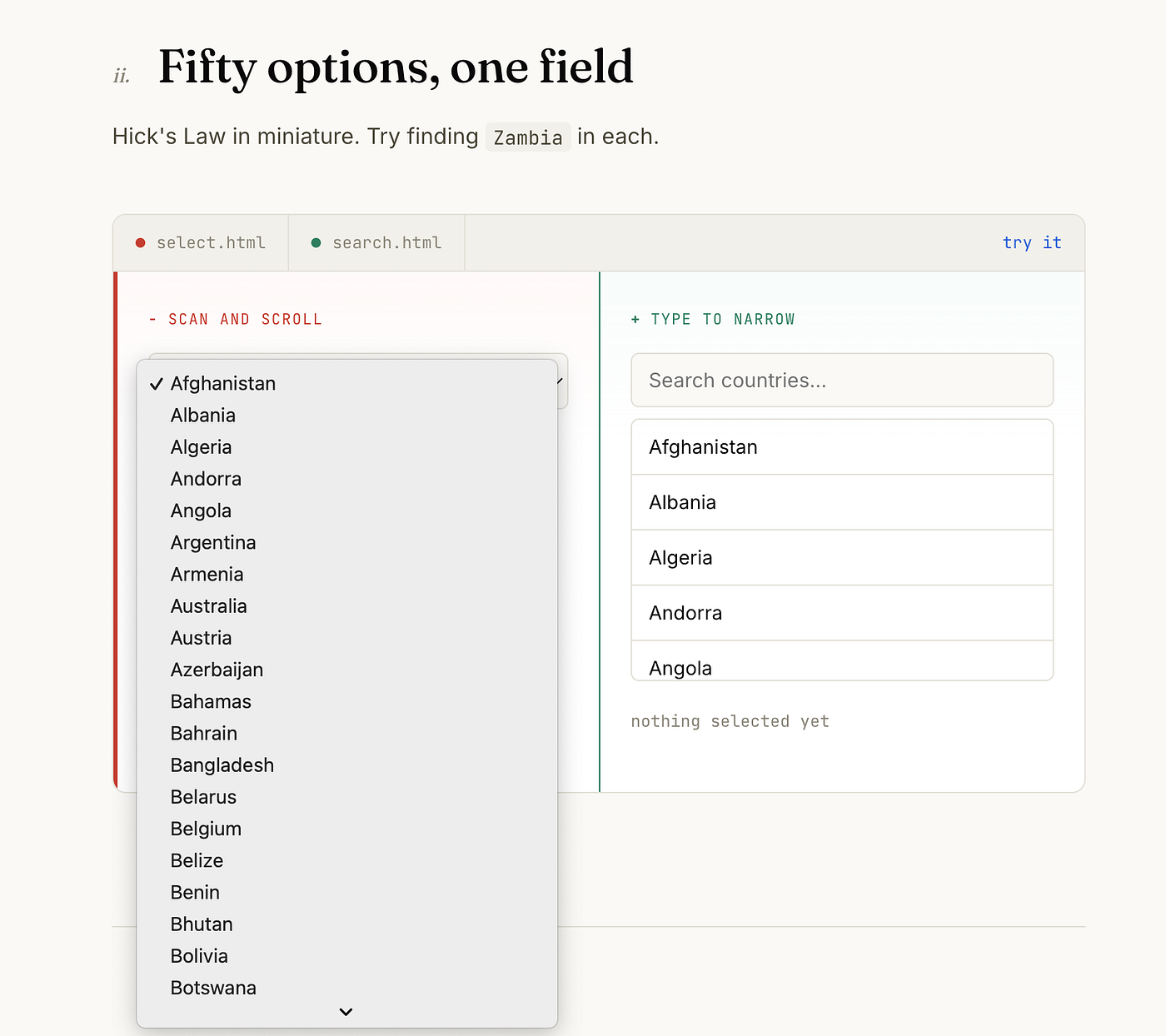
Country select: Fifty options, one field
The plain select forces a user to scan, maybe scroll, and hold their target in mind while they look for it. The searchable version turns “find my country in a list” into “type three letters,” a much smaller task for a brain to do. Same data, same outcome, different amount of effort spent getting there. Multiply that gap by every dropdown, every settings page, every navigation menu in a product, and the aggregate cost of a “fine” interface versus a good one adds up fast, even though no single instance looks dramatic on its own.
Money
The clearest version of this is cart abandonment, which is the time, trust, and cognitive-load costs above, converted into a number a business tracks directly. A checkout with fewer steps and fewer surprises converts more of the people who reach it. There’s no separate trick to it. This is why checkout flows get disproportionate design attention relative to their size: they’re the exact point where every prior UX decision either pays off or doesn’t.
The technical layer
UX principles aren’t just visual choices. They’re implementation choices, and the difference often shows up in code that has nothing to do with color or layout.
Loading states.
A spinner tells the user “wait.” A skeleton screen tells the user “this is roughly what’s coming.”
<div id="article-container">
  <div class="skeleton-line" style="width: 60%"></div>
  <div class="skeleton-line" style="width: 100%"></div>
  <div class="skeleton-line" style="width: 90%"></div>
</div>

<script>
async function loadArticle(id) {
  const container = document.getElementById('article-container');
  const data = await fetchArticle(id);
  container.innerHTML = `<article>${data.body}</article>`;
}
loadArticle(currentArticleId);
</script>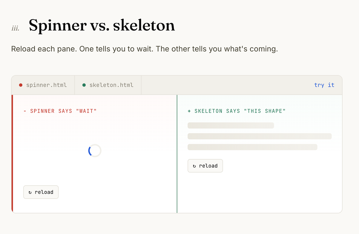
Spinner vs. skeleton
The skeleton matches the shape of the real content, so the layout doesn’t jump once data arrives, and the wait feels shorter because the user already has a sense of what they’re waiting for.
Debounced input.
A search box that fires a network request on every keystroke wastes bandwidth and usually shows a flickering, half-typed result to the user. Debouncing waits for a pause:
<input id="search-box" placeholder="Search..." />

<script>
function debounce(fn, delayMs) {
  let timeoutId;
  return (...args) => {
    clearTimeout(timeoutId);
    timeoutId = setTimeout(() => fn(...args), delayMs);
  };
}
const debouncedSearch = debounce((query) => {
  if (query) searchApi(query);
}, 300);
document.getElementById('search-box').addEventListener('input', (e) => {
  debouncedSearch(e.target.value);
});
</script>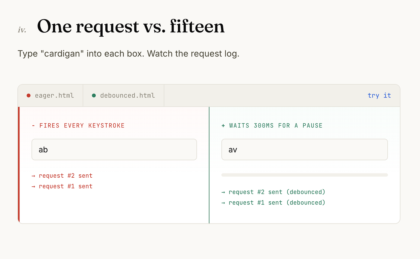
Debounce log
This is a performance optimization and a UX decision at once. The user doesn’t see a laggy, flickering result list, and the server doesn’t get hit fifteen times for a five-letter word.
Optimistic updates.
When a user clicks “like,” the correct experience is that the heart fills in immediately, not after the server confirms it:
<button id="like-btn" data-liked="false">♡</button>

<script>
const likeBtn = document.getElementById('like-btn');
likeBtn.addEventListener('click', async () => {
  const wasLiked = likeBtn.dataset.liked === 'true';
  likeBtn.dataset.liked = 'true';
  likeBtn.textContent = '♥';
  try {
    await likePost(currentPostId);
  } catch {
    likeBtn.dataset.liked = String(wasLiked);
    likeBtn.textContent = wasLiked ? '♥' : '♡';
    showToast('Could not save your like. Try again.');
  }
});
</script>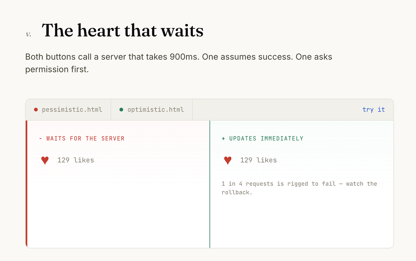
Optimistic like: ideally mid-rollback (catch the toast showing)
The interface assumes success because success is the overwhelmingly common case and only rolls back when it’s wrong. This single pattern is why some apps feel instant and others feel like they’re checking with a server before every action, because one of them is, and the other isn’t.
Three bugs that were actually UX bugs
The double submit.
Charge counter at 3+
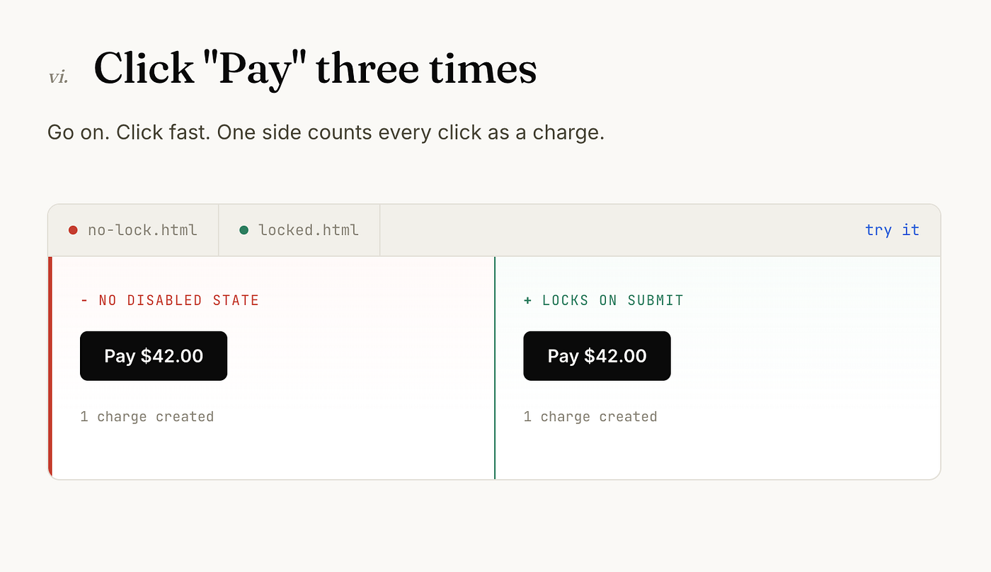
A payment form without a disabled state during submission lets an impatient user click “Pay” three times, which can create three charges if the backend doesn’t deduplicate. The fix is the submitBtn.disabled = true pattern from the earlier form example, not a backend patch, though a backend safeguard is still worth having.
The silent failure.
A file upload that fails when the file is too large, but shows nothing because the error toast library was never wired into that code path. The user assumes the upload worked and moves on, then finds out days later that it didn’t. The fix isn’t more error-handling code, it’s making sure every failure path actually reaches the user, which usually means an audit rather than a new feature.
The infinite skeleton.
Infinite skeleton vs. handled failure
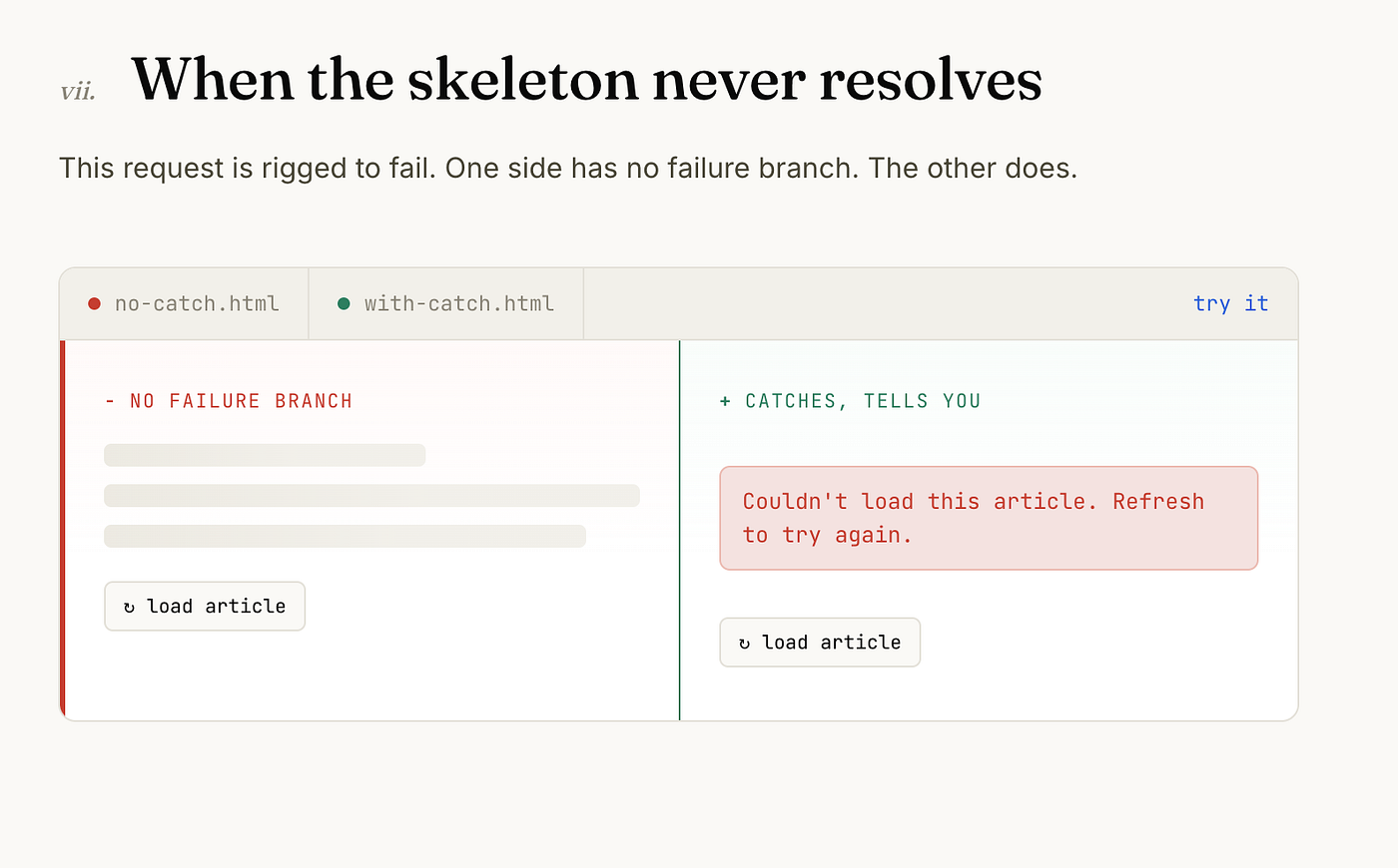
A skeleton loader with no timeout or error state, so a failed API call leaves the user staring at gray boxes forever instead of a message. This is the mirror image of the first example in this article: a good pattern applied without the failure branch that makes it actually good.
<div id="article-container">
  <div class="skeleton-line" style="width: 60%"></div>
  <div class="skeleton-line" style="width: 100%"></div>
  <div class="skeleton-line" style="width: 90%"></div>
</div>

<script>
async function loadArticle(id) {
  const container = document.getElementById('article-container');
  try {
    const data = await fetchArticle(id);
    container.innerHTML = `<article>${data.body}</article>`;
  } catch {
    container.innerHTML =
      '<p role="alert">Couldn\'t load this article. Refresh to try again.</p>';
  }
}
loadArticle(currentArticleId);
</script>
Back to the form
Go back to the signup form at the start of this article. The rebuilt version isn’t cleverer, it’s just accountable for the same failures the first version ignored. Wrong input, slow network, a request that fails partway through. None of that is a design layer sitting on top of engineering. It’s a set of branches in the same code, and whether those branches exist is what separates a form that works from a form people can actually use.
Try it yourself Every example above, live. Click around, break things, watch what happens.
[embed]
Did you learn something good today as a UX designer? Then show some love. © Usman Writes WordPress Developer | Website Strategist | SEO Specialist Don’t forget to subscribe to **Developer’s Journey** to show your support.

메타데이터
- post_id
- 52facc8cdb8b
- slug
- the-ux-decisions-hiding-in-your-code-52facc8cdb8b
- url
- https://uxplanet.org/the-ux-decisions-hiding-in-your-code-52facc8cdb8b
- canonical_url
- https://uxplanet.org/the-ux-decisions-hiding-in-your-code-52facc8cdb8b
- author_url
- https://medium.com/@pixicstudio
- status
- ok
- fetched_at
- 2026-07-17 19:24:55