Visualizing Data on AI and Climate — DataViz Weekly
See data visualization do real work — four standout projects on AI and climate in the latest DataViz Weekly.
Visualizing Data on AI and Climate — DataViz Weekly

Over the course of a week, we look through a wide range of data visualization projects. On Friday, the four that stood out most to us make it into DataViz Weekly, to inspire your own work or for your pure entertainment if you like.
See what made the cut this time and join us in taking a closer look at them right away:
- AI content across creative fields — The Economist
- AI copyright lawsuits — Information Is Beautiful
- Climate data and visualizations after Climate.gov — Climate.us
- Extreme heat across Europe — The New York Times

AI Content Across Creative Fields
Generative AI tools now let almost anyone produce text, code, images, and music from a simple prompt. The volume of this kind of content appearing online has grown quickly over the past few years.
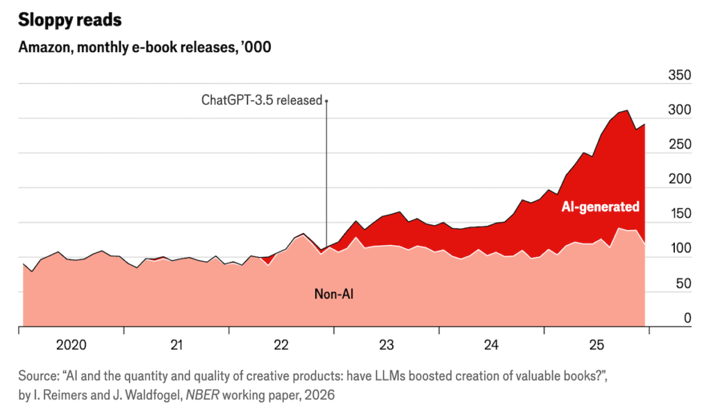
The Economist tracked how artificial intelligence is changing five creative fields, each through its own chart. Shown above is the first, a stacked area chart of monthly e-book releases on Amazon. The total splits into two bands, non-AI titles below and AI-generated ones above, with an annotation marking the release of ChatGPT-3.5 in late 2022. Before that point, the total holds near 100,000 books a month and is almost entirely non-AI. After it, the AI-generated band swells and pushes the total to roughly 300,000 by the end of 2025, accounting for nearly all of the rise.
The other four fields follow the same approach. Column charts track self-filed civil lawsuits in the United States, academic preprints on arXiv, and new app releases on Apple’s App Store. A line chart compares AI-generated and human music uploaded to Deezer. In each, the rise steepens around the arrival of widely available AI tools.
👉 See the piece in The Economist.
AI Copyright Lawsuits
The boom in AI-generated content rests on models trained on huge volumes of existing text, images, and music. Many of the people and companies behind that material object to how it was used. More than 100 copyright lawsuits have now been filed against AI companies over how their models were trained.
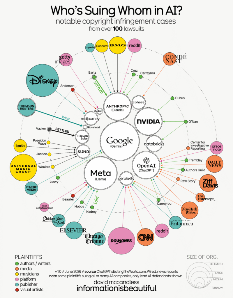
David McCandless represented a selection of these cases as a radial network diagram. Each major AI company sits as a large circle near the center, among them OpenAI, Google, Meta, Anthropic, and Nvidia, alongside smaller image and music generators. The plaintiffs ring the outside. Each appears as a circle scaled to the organization’s size and colored by type, with separate colors for authors, media outlets, musicians, platforms, publishers, and visual artists.
An arrow runs from each plaintiff to the AI company it is suing. A few arrows carry a label marking the outcome where a case has been resolved, such as settled, won, or lost.
The same page sits within a wider look at generative AI, starting with a bubble chart that plots major large language models by capability score over time, with each bubble sized by the number of training parameters.
👉 Look at the graphics on Information Is Beautiful.
Climate Data and Visualizations After Climate.gov
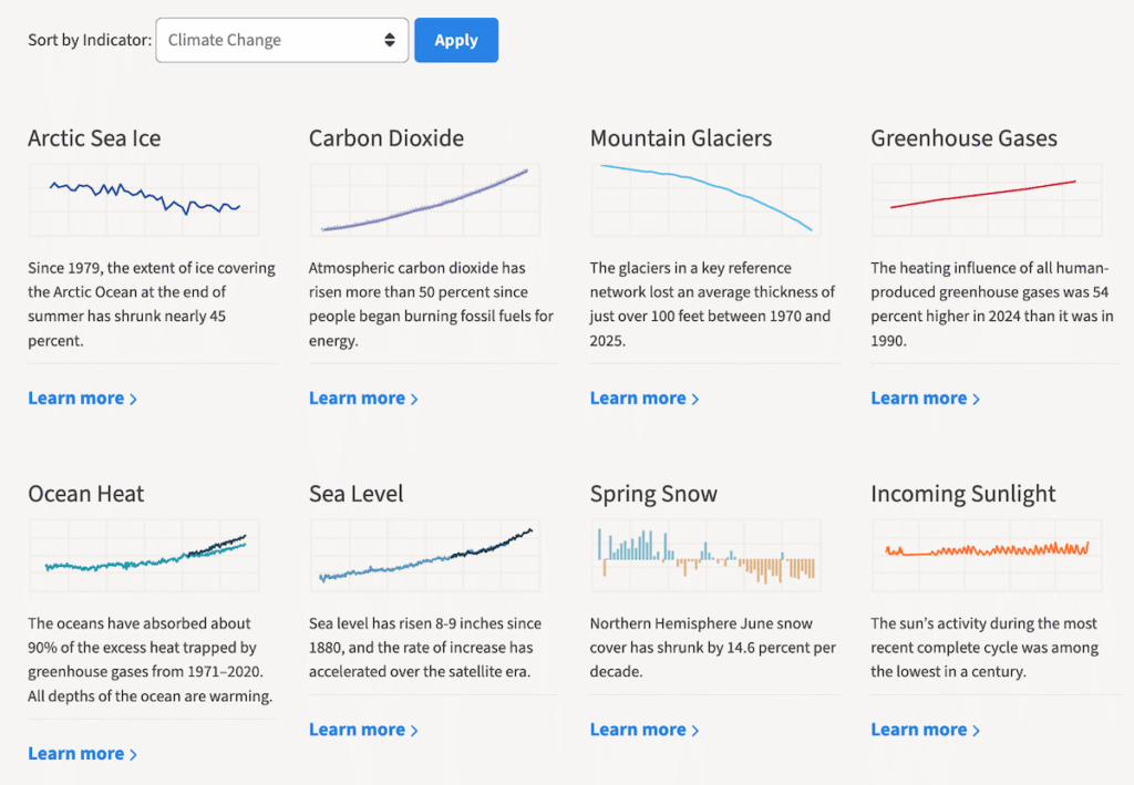
For years, Climate.gov was a leading public source of climate information in the United States, widely used by educators, journalists, and local decision-makers. In 2025, the small NOAA team that ran it was laid off and the site was taken offline, with its address redirected to another government page.
The same team rebuilt the work independently as Climate.us, a nonprofit platform, recreating the dashboard, story archive, expert blogs, maps, and data pathways the federal version held.
Pictured above is its Global Climate Dashboard, which greets visitors on the home page with a compact overview of key indicators including Arctic sea ice, carbon dioxide, mountain glaciers, and greenhouse gases. Each indicator sits in its own card pairing a small chart with a short plain-language summary. Most are line charts tracking the long-term trend. Spring snow cover and surface temperature use column charts marking year-by-year departures above and below a baseline. Selecting any indicator opens its full interactive version to explore the data in depth.
The dashboard is only the entry point, with more visual indicator reports, maps, and explainers across the rest of the site.
👉 Explore the Climate.us website.
Extreme Heat Across Europe
Recent summers have set temperature records across much of the world. Europe in particular has once again been gripped by extreme heat, with dangerous conditions across large parts of the continent.
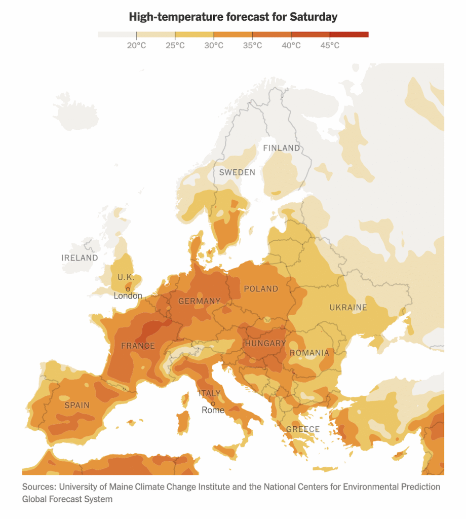
The New York Times captures the scale of the heat across the European continent at a glance in its dedicated tracker. The view updates continuously. At the time of writing, it shows the forecast for Saturday, June 27, with the strongest heat concentrated over central and western Europe.
Two maps sit one after the other, both shaded as continuous color gradients. The first shows how far the forecast temperature runs above or below the local average. The second shows the absolute forecast highs.
👉 Check out the tracker on The New York Times, by Lazaro Gamio, Zach Levitt, and Erin McCann.
That’s all for this edition. More great data visualization examples from around the web land here next Friday, in DataViz Weekly. Stay tuned:
👉 DataViz Weekly on AnyChart Blog 👉 DataViz Weekly on Medium
Originally published at https://www.anychart.com on June 26, 2026.
메타데이터
- post_id
- 542d243c6db9
- slug
- visualizing-data-ai-climate-542d243c6db9
- url
- https://medium.com/data-visualization-weekly/visualizing-data-ai-climate-542d243c6db9
- canonical_url
- https://medium.com/data-visualization-weekly/visualizing-data-ai-climate-542d243c6db9
- author_url
- https://medium.com/@anychart
- status
- ok
- fetched_at
- 2026-07-09 10:29:04