Volvo XC60 Dashboard UX Is A Designer’s Case Study
Most UX designers spend their careers working on apps, SaaS products, or websites. The problems feel familiar navigation depth, onboarding…
Volvo XC60 Dashboard UX Is A Designer’s Case Study
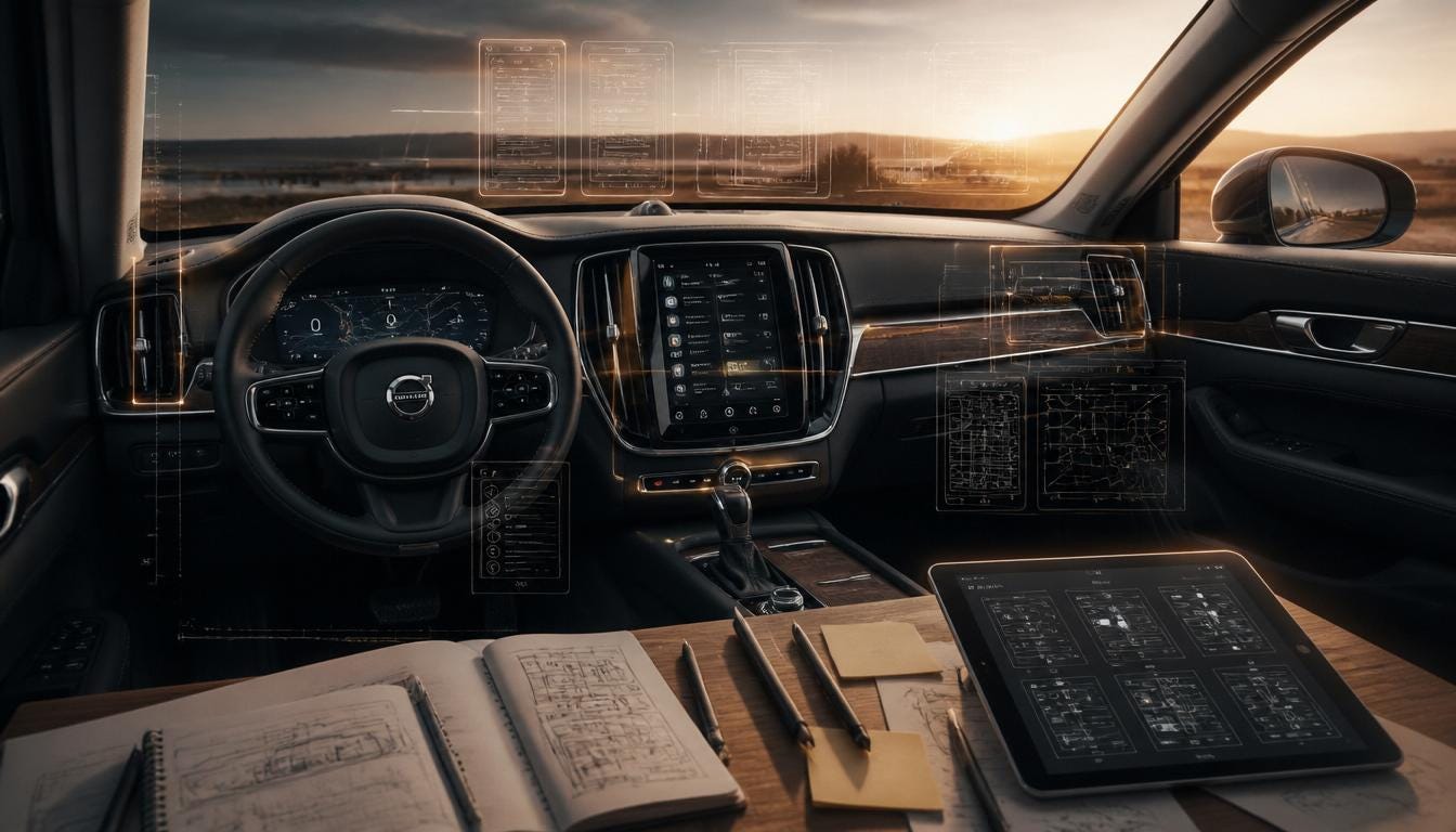
Most UX designers spend their careers working on apps, SaaS products, or websites. The problems feel familiar navigation depth, onboarding flows, empty states. Then someone asks them to look at a car dashboard and suddenly the rulebook shifts. The screen is smaller than expected. The user is moving at 100 kilo meters per hour. Every extra tap is borrowed from something more important.
The Volvo XC60 dashboard is worth studying not because it is perfect, but because it makes design decisions visible in ways that most screens never have to. The constraints are unforgiving, the tradeoffs are honest, and if a designer spends time pulling it apart, they will find patterns that show up in their own work in completely different contexts.
What Kind of Design Problem Is a Car Dashboard, Really?
Before getting into the XC60 specifically, it helps to frame what type of UX problem a car dashboard actually is because it is not the same category as a mobile app, even though it involves a touchscreen.
Most interfaces are designed for a primary task context. Someone opens a banking app to check their balance. That is the task. The interface supports it. Car dashboards are different because the interface is never the primary task. Driving is. The dashboard exists entirely in the margins of someone’s attention, and every interaction with it is an interruption of something more important.
That constraint changes how designers should evaluate every decision. The question is not “is this easy to use?” It is “is this fast enough to use without costing the driver something?” Those are different questions, and they lead to different design choices.
The National Highway Traffic Safety Administration data on glance duration puts a hard number on the two seconds of eyes-off-road at highway speed that covers roughly the length of a football field. That is the ceiling a designer is working under. Not user satisfaction scores neither session length its two seconds.
The Information Architecture Decision Volvo Got Right
The first thing a designer should notice about the Volvo XC60 dashboard is the physical separation of screens. The instrument cluster ahead of the driver handles safety-critical information speed, navigation prompts, and active warnings. The 9-inch Sensus touchscreen in the center console handles everything else.
This is not just an ergonomic choice. It is an information architecture decision. Volvo made a call about what belongs in primary attention and what belongs in secondary attention, and then built the physical layout around that call. The result is that a driver can run their eyes across the instrument cluster in under a second and get the information that cannot wait, without touching anything else.
From a design perspective, the interesting question is why more interfaces do not do this. Most apps try to put everything in one place: a single dashboard, a single nav structure, one screen that handles all contexts. The XC60 shows what happens when a designer commits to separating concerns physically, not just visually.
The Sensus home screen continues this logic. Four tiles: Navigation, Media, Phone, and one user-defined option. A designer looking at this should immediately recognize the cognitive load principle at work. Working memory handles roughly three to five items before performance degrades. Four tiles means the entire home screen is processable in a single glance. There is no scanning, no hunting. The eye lands and the decision is already made.
Where Norman’s Framework Actually Shows Up in the Interface
Don Norman’s The Design of Everyday Things is required reading for most design programs, but it can feel abstract until something like the XC60 makes it concrete.
The portrait orientation of the Sensus touchscreen is an affordance decision. Most automotive displays go landscape wide, horizontal, following the natural shape of a dashboard fascia. Volvo went portrait, and the reason matters. Portrait orientation maps to smartphone behavior that drivers have spent years internalizing. The screen shape itself communicates interaction patterns before a single pixel loads. A designer would call this borrowing from an established mental model rather than building a new one. In interface terms, that is almost always the right call.
The physical volume knob and track-skip buttons at the base of the Sensus screen are a mapping decision. Mapping, in Norman’s framework, means the relationship between a control and its effect should be spatially and logically obvious. Those physical controls sit where a hand naturally falls when reaching toward the center console. The knob turns in the direction that feels right. There is no gap between the action and its result. Compare that to any interface that puts volume control inside a media sub-menu and the difference in cognitive cost is immediate.
What is also worth noting, from a critical standpoint, is where the Norman framework breaks down in the XC60. Earlier versions of the Sensus software buried display brightness and audio equalization settings several taps deep, inside sub-menus that did not follow the same structural logic as the home screen. A designer reviewing this would flag it immediately that the top-level information architecture is well-considered, but the secondary layer was clearly built without the same level of scrutiny. That inconsistency is a familiar problem. It shows up in product design all the time when a strong design system at the surface level does not extend into the settings and configuration screens.
Reading the Gestalt Decisions in the Dashboard Layout
Gestalt principles are often taught as visual design fundamentals, but they are really cognitive shortcuts that designers exploit to create interfaces that feel immediately readable. The XC60 dashboard applies three of them in ways worth examining.
Proximity in the instrument cluster is doing structural work. Speed, range indicator, and driver assist status group together in the center zone. Navigation directions sit at the outer edges. There are no labels separating these categories; the spatial distance between them communicates the difference. A designer building a data dashboard for any product should look at this and recognize the same principle. Items that belong together should be near each other. Items that belong to different categories should have physical space between them. The eye reads that separation before the brain reads any label.
Similarity runs through the Sensus icon set with a consistency that makes the system feel cohesive even when a user moves between unfamiliar screens. Audio, connectivity, and climate icons share the same line weight and visual style. A designer who has worked on design systems will recognize this as the value of a tightly maintained icon library once the user learns one icon’s visual register, the rest of the system inherits that familiarity. The learning curve compresses.
Figure-ground is where Sensus makes a decision that often goes unexamined. Both screens use dark backgrounds. From a pure aesthetics standpoint, this might read as a brand choice. From a design standpoint, it is a visual recovery decision. A bright white interface requires the eye to adjust every time the driver looks back at the dark road ahead. Dark UI reduces that adjustment time. Designers working on interfaces used in low-light environments medical monitoring, industrial control systems, night-mode apps should think about figure-ground in the same terms. It is not just about readability on the screen. It is about what happens to the user’s vision the moment they look away.
Progressive Disclosure as a Safety Architecture, Not Just a UX Pattern

Progressive disclosure is a pattern most designers learn in the context of onboarding flows or complex settings screens. The idea, formalized by Jakob Nielsen, is to show users what they need for the current task and keep everything else accessible but out of the way.
In the Sensus interface, this pattern is applied at a structural level. The home screen shows four tiles. Tapping Media opens playback and source controls, but only because the user chose that context. Climate settings stay visible at the bottom of every screen as a persistent layer. Granular airflow controls are one additional tap behind that. The phone shows recent contacts at the surface; call management features live deeper.
What makes this worth studying is that progressive disclosure here is not a UX nicety; it is the mechanism that keeps a two-second interaction window viable. If everything were surface-level, the home screen would be unusable. If common tasks were buried, the driver would spend five taps getting to something they do twenty times a day. The layering is a safety architecture before it is a design pattern.
Designers building complex tools, medical software, enterprise dashboards, control systems can use the XC60 as a reference for what progressive disclosure looks like when it is taken seriously as a structural decision rather than applied as an afterthought. A closer read of how dashboard UI components get layered and structured shows how these decisions stack across a full interface system, not just a single screen.
The Least Astonishment Principle and What the AAOS Transition Broke
The Principle of Least Astonishment says that an interface should behave the way a user reasonably expects it to. When it does, the user stops thinking about the interface and starts thinking about their task. When it does not, the interface becomes visible and in a car, visible friction is dangerous friction.
Sensus earns this principle at the top level through convention borrowing. Swiping the touchscreen behaves like a phone. The home icon returns to the tile grid. The volume knob does what volume knobs have always done. These are not innovative interactions and that is the point. The interface is not trying to teach the driver anything new. It is using habits the driver already has.
Where it gets instructive for designers is the transition to Android Automotive OS in newer model year XC60s. Users who had spent years with Sensus found familiar configuration options gone or relocated. The new platform was more capable in measurable ways. But capability and familiarity are not the same thing, and a designer should understand why users described the experience as a step backward even when specifications improved.
Mental models take time to build. Every interaction a driver repeats becomes an automatic behavior reaching for the volume, tapping the home tile, finding climate settings at the bottom of the screen. When a platform update removes or relocates those anchors, the cost is not just relearning. It is the temporary removal of automaticity, which forces conscious attention back onto the interface at exactly the moments when the driver needs their attention elsewhere. This is the real cost of breaking the least astonishment, and it is one product teams consistently underestimate when planning redesigns.
Sensus vs. BMW iDrive: What the Comparison Reveals About Design Philosophy
Putting Sensus next to BMW iDrive is one of the more useful exercises in automotive UX because the two systems represent different answers to the same question, not different quality levels.
Sensus assumes that touchscreen interaction, modeled on smartphone habits, is the right primary input method for a modern car. The interface is designed around that assumption: shallow architecture, familiar gestures, persistent access to frequent functions.
iDrive was built on a different assumption: that in a moving vehicle, physical controls are safer than touchscreens because they can be located and operated without looking. The rotary dial at the center of iDrive is not a legacy decision, it is a deliberate affordance. A driver can find it by touch, navigate menus by feel, and confirm selections through tactile clicks without shifting their eyes from the road.
Research supports iDrive’s instinct here. Studies measuring eyes-off-road time found that physical control setups allowed drivers to complete standard tasks in around 10 seconds, while touchscreen-first systems took significantly longer and increased glance duration proportionally. A designer evaluating both systems should sit with that finding. It does not mean touchscreens are wrong in cars. It means touchscreens carry a real cost that good information architecture can reduce but not eliminate.
iDrive’s tradeoff is menu depth. Physical navigation through a rotary dial works well when the hierarchy is shallow. When it runs several layers deep as earlier iDrive generations often did, the dial becomes its own cognitive burden. Sensus has the shallower architecture. iDrive has the safer input model. Neither has fully solved both problems at once, which is part of what makes the comparison honest and useful.
What Designers Outside the Auto Industry Should Actually Take From This
The reason automotive HMI is worth studying, even for designers who will never work on a car interface, is that it removes the safety net. There are no engagement metrics to hide behind. There is no A/B test that will tell you whether the new navigation is better over three months of data. The feedback is immediate and the stakes are physical.
That clarity makes the design decisions visible in a way that most digital products obscure. The XC60 shows what it looks like when a team commits to an information hierarchy and builds every layer of the interface around it. It shows where that commitment breaks down when secondary screens get less design attention. It shows what happens when a platform transition does not account for the mental models users have spent years building.
These are not car problems. They are product design problems that happen to be visible in a car.
What to Carry Back Into Your Own Work

A few things from the XC60 are worth taking seriously regardless of what kind of interface is being designed.
Urgency should determine placement, not convention. The instrument cluster exists because certain information cannot wait for the user to navigate to it. Most complex products have a version of this information that is critical right now versus information that is useful when the user goes looking. Those two categories should not live in the same visual layer.
Persistent placement for frequent actions beats smart navigation every time. The climate strip that stays visible on every Sensus screen is not a glamorous design. It is the correct design. The question worth asking in any interface: what do users reach for repeatedly, and is it always in the same place?
Physical affordances are a context question, not a legacy question. In any interface used under divided attention with noise, with time pressure, with the user’s focus partially elsewhere something that can be operated without looking carries a different kind of value than a touchscreen tap. That is worth factoring into input design decisions.
Progressive disclosure is a structural call, not a cleanup pass. The depth of an interface’s primary screen communicates what the design values. Four tiles is a statement. Twenty icons is also a statement. Those decisions should be made deliberately, not arrived at by accumulation.
The cost of relearning is always underestimated. When the AAOS transition disrupted XC60 users who had internalized Sensus, the issue was not that the new system was worse in objective terms. It was that the switch cost something real. Every redesign carries that cost. The question is whether the improvement justifies it and that calculation happens before shipping, not after.
메타데이터
- post_id
- 57464bde5e7d
- slug
- volvo-xc60-dashboard-ux-is-a-designers-case-study-57464bde5e7d
- url
- https://medium.com/@designstudiouiux/volvo-xc60-dashboard-ux-is-a-designers-case-study-57464bde5e7d
- canonical_url
- https://medium.com/@designstudiouiux/volvo-xc60-dashboard-ux-is-a-designers-case-study-57464bde5e7d
- author_url
- https://medium.com/@designstudiouiux
- status
- ok
- fetched_at
- 2026-06-15 20:49:13