When DE assigned to develop Looker Custom Visualization — Part 3: Building the Real Visualization
Creating a configurable table style with React
When DE assigned to develop Looker Custom Visualization — Part 3: Building the Real Visualization
Creating a configurable table style with React
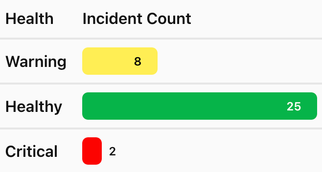
Table visualization with rows colored by health status (green/yellow/red) and measures shown as progress bars
👉 In Part 2, we set up the project structure and built a complete data pipeline using mock data. If you haven’t read it yet, check it out here:
We verified that our data flows correctly from mockData.ts through data-transformer.ts into a dummy component. Now it's time to make it real.
In this part, we’ll build the actual table visualization with color overriding — the one that Looker’s native charts simply can’t do. By the end, you’ll have a fully working visualization running locally that’s ready to be connected to Looker in Part 4.
1. What We’re Building
From the table above, each row’s background color changes based on the value of a dimension — in our case, health status. Warning is yellow, Healthy is green, Critical is red. The color rules are configurable, not hardcoded, so users can adjust them directly from the Looker UI without touching the code.
We’ll break this into three steps:
- Define the color config options in
options.ts - Build the table UI in
MyTable.tsxcomponent - Wire the config into the component
2. Defining the Color Config Options
Before building the UI, we need to decide how color rules are structured — hardcoded, or driven by config from the Looker UI? We’ll go with the latter, since that’s the whole point of a configurable visualization.
To support that, we first need types that describe two things: the shape of a single config option (LookerVizOption), and what config will actually look like at runtime (Config). Let's add these to types.ts:
// types.ts
// The value types allowed for config options
export type ConfigValue = string | number | boolean | string[];
export type DisplaySize = "full" | "half" | "third";

// The Config object Looker provides based on the options defined
export interface Config {
  [key: string]: ConfigValue;
};

// The shape of the options object we will use to define our visualization options
export interface LookerVizOption {
 type: "string" | "number" | "boolean" | "array";
 label: string;
 section?: string;
 order?: number;
 display?:
  | "text"
  | "number"
  | "color"
  | "select"
  | "radio"
  | "range"
  | "divider";
 display_size?: DisplaySize;
 default?: ConfigValue;
 placeholder?: string;
 min?: number;
 max?: number;
 values?: Array<string | number | { [key: string]: string | number }>;
}
Options Descriptions:
type— Type of input value which can be number, string, boolean or arraylabel— An option’s namesection— The tab’s name which this option belongs to. Used when you have many options and would like to categorize your options into several tabs .default— The option’s default valueorder— The option’s order in config panel (as per section)display_size— The option size in the config panel. The two options with display_size “half” at the consecutive order will be shown as two options in a line.
Note: There are many displays of options available, such as radio, select, etc., and also the attributes of each option varies. For example, options with type ‘number’ can have
minandmaxvalues.
With these types in place, we can define the actual options. We want two things configurable per rule: which value to match (rule_{i}_value) and which color to apply (rule_{i}_color) — and the number of rules itself should be configurable too, via num_rules.
Here’s staticOptions (the fixed option, num_rules) and buildDynamicOptions, which reads num_rules and generates a rule_{i}_value / rule_{i}_color pair for each one:
// options.ts
import type { Config, Option } from "./types"

export const staticOptions: Record<string, Option> = {
    num_rules: {
        type: "number",
        label: "Number of Rules",
        section: "Conditional Formatting",
        default: 3,
        order: 1,
    }
}
export const buildDynamicOptions = (config: Config) : Record<string, Option> => {
    // Start with your static options
 const options = { ...staticOptions };
    const numRules = Number(config.num_rules) || 0

    // loop thrugh the number of rules and add dynamic options
    // for example, for rule 1 we will add options like rule_1_value and rule_1_color
    for (let i = 1; i <= numRules; i++) {
        options[`rule_${i}_value`] = {
            type: "string",
            label: `Rule ${i} Value`,
            section: "Conditional Formatting",
            default: "",
            order: 20 + i,
            display_size: "half"
        };
        options[`rule_${i}_color`] = {
            type: "string",
            label: `Color`,
            section: "Conditional Formatting",
            default: "#CCCCCC",
            order: 20 + i,
            display_size: "half"
        };
    }
    return options;
}
Then, prepare mockConfig in mockData.ts — this is what lets us test the color logic locally later, without needing a real Looker instance yet.
// mockData.ts
export const mockConfig: Config = {
    // num_rules: 3,
    // rule_1_value: "Healthy",
    // rule_1_color: "#0ab348",
    // rule_2_value: "Warning",
    // rule_2_color: "#ffee54",
    // rule_3_value: "Critical",
    // rule_3_color: "#fb0202"
}
3. Building the Table (MyTable.tsx)
Now we replace the dummy JSON.stringify component with a real table. We'll use plain React — no UI library needed for this one.
// MyTable.tsx (Initial Version)
import type { Row, QueryResponse, Config } from '../types'
import { transformedData } from '../data-transformer'

type MyTableProps = {
  data: Row[]
  queryResponse: QueryResponse
  config: Config
}

// simple color map (no config) — keys lowercased
const COLOR_MAP: Record<string, string> = {
  healthy: '#0ab348',
  warning: '#ffee54',
  critical: '#fb0202',
}

const getColor = (val: unknown) => {
  if (val == null) return '#39a7e5'
  const key = String(val).toLowerCase()
  return COLOR_MAP[key] ?? '#39a7e5'
}

const getContrastingTextColor = (hex: string) => {
  try {
    const c = hex.replace('#', '')
    const r = parseInt(c.substring(0, 2), 16)
    const g = parseInt(c.substring(2, 4), 16)
    const b = parseInt(c.substring(4, 6), 16)
    const luminance = (0.299 * r + 0.587 * g + 0.114 * b) / 255
    return luminance > 0.6 ? '#000' : '#fff'
  } catch {
    return '#000'
  }
}

export const MyTable = ({ data = [], queryResponse, config }: MyTableProps) => {
  const dimensions = queryResponse.fields.dimensions || [];
  const measures = queryResponse.fields.measures || [];
  const rows = transformedData(data)

  // Calculate max value in order to make progress bar
  const maxValues: Record<string, number> = {}
  for (const measure of measures) {
    maxValues[measure.name] = Math.max(...rows.map(r => Number(r[measure.name] ?? 0) || 0))
  }

  return (
    <div style={{ borderRadius: 6, overflow: 'hidden', background: '#fff' }}>
      <table style={{ width: '100%', borderCollapse: 'collapse', backgroundColor: '#fff', color: '#111' }}>
        <thead>
          <tr>
            {dimensions.map(dim => <th key={dim.name} style={{
                                textAlign: 'left',
                                padding: '8px',
                                borderBottom: '2px solid #e6e6e6',
                                background: '#fafafa',
                                fontWeight: 600,
                                whiteSpace: 'nowrap',
                                color: '#111'
                            }}>{dim.label_short ?? dim.label}</th>)}
            {measures.map(measure => <th key={measure.name} style={{
                                textAlign: 'left',
                                padding: '8px',
                                borderBottom: '2px solid #e6e6e6',
                                background: '#fafafa',
                                fontWeight: 600,
                                whiteSpace: 'nowrap',
                                color: '#111'
                            }}>{measure.label_short ?? measure.label}</th>)}
          </tr>
        </thead>
        <tbody>
          {rows.map((row, i) => (
            <tr key={i}>
              {/* Render Dimensions */}
              {dimensions.map(dim => <td key={dim.name} style={{
                                textAlign: 'left',
                                padding: '8px',
                                borderBottom: '2px solid #e6e6e6',
                                background: '#fafafa',
                                fontWeight: 600,
                                whiteSpace: 'nowrap',
                                color: '#111'
                            }}>{String(row[dim.name] ?? '')}</td>)}

              {/* Render Measures ด้วยแถบสีพื้นฐาน */}
              {measures.map(measure => {
                const numValue = Number(row[measure.name] ?? 0) || 0
                const maxVal = maxValues[measure.name] || 1
                const pct = Math.max(0, Math.min(100, Math.round((numValue / maxVal) * 100)))
                const barWidth = 240
                // choose color based on first dimension value for this row (if exists)
                const dimVal = dimensions[0] ? row[dimensions[0].name] : undefined
                const color = getColor(dimVal)
                const textColor = getContrastingTextColor(color)
                const insideThreshold = 18

                return (
                  <td key={measure.name} style={{
                                textAlign: 'left',
                                padding: '8px',
                                borderBottom: '2px solid #e6e6e6',
                                background: '#fafafa',
                                fontWeight: 600,
                                whiteSpace: 'nowrap',
                                color: '#111'
                            }}>
                    <div style={{ width: barWidth, height: 28, position: 'relative', background: 'transparent', borderRadius: 6 }}>
                      <div style={{ width: `${pct}%`, height: '100%', background: color, borderRadius: 6, display: 'flex', alignItems: 'center', justifyContent: 'flex-end', padding: '0 12px 0 8px', boxSizing: 'border-box' }}>
                        {pct >= insideThreshold && <span style={{ color: textColor, fontSize: 12, marginRight: 4 }}>{numValue}</span>}
                      </div>
                      {pct < insideThreshold && (
                        <div style={{ position: 'absolute', left: Math.max(barWidth * (pct / 100) + 8, 8), top: 0, height: '100%', display: 'flex', alignItems: 'center' }}>
                          <span style={{ color: '#111', fontSize: 12 }}>{numValue}</span>
                        </div>
                      )}
                    </div>
                  </td>
                )
              })}
            </tr>
          ))}
        </tbody>
      </table>
    </div>
  )
}
If you run yarn dev now, you’ll already see rows colored correctly. But the colors come from a hardcoded map (healthy → green, warning → yellow, critical → red) baked directly into the component. Next, we'll make this config-driven instead of hardcoded.
4. Implementing Color Overriding
Let’s replace COLOR_MAP with a function getColorRules that reads from config (the same num_rules, rule_{i}_value, rule_{i}_color we defined in options.ts back in section 2, and revise the getColor function to get color from the input value and rules it’s given.
// MyTable.tsx

// Replace COLOR_MAP with this helper function
const getColorRules = (config: Config) => {
    const numRules = Number(config.num_rules) || 0
    const rules: Record<string, string> = {}

    for (let i = 1; i <= numRules; i++) {
        const valKey = `rule_${i}_value`
        const colKey = `rule_${i}_color`
        const value = config[valKey]
        const color = config[colKey]

        if (value !== undefined && value !== null && String(value).length > 0) {
            rules[String(value).toLowerCase()] = String(color ?? '#CCCCCC')
        }
    }

    return rules
}

// Replace the old getColor function with the new one
const getColor = (value: unknown, rules: Record<string, string>) => {
    const key = String(value ?? '').toLowerCase()
    return rules[key] ?? '#CCCCCC'
}
Two things changed compared to the earlier version:
getColorno longer just takesvaland checks it against a map baked into the code. It now takesrulesas a parameter, which means the function isn't tied to any particular set of colors — whether there are 3 rules or 10, it works the same way.- The fallback color when nothing matches changed from
#39a7e5(blue) to#CCCCCC(gray), to make it clearer that "no rule has been configured yet."
Matching is always case-insensitive (both the keys when building rules and the value being compared), to avoid subtle bugs when data coming from Looker has inconsistent casing like Healthy, healthy, HEALTHY.
Here is the final version of MyTable.tsx
import type { Row, QueryResponse, Config } from '../types'
import { transformedData } from '../data-transformer'

type Props = {
    data: Row[]
    queryResponse: QueryResponse,
    config: Config
}

const getColorRules = (config: Config) => {
    const numRules = Number(config.num_rules) || 0
    const rules: Record<string, string> = {}

    for (let i = 1; i <= numRules; i++) {
        const valKey = `rule_${i}_value`
        const colKey = `rule_${i}_color`
        const value = config[valKey]
        const color = config[colKey]

        if (value !== undefined && value !== null && String(value).length > 0) {
            rules[String(value).toLowerCase()] = String(color ?? '#CCCCCC')
        }
    }

    return rules
}

const getColor = (val: unknown, rules: Record<string, string>) => {
    if (val == null) return '#CCCCCC'
    const key = String(val).toLowerCase()
    return rules[key] ?? '#CCCCCC'
}

const getContrastingTextColor = (hex: string) => {
    try {
        const c = hex.replace('#', '')
        const r = parseInt(c.substring(0, 2), 16)
        const g = parseInt(c.substring(2, 4), 16)
        const b = parseInt(c.substring(4, 6), 16)
        // Perceived luminance
        const luminance = (0.299 * r + 0.587 * g + 0.114 * b) / 255
        return luminance > 0.6 ? '#000' : '#fff'
    } catch (e) {
        return '#000'
    }
}

export const MyTable = ({ data = [], queryResponse, config }: Props) => {

    const dimensions = queryResponse.fields.dimensions || [];
    const measures = queryResponse.fields.measures || [];
    const colorRules = getColorRules(config || {})
    // use transformed data (optionally sorted) as the source of truth for rendering
    const rows = transformedData(data)
    // Compute per-measure max values for relative bar scaling from transformed rows
    const maxValues: Record<string, number> = {}
    for (const measure of measures) {
        maxValues[measure.name] = Math.max(
            ...rows.map(r => Number(r[measure.name] ?? 0) || 0)
        )
    }

    return (
        <div style={{ borderRadius: 6, overflow: 'hidden', background: '#fff' }}>
        <table style={{ width: '100%', borderCollapse: 'collapse', backgroundColor: '#fff', color: '#111' }}>
            <thead>
                <tr>
                    {/* Dimension headers */}
                    {dimensions.map(dim => (
                        <th
                            key={dim.name}
                            style={{
                                textAlign: 'left',
                                padding: '8px',
                                borderBottom: '2px solid #e6e6e6',
                                background: '#fafafa',
                                fontWeight: 600,
                                whiteSpace: 'nowrap',
                                color: '#111'
                            }}
                        >
                            {dim.label_short ?? dim.label ?? dim.name}
                        </th>
                    ))}

                    {/* Measure headers */}
                    {measures.map(measure => (
                        <th
                            key={measure.name}
                            style={{
                                textAlign: 'left',
                                padding: '8px',
                                borderBottom: '2px solid #e6e6e6',
                                background: '#fafafa',
                                fontWeight: 600,
                                whiteSpace: 'nowrap',
                                color: '#111'
                            }}
                        >
                            {measure.label_short ?? measure.label ?? measure.name}
                        </th>
                    ))}
                </tr>
            </thead>

                <tbody>
                {rows.map((row, i) => (
                    <tr key={i}>
                        {/* Dimension cells */}
                        {dimensions.map(dim => {
                            const val = row[dim.name]
                            const displayValue = String(val ?? '')
                            return (
                                <td
                                    key={dim.name}
                                    style={{ padding: '8px', borderBottom: '1px solid #eee' }}
                                >
                                    {displayValue}
                                </td>
                            )
                        })}

                        {/* Measure cells — each renders a horizontal bar */}
                        {measures.map(measure => {
                            const raw = row[measure.name]
                            const numValue = Number(raw ?? 0) || 0
                            const displayValue = String(raw ?? numValue)

                            // choose color based on first dimension value for this row (if exists)
                            const dimVal = dimensions[0] ? row[dimensions[0].name] : undefined
                            const color = getColor(dimVal, colorRules)

                            const maxVal = maxValues[measure.name] || 1

                            const safeMax = maxVal || 1
                            const pct = Math.max(0, Math.min(100, Math.round((numValue / safeMax) * 100)))
                            const barWidth = 240
                            const textColor = getContrastingTextColor(color)
                            const insideThreshold = 18 // percent threshold to keep label inside bar

                            return (
                                <td
                                    key={measure.name}
                                    style={{ padding: '8px', borderBottom: '1px solid #eee', overflow: 'visible', whiteSpace: 'nowrap' }}
                                >
                                    <div style={{ display: 'flex', alignItems: 'center', gap: 8 }}>
                                        <div style={{ width: barWidth, height: 28, background: 'transparent', borderRadius: 6, overflow: 'visible', position: 'relative' }}>
                                            <div style={{ width: `${pct}%`, height: '100%', background: color, display: 'flex', alignItems: 'center', justifyContent: 'flex-end', padding: '0 12px 0 8px', boxSizing: 'border-box', borderRadius: 6 }}>
                                                {pct >= insideThreshold && (
                                                    <span style={{ color: textColor, fontSize: 12, marginRight: 4 }}>{displayValue}</span>
                                                )}
                                            </div>
                                            {pct < insideThreshold && (
                                                <div style={{ position: 'absolute', left: Math.max(barWidth * (pct / 100) + 8, 8), top: 0, height: '100%', display: 'flex', alignItems: 'center' }}>
                                                    <span style={{ color: '#111', fontSize: 12 }}>{displayValue}</span>
                                                </div>
                                            )}
                                        </div>
                                    </div>
                                </td>
                            )
                        })}
                    </tr>
                ))}
            </tbody>
        </table>
        </div>
    )
}
5. Testing Locally
Run yarn dev and select My Table — the table should now be colored according to the rules defined in staticOptions (the default is 3 empty rules, so everything will show up gray until values are filled in).
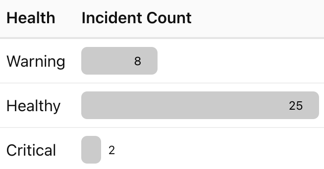
Try uncommenting mockConfig to match what a user would actually fill in inside the Looker UI, for example:
export const mockConfig: Config = {
    num_rules: 3,
    rule_1_value: "Healthy",
    rule_1_color: "#0ab348",
    rule_2_value: "Warning",
    rule_2_color: "#ffee54",
    rule_3_value: "Critical",
    rule_3_color: "#fb0202",
}
Then check that rows where health_status.status is Critical turn red, Warning turns yellow, and Healthy turns green — exactly what we set out to build at the start of this article.
We can try changing values in mockConfig back and forth — swap colors, change which values should match, increase or decrease num_rules — and watch the UI update instantly without restarting the dev server. This is the feedback loop we set up back in Part 2 paying off: no Looker instance needed, no deploy, and you can fully validate the coloring logic locally.
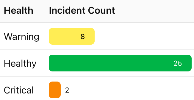
The table after changing rule_3_color to orange
Key Takeaway
In this part, we turned a static data pipeline into a real, user-facing visualization. The core design decision was keeping color logic completely separate from table structure: the table component only knows how to render dimensions, measures, and bars — it has no opinion about what “healthy” or “critical” should look like. That opinion lives entirely in config, which means stakeholders can reshape the visualization's behavior from the Looker UI without ever touching the code again.
👉 In Part 4, we’ll close that gap: bundling the visualization, hosting it, and registering it in Looker Admin so this same table runs live on a real Looker dashboard.
Going Further
The same config-driven pattern extends naturally beyond exact-match dimension values. For example, you could support rules on measures too — “color this bar red if revenue is below 0” or “green if growth is greater than 20%” — without changing how the table renders at all, only how rules are matched.
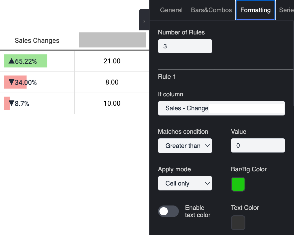
Configuration with more complex rules (rendered on Local)
If this was useful, a clap means a lot as encouragement — and if you don’t want to miss Part 4, follow along here on Medium.
Thanks for reading, and see you in Part 4!
메타데이터
- post_id
- 575c5cb7b7d7
- slug
- when-de-assigned-to-develop-looker-custom-visualization-part-3-building-the-real-visualization-575c5cb7b7d7
- url
- https://medium.com/@jb.ranchana/when-de-assigned-to-develop-looker-custom-visualization-part-3-building-the-real-visualization-575c5cb7b7d7
- canonical_url
- https://medium.com/@jb.ranchana/when-de-assigned-to-develop-looker-custom-visualization-part-3-building-the-real-visualization-575c5cb7b7d7
- author_url
- https://medium.com/@jb.ranchana
- status
- ok
- fetched_at
- 2026-07-11 08:43:39