The Importance of Responsive Design
Introduction
The Importance of Responsive Design
Introduction
In today’s digital world, users access websites from a wide variety of devices — smartphones, tablets, laptops, desktops, and even smart TVs. A website that looks perfect on a desktop but breaks on a mobile screen can quickly frustrate users and drive them away. This is where Responsive Design becomes essential.
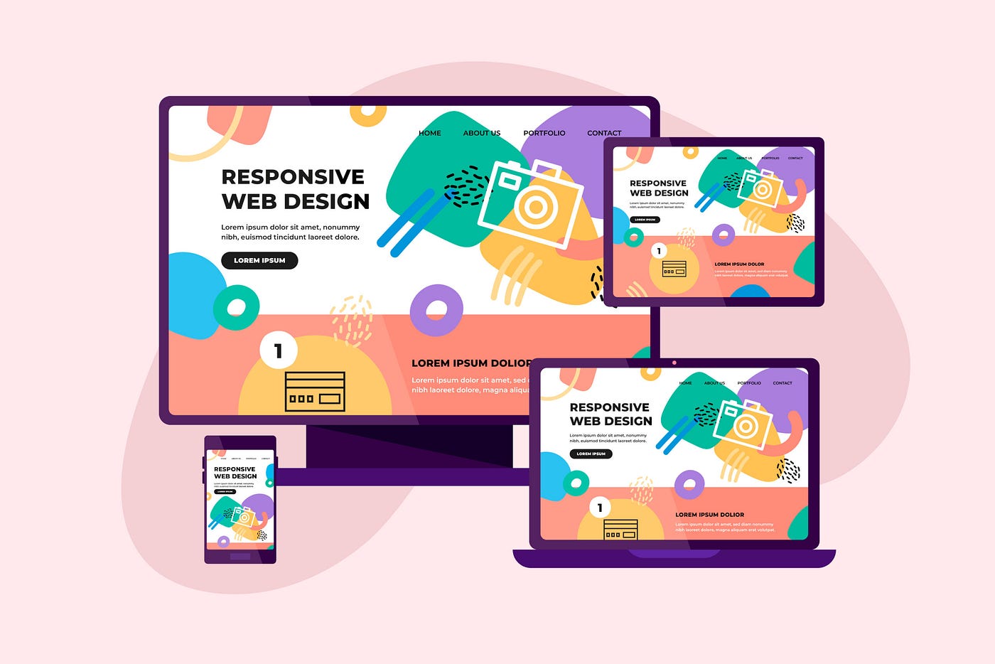
Responsive design ensures that a website automatically adjusts its layout, images, and content to fit different screen sizes and devices. It improves user experience, increases accessibility, and helps businesses reach a larger audience effectively.
What is Responsive Design?
Responsive Web Design (RWD) is a web development approach that makes websites adapt seamlessly to different screen sizes and resolutions. Instead of creating separate websites for desktop and mobile users, developers build a single flexible layout that works everywhere.
Key Features of Responsive Design:
- Flexible layouts and grids
- Scalable images and media
- CSS media queries
- Mobile-friendly navigation
- Better readability across devices
Why Responsive Design Matters
1. Better User Experience
A responsive website provides a smooth and consistent experience across all devices. Users can easily navigate, read content, and interact with the website without zooming or scrolling excessively.
When users enjoy their browsing experience, they are more likely to stay longer and engage with the content.
2. Mobile Usage is Growing Rapidly
Most internet users today browse websites using mobile devices. If a website is not optimized for mobile screens, businesses risk losing a large number of potential visitors and customers.
Responsive design helps websites:
- Load properly on smaller screens
- Improve touch navigation
- Reduce bounce rates
- Increase user engagement
3. Improved SEO Performance
Search engines like Google prioritize mobile-friendly websites in search rankings. Responsive design improves SEO by:
- Providing a single URL structure
- Improving page loading speed
- Enhancing user experience
- Reducing duplicate content issues
A responsive website can significantly improve visibility in search engine results.
4. Cost and Time Efficiency
Maintaining separate desktop and mobile websites can be expensive and time-consuming. Responsive design allows developers to manage a single website that works across all devices, reducing:
- Development costs
- Maintenance effort
- Testing complexity
This makes responsive design a smart long-term investment for businesses.
Core Technologies Behind Responsive Design
Responsive websites are built using modern front-end technologies such as:
HTML5
Provides the structure of the webpage.
CSS3
Controls styling, layouts, and responsiveness.
Media Queries
Allow websites to adapt styles based on screen size.
Example:
@media (max-width: 768px) {
  body {
    font-size: 14px;
  }
}
Flexible Grids
Use percentage-based layouts instead of fixed widths.
Responsive Design Best Practices
Use Mobile-First Design
Start designing for smaller screens first, then scale up for larger devices.
Optimize Images
Use compressed and scalable images for faster loading.
Test on Multiple Devices
Always test websites on smartphones, tablets, and desktops.
Keep Navigation Simple
Use clean menus and easy-to-click buttons.
Challenges in Responsive Design
Although responsive design offers many benefits, developers may face challenges such as:
- Complex layouts on smaller screens
- Cross-browser compatibility issues
- Performance optimization
- Managing large media files
However, modern frameworks like Bootstrap and Tailwind CSS make responsive development easier and more efficient.
Real-World Impact of Responsive Design
Companies with responsive websites often experience:
- Higher customer satisfaction
- Increased mobile traffic
- Better conversion rates
- Improved brand reputation
Popular platforms like Amazon, Netflix, and Airbnb use responsive design to deliver seamless experiences across devices.
Conclusion
Responsive design is no longer optional — it is a necessity in modern web development. With the increasing number of mobile users worldwide, businesses and developers must ensure that websites are accessible, fast, and visually appealing on every device.
A responsive website improves user experience, boosts SEO, saves development costs, and helps businesses stay competitive in the digital age. By adopting responsive design principles, developers can create future-ready websites that deliver excellent performance everywhere.
Final Thoughts
As technology continues to evolve, responsive design will remain a key part of successful web development. Whether you are building a personal blog, an e-commerce platform, or a corporate website, responsiveness should always be a top priority.
메타데이터
- post_id
- 5900ae0a9582
- slug
- the-importance-of-responsive-design-5900ae0a9582
- url
- https://medium.com/@aasith32/the-importance-of-responsive-design-5900ae0a9582
- canonical_url
- https://medium.com/@aasith32/the-importance-of-responsive-design-5900ae0a9582
- author_url
- https://medium.com/@aasith32
- status
- ok
- fetched_at
- 2026-06-09 15:37:30