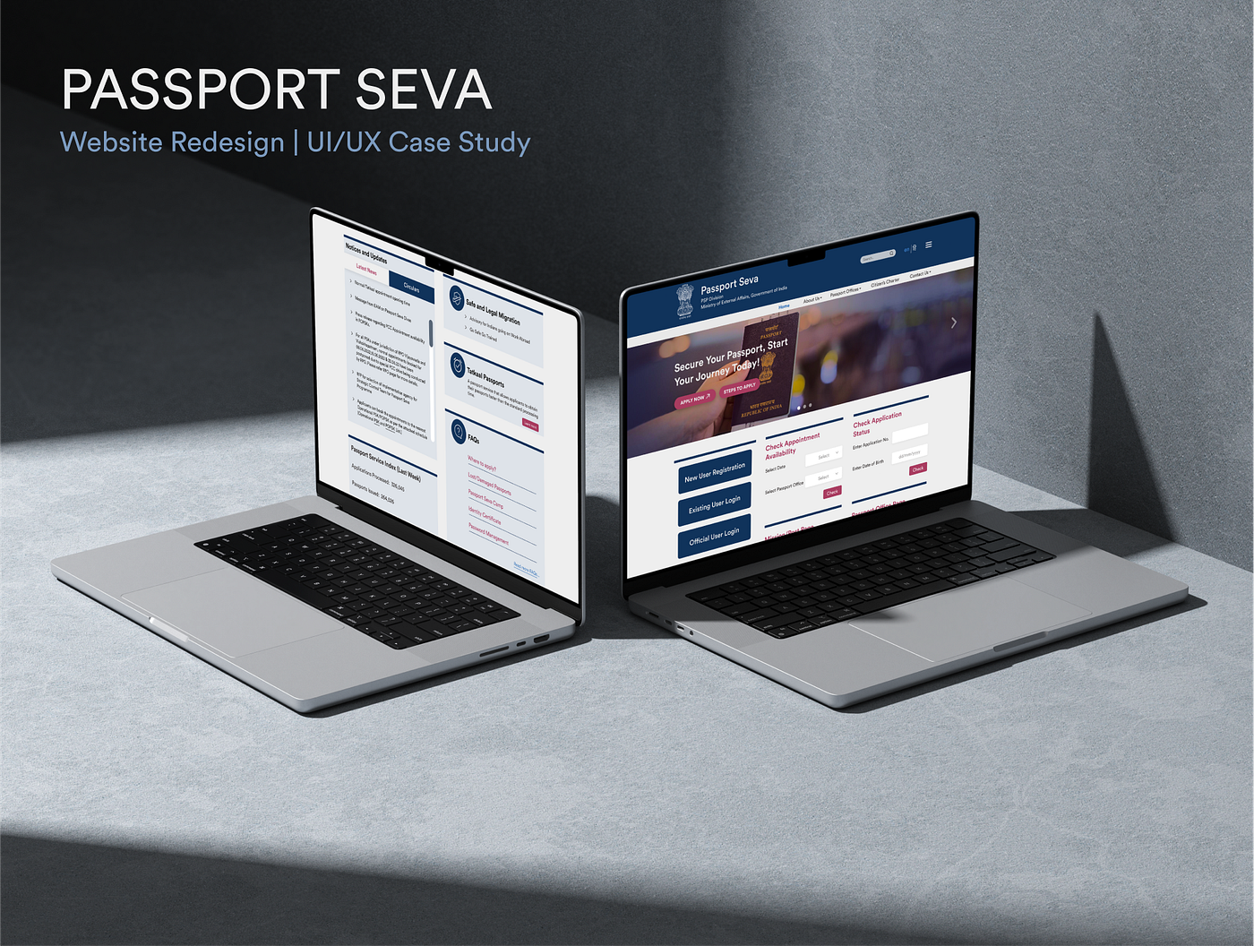
Redesigning the Passport Seva Website: A Minimal, User-Centric Take on Government UX
UX Case Study | Self Project | September 2024
Redesigning the Passport Seva Website: A Minimal, User-Centric Take on Government UX
UX Case Study | Self Project | September 2024
We’ve all had our share of frustrating experiences with government websites — clunky interfaces, confusing navigation, outdated visuals, and an overwhelming flood of information.
It’s how poor interaction design often turns essential tasks into digital scavenger hunts. The Passport Seva website, run by India’s Ministry of External Affairs, is no different. Its current design feels stuck in the past, cluttered, repetitive, and unintuitive for users of all ages.
This redesign project aims to reimagine what a government service portal can feel like when built with empathy, clarity, and accessibility at its core.
Problem Statement
The official Passport Seva website suffers from a cluttered interface, inconsistent visual hierarchy, and overwhelming navigation.
Users often encounter repeated elements, an overload of information & color and unclear pathways all of which make the experience unnecessarily confusing and time-consuming. These issues not only impact usability but also reduce trust in a system meant to serve millions efficiently.
Project Goal
The goal of this project was to redesign the landing page of Passport Seva website by addressing key usability and accessibility challenges faced by users. Through careful analysis of the existing experience, the aim was to create a clearer, simpler information architecture.
A minimalistic and user-first design approach guided the redesign, focusing on reducing visual noise, streamlining user flows, and building an interface that feels intuitive, trustworthy, and efficient for users of all ages and digital literacy levels.
Design Process
Empathize → Define → Ideate → Prototype
- Empathize:
Conducted a survey to gather user feedback and pain points on the existing Passport Seva website
Compared the Indian website with 4 international passport websites on parameters like UI, UX, application flow, and unique features — gaining insights into global benchmarks and user-centric features
- Define:
Analyzed the current site using UX laws to identify specific usability flaws
Created a list of key issues and challenges faced by users
Synthesized findings into a clear problem statement and project goal
- Ideate:
Developed recommendations/solutions for each identified problem
Created a revised Information Architecture (IA) to restructure content in a more intuitive way
- Prototype:
Designed a style guide to establish visual consistency (typography, colors, buttons, etc.)
Built the final high-fidelity prototype of the redesigned Passport Seva website
Target Audience
Age & Needs:
- 18–30 years: Young adults applying for their first passport or renewing it for travel purposes.
- 31–50 years: Professionals and parents needing passports for work-related or family travel.
- 51+ years: Older adults who may require assistance and clearer guidance during the application process.
Gender: All
Competitors: Agencies and third-party services or apps that offer passport application assistance as part of their travel packages, typically for an added fee.
User Survey & Reviews
I conducted a survey through Google Forms with 22 participants across different age groups. The goal was to identify usability challenges, pain points, and expectations from the platform.

Survey Results
Key Observations:
- The survey shows that older users were comfortable with the interface, while younger users struggled to navigate, highlighting the outdated design and the need for a more balanced, age-inclusive interface.
- Difficult to find options to renew passports
- Processing is time consuming, therefore some people prefer offline methods.
Benchmarking Global Passport Platforms
To identify gaps and opportunities for improvement, I conducted a comparative study of passport service websites from Australia, the UK, Canada, and the US. Each site was analyzed based on user experience, interface design, application flow, and unique features. This helped establish benchmarks and highlight how and where India’s Passport Seva website falls short.

Comparison Chart
Problems with the existing website

Identified Problems
- The design does not look cohesive.
- Too many options with unimportant things taking up space creating mental overload for the user.
- Important things are not highlighted enough.
- Lack of use of visual hierarchy and too much use of text.
- Overall the website design is very outdated with no visual appeal especially to younger audience.
UX Law Analysis: Problems & Solutions
This part evaluates the current Passport Seva website through the lens of key UX laws and design principles. Each slide highlights a specific usability issue, explains the psychological or design rule it violates, and proposes a focused solution to improve user experience and clarity.


Information Architecture (OLD & NEW)

Visual Guide
The designed website uses the 60–30–10 rule which helps to harmonize color scheme and make a well-balanced interface design.

Final Landing Page

As someone still early in my design journey, taking on a government website like Passport Seva felt both exciting and intimidating.
This project taught me how small, thoughtful changes can dramatically improve real-world experiences. It wasn’t just about making it look better, but about making it feel easier, friendlier, and more human.
Because at the end of the day, even something as official as getting a passport should feel approachable , not like a test of patience.
You can find the complete case study *here as well. Also check out my portfolio here .*
메타데이터
- post_id
- 5ab5fa3fefc7
- slug
- redesigning-the-passport-seva-website-a-minimal-user-centric-take-on-government-ux-5ab5fa3fefc7
- url
- https://medium.com/@aayushinagar25/redesigning-the-passport-seva-website-a-minimal-user-centric-take-on-government-ux-5ab5fa3fefc7
- canonical_url
- https://medium.com/@aayushinagar25/redesigning-the-passport-seva-website-a-minimal-user-centric-take-on-government-ux-5ab5fa3fefc7
- author_url
- https://medium.com/@aayushinagar25
- status
- ok
- fetched_at
- 2026-06-28 10:39:35