The Coffee Cup No One Noticed — Until It Became the Reason People Started Coming Back
I didn’t expect a paper cup to change anything.
The Coffee Cup No One Noticed — Until It Became the Reason People Started Coming Back
I didn’t expect a paper cup to change anything.
When you run seven coffee shops across different neighborhoods in Canada, you learn to focus on the obvious problems — staffing during rush hours, espresso consistency, machine maintenance, supply delays. Packaging usually sits somewhere near the bottom of that list.
But sometimes, the smallest things are the ones customers quietly remember — or forget entirely.
And forgetting, in our case, was becoming a problem.
When “good enough” stops being enough
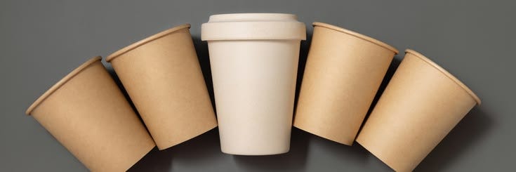
Our cups were standard white kraft paper cups. Clean. Functional. Familiar.
Nothing wrong with them.
But nothing memorable either.
We started noticing a pattern across all seven stores. Customers would talk about the coffee, the atmosphere, even the playlists. But when we asked simple follow-up questions — what did they remember about their experience — there was a long pause when it came to packaging.
It wasn’t just a branding issue. It was an identity issue.
If people can’t recall how your product was presented, you’re partially invisible in their memory.
At the same time, another pressure was building quietly in the background: sustainability.
More customers were asking about materials. Not aggressively, not in a demanding way — but with curiosity. What was the cup made of? Was it recyclable? Was there a better option?
We weren’t trying to “rebrand ourselves as eco-friendly.” We were just trying to respond honestly and responsibly.
But those two goals — memorability and sustainability — felt like they were pointing in different directions.
The change that started as a test
We didn’t overhaul everything.
We changed one thing: the cup.
We worked with a supplier capable of custom printing and material adjustments. The goal wasn’t to create something flashy. It was to see whether a different visual identity could make a difference in everyday operations.
The test version was a kraft-based paper cup with a matte black exterior and a three-color logo print.
Before finalizing it, we went through several rounds of sampling. We checked how the ink behaved under different lighting conditions, how the cup felt during busy service hours, and how consistent the print appeared when stacked behind the counter.
What surprised me wasn’t the design itself.
It was how much the “experience of holding it” mattered. A cup isn’t static. It moves through hands, counters, trays, and streets. Every detail shows up in motion, not on a design file.
During our evaluation process, we also reviewed broader industry discussions about how packaging color and material influence customer perception in food service environments. One useful reference point was this overview of **black disposable cups in food service trends**, which helped us frame the shift we were considering — not as decoration, but as perception design.
Still, the final decision came from inside our own stores, not from external trends.
The first week nobody commented
We rolled the new cups out gradually across all seven locations.
At first, nothing happened.
No customer feedback. No complaints. No excitement.
Just a different cup sitting where the old one used to be.
That silence lasted longer than expected.
Then, slowly, things started to shift in ways that were easy to miss if you weren’t paying attention.
Customers began taking more photos. Not of promotions. Not of signage. Of their coffee.
It wasn’t because we asked them to. It wasn’t part of any campaign.
It was because the cup suddenly looked like it belonged in the frame.
One store manager described it to me in a way that stuck:
“It doesn’t feel like we’re serving coffee anymore. It feels like we’re presenting it.”
That distinction matters more than it sounds like it should.

What changed behind the counter
From an operational perspective, the difference was subtle but real.
The matte black surface didn’t show stains as easily during peak hours. Staff felt less pressure to constantly “fix” small visual imperfections. During rush periods, when everything moves too fast to be perfect, that matters.
There was also something psychological happening. The consistency of the cup design across all seven stores made the brand feel more unified internally, not just externally.
We weren’t changing the coffee.
We were changing how it was framed.
Sustainability, without slogans
We also made a deliberate decision on materials.
The cups were built on kraft-based paper, and we continued moving toward reducing unnecessary plastic dependence in our packaging system. In practice, this wasn’t a marketing decision. It was a materials decision.
We weren’t trying to signal sustainability. We were trying to reduce waste in ways that actually held up under daily use.
Customers noticed, but not always in explicit terms. It showed up in small comments, questions, and casual approval.
And that was enough.
Sustainability rarely works as a headline in real operations. More often, it works as a series of quiet decisions that accumulate over time.
The number that made us pause
A few months after full rollout, we compared store performance.
Repeat purchase rate across all seven locations had increased by 19.86%.
We didn’t treat that number as a simple cause-and-effect result. Coffee shops don’t work that cleanly.
But we also didn’t ignore it.
Something had changed in how customers were interacting with us. Not just what they were buying, but how often they were coming back.
Brand recall improved. Visual consistency improved. And most importantly, customers started recognizing us more easily in everyday contexts — not just inside the store.
What a cup actually carries
It’s easy to underestimate packaging when you’re focused on product quality.
But packaging is often the first and last physical interaction a customer has with your brand.
It’s not just a container.
It’s a surface people hold, photograph, carry, discard, and sometimes remember without realizing it.
We didn’t redesign our coffee.
We redesigned how it shows up in people’s daily lives.
And in the end, that turned out to matter more than we expected.

메타데이터
- post_id
- 5b7993374ff0
- slug
- the-coffee-cup-no-one-noticed-until-it-became-the-reason-people-started-coming-back-5b7993374ff0
- url
- https://medium.com/@zhixinz746/the-coffee-cup-no-one-noticed-until-it-became-the-reason-people-started-coming-back-5b7993374ff0
- canonical_url
- https://medium.com/@zhixinz746/the-coffee-cup-no-one-noticed-until-it-became-the-reason-people-started-coming-back-5b7993374ff0
- author_url
- https://medium.com/@zhixinz746
- status
- ok
- fetched_at
- 2026-07-11 10:09:22