How the Incredible Hulk tells the story of color science — Part 2: MacAdam’s Ellipses: the…
Ready for what comes next? Good. Because we’re about to dismantle the way you think you see color. It’s clobbering time!
How the Incredible Hulk tells the story of color science — Part 2: MacAdam’s Ellipses: the physiology of perception explains why green works and gray doesn’t

Ready for what comes next? Good. Because we’re about to dismantle the way you think you see color. It’s clobbering time!
There’s a question Stan Lee never asked himself because he was trying to print a comic book, not do science. The question is this: why is gray so hard to keep stable, while green forgives any process error?
The answer exists. It’s formal, published, measurable. And it arrives twenty years before Hulk #1, from an American physicist working at Eastman Kodak under conditions very different from those of a comics print shop.
David MacAdam was a physicist specializing in colorimetry, the science that tries to measure color in a way that matches what the human eye actually perceives. A problem that sounds simple and isn’t, at all.
In 1942 he published in the Journal of the Optical Society of America a paper that would become a classic: Visual Sensitivities to Color Differences in Daylight. In it, he describes an experiment conducted on 25 reference colors, asking an observer to adjust a test color until it looked identical to the reference. Same color. Same pair. Repeated thousands of times.
The result? The observer never produced exactly the same point on the chromaticity diagram. Instead, they produced a cloud of points. And that cloud, surprise, was not circular. It was an ellipse. With completely different size, shape, and orientation depending on where in the chromaticity diagram the reference color sat.
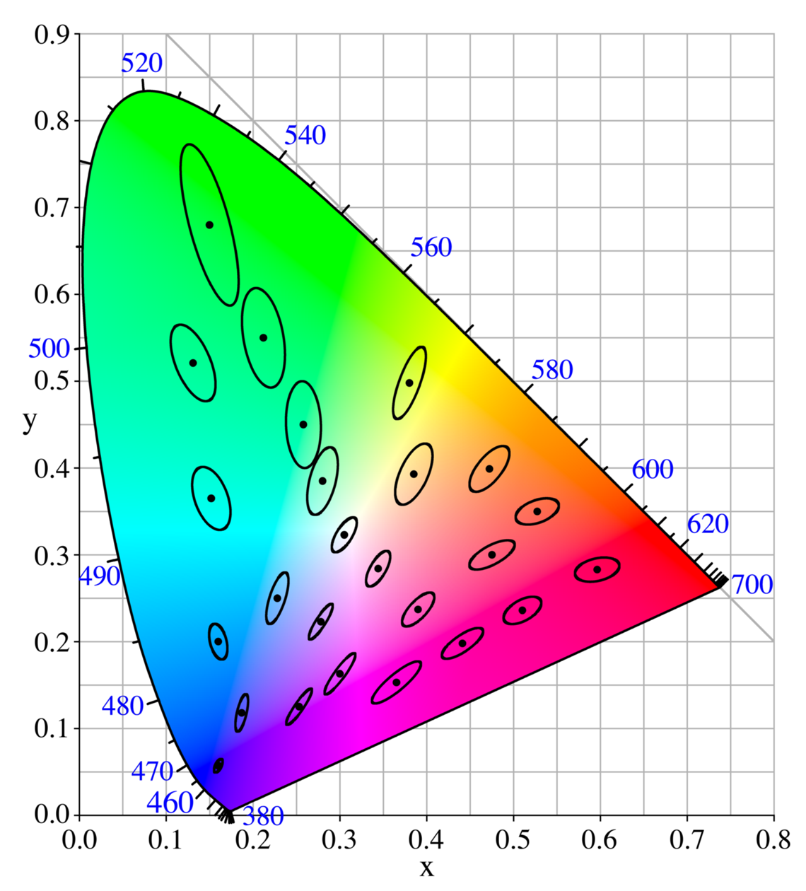
CC BY-SA 3.0, https://commons.wikimedia.org/w/index.php?curid=173591
The CIE xy space and its fundamental problem
The CIE xy diagram, standardized in 1931, is the two-dimensional map of all colors perceivable by the human eye. It’s beautiful to look at: that horseshoe shape with white at the center and saturated colors along the edge. It’s also, as MacAdam demonstrated in 1942, fundamentally misleading.
The problem is that geometric distance on the diagram doesn’t correspond to perceptual distance. Two colors that appear equidistant from a third on the diagram might be perceived as very different from each other, or as nearly identical. The space is not uniform. The geometry lies.
MacAdam’s ellipses make this visible: in the central achromatic zone (the grays, whites, neutral colors) the ellipses are small and round. Small color variations in that zone are immediately perceptible. Our eye discriminates there with surgical precision. In the green-yellow zone, the ellipses are large and elongated. Significant color variations in that zone go almost unnoticed. Our eye is, in that zone, relatively lazy.
There’s a technical detail worth clarifying before we go further. When talking about chromatic drift in the achromatic zone, we use the unit ΔE (delta E) which is simply the way colorimetrists measure how different two colors look to a human eye, not how different they are on a diagram. A ΔE of 1 is the minimum threshold perceptible to a trained observer. A ΔE of 3–5 is already visible to anyone. Above 10, the difference is obvious even from a distance.
In the achromatic zone (grays, whites, neutrals) a shift of just 1–2 ΔE is already enough for the eye to notice. Because there the visual system works at maximum precision: MacAdam’s ellipses are small, tolerance is almost zero. Any oscillation in the printing process becomes visible, and becomes a problem.
In the green-yellow zone the opposite happens. The same shift of 1–2 ΔE disappears. The ellipses are large, the eye is relatively lazy, and errors get absorbed without the reader noticing. Green acts as a perceptual buffer: you can get it wrong, and your audience will never know.
Want to see it for yourself? Here are two sets of swatches. The first set shows a neutral gray flanked by four variants each at a chromatic distance of ΔE 5 from the neutral. The second set shows the same exercise in saturated green, with four variants at ΔE 10. Note that the chromatic distance in the green set is double. Look at them and notice what your eye does and what it doesn’t.


The M-cones: why we’re built this way
The physiological explanation is in our photoreceptors. The human eye has three types of cones: L (sensitive to red-orange), M (sensitive to green-yellow), and S (sensitive to blue-violet). L and M cones together account for the overwhelming majority of all photoreceptors; S cones, the blue-sensitive ones, are barely a sliver of the total. A system this weighted toward L and M cones is optimized for luminance, not for catching subtle hue shifts, especially in the green range, where the two cone types overlap the most.
We are probably the evolutionary descendants of primates who lived in forests and needed to tell ripe fruit from green leaves, not to do precision colorimetry on neutral tones. Thanks, evolution. Very helpful. Which brings us back, inevitably, to a green monster and a gray one — and to why one of them could never have worked on a 1960s offset press.
Back to the Hulk: Lee was right without knowing it
Hulk’s green, that bright, vivid, saturated green that doesn’t exist in nature but reads as completely credible on comic paper, sits in the zone of the chromaticity diagram where MacAdam’s ellipses are largest. Maximum perceptual tolerance zone.
This means that the inevitable color variations between print runs, between pages, between the start and end of a single printed sheet, get absorbed by the reader’s visual system without generating any discomfort. Green Hulk can vary. The reader doesn’t notice, even on a cheap comic book.
Gray Hulk cannot vary at all. Because it sits in the zone where the human eye is most sensitive, where the ellipses are smallest, where any tiny process oscillation becomes immediately obvious. What the readers of Hulk #1 were actually seeing, that unsettling, unstable skin shifting from page to page, was not an artistic choice. It was exactly the kind of chromatic oscillation MacAdam had measured in his laboratory twenty years earlier. The experiment and the comic book were describing the same phenomenon. Nobody had connected the two.
Stan Lee wasn’t doing colorimetry. He was trying to solve a production problem. But the solution he found, switching to green, was also the scientifically optimal one. If the character has to be completely monochromatic, then in the green spectrum the chromatic shift from one page to the next is actually less visible than with any other color. Remember what we said about comics in the ’60s: they were for broke kids, not spoiled people like you with Frank Miller and Alan Moore paperbacks on your nightstand.
As sometimes happens when practical necessity arrives before theory.
Nature builds its own ellipses
There’s something almost poetic here. MacAdam measures the ellipses in 1942 in an Eastman Kodak laboratory. Lee adopts green in 1962 for purely practical reasons. The connection between the two events isn’t formalized for decades.
And in the meantime, every week, millions of readers look at a green monster and notice no chromatic variation between pages. Because their visual system, built over millions of years of evolution, is optimized not to notice it.
MacAdam’s ellipses are not an abstract mathematical construct. They are the map of how we are made. And Hulk, without knowing it, without meaning to, chose exactly the zone where the eye stops paying attention.
Next time: the three literary fathers of Bruce Banner: Jekyll-Hyde, Frankenstein, and the Golem. Each contributes something the others don’t have. And one of them is far more present than it seems.
HULK SMASH!

메타데이터
- post_id
- 5bba2fffd609
- slug
- how-the-incredible-hulk-tells-the-story-of-color-science-part-2-macadams-ellipses-the-5bba2fffd609
- url
- https://medium.com/@gtxfvmm/how-the-incredible-hulk-tells-the-story-of-color-science-part-2-macadams-ellipses-the-5bba2fffd609
- canonical_url
- https://medium.com/@gtxfvmm/how-the-incredible-hulk-tells-the-story-of-color-science-part-2-macadams-ellipses-the-5bba2fffd609
- author_url
- https://medium.com/@gtxfvmm
- status
- ok
- fetched_at
- 2026-06-17 08:20:12