From MVP to 2.0: Designing a Banking Login That Users Actually Trust
A visual designer’s perspective on iterating a high-stakes authentication flow across 6 countries.
From MVP to 2.0: Designing a Banking Login That Users Actually Trust
A visual designer’s perspective on iterating a high-stakes authentication flow across 6 countries.
When I joined the BAC Credomatic -largest financial networks — 4M+ users across 6 countries- mobile banking redesign, the login screen looked like most banking apps from five years ago: a white card, two input fields, a blue button. It worked. But it didn’t feel like a bank you could trust with your savings.
This is the story of how I designed the MVP login from scratch, incorporated insights from usability testing with real users across the region, and iterated toward a biometric-first experience that felt as secure as it actually was. Not a solo effort — I worked within a multidisciplinary team, with a UX Lead from the client side validating direction. But the visual design decisions were mine to make.
The Problem
The old app had all the functional pieces in place: username field, password field, a “forgot password” link, a token input. But everything lived on a single screen, competing for attention at the same time.
The token input was always visible — even for users who didn’t need it. The biometric option was an afterthought, tucked below the form as a small fingerprint icon. There was no personalization, no context. Every time you opened the app, it greeted you the same way it would greet a stranger.
For a bank serving millions of users across six different countries — with different levels of digital literacy, different devices, different habits — that one-size-fits-all approach wasn’t scaling. And the usability data would later confirm what the design already suggested: users were hesitating, second-guessing, and in some cases, failing to complete basic authentication tasks.
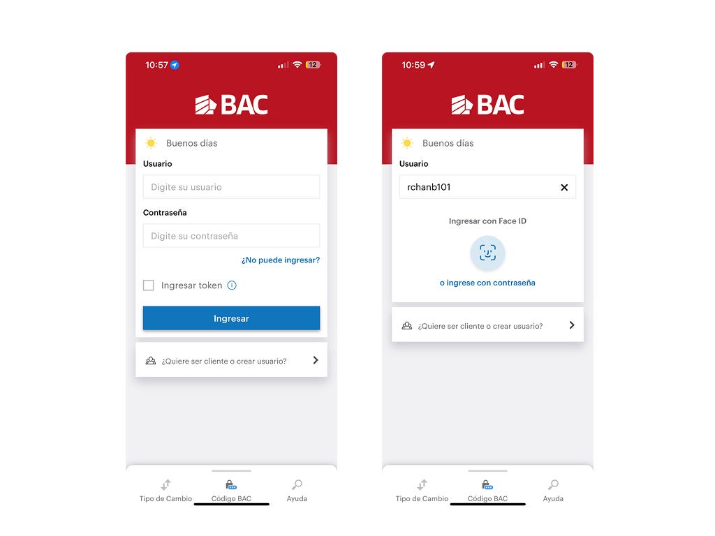
The old login experience: token always visible, biometrics buried. Every user, same screen.
The Process
My scope covered the end-to-end visual design of the login flow — from the first MVP screens to the iterative work that became Login 2.0.
Benchmark
Before starting with Figma, I researched how other banking apps handled login. I looked at authentication patterns, how biometrics were shown to users, how apps communicated trust visually, and how they handled the “remembered user” state.
Two things stood out: the best apps made biometrics feel like a feature, not a fallback. And the ones users trusted most were the ones that greeted them by name.
MVP
The MVP was the first real departure from the old app. I removed the token checkbox from the main screen — it was creating noise for the majority of users who never used it. I introduced “Recordar usuario” as a checkbox, planting the seed for what would become the biometric-first experience. The layout was cleaner, the hierarchy clearer. But it still felt like a form.
Phase 3: Login 2.0
The usability testing results gave us something concrete to work with. Users hesitated on terminology — “token”, “recordar usuario” — especially users over 40, who represented 44% of the test group. The old model was asking users to think too much at the moment they most needed to feel secure.
For Login 2.0, I explored multiple visual directions. The breakthrough came when I shifted the question from “how do I display these fields?” to “what should the user feel when they open this app?”.
That shift drove three key decisions: putting the user’s name front and center, making the biometric icon the visual protagonist of the screen, and committing to a fully red interface — removing the blue that came from the broader Design System to create a login experience that felt distinctly BAC, and distinctly trustworthy.
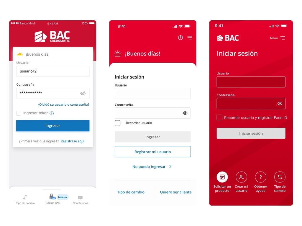
Old App > MVP > Login 2.0. Three phases tomake authentication feel like trust.
Key Design Decisions
Every change between the old app and Login 2.0 had a reason.
1. Biometrics as the protagonist, not the fallback
In the old app, the biometric option appeared only after the user typed their username — small, low contrast, easy to miss. In Login 2.0, Face ID and Touch ID became the centerpiece of the screen. The password option was still there, but as a secondary action. This hierarchy change wasn’t cosmetic: it was a statement about how users should authenticate in 2024.
2. Personalization as a trust signal
“Buenos días, Miguel” isn’t just a greeting. In a banking context, seeing your own name before you authenticate tells you: this app knows who you are, and it’s ready for you. It reduces the cognitive load of the login moment and replaces the feeling of filling out a form with the feeling of being recognized.
3. One color, one message
The MVP used both red and blue — both valid within BAC’s Design System. But for Login 2.0, I explored proposals that used only red. The result felt more cohesive, more corporate, more trustworthy. In a screen where the user is about to hand over their credentials, visual consistency isn’t just a detail.
4. Pre-login quick actions
Users who aren’t logged in still need things: exchange rates, help, product information. So for the Login 2.0, I surfaced them as icon-based quick actions at the bottom of the screen — visible before authentication, without cluttering the main login area. A small decision with a real impact on how non-clients and first-time users experience the app.
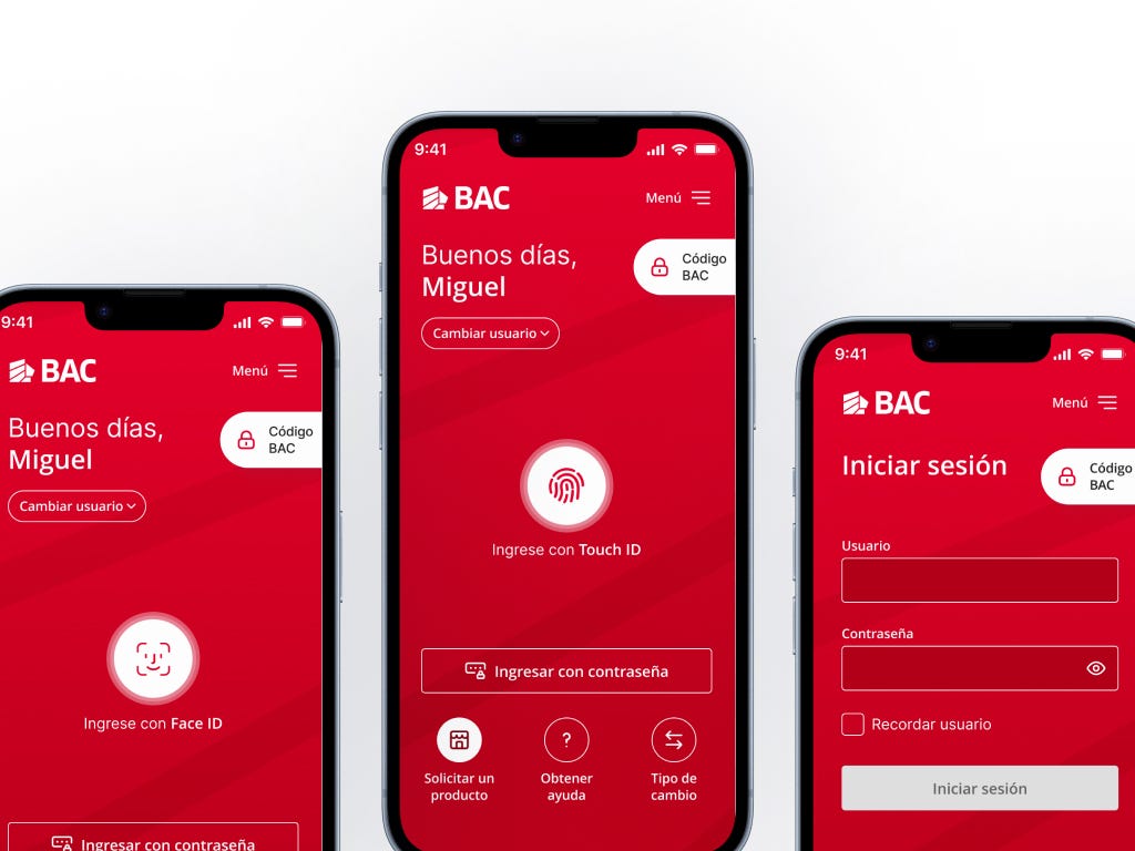
Face ID, Touch ID, password — three ways in, one consistent experience. Designed to feel like the same app, regardless of how you authenticate.
Reflection
I learned that in banking, the login is the handshake. It’s the moment a user decides whether they trust you with their money. Every pixel, every label, every hierarchy decision carries weight that most interfaces don’t have to bear.
Working on BAC taught me that defensive design isn’t about adding warnings — it’s about removing doubt. The best security UX is the kind users don’t have to think about.
If I were to do it again, I’d push earlier for user testing on the MVP, before the patterns got established. The insights we gathered validated decisions already made — useful, but less powerful than insights that shape the first proposal.
That’s the thing about iterative design: the earlier you learn, the more freedom you have to change.
Thanks for reading!
메타데이터
- post_id
- 5ce382bd3091
- slug
- from-mvp-to-2-0-designing-a-banking-login-that-users-actually-trust-5ce382bd3091
- url
- https://medium.com/@marocchicamila/from-mvp-to-2-0-designing-a-banking-login-that-users-actually-trust-5ce382bd3091
- canonical_url
- https://medium.com/@marocchicamila/from-mvp-to-2-0-designing-a-banking-login-that-users-actually-trust-5ce382bd3091
- author_url
- https://medium.com/@marocchicamila
- status
- ok
- fetched_at
- 2026-07-16 01:10:58




