Plotly Studio: AI Data Analysis and Visualization
Plotly Studio is a clever and polished product that makes data analysis and visualization a breeze
Plotly Studio: AI Data Analysis and Visualization
Plotly Studio is a clever and polished product that makes data analysis and visualization a breeze
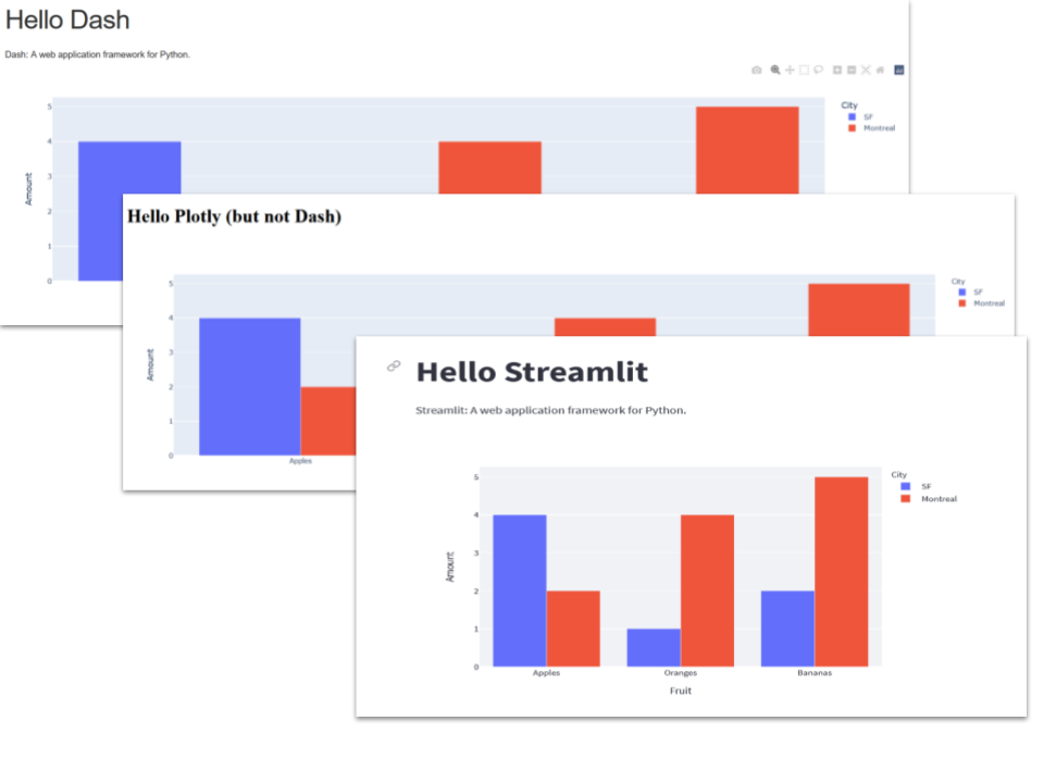
You may well have seen AI-driven data visualization applications before, but other tools that I have used have a kind of DIY feel. By contrast, Plotly Studio is a complete desktop app that takes you smoothly and professionally from raw data to a visualization application.
I have written about how to use AI for data analysis and visualisation using Google Colab’s Data Science Agent and also using Gemini CLI. Plotly Studio has similar aims, but it is quite a different beast. Whereas the other approaches are extensions of a general-purpose tool, Plotly Studio is a desktop app dedicated to transforming data into data visualisation implemented in Dash.
Plotly Studio is a recent product from Plotly that is being heavily promoted, but unlike the Plotly chart library, it is not free. This is unsurprising as it incorporates a significant AI element that does not rely on the user’s own subscriptions. However, there is a range of reasonable pricing options, including a free one that lets you get a feel of the product.
I’ll use the free version for this article; it does the job well enough, but it is restricted in the amount of work you can publish and, unsurprisingly, has fewer features than the paid-for versions. However, you should be able to get a good idea of what Plotly Studio can do and whether it is worth paying for the more capable versions.
At the time of writing, the free version allows you to create projects locally and publish one of these to the Plotly Cloud. Paid versions incorporate more options, particularly offering better access to the generated code.
What does it do?
In a nutshell, Plotly Studio takes raw data (I use a CSV file), analyses it and transforms the analysis into visualisations in the form of a Plotly Dash app. You can publish the app to the Plotly Cloud.
Furthermore, the result is customizable.
Let’s give it a whirl
From the main screen in Plotly Studio, you can choose to create a new project, and from there, you are prompted to load or drag and drop a data file.
I should point out that Plotly Studio is in active development. Indeed, it has changed since I started this article. So, please bear in mind that my descriptions of the product may not be entirely accurate if you are using a later version than the one used here.
The data file is a simple table of the popularity of programming languages from July 2004 to the end of 2024. The numbers in the language columns are percentages and represent the proportion of users of a particular language. It’s the same data I used in the article about Colab’s Data Science Agent mentioned above, and you can access it from the link in the Notes below.
Here’s a snippet of the file:

After loading the data, Plotly Studio thinks for a while and then produces code for analysis and a set of options for moving forward.
The left of the Studio window is a chat interface that tells you what is happening and allows you to enter prompts. On the right is a frame where you can see a description of the data, the code that loads them and a preview in the form of a simple table.

The data loading session
Let’s take a detailed look at what happens when we load the data — in the description below, the Plotly-generated text that appears in the left window is in italics.
The initial response to loading the data is to create code and to load and clean the data.
I’ll create a data view artifact to load and process this programming language popularity dataset for you…
Perfect! I’ve created a data view artifact that loads your programming languages popularity dataset. Here’s what the artifact does:
Key Features:
- ✅ Loads the CSV file with the comma separator and ‘c’ engine as specified
- ✅ Converts the Date column to proper datetime format for time-series analysis
- ✅ Includes comprehensive logging to track the data loading process
- ✅ Handles 29 programming languages with their popularity metrics from 2004–2024
The ‘Key Features’ give you an overview of the code produced. You can inspect this code to see that this is indeed what has been done.
The next set of messages suggests options for moving forward.
What you can do next:
- Create visualizations showing trends for specific languages (e.g., Python’s rise, Java’s decline)
- Compare language popularity across different time periods
- Analyze which languages are emerging vs. declining
- Create charts showing the top languages by year or time period
- Examine correlations between language popularity trends
The data is now ready for analysis and visualization!
These are suggestions that you might want to take up to analyse the data further. What follows next is a description of the data and specific suggestions for that analysis.
Excellent! Your data view artifact is running successfully. Here’s a summary of what was loaded:
Dataset Overview:
- Total Records: 246 rows (monthly data points)
- Time Period: April 2005 to September 2024 (~19.5 years)
- Languages Tracked: 29 programming languages
- Columns: Date + 29 language popularity metrics
Data Quality:
✅ All 246 rows loaded successfully
✅ Date column properly converted to datetime format
✅ All 29 languages present with their popularity scores
What’s Available for Analysis:
Your dataset is now ready for creating visualizations and analyses such as:
- Trend Analysis: Track how individual languages have evolved over time
- Comparative Charts: Compare popularity of multiple languages side-by-side
- Top Languages: Identify the most and least popular languages by time period
- Growth/Decline: Measure which languages are gaining or losing popularity
- Emerging Languages: Spot newer languages like Rust, Go, TypeScript, and Kotlin
- Legacy Languages: Track the decline of older languages like Perl, PHP, and Visual Basic
You can now create charts and perform further analysis on this data. What would you like to explore or visualize?
You have the option to prompt Plotly Studio with your requirements for an app based on the data. However, at this point, you are already presented with a button labelled ‘Generate App’.
In the spirit of finding out what Plotly Studio can do, this is temptation too good to ignore. Press the button, and Plotly Studio gets on with producing chart specifications and then implements these as a Dash app.
In the free version, you can edit these specifications, and the changes will be reflected in the code produced. In the more expensive versions, you have access to the code and can edit it, and those edits will be reflected in the specifications. Which is pretty neat, but unfortunately, not available to us here.
The Charts and the app
Plotly Studio produces 5 charts and a summary table of the data. You can also preview the app at this stage.
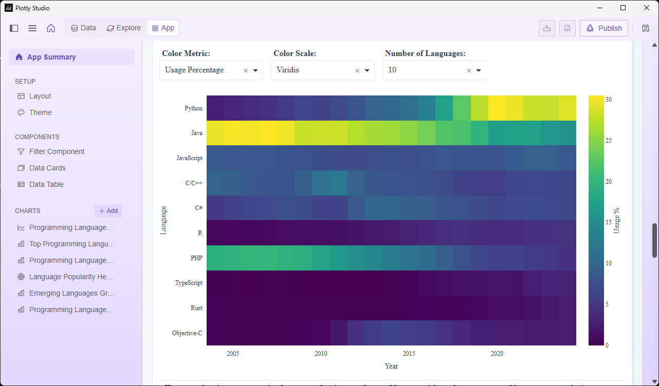
The app is a single Dash page. Below you can see the top of the app that allows you to select various options, and as you scroll down, the charts will be revealed.

The five charts are detailed below, starting with the title and a screenshot and followed by the specification of the chart as defined by Plotly Studio.
1. Programming language popularity trends over time

Chart:
- Type: Line
- X: Date (
Date) - Y: Usage percentage (
selected language)
Data:
- Time series of language popularity from 2004 to 2024
- Aggregated by month (raw data available)
- Multiple languages displayed as separate lines
Options:
- Multi-select dropdown to select languages (Java, Python, C/C++, C#, PHP, JavaScript, Visual Basic, Matlab, Objective-C, Perl, R, Ruby, Rust, Go, Kotlin, Swift, TypeScript, Scala, Groovy, Haskell, Lua, Delphi/Pascal, VBA, Cobol, Ada, Abap, Dart, Julia, Powershell, All) — Default Java, Python, C/C++, JavaScript
- Dropdown to select aggregation (Raw data, Average, Sum, Min, Max, Median) — Default Raw data
2. Top 10 programming languages by current usage

Chart:
- Type: Horizontal bar chart
- X: Usage percentage (latest month)
- Y: Language name
Data:
- Filtered to latest available date (December 2024)
- Sorted by usage percentage descending
- Limited to top 10 languages
Options:
- Dropdown to adjust N (5, 10, 15, 20, All) — Default 10
3. Compare growth trajectories of programming languages

Two charts side by side in separate components
Both charts use IDENTICAL structure:
- Type: Line chart
- X: Date (
Date) - Y: Usage percentage
Chart 1 (left) and Chart 2 (right) differ only by their language selection. Each chart should have a descriptive title showing which language is displayed.
Data:
- Chart 1: Time series of selected language 1 usage from 2004 to 2024
- Chart 2: Time series of selected language 2 usage from 2004 to 2024
Options:
- Dropdown to select language for Chart 1 (left) (all 30 languages) — Default Java
- Dropdown to select language for Chart 2 (right) (all 30 languages) — Default Python
- Dropdown for Y-axis range (Shared, Individual) — Default Shared
4. Language popularity heatmap by year

Chart:
- Type: Heatmap
- X: Year (extracted from
Date) - Y: Language name
- Color: Usage percentage or None (via Dropdown)
Data:
- Aggregated by year and language, average usage percentage
- Filtered to top 15 languages by current usage
- Sorted by current popularity (descending)
Options:
- Dropdown to select color metric (Usage percentage, None) — Default Usage percentage
- Dropdown to select color scale (Viridis, Blues, Reds, Plasma) — Default Viridis
- Dropdown to adjust number of languages shown (10, 15, 20, All) — Default 15
5. Emerging languages growth rate analysis

Chart:
- Type: Scatter plot
- X: Usage in 2004 (
initial usage) - Y: Usage in 2024 (
current usage) - Size: Growth rate or None (via Dropdown)
- Color: Language category or None (via Dropdown)
Data:
- Calculated growth rate as (2024 usage — 2004 usage) / 2004 usage
- Filtered to languages with measurable 2004 baseline
- Each point represents one language
Options:
- Dropdown to select size metric (Growth rate, None) — Default Growth rate
- Dropdown to select color grouping (Language category, None) — Default None
Is it an app or a list of charts
Given that I did not specify any requirements, this is not a bad result. It is, however, simply a list of charts. Relevant charts, to be sure, and they could form the basis of a report, but still just a list of charts, not a complete application.
You can tailor charts by giving Plotly Studio a specification of what you want, and it will execute your commands very competently but, for full customisation, you probably want to invest in a paid version. This will give you access to the Dash code so that you can create a complete application.
What Plotly Studio does, it does well. And if you want a Dash app that will display your data and charts, then that’s exactly what you get.
Things have changed (a little)
As I warned earlier, Plotly Studio appears to be in a state of flux at the moment. The interface has, indeed, changed since beginning this article, but the functionality seems to be much the same: you still specify a data source, and it produces charts.
Plotly Studio is free to download and quite fun to work with. If you think this might be a solution for your data analysis and visualization needs, then you should download the trial and give it a go.
Notes
- The data comes from the Kaggle dataset Most Popular Programming Languages Since 2004 by Muhammad Khalid, accessed 29th April 2025. A copy of the version used here can be found in my GitHub repo, here.
메타데이터
- post_id
- 5f5dfe42775f
- slug
- plotly-studio-ai-data-analysis-and-visualization-5f5dfe42775f
- url
- https://medium.com/codefile/plotly-studio-ai-data-analysis-and-visualization-5f5dfe42775f
- canonical_url
- https://medium.com/codefile/plotly-studio-ai-data-analysis-and-visualization-5f5dfe42775f
- author_url
- https://medium.com/@alan-jones
- status
- ok
- fetched_at
- 2026-06-10 08:17:25