Dark patterns in UX design with example
You often hear stories of people being tricked in markets or by individuals. But have you ever heard stories of people being tricked by…
Dark patterns in UX design with example
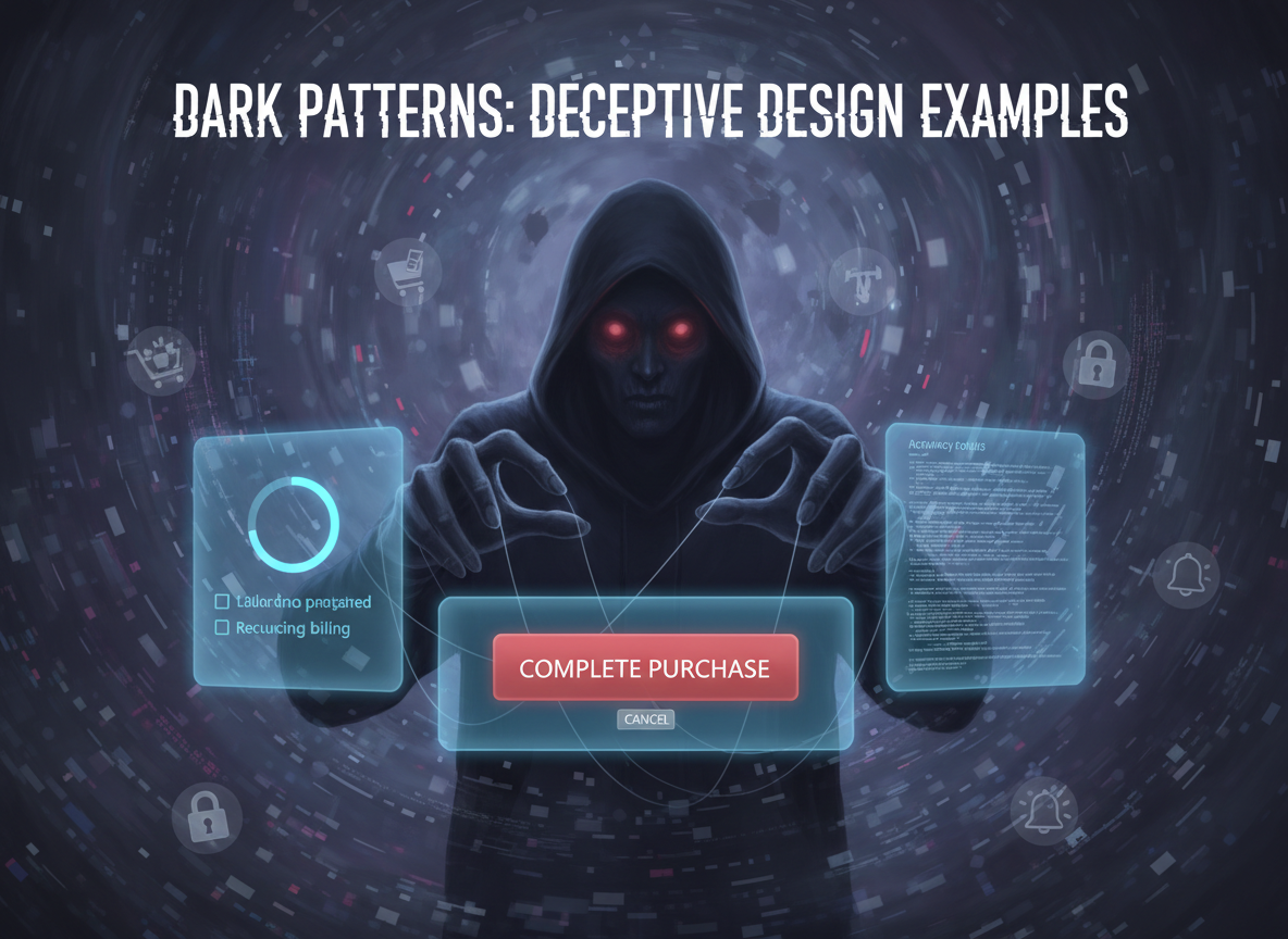
Adobe firefly
You often hear stories of people being tricked in markets or by individuals. But have you ever heard stories of people being tricked by digital portal or online shopping portals? The answer could be YES or NO, because many of these digital tricks go unnoticed.
In the digital world, these tricks are known as dark patterns, a term coined by Harry Brignull.
Recognizing the harm they cause to user online consumers, several governments — including the Indian government — have introduced the guidelines to curb these practices.
In India, the Central Consumer Protection Authority (CCPA) issued official guidelines in November 2023 under the Consumer Protection Act, 2019.
In this guideline, government of India officially identified 13 Major dark patterns that often appears in apps, websites, and digital services we use every day.
List of 13 dark patterns
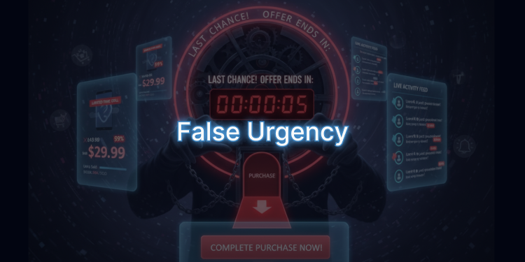
- False Urgency — Creating a fake sense of urgency or scarcity. Example: “Only 2 rooms left! 30 people are viewing this right now.”
- Basket Sneaking — Adding items or services to the cart without the user’s consent. Example: Travel insurance added automatically during checkout.
- Confirm Shaming — Making users feel guilty for not taking an action. Example: “I’ll stay unsecured” or “Charity is for the rich, I don’t care.”
- Forced Action — Forcing users to sign up or share personal data to continue. Example: Blocking checkout unless you subscribe to a newsletter.
- Subscription Trap — Easy to subscribe, but difficult to cancel. Example: Cancel button hidden or placed in a confusing location.
- Interface Interference — Hiding or misdirecting important information through design.
- Bait and Switch — Advertising one product but pushing users to buy a more expensive alternative. Example: Showing a low-cost product, then saying it’s unavailable and offering a pricier option instead.
- Drip Pricing — Showing a low price upfront, then adding hidden charges later. Example: Flight ticket advertised at ₹5,000, but final payment shows ₹6,500 after extra fees.
- Disguised Ads — Presenting advertisements as normal interface elements. Example: A big “Download” button that is actually an ad.
- Nagging — Repeated prompts or interruptions that annoy the user. Example: Constant reminders to download an app.
- Trick Questions — Using confusing language to mislead user choices. Example: “Do you wish to opt out of receiving updates forever?” with options like “Yes, I want updates” and “Not now,” instead of a clear Yes/No.
- SaaS Billing — Converting free trials into paid subscriptions without clear notice. Example: A free trial ends and automatically charges your card without any reminder or confirmation.
- Rogue Malware — Using scare tactics to trick users into paying for fake security tools. Example: A pop-up says, “Your computer is infected! Pay ₹999 to clean it,” but the tool installs malware instead.
Dark patterns are now considered as illegal in many countries, and these guidelines are expected to protect consumer and act as a deterrent for companies that commonly use such tactics to mislead users.
This article, along with a series of upcoming articles, aims to raise awareness about dark patterns by using simple examples that help everyday users and consumers identify them. It also seeks to encourage the design community to avoid using dark patterns — whether intentionally or unintentionally.
So, what Are Dark Patterns?
Dark patterns are design elements intentionally crafted to manipulate user behaviour.
These patterns subtly influence, encourage, or even push users to take actions that primarily benefit the company implementing them. In simple terms, dark patterns trick users into doing something they did not plan or want to do.
There are many kinds of dark patterns out there, and experts have spent years studying and categorizing them.
Dark Patterns vs. Persuasive Design
Sometimes it is difficult to distinguish whether a pattern is a dark pattern or a persuasive design. For example, take a look at Image 1 — the Myntra product detail page, where the size selector shows how many items are left. If the number shown is authentic and the company is not engaging in any manipulative business practices, then it is not a dark pattern but rather a persuasive design.
How to protect yourself as user?
These dark patterns are deliberately designed to influence a user’s decision-making — often without them realising it. By manipulating cognitive biases, they subtly push users or customers toward actions they may not have taken otherwise. In simple terms, dark patterns play with the user’s mind, affecting choices that should ideally be made freely and consciously.
This brings us to an important question: What can users or customers do to protect themselves?
No matter which website or app you use, or how much you trust a brand, it’s essential to stay aware and alert. Recognising dark patterns and practising mindful browsing can help you avoid falling into these traps.
Practical tips to protect yourself from dark patterns
Read carefully before taking any action — Take a moment to read product details, pop-ups, consent boxes, and terms. Rushing increases the chance of missing hidden tricks.
Double-check your cart — Before proceeding to payment, review your cart for any unexpected or unwanted items that might have been added automatically.
Be vigilant about “no escape” pressure — If you feel you’re being pushed into a quick purchase or a time-bound decision, pause. Legitimate services always provide a clear way to opt out. High-pressure nudges are often a red flag.
Seek a second opinion — There’s no harm in asking someone you trust for advice — especially if they have some knowledge of the product or service. A quick check can prevent long-term regret.
Report suspicious dark patterns — If you encounter manipulative design practices, report them to the platform or relevant consumer authority. Raising awareness helps protect others too.
Why Businesses and Designers Should Avoid Dark Patterns
Dark patterns don’t just trick users — they destroy trust. When customers feel misled, they experience frustration and even betrayal. This often leads to abandoned purchases, negative reviews, and a damaged brand reputation. In today’s competitive market, trust is everything. A single bad experience can push users toward competitors and harm long-term loyalty.
Designers share equal responsibility. While some dark patterns may appear unintentionally, they should be fixed immediately. Ethical design isn’t just about compliance — it’s about creating experiences that users value and enjoy. Good design builds confidence, not confusion.
To achieve this, focus on:
- Understand user behavior — Learn how users interact with your product and make decisions. Use this knowledge to create intuitive, user-friendly experiences.
- Clear, simple language — Avoid jargon and misleading phrasing that could confuse or misdirect users.
- Transparent pricing — Show all costs upfront. Avoid hidden charges or tactics that lead to unexpected expenses.
- Easy opt-out options — Give users full control to cancel subscriptions or opt out of services without hassle.
- Compliance with laws — Follow consumer protection and data privacy regulations, as well as local government guidelines.
- Use ethical design tools — Leverage available resources and tools to identify and eliminate dark patterns.
By prioritizing honesty and user-centric design, businesses and designers can build trust, strengthen relationships, and create products that people genuinely love.
Conclusion: Dark patterns are more than just clever design tricks — they are manipulative practices that erode trust and harm user experience. As consumers become increasingly aware of these tactics, businesses and designers must prioritize transparency and ethical design. Building trust is not only a legal and moral obligation but also a strategic advantage in a competitive market. By avoiding dark patterns and focusing on user-centric design, we create products that are desirable, helpful, and truly valuable. Awareness is the first step — together, we can ensure digital spaces remain fair and respectful for everyone.
References:
Different books references including Indian bare act.
- Deceptive Patterns in UX: How to Recognize and Avoid Them — NN/G
- Dark Design Patterns Catalog — Jakob Nielsen on UX
- https://doca.gov.in/ccpa/files/The%20Guidelines%20for%20Prevention%20and%20Regulation%20of%20Dark%20Patterns,%202023_1732707717.pdf
- https://medium.com/design-bootcamp/deceptive-design-and-how-to-avoid-dark-patterns-62a6dff026e4
- https://arxiv.org/pdf/1907.07032
- https://www.ndtv.com/india-news/dark-patterns-explained-what-are-dark-patterns-dark-patterns-meaning-dark-patterns-in-e-commerce-dark-patterns-guidelines-8539355
- Dark Patterns in UX Design: How to Avoid Them | 2025
- 18 Dark Patterns Examples (and How to Avoid Them)
- Dark Patterns UX: What are They and What to Avoid? | Gapsy
- Dark Patterns in UI and UX: What They Are, Examples, and How to Avoid Them — Bonix Design
메타데이터
- post_id
- 5fa8b13b61a7
- slug
- dark-patterns-in-ux-design-with-example-5fa8b13b61a7
- url
- https://medium.com/@kamlesh.hanswal/dark-patterns-in-ux-design-with-example-5fa8b13b61a7
- canonical_url
- https://medium.com/@kamlesh.hanswal/dark-patterns-in-ux-design-with-example-5fa8b13b61a7
- author_url
- https://medium.com/@kamlesh.hanswal
- status
- ok
- fetched_at
- 2026-07-26 09:46:03