3.2 Reactive Forms Done Right: Validation Patterns Every Angular Developer Should Know
Required Fields, Email Validation, and Min Value Rules with Angular Material — One Form for Create and Edit
3.2 Reactive Forms Done Right: Validation Patterns Every Angular Developer Should Know
Required Fields, Email Validation, and Min Value Rules with Angular Material — One Form for Create and Edit
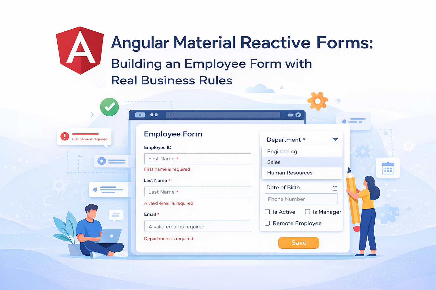
Template-driven forms work fine for login boxes. Reactive forms are what you use when the stakes are higher: a form that creates records in a production database, needs per-field validation messages, must pre-populate for editing, and has to submit different API payloads depending on whether you’re creating or updating.
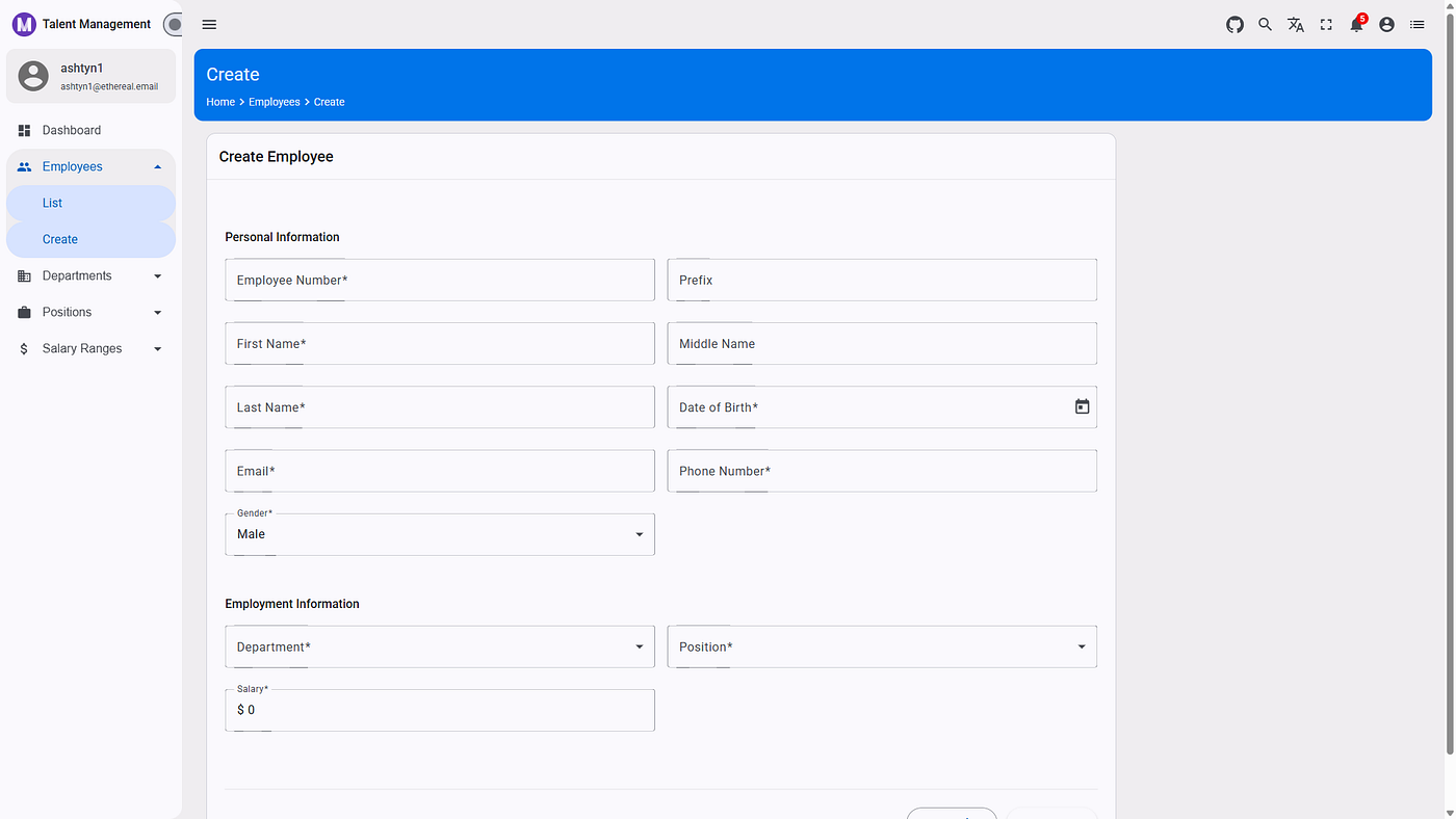
This article builds the Employee Form from the TalentManagement app — a single component that handles both “Create Employee” and “Edit Employee” modes, validates 12 fields with real business rules, loads dropdown options from the API, and gives users clear error messages at the right moment.
📖 Tutorial Repository: AngularNetTutorial on GitHub
This article is part of the AngularNetTutorial series. The full-stack tutorial — covering Angular 20, .NET 10 Web API, and OAuth 2.0 with Duende IdentityServer — has been published at Building Modern Web Applications with Angular, .NET, and OAuth 2.0. This article dives deep into how Angular reactive forms handle validation, create mode, and edit mode in a single reusable component.
📚 What You’ll Learn
- How
FormBuilderandFormGroupreplace template-driven form boilerplate - The four built-in validators used in this form:
required,email,maxLength,min - How
mat-errorwithhasError()shows the right message for the right error - Why
markAllAsTouched()is the correct way to trigger validation on submit - One component, two modes: detecting create vs edit via route params
patchValue()for populating a form from an API response without resetting untouched fields- Loading dropdown options (Departments, Positions) from the API into
mat-select mat-datepickerfor the Date of Birth field- Disabling the submit button during API calls to prevent double-submits
MatSnackBarfor success and error feedback
🏗️ Single Form, Two Modes
The EmployeeFormComponent handles both creation and editing with one FormGroup. The mode is determined by whether the route contains an id parameter:
/employees/create     → isEditMode = false → "Create Employee"
/employees/edit/:id   → isEditMode = true  → "Edit Employee"
checkEditMode(): void {
  this.employeeId = this.route.snapshot.paramMap.get('id') || undefined;
  this.isEditMode = !!this.employeeId;
  if (this.isEditMode && this.employeeId) {
    this.loadEmployee(this.employeeId);
  }
}
!!this.employeeId converts the string-or-undefined to a boolean. If id is present, loadEmployee() fetches the employee from the API and populates the form. If not, the form stays empty and ready for input.
The form title, submit button label, and API call all adapt to the mode:
getFormTitle(): string {
  return this.isEditMode ? 'Edit Employee' : 'Create Employee';
}
<mat-card-title>{{ getFormTitle() }}</mat-card-title>
<button type="submit" mat-raised-button color="primary" [disabled]="loading">
  {{ isEditMode ? 'Update' : 'Create' }}
</button>
📋 Building the FormGroup
FormBuilder.group() creates the FormGroup with initial values and validators in one declarative block:
initForm(): void {
  this.employeeForm = this.fb.group({
    employeeNumber: ['', [Validators.required, Validators.maxLength(50)]],
    prefix:         ['', Validators.maxLength(10)],
    firstName:      ['', [Validators.required, Validators.maxLength(100)]],
    middleName:     ['', Validators.maxLength(100)],
    lastName:       ['', [Validators.required, Validators.maxLength(100)]],
    birthday:       [null, Validators.required],
    gender:         [Gender.Male, Validators.required],
    email:          ['', [Validators.required, Validators.email, Validators.maxLength(255)]],
    phone:          ['', [Validators.required, Validators.maxLength(20)]],
    salary:         [0, [Validators.required, Validators.min(0)]],
    positionId:     ['', Validators.required],
    departmentId:   ['', Validators.required],
  });
}
Each field follows the tuple format: [initialValue, validators]. When a field has multiple validators, pass them as an array.
A few notable defaults:
birthday: [null, ...]—nullinstead of''because the date picker expects a null starting value, not an empty stringgender: [Gender.Male, ...]— pre-selected to avoid a blank select on first loadsalary: [0, ...]— starts at zero to give the number input a meaningful default
Optional vs required:
Fields without Validators.required are optional by design:
prefix:     ['', Validators.maxLength(10)],   // optional
middleName: ['', Validators.maxLength(100)],  // optional
The maxLength validator still runs on optional fields — an empty string passes maxLength, so no error is shown when the field is blank. But if a user types more than the limit, the error appears immediately.
✅ Validators: Four Patterns
1. Required
firstName: ['', [Validators.required, Validators.maxLength(100)]],Validators.required fails on empty strings, null, and undefined. It sets the required error key on the control when invalid.
2. Email Format
email: ['', [Validators.required, Validators.email, Validators.maxLength(255)]],Validators.email uses a regex to check for a valid email format. It sets the email error key — separate from required. This matters for showing the right error message: "Email is required" vs "Please enter a valid email."
3. Max Length
employeeNumber: ['', [Validators.required, Validators.maxLength(50)]],Validators.maxLength(n) fails when value.length > n. It sets the maxlength error key with details about the actual and allowed length.
4. Min Value
salary: [0, [Validators.required, Validators.min(0)]],Validators.min(0) fails when the numeric value is less than 0. It sets the min error key. Useful for numeric inputs where negative values don't make business sense.
🔴 Displaying Errors: mat-error and hasError()
mat-error inside a mat-form-field only displays when the field is invalid and touched (the user has interacted with it). Angular Material handles this timing automatically — errors don't flash on every field the moment the form loads.
Single Error Per Field
<mat-form-field appearance="outline">
  <mat-label>First Name</mat-label>
  <input matInput formControlName="firstName" />
  <mat-error *ngIf="employeeForm.get('firstName')?.hasError('required')">
    First name is required
  </mat-error>
</mat-form-field>
employeeForm.get('firstName') returns the AbstractControl for that field. ?.hasError('required') uses optional chaining to avoid null errors during form initialization, and checks for the specific error key.
Multiple Errors Per Field
When a field has multiple validators, each possible error gets its own mat-error element:
<mat-form-field appearance="outline">
  <mat-label>Email</mat-label>
  <input matInput type="email" formControlName="email" />
  <mat-error *ngIf="employeeForm.get('email')?.hasError('required')">
    Email is required
  </mat-error>
  <mat-error *ngIf="employeeForm.get('email')?.hasError('email')">
    Please enter a valid email
  </mat-error>
</mat-form-field>
Angular Material shows all mat-error elements whose *ngIf is true simultaneously — but in practice, only one error is active at a time. An empty field fails required but not email. A field with "notanemail" fails email but not required. The hasError() check makes each message mutually exclusive.
The salary field handles two numeric validators:
<mat-form-field appearance="outline">
<mat-label>Salary</mat-label>
<input matInput type="number" formControlName="salary" />
<span matTextPrefix>$ </span> <mat-error *ngIf="employeeForm.get('salary')?.hasError('required')">
Salary is required
</mat-error>
<mat-error *ngIf="employeeForm.get('salary')?.hasError('min')">
Salary must be greater than 0
</mat-error>
</mat-form-field>matTextPrefix adds the $ symbol inside the form field to the left of the input — a built-in Material feature requiring no custom CSS.
📤 Submitting: markAllAsTouched()
The form binds to ngSubmit:
<form [formGroup]="employeeForm" (ngSubmit)="onSubmit()">The submit handler checks validity before calling the API:
onSubmit(): void {
  if (this.employeeForm.invalid) {
    this.employeeForm.markAllAsTouched();
    return;
  }
  this.loading = true;
  // ... API call
}
Why markAllAsTouched()?
mat-error only displays for touched fields. A user who clicks Submit immediately without touching any field would see a valid-looking form even though required fields are empty — the errors are hidden because nothing has been "touched."
markAllAsTouched() marks every control as touched simultaneously, forcing Angular Material to display all pending validation errors at once. The user sees every problem on the first submit attempt, not one field at a time.
🔄 Edit Mode: patchValue()
When editing an existing employee, loadEmployee() fetches the record and populates the form:
loadEmployee(id: string): void {
  this.loading = true;
  this.employeeService.getById(id).subscribe({
    next: (employee: Employee) => {
      this.employeeForm.patchValue({
        employeeNumber: employee.employeeNumber,
        prefix:         employee.prefix,
        firstName:      employee.firstName,
        middleName:     employee.middleName,
        lastName:       employee.lastName,
        birthday:       employee.birthday || employee.dateOfBirth,
        gender:         employee.gender,
        email:          employee.email,
        phone:          employee.phone || employee.phoneNumber,
        salary:         employee.salary,
        positionId:     employee.positionId,
        departmentId:   employee.departmentId,
      });
      this.loading = false;
    },
    error: error => {
      console.error('Error loading employee:', error);
      this.showMessage('Error loading employee');
      this.loading = false;
    },
  });
}
patchValue() vs setValue():
setValue()requires every field in theFormGroupto be provided — it throws if any key is missingpatchValue()only updates the fields you provide — missing keys are ignored
patchValue() is the right choice here because it's safe even if the API response is missing optional fields.
Field name fallbacks:
birthday: employee.birthday || employee.dateOfBirth,
phone:    employee.phone    || employee.phoneNumber,
The API response may use slightly different field names depending on how data shaping is applied. The || fallback handles both naming conventions without breaking the form.
🔽 API-Loaded Dropdowns with mat-select
Department and Position dropdowns are loaded from the API on ngOnInit:
loadDependencies(): void {
  this.departmentService.getAll().subscribe({
    next: departments => { this.departments = departments; },
    error: error => {
      console.error('Error loading departments:', error);
      this.showMessage('Error loading departments');
    },
  });
  this.positionService.getAll().subscribe({
    next: positions => { this.positions = positions; },
    error: error => {
      console.error('Error loading positions:', error);
      this.showMessage('Error loading positions');
    },
  });
}
In the template, mat-select binds the control and mat-option iterates over the loaded arrays:
<mat-form-field appearance="outline">
  <mat-label>Department</mat-label>
  <mat-select formControlName="departmentId">
    <mat-option *ngFor="let dept of departments" [value]="dept.id">
      {{ dept.name }}
    </mat-option>
  </mat-select>
  <mat-error *ngIf="employeeForm.get('departmentId')?.hasError('required')">
    Department is required
  </mat-error>
</mat-form-field>
<mat-form-field appearance="outline">
  <mat-label>Position</mat-label>
  <mat-select formControlName="positionId">
    <mat-option *ngFor="let position of positions" [value]="position.id">
      {{ position.positionTitle }}
    </mat-option>
  </mat-select>
  <mat-error *ngIf="employeeForm.get('positionId')?.hasError('required')">
    Position is required
  </mat-error>
</mat-form-field>
[value]="dept.id" stores the department's GUID in the form control — not the display name. The form value sent to the API contains IDs, not text labels. The mat-option text ({{ dept.name }}) is only for display.
The Gender dropdown uses a component property instead of an API call, since it’s a fixed enum:
genderOptions = [
  { value: Gender.Male,   label: 'Male' },
  { value: Gender.Female, label: 'Female' },
];

<mat-select formControlName="gender">
  <mat-option *ngFor="let option of genderOptions" [value]="option.value">
    {{ option.label }}
  </mat-option>
</mat-select>
📅 Date Picker with mat-datepicker
The birthday field uses Angular Material’s date picker:
<mat-form-field appearance="outline">
  <mat-label>Date of Birth</mat-label>
  <input matInput
    [matDatepicker]="dobPicker"
    formControlName="birthday" />
  <mat-datepicker-toggle
    matIconSuffix
    [for]="dobPicker">
  </mat-datepicker-toggle>
  <mat-datepicker #dobPicker></mat-datepicker>
  <mat-error *ngIf="employeeForm.get('birthday')?.hasError('required')">
    Date of birth is required
  </mat-error>
</mat-form-field>
Three elements working together:
<input [matDatepicker]="dobPicker">— the text input, linked to the picker via template reference<mat-datepicker-toggle [for]="dobPicker">— the calendar icon button that opens the picker, placed asmatIconSuffixinside the form field<mat-datepicker #dobPicker>— the popup calendar panel
formControlName="birthday" binds the selected date to the reactive form control. The date adapter configured in app.config.ts controls the format:
provideDateFnsAdapter({
  parse: { dateInput: 'yyyy-MM-dd' },
  display: { dateInput: 'yyyy-MM-dd' },
})
The API receives ISO date strings ("1990-05-15"), not JavaScript Date objects.
⏳ Loading State and Overlay
The template uses Angular 17’s @if control flow syntax for the loading overlay:
@if (loading) {
  <div class="loading-overlay">
    <mat-spinner></mat-spinner>
  </div>
}
The submit button is disabled while any API call is in progress:
<button type="submit" mat-raised-button color="primary" [disabled]="loading">
  {{ isEditMode ? 'Update' : 'Create' }}
</button>
[disabled]="loading" prevents double-submits — clicking Submit a second time while the API request is in flight does nothing. Without this guard, a slow connection could create the same employee twice.
📤 Building the API Payload
On submit, the form value is spread into the command interface:
// Create mode
const command: CreateEmployeeCommand = this.employeeForm.value;
// Edit mode
const command: UpdateEmployeeCommand = {
  id: this.employeeId,
  ...this.employeeForm.value,
};
In create mode, this.employeeForm.value directly matches the CreateEmployeeCommand interface — all form control names were chosen to align with the API command property names. In edit mode, id is added from this.employeeId since the ID isn't a form field.
🔔 User Feedback with MatSnackBar
Success and error messages use MatSnackBar with consistent positioning:
showMessage(message: string): void {
  this.snackBar.open(message, 'Close', {
    duration: 3000,
    horizontalPosition: 'end',
    verticalPosition: 'top',
  });
}
After a successful create:
this.showMessage('Employee created successfully');
this.router.navigate(['/employees', employee.id]);
After a successful update:
this.showMessage('Employee updated successfully');
this.router.navigate(['/employees', this.employeeId]);
Both cases navigate away after success — the snackbar appears briefly at the destination page. For errors, the component stays on the form so the user can correct the problem:
error: error => {
  this.showMessage('Error creating employee');
  this.loading = false;  // re-enable the submit button
},
🎯 Key Design Decisions
FormBuilder.group() over manual FormGroup construction — FormBuilder reduces boilerplate and keeps field names, defaults, and validators co-located. The alternative (new FormGroup({ firstName: new FormControl('', Validators.required) })) spreads the same information across more lines.
markAllAsTouched() on invalid submit — the most common reactive forms mistake is not handling the "user submits without touching any field" case. markAllAsTouched() covers it in one line.
patchValue() for edit mode — setValue() would require listing every field in the form, even if some fields aren't in the API response. patchValue() only updates what you provide.
Separate error messages per validator — <mat-error *ngIf="...hasError('email')"> and <mat-error *ngIf="...hasError('required')"> give users precise feedback. A single generic "Invalid email" message for both cases leaves users guessing whether the field is empty or malformed.
[disabled]="loading" on submit — prevents double-submits on slow connections without any additional logic. The form itself stays interactive so the user can review what they typed.
Form control names aligned with API command fields — this.employeeForm.value can be spread directly into CreateEmployeeCommand without field name mapping. Consistent naming between form and API eliminates a class of bugs.
🌟 Why This Matters
The dual-mode create/edit form — where the same ReactiveForm handles both POST and PUT depending on whether an ID is present — is one of the most common patterns in CRUD applications. Building it once correctly (with markAllAsTouched() for submit-time validation, patchValue() for edit mode, and per-field error messages) means every subsequent form in the app follows the same pattern.
The submit-guard pattern that prevents double submissions on slow networks transfers to any form in any Angular application. The validation approach using getFieldError() helpers eliminates the template noise that accumulates in Angular forms without a shared pattern.
Transferable skills:
- Dual-mode
FormBuilderinitialization — Applicable to any Angular feature with both create and edit workflows patchValue()for edit mode — Foundation for populating forms from existing entity data- Per-field error display with
markAllAsTouched()— Pattern for immediate validation feedback at form submit
🤝 Community & Support
Questions or feedback? The tutorial repository welcomes:
- ⭐ GitHub stars — Help others discover it!
- 🐛 Issue reports — Found a bug or have a suggestion?
- 💬 Discussions — Ask questions, share your use cases
- 🚀 Pull requests — Improvements always appreciated
Found this helpful? Share it with your team and follow for more full-stack development content!
메타데이터
- post_id
- 6065450a7e96
- slug
- reactive-forms-done-right-validation-patterns-every-angular-developer-should-know-6065450a7e96
- url
- https://medium.com/scrum-and-coke/reactive-forms-done-right-validation-patterns-every-angular-developer-should-know-6065450a7e96
- canonical_url
- https://medium.com/scrum-and-coke/reactive-forms-done-right-validation-patterns-every-angular-developer-should-know-6065450a7e96
- author_url
- https://medium.com/@fuji-nguyen
- status
- ok
- fetched_at
- 2026-07-12 00:07:18