How To Create Infographics With AI Using Nano Banana Pro
Learn how to create infographics with AI using Nano Banana Pro — the prompt structure, layout types, and iteration process that gets you a…
AI IMAGES
How To Create Infographics With AI Using Nano Banana Pro
Learn how to create infographics with AI using Nano Banana Pro — the prompt structure, layout types, and iteration process that gets you a usable result.
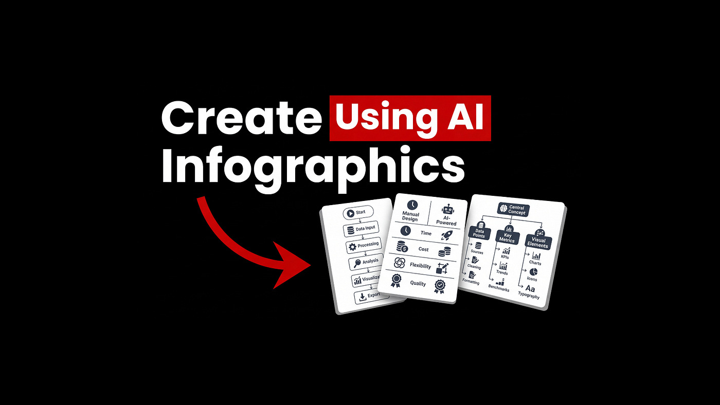
For years, AI image models were genuinely terrible at infographics. You’d ask for a clean layout with readable text and get back something that looked like clip art melted in the microwave.
The problem wasn’t AI image generation in general. It was that most models were trained on photos and art, not structured data layouts.
Nano Banana Pro is different… it’s specifically built for text rendering, structured composition, and producing clean vector-like output that actually looks designed.
Once you have the prompting formula down, you can generate a professional infographic in under a minute.
This guide covers the exact prompt structure, the 12 types worth trying, and the one mistake that kills your first result every time.
Why Most AI Infographics Look Terrible
The model was trained on the wrong kind of content.
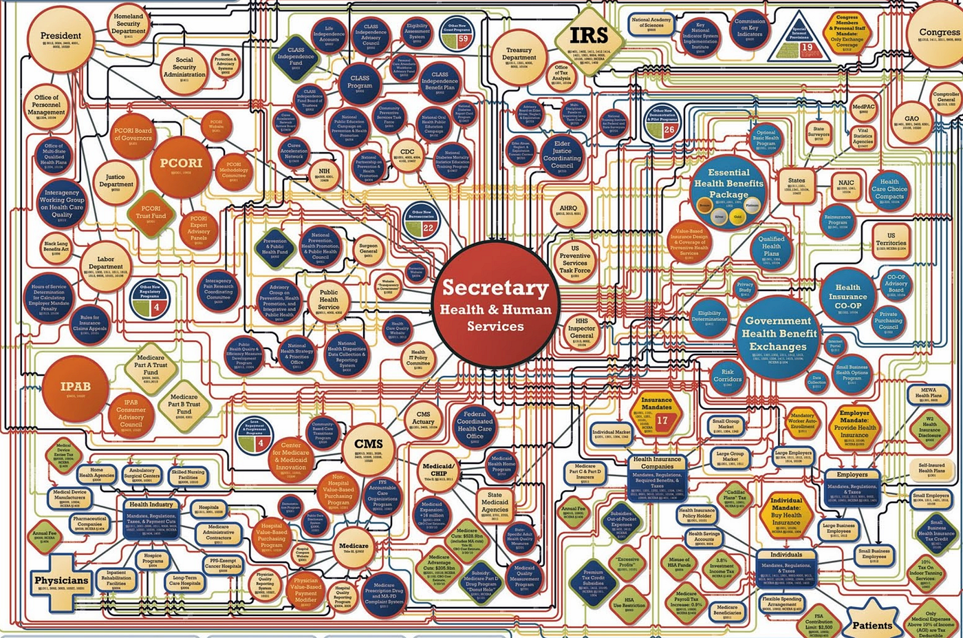
Photo-focused AI models have no mental model for grid layouts, text alignment, or visual hierarchy.
Ask for an infographic and they’ll produce something that technically contains the words you wanted, in sizes and positions they picked at random.
Nano Banana Pro was built to handle structured composition. Text lands where it should, columns stay columns, icons don’t randomly bleed into labels.
That’s the whole reason it works here where other models don’t, and it’s why it’s worth using for any infographic work you’re doing on a regular basis.
The One Mistake That Ruins First Results
Asking for “an infographic about X” and stopping there.
The model has no idea what layout you want, what text should actually appear, what the color palette is, or what you’re using the image for.
The more you leave out, the more it invents.
What it invents is almost always wrong.
The fix isn’t complicated… write out everything you want the model to produce before it produces it. The prompt is basically a visual brief, treat it like one.
The Nano Banana Prompt Structure That Works
This is the formula.
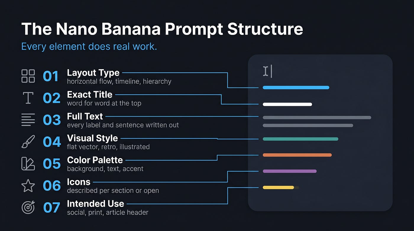
Every element here does real work:
- Describe the layout type: horizontal flow, two-column comparison, vertical list, timeline, hierarchy tree
- Include the exact title you want at the top
- Write out every piece of text that should appear, word for word
- Set the visual style: flat vector, minimal, retro, corporate, illustrated storytelling
- Define the color palette: background, text color, accent
- Specify icons: either describe them per section or let the model decide
- Note the intended use: article header, social post, print, presentation
That last item changes the output more than most people expect. A social post needs to read at thumbnail size, around 400px wide. A print piece can carry more detail.
Tell the model what the output is for and it adjusts accordingly.
12 Infographic Prompts Worth Trying
1. Workflow Infographic
Best for any process with a clear sequence of steps. Tutorials, onboarding flows, how-to content. Horizontal orientation keeps the eye moving left to right through the stages naturally.
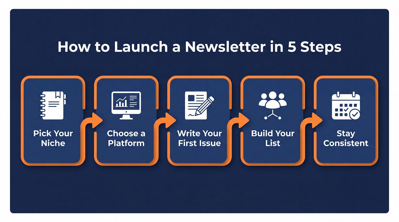
Clean flat vector infographic, landscape orientation, dark navy blue background, white text, orange accent color. Title at top in bold white: “How to Launch a Newsletter in 5 Steps.” Horizontal process flow with five steps connected by thick orange arrow lines. Each step inside a rounded rectangle with a soft drop shadow. Step 1: Pick Your Niche. Step 2: Choose a Platform. Step 3: Write Your First Issue. Step 4: Build Your List. Step 5: Stay Consistent. Small flat icon above each step label — notebook, computer screen, pencil, people group, calendar. No photorealistic elements. Minimal, professional. Readable at thumbnail size.
Orientation: landscape. Swap title, steps, and icons for any 4–7 step process.
2. Comparison Chart
Good for head-to-head tool comparisons, plan breakdowns, or feature evaluations. The two-column structure gives readers a clear visual anchor for each option.
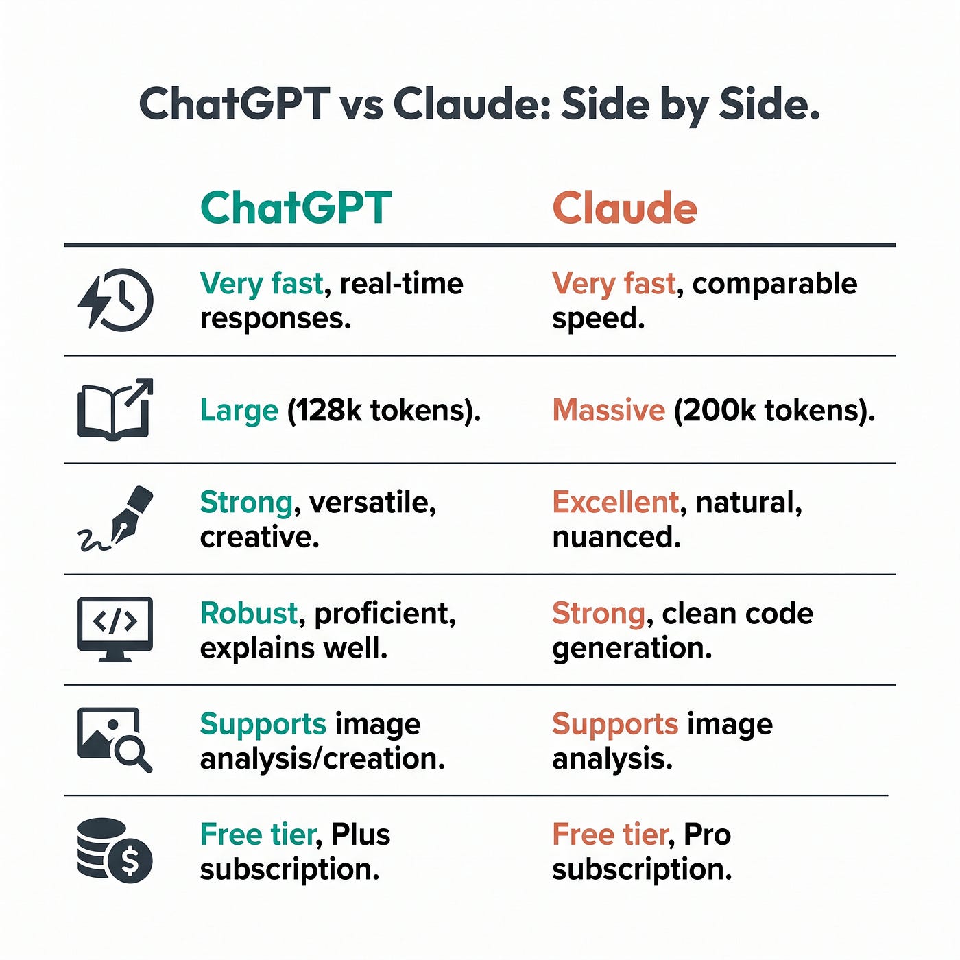
Clean flat vector infographic, square format, white background, dark charcoal text, teal and coral as accent colors. Title at top center: “ChatGPT vs Claude: Side by Side.” Two-column layout, left column header “ChatGPT” in teal, right column header “Claude” in coral. Six comparison rows below: Speed, Context Window, Writing Quality, Coding, Image Input, Price. Each row has a flat icon on the far left as a row label. Cell content is short, 3–5 words max. Thin horizontal divider lines between rows. Clean sans-serif font throughout. No shadows, no gradients. Minimal and scannable.
Orientation: square or portrait. Works for any two-option, multi-attribute comparison.
3. Timeline
For histories, product roadmaps, or anything with a chronological arc. Match the orientation to how dense the content is — wide for sparse, tall for detailed.
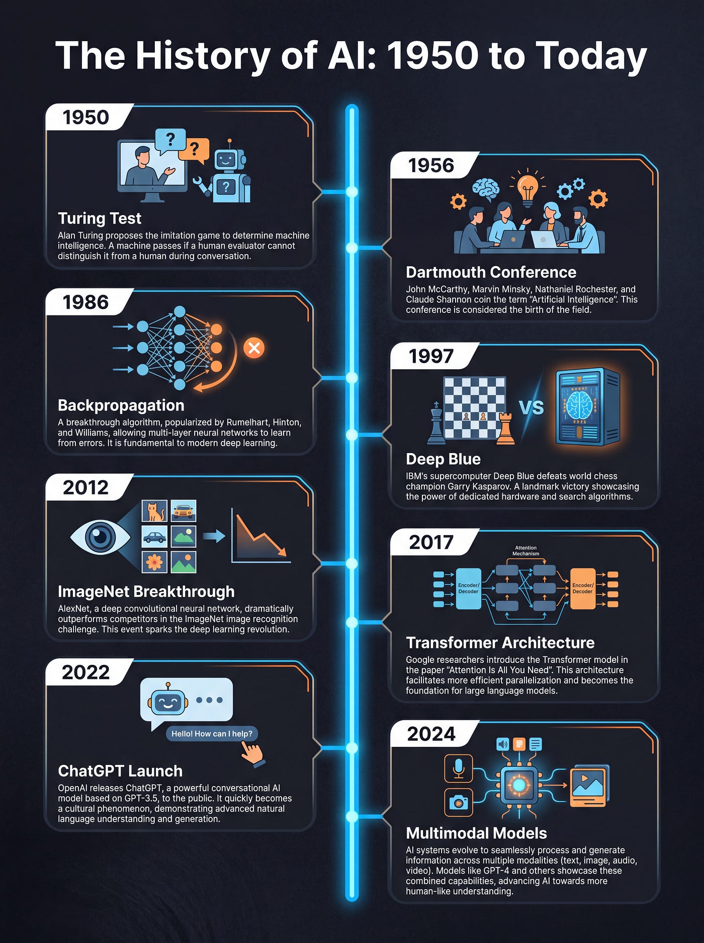
Detailed illustrated infographic, portrait orientation, dark charcoal background with subtle dark texture. Title at top: “The History of AI: 1950 to Today.” Vertical timeline running down the center with a glowing electric blue line. Eight milestone nodes connected to the line alternating left and right. Each node: a year label, bold milestone title, two-sentence description in small white text, and a small illustrated icon. Milestones: 1950 Turing Test, 1956 Dartmouth Conference, 1986 Backpropagation, 1997 Deep Blue, 2012 ImageNet Breakthrough, 2017 Transformer Architecture, 2022 ChatGPT Launch, 2024 Multimodal Models. Flat vector icons, clean readable typography, generous spacing between nodes. No photorealistic elements. Warm electric blue and orange accent palette.
Orientation: portrait for dense timelines, landscape for sparse ones with fewer milestones.
4. Hierarchy Diagram
Org charts, team maps, system architectures. The more exact you are with labels and parent-child relationships, the cleaner the output. Vague hierarchy prompts produce vague hierarchy results.
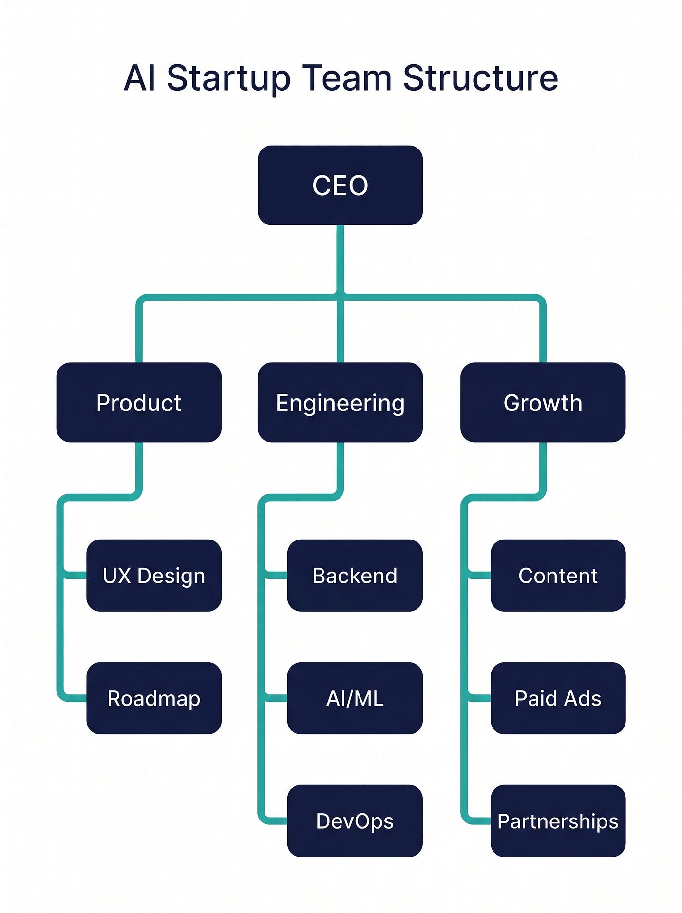
Clean minimal vector infographic, square format, white background, dark navy nodes, white node text, teal connector lines. Title at top: “AI Startup Team Structure.” CEO node at the top center. Three department nodes below connected by vertical lines: Product, Engineering, Growth. Under Product: UX Design, Roadmap. Under Engineering: Backend, AI/ML, DevOps. Under Growth: Content, Paid Ads, Partnerships. Each node is a rounded rectangle, same width. Lines connect parent to children with clean right-angle bends. Font is clean sans-serif. No icons, no gradients. Structure and label clarity is the only priority.
Orientation: square or portrait. The more levels you have, the taller the format needs to be.
5. Checklist
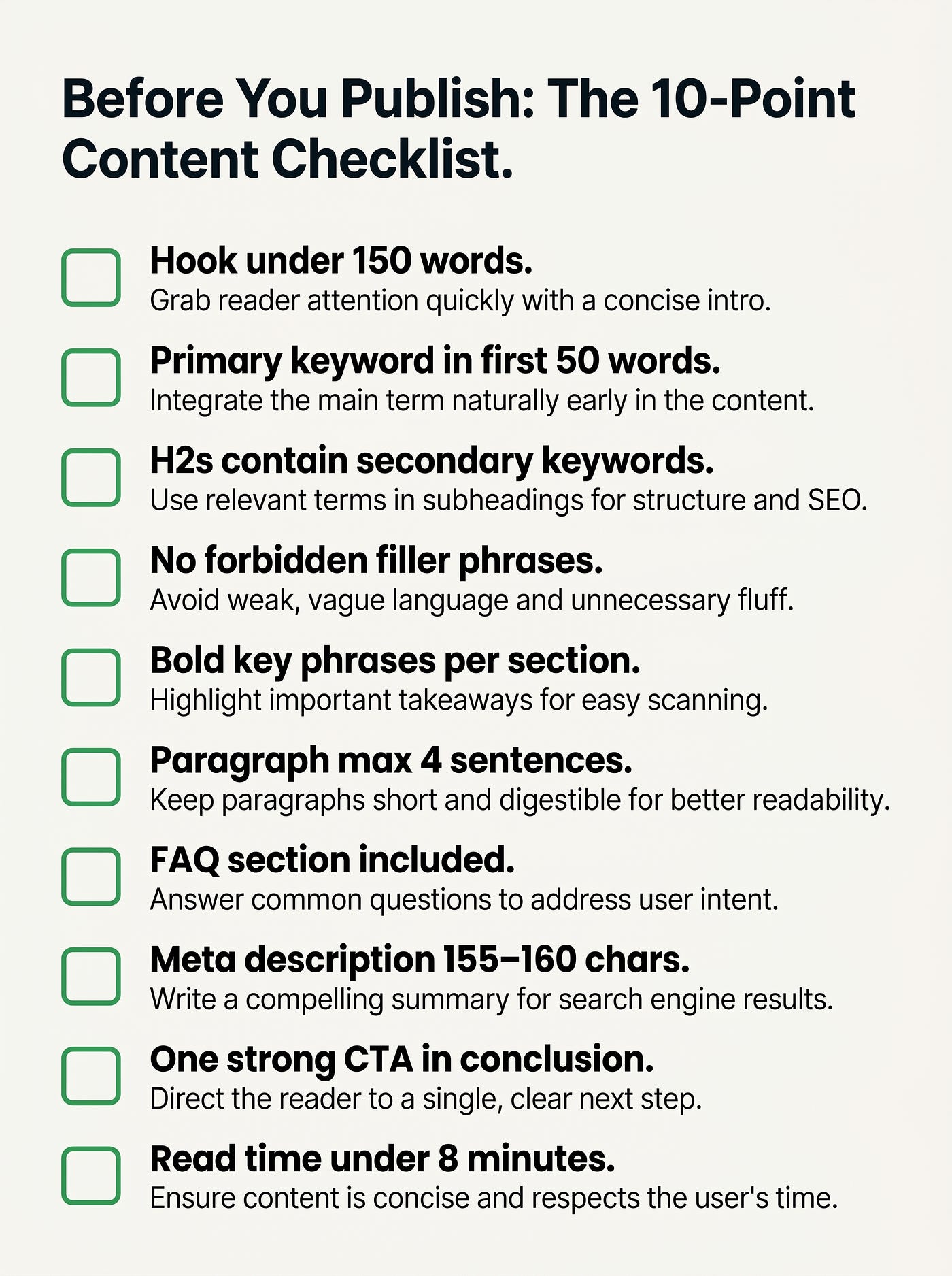
Simple vertical list with icons or checkboxes per item. Good for how-to content, pre-publish audits, or feature breakdowns. Probably the easiest format to get right on the first try.
Clean flat vector infographic, portrait orientation, off-white background, dark charcoal text, green check accent color. Title at top in bold: “Before You Publish: The 10-Point Content Checklist.” Ten items listed vertically with generous spacing. Each item has a green outlined checkbox on the left, bold short label, and a one-line description below in lighter gray text. Items: Hook under 150 words, Primary keyword in first 50 words, H2s contain secondary keywords, No forbidden filler phrases, Bold key phrases per section, Paragraph max 4 sentences, FAQ section included, Meta description 155–160 chars, One strong CTA in conclusion, Read time under 8 minutes. Clean modern sans-serif, no shadows, no photorealistic elements. Readable at 400px wide.
Orientation: portrait. Best for 6–12 items. Fewer than 6, use a different format.
6. Storytelling Poster
Looser structure, heavier on illustrated elements, more graphic than text. Better for topics with a narrative arc. Requires a more descriptive prompt, but the results can look genuinely polished.

Richly illustrated infographic poster, portrait orientation, warm cream background with aged paper texture. Title in vintage serif font at top: “From Bean to Cup: The Coffee Journey.” Illustrated narrative path winding from bottom to top of the poster across eight stages. Each stage has a hand-drawn style icon, a bold short title, and two lines of supporting text. Stages: 1 Coffee Cherry Picked, 2 Pulping and Fermentation, 3 Sun Drying, 4 Milling and Sorting, 5 Roasting, 6 Cupping and Grading, 7 Grinding, 8 Brewing. Warm earthy color palette: terracotta, espresso brown, golden yellow, forest green. Friendly hand-drawn illustration style. No corporate feel, no flat vector. Should feel like a premium artisan brand poster.
Orientation: portrait. Give the model a clear narrative direction — bottom to top, left to right, or circular — or it will pick.
7. Stats and Data Visualization
Best for articles built around numbers, survey results, or research findings. Turns raw data into a visual that makes the point instantly, without building a chart from scratch in a design tool.
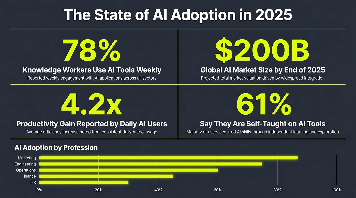
Clean flat vector data infographic, landscape orientation, dark slate background, white and electric yellow text, thin accent lines in yellow. Title at top center: “The State of AI Adoption in 2025.” Layout: four large stat blocks arranged in a 2x2 grid. Each block contains a large bold percentage or number, a short bold label underneath, and a one-line supporting note in smaller text. Stats: 78% of knowledge workers use AI tools weekly, $200B global AI market size by end of 2025, 4.2x productivity gain reported by daily AI users, 61% say they are self-taught on AI tools. Below the grid, a simple horizontal bar chart showing AI adoption by profession: Marketing, Engineering, Operations, Finance, HR. Bars in electric yellow, labels in white. Clean, no icons, data-first layout.
Orientation: landscape. Keep stat blocks to four. More than that and the numbers lose impact.
8. Before/After Panel
Good for transformation content — before and after an optimization, a redesign, a process change, or a behavior shift. Gives readers an instant visual contrast without having to read a paragraph to understand the gap.
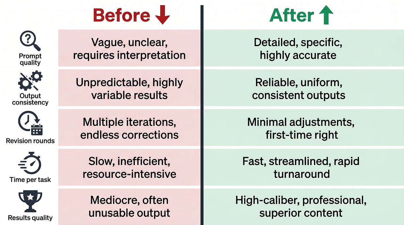
Clean flat vector infographic, landscape orientation, white background, dark charcoal text. Two equal columns divided by a bold vertical center line. Left column header: “Before” in red with a downward arrow. Right column header: “After” in green with an upward arrow. Five comparison rows: Prompt quality, Output consistency, Revision rounds, Time per task, Results quality. Left column (Before) cells in light red-tinted background, text describes the worse state in 4–6 words. Right column (After) cells in light green-tinted background, text describes the improved state in 4–6 words. Flat icons in the far left as row labels. Clean sans-serif font. No gradients, no photorealistic elements. High contrast. Readable at thumbnail size.
Orientation: landscape works best. Keep row text under 7 words per cell or it gets cramped.
9. Pros and Cons
Simpler than a full comparison chart. Best for evaluating a single option rather than comparing two things head-to-head. Works well for tool reviews, business decisions, or strategy pieces.
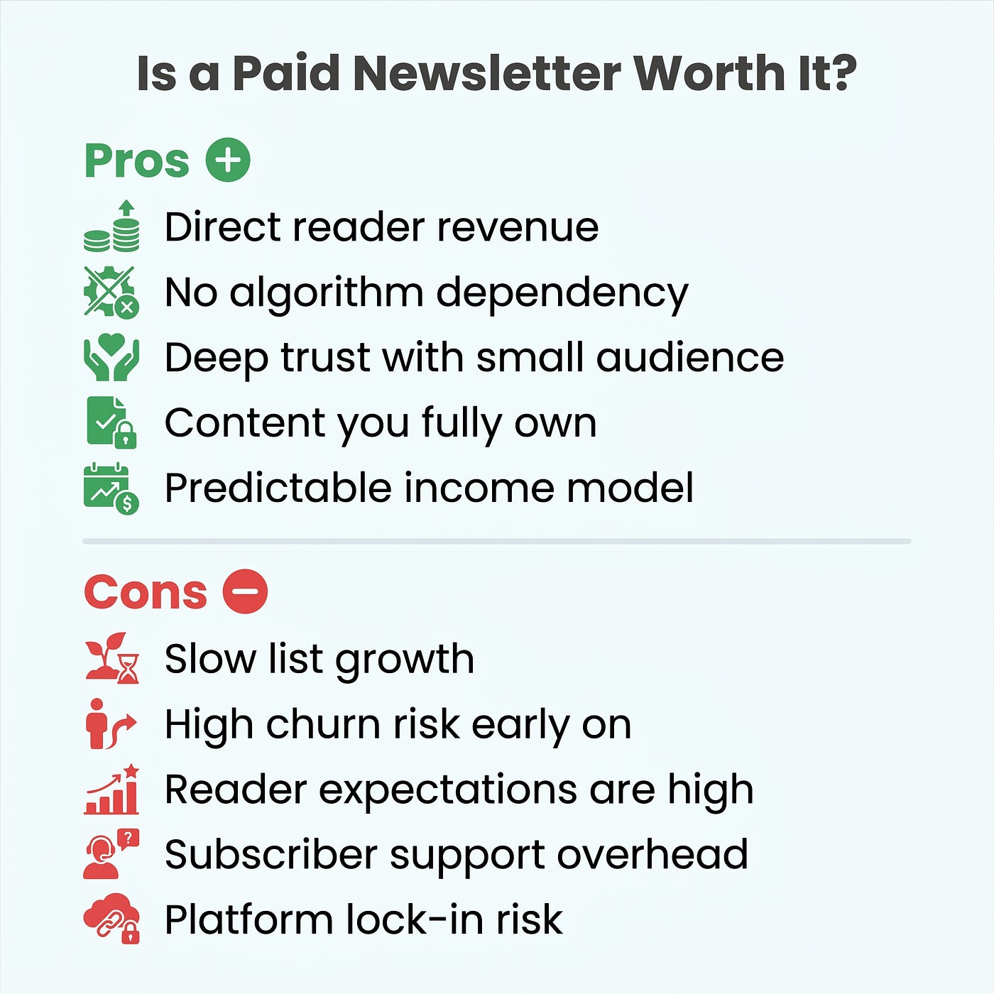
Clean flat vector infographic, square format, white background, green and red accent colors. Title at top center in bold dark text: “Is a Paid Newsletter Worth It?” Two sections separated by a soft horizontal divider. Top section header: “Pros” in green with a plus icon. Bottom section header: “Cons” in red with a minus icon. Five bullet points per section. Pros: Direct reader revenue, No algorithm dependency, Deep trust with small audience, Content you fully own, Predictable income model. Cons: Slow list growth, High churn risk early on, Reader expectations are high, Subscriber support overhead, Platform lock-in risk. Each point on its own line with a small corresponding flat icon. Clean modern sans-serif, generous line spacing. No gradients, no drop shadows.
Orientation: square or portrait. Keep it to 4–6 points per side. More than that and neither side reads clearly.
10. Mind Map
For concept-heavy content where the relationships between ideas matter as much as the ideas themselves. Good for explaining ecosystems, topic clusters, tool stacks, or decision frameworks.
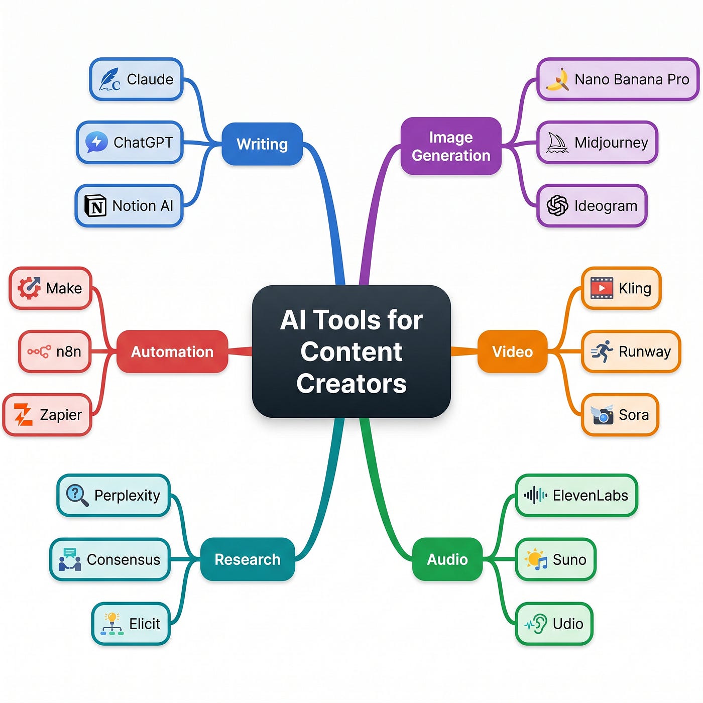
Clean vector mind map infographic, square format, white background, dark charcoal central node, color-coded branch nodes. Central node: “AI Tools for Content Creators” in a large rounded rectangle. Six branches radiating outward, each a different color: Writing (blue), Image Generation (purple), Video (orange), Audio (green), Research (teal), Automation (red). Each branch has three sub-nodes with specific tool examples. Writing: Claude, ChatGPT, Notion AI. Image Generation: Nano Banana Pro, Midjourney, Ideogram. Video: Kling, Runway, Sora. Audio: ElevenLabs, Suno, Udio. Research: Perplexity, Consensus, Elicit. Automation: Make, n8n, Zapier. Curved connector lines in matching branch color. Small flat icons next to each tool name. Clean sans-serif, tight node sizing, no overflow. High contrast, reads at thumbnail size.
Orientation: square. More than 6 main branches and it starts looking like a spider web. Sub-nodes: 3 per branch max.
11. Product Feature Breakdown
For tool reviews, plan comparisons, or any article where you need to show what something actually includes. Cleaner than a bullet list, more scannable than prose, and easy to screenshot as a standalone social asset.
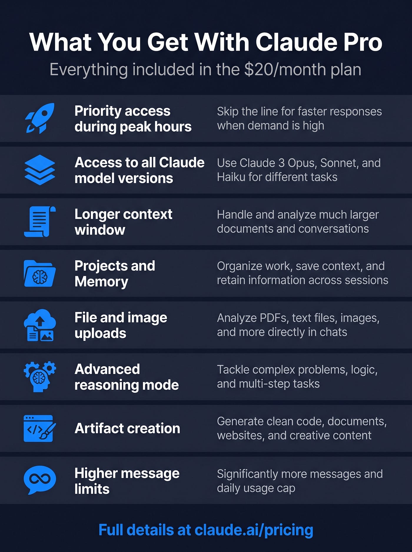
Clean flat vector infographic, portrait orientation, dark navy background, white text, electric blue accents. Title at top: “What You Get With Claude Pro.” Subtitle below in smaller gray text: “Everything included in the $20/month plan.” Eight feature rows below, each in its own horizontal strip with alternating very subtle stripe backgrounds. Each row: small flat icon on the left, bold feature name, short description in lighter gray text on the right. Features: Priority access during peak hours, Access to all Claude model versions, Longer context window, Projects and Memory, File and image uploads, Advanced reasoning mode, Artifact creation, Higher message limits. Bottom row: single bold CTA text in electric blue — “Full details at claude.ai/pricing.” No gradients, no photorealistic elements. Clean, corporate but minimal.
Orientation: portrait. Great for reviews — you can screenshot this as a standalone social asset too.
12. FAQ Poster
Turns your article FAQ section into a visual asset. Works well as a social post, an in-article embed, or a featured image that also answers the most common reader questions at a glance.
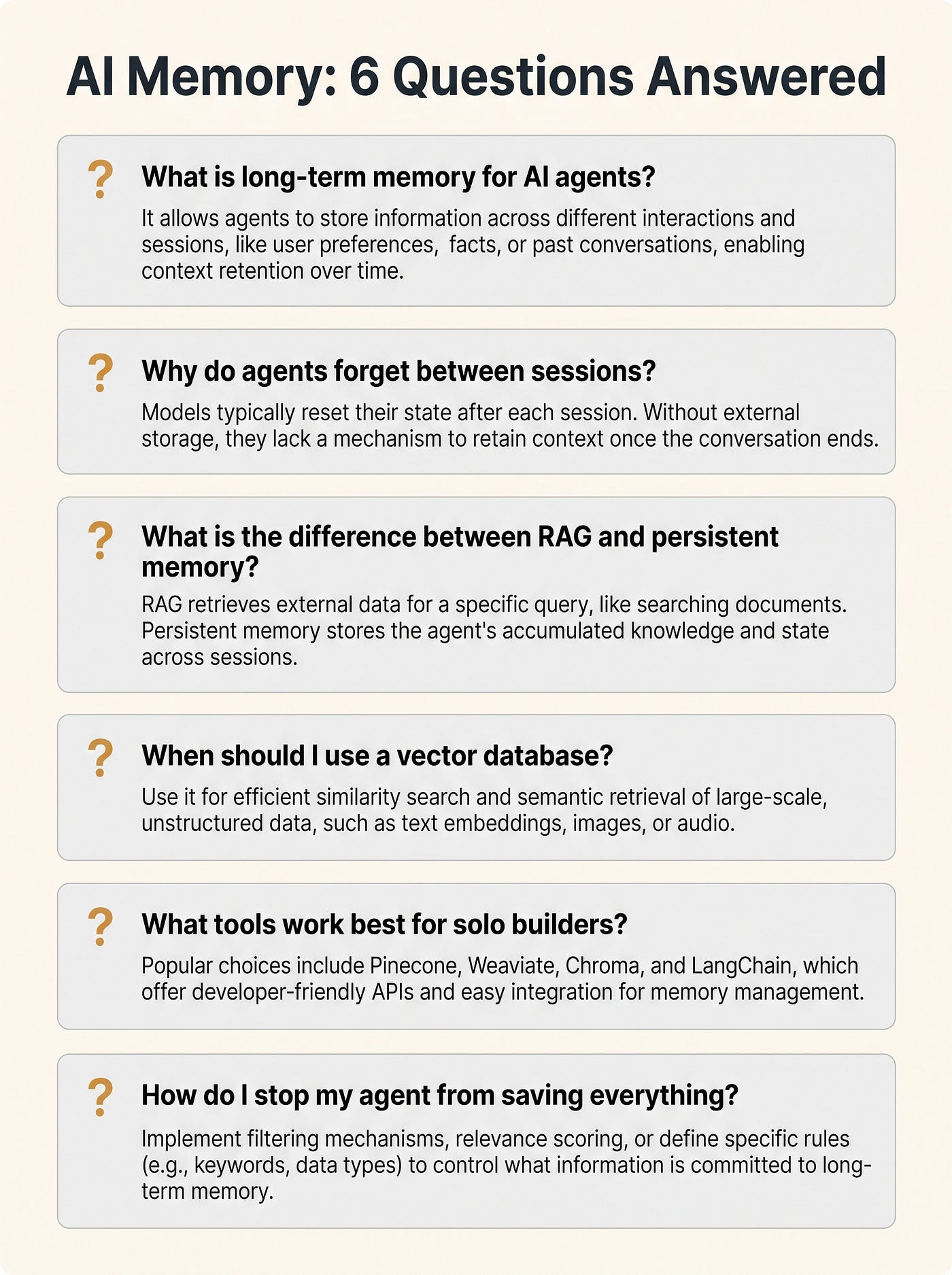
Clean flat vector FAQ infographic, portrait orientation, soft off-white background, dark charcoal text, warm amber accent color. Title at top in bold: “AI Memory: 6 Questions Answered.” Six question-and-answer blocks stacked vertically, each in its own card with a light gray background and subtle rounded corners. Each card: bold question in dark charcoal on top, concise 2–3 line answer in lighter gray below, small amber question mark icon top-left of each card. Questions: What is long-term memory for AI agents? Why do agents forget between sessions? What is the difference between RAG and persistent memory? When should I use a vector database? What tools work best for solo builders? How do I stop my agent from saving everything? Generous spacing between cards. Clean modern sans-serif font. No illustrations, no photorealistic elements.
Orientation: portrait. Best for 4–8 questions. More than that and the cards compress too much to read comfortably.
How To Iterate Without Starting Over
The first version usually gets close but rarely nails it.
Don’t rewrite the whole prompt. Change one variable at a time.
If the layout is right but the colors are off, fix only the color instruction and regenerate. If the text is correct but the spacing feels cramped, switch the orientation.
One change, one regenerate, check, repeat.
This gets you to a good result faster than rebuilding from scratch every time you don’t love the output.
Editing vs. Regenerating: When To Use Each
Editing works for small, targeted changes — removing a single text element, swapping a label, adjusting one icon. That’s what it’s for.
If something structural is wrong, regenerate.
Editing a layout that isn’t working is slower and produces worse results than just prompting a fresh version with better instructions.
Edit is a finishing tool, regeneration is the directional one.
Confusing the two is where people waste time.
FAQ
What infographic types does Nano Banana Pro handle well?
Workflows, comparisons, timelines, hierarchies, checklists, data visualizations, mind maps, and FAQ poster formats. Structured layouts with readable text are its clear strong point.
How specific do prompts need to be?
Write out every piece of text you want to appear. Describe the layout type. Define the colors. Set the style and intended use. The more specific the prompt, the less the model invents, and what it invents is usually wrong.
Does aspect ratio matter?
Yes. Match the orientation to your use case before generating. Landscape for horizontal flows, portrait for timelines and vertical lists, square for social. Setting this first saves you a round of regeneration.
Conclusion
Pick one infographic type, write out your exact content, and run a first generate using the prompt structure above.
If the result is close, iterate on one variable. If it’s off, adjust the orientation or style and go again.
The whole workflow from prompt to usable output takes under five minutes once you’ve run it a couple of times… the hard part is just writing the prompt properly the first time.
메타데이터
- post_id
- 64c78fa13d21
- slug
- how-to-create-infographics-with-ai-using-nano-banana-pro-64c78fa13d21
- url
- https://medium.com/ai-systems-lab/how-to-create-infographics-with-ai-using-nano-banana-pro-64c78fa13d21
- canonical_url
- https://medium.com/ai-systems-lab/how-to-create-infographics-with-ai-using-nano-banana-pro-64c78fa13d21
- author_url
- https://medium.com/@0xmega
- status
- ok
- fetched_at
- 2026-06-09 14:34:10