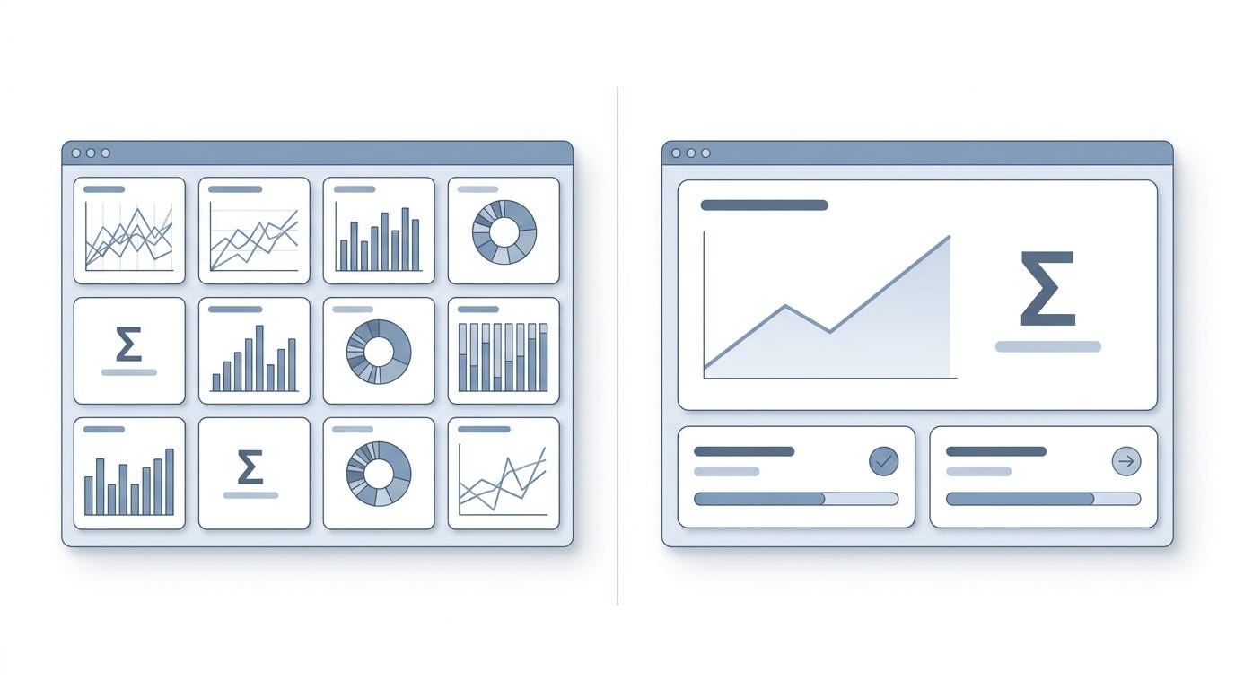
Why a Single Red Dot Can Hijack User Behavior for Weeks
The hidden behavioral psychology behind notification badges, and why your design system might be accidentally addicting your users.
Why a Single Red Dot Can Hijack User Behavior for Weeks
The hidden behavioral psychology behind notification badges, and why your design system might be accidentally addicting your users.
I still remember the exact moment I realized a six pixel circle had more psychological power than the entire feature set we had spent six months building.
It was a Tuesday afternoon. We were in a glass walled conference room, reviewing the final high fidelity mockups for a major update to our project management platform. The whiteboard was covered in user journey maps. The air conditioning was humming loudly. The team was tired, but the energy was high. We were finally ready to ship.
Then the argument started.
It was about a notification badge. Specifically, a small red dot that appeared next to the settings icon whenever a user had an unread system message.
The product manager wanted the dot to be persistent. He argued that system messages contained critical updates about billing, security patches, and new feature releases. He believed the red dot needed to remain on the screen until the user explicitly opened the message center and cleared it.
The lead visual designer disagreed. She argued that a persistent red dot created visual clutter. She suggested we use a subtle gray dot instead, or make the red dot disappear after twenty four hours. She felt the bright red was too aggressive for a non urgent system update.
I sat at the end of the table, listening to them debate the aesthetic and functional merits of a tiny circle. They were arguing about visual hierarchy, brand guidelines, and screen real estate.
But as I watched them, I realized they were completely missing the point.
They were treating the red dot as a user interface element. They were debating its size, its color, and its placement. But a red dot is not just a UI element. It is a psychological trigger. It is a behavioral lever. And depending on how we deployed it, we were about to fundamentally alter how our users felt, thought, and behaved for the next several weeks.
I cleared my throat and stopped the debate. I told them we were not going to make a decision based on visual preference. I told them we needed to understand what that tiny pixel was actually doing to the human brain.
Looking back, that conversation was a turning point in my career. It forced me to stop looking at design as just the arrangement of pixels on a screen. It forced me to start looking at design as the architecture of human behavior.
Most people assume that notification badges are just helpful little indicators. They assume a red dot simply tells the user that something new has arrived. It is a neutral piece of information.
This is a dangerous misunderstanding.
A red dot is never neutral. It is a highly calibrated psychological stimulus. It taps into deep evolutionary biology, cognitive biases, and behavioral conditioning. When you place a red dot on a screen, you are not just displaying information. You are initiating a cascade of neurological events. You are creating an open loop in the user’s working memory. You are triggering a micro stress response. You are potentially hooking them into a variable reward cycle.
And the most terrifying part is that these effects compound over time. A single red dot might only cause a momentary distraction on day one. But by week three, it can fundamentally alter the user’s relationship with your product, their stress levels, and their ability to focus.
Over the years, I have studied the hidden mechanics of these micro interactions. I have run the A/B tests. I have conducted the user interviews. I have watched the analytics dashboards light up when we changed the color of a badge from red to blue.
What I have learned is that we, as product builders, hold immense power over our users’ cognitive states. We are designing behavioral traps, often without even realizing it.
If you want to build products that people actually love, rather than products they compulsively check, you have to understand the psychology of the red dot. You have to understand why it works, how it harms, and how to design for cognitive respect.
Here is what I have learned about the hidden power of the notification badge.
The Zeigarnik Effect and the Unfinished Task
To understand why a red dot has such a profound impact on user behavior, we have to travel back to a Viennese restaurant in the 1920s.
A young psychologist named Bluma Zeigarnik was sitting in a busy cafe, observing the waiters. She noticed something fascinating. The waiters could remember incredibly complex, unpaid orders with perfect clarity. They could recall exactly which table wanted their soup before the salad, and which table needed their coffee black.
But the moment the bill was paid, the waiters completely forgot the order. The memory vanished almost instantly.
Zeigarnik realized that the human brain has a peculiar relationship with incomplete tasks. When a task is interrupted or left unfinished, the brain maintains a state of cognitive tension. It keeps the task active in our working memory. We experience a psychological itch that demands to be scratched. Once the task is completed, the tension is released, and the brain discards the information to free up cognitive resources.
This phenomenon became known as the Zeigarnik effect.
Now, fast forward ninety years to a digital dashboard.
When a user logs into your application and sees a red notification dot, their brain instantly recognizes an incomplete task. The red dot is the unpaid bill. It is the interrupted waiter. It is an open loop in their cognitive system.
Most people assume that users will just ignore the dot if they are busy. They assume the dot is passive information. But the Zeigarnik effect proves otherwise. The brain does not easily ignore open loops. It actively rehearses them.
I noticed the sheer power of this effect during a project for an enterprise email client. We were trying to increase the adoption of a new, highly complex analytics feature. Very few users were clicking on it because it required a significant time investment to learn.
The product team suggested we add a red notification dot to the analytics icon in the main navigation. The logic was simple. The dot would create a Zeigarnik effect. Users would see the dot, feel the cognitive tension of the unfinished task, and eventually click the icon just to resolve the tension and make the dot go away.
We ran the experiment. We added a persistent red dot to the analytics icon for a test group of five hundred users.
The results were immediate and staggering. Clicks on the analytics feature increased by four hundred percent in the first forty eight hours. Users were clicking the icon, seeing the complex dashboard, closing it, and then clicking it again an hour later. The red dot was driving massive engagement.
But what surprised me most was what happened in week three.
The engagement did not just sustain itself. It mutated. Users started exhibiting signs of compulsive checking. They were clicking the analytics icon multiple times a day, even though the content inside never changed. The red dot had successfully hijacked their attention.
We had successfully used the Zeigarnik effect to drive feature adoption. But we had also created a cognitive burden. Every time the user looked at the main navigation, their brain registered an unfinished task. They were carrying the mental weight of that red dot all day long.
When we finally turned the experiment off and removed the red dot, the usage of the analytics feature dropped back to baseline. But more importantly, the overall time users spent in the application dropped by fifteen percent. The cognitive relief of removing the open loop actually made them close the app faster.
This taught me a critical lesson about the Zeigarnik effect in design. It is an incredibly powerful tool for driving short term behavior. But it comes with a hidden tax. Every open loop you create consumes a fraction of the user’s cognitive bandwidth. If you create too many open loops, you exhaust the user.
The practical takeaway here is to treat notification dots as cognitive debt. Every time you place a red dot on the screen, you are borrowing a small amount of the user’s attention. If you do not provide a clear, satisfying way to close that loop, the debt accumulates.
You must design the resolution of the loop to be as frictionless as possible. If the user clicks the dot, the underlying task must be immediately clear and easy to resolve. If they have to navigate through three sub menus to find the message that triggered the dot, you are not closing the loop. You are just making the unpaid bill more complicated.
Furthermore, you must be highly selective about what deserves a red dot. If every minor system update gets a red dot, you create a state of perpetual cognitive tension. The user’s brain becomes overwhelmed with unfinished tasks.
Design for closure. Use the Zeigarnik effect to guide users toward meaningful actions, but never use it to trap them in a state of perpetual, low grade anxiety. The goal is to help them clear their mental workspace, not to clutter it with digital sticky notes.
The Illusion of Urgency and the Cortisol Spike
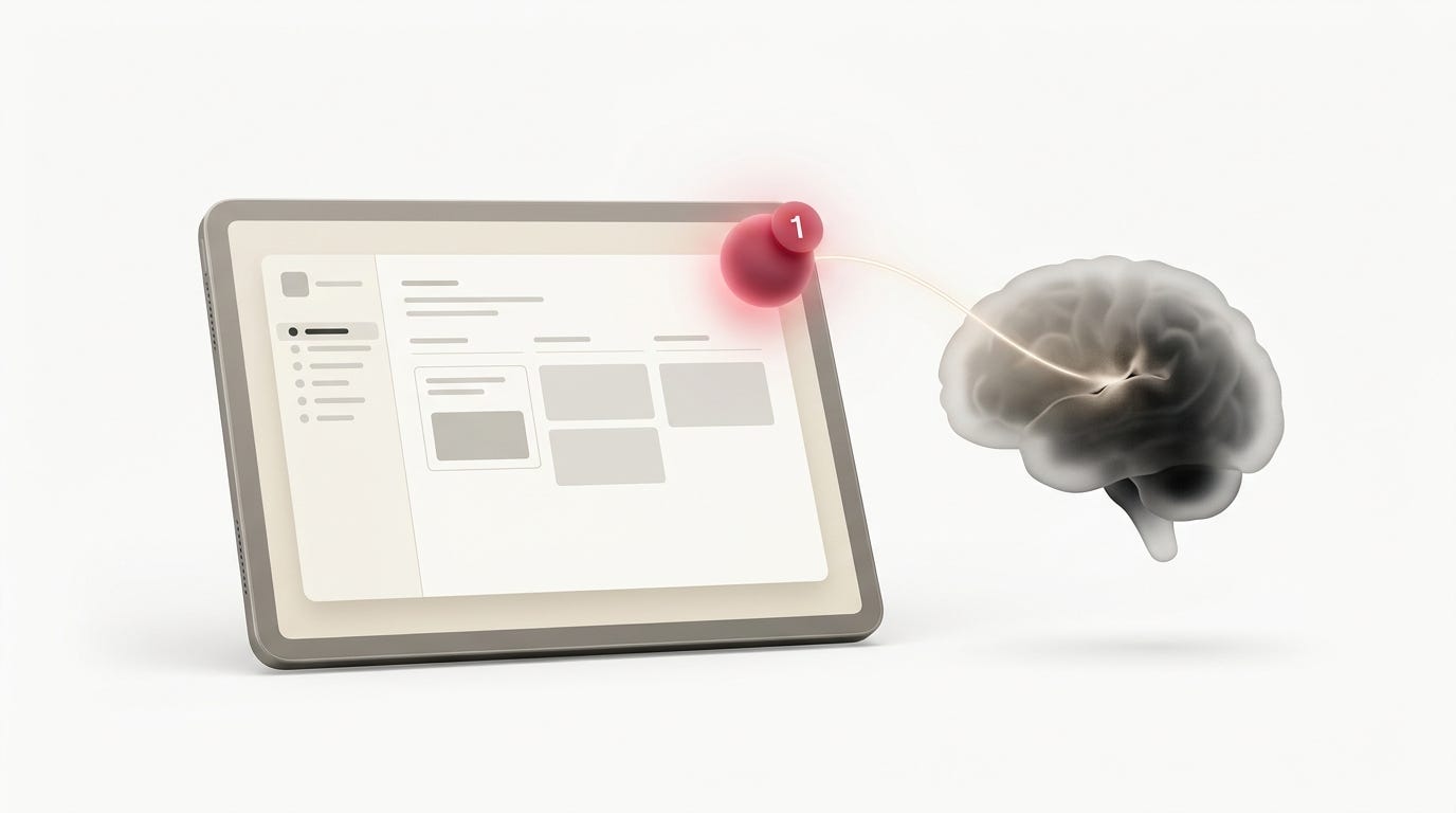
The Zeigarnik effect and the concept of cognitive open loops in UI design.
The shape of the notification badge matters. But the color matters even more.
Why do we use red for urgent notifications? Why not blue, or green, or purple?
The answer is not rooted in design trends or brand guidelines. It is rooted in evolutionary biology.
For millions of years, the human brain has been wired to associate the color red with immediate, physical threat. Red is the color of blood. It is the color of fire. It is the color of ripe fruit, signaling a critical survival resource. When the human eye detects the color red in the peripheral vision, the brain does not process it through the slow, analytical prefrontal cortex. It routes it directly to the amygdala, the brain’s threat detection center.
This triggers an immediate physiological response. The heart rate increases slightly. The pupils dilate. A micro dose of cortisol and adrenaline is released into the bloodstream. The body prepares to fight or flee.
When you place a bright red dot on a user interface, you are bypassing the user’s logical brain and speaking directly to their primitive survival instincts. You are telling their amygdala that there is a threat on the screen.
Now, consider the context. The user is sitting at their desk, drinking coffee, trying to write a quarterly report. The threat is not a predator in the bushes. The threat is an unread message from a colleague about a minor schedule change.
This mismatch between the biological response and the actual environmental context creates a specific type of psychological friction. I call it the illusion of urgency.
I learned about the danger of this illusion the hard way when we were redesigning a workflow application for a large hospital network. The application was used by nurses to manage patient handoffs and administrative tasks.
The existing system used a gray dot for all notifications. The hospital administrators complained that nurses were ignoring critical alerts. They demanded that we implement a tiered notification system. They wanted critical patient alerts to be red, administrative updates to be yellow, and system messages to be blue.
We designed the new system exactly as requested. We ran a pilot program in one of the wards.
Within a week, the pilot was a disaster. The nurses were reporting high levels of stress and fatigue. They were complaining of headaches and anxiety.
I went to the ward to observe the nurses in action. I stood behind a nurse named Sarah as she worked her shift. Every time a red dot appeared on her screen, I watched her shoulders tense up. Her breathing became slightly shallower. She would immediately abandon her current task to click the red dot, driven by the biological imperative to address the threat.
But here was the problem. The hospital administrators had defined “critical patient alerts” very broadly. A red dot didn’t just mean a patient’s heart rate was dropping. A red dot also meant a patient needed a routine medication refill, or a bed needed to be cleaned, or a lab result was ready for review.
Sarah was experiencing a cortisol spike every time she saw a red dot. But because the underlying task was rarely a life or death emergency, the physiological arousal had no physical outlet. She could not fight, and she could not flee. She just had to click a button and fill out a form.
Over the course of an eight hour shift, Sarah was experiencing dozens of these micro stress responses. The cumulative effect was profound cognitive exhaustion. By the end of her shift, she was completely drained, not just from the physical work of nursing, but from the constant, low grade neurological alarm state induced by the interface.
What I have learned is that color in UI design is never just aesthetic. It is biological. When you use red, you are borrowing the brain’s threat detection circuitry. If you use it for non urgent tasks, you are crying wolf at a neurological level.
We had to completely rethink the notification system for the hospital. We removed the red dots entirely for administrative tasks. We used a calm, muted blue for routine updates. We reserved the red dot exclusively for true, life threatening clinical emergencies. And even then, we paired the red dot with a distinct audio cue and a full screen modal, so the context matched the biological response.
The difference in the nurses’ feedback was night and day. The anxiety dropped. The cognitive fatigue decreased. They felt in control of their environment again.
The practical takeaway here is to audit your use of color with biological empathy. Stop thinking of red as just the color for “important”. Start thinking of red as the color for “threat”.
If your application uses red dots for marketing emails, social media likes, or minor system updates, you are subjecting your users to unnecessary physiological stress. You are training their brains to associate your product with anxiety.
Consider using neutral colors like blue, gray, or even green for standard notifications. These colors do not trigger the amygdala. They are processed by the analytical brain. They inform without alarming.
Reserve the red dot for situations where immediate, critical action is genuinely required. When you save the biological alarm system for true emergencies, your users will trust it. And when they trust it, they will respond to it exactly the way you want them to.
Variable Rewards and the Slot Machine in Your Pocket
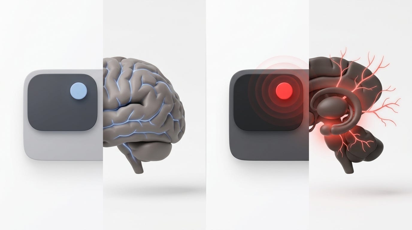
The biological and evolutionary response to the color red in user interfaces.
The Zeigarnik effect explains why we feel compelled to click the dot. Color psychology explains why the dot grabs our attention. But neither of these concepts fully explains why some notification systems are so incredibly addictive.
To understand the addictive nature of the red dot, we have to look at the work of B.F. Skinner and the concept of variable rewards.
Skinner was a behavioral psychologist who studied operant conditioning. He placed pigeons in a box with a lever. When the pigeon pecked the lever, it received a food pellet. The pigeon quickly learned to peck the lever whenever it wanted food. This is a predictable reward.
But then Skinner changed the rules. He programmed the lever to dispense food only occasionally, and on an unpredictable schedule. Sometimes the pigeon pecked the lever and got food. Sometimes it pecked and got nothing.
The behavior of the pigeons changed dramatically. They did not just peck the lever when they were hungry. They pecked it compulsively. They pecked it until they collapsed from exhaustion. The unpredictability of the reward created a massive dopamine spike in their brains. The anticipation of the reward became more powerful than the reward itself.
This is the exact psychological mechanism behind slot machines. And it is the exact mechanism behind the red notification dot on your smartphone.
When you see a red dot on your phone, your brain immediately asks a question. What is it?
If the red dot always meant a system update, it would be a predictable reward. You would click it, read the update, and move on. The dopamine response would be minimal.
But the red dot is rarely predictable. Sometimes it is a text message from your spouse. Sometimes it is a like on your social media post. Sometimes it is an email from your boss. Sometimes it is a spam email from a retailer. Sometimes it is a critical security alert.
The reward is highly variable. You do not know what you are going to get until you open the app. This unpredictability triggers a massive dopamine release. Your brain is essentially pulling the slot machine lever every time you tap that red icon.
I saw the destructive power of variable rewards when we added a social collaboration feature to a B2B project management tool. We wanted to increase daily active usage, so we added a red notification dot for social interactions. If someone commented on your task, liked your update, or mentioned you in a chat, a red dot appeared.
The engagement metrics were spectacular. Daily active users skyrocketed. Time spent in the app increased by thirty percent. The product team was thrilled. We popped champagne.
But as a designer, I was looking at a different set of metrics. I was looking at the deep work metrics.
I noticed that while users were spending more time in the app, they were completing fewer actual tasks. The average time to complete a core project workflow increased by twenty percent. Users were constantly context switching. They would be working on a complex spreadsheet, see the red dot, click it to check the social notification, get distracted by a thread of comments, and lose their train of thought.
We had turned a productivity tool into a variable reward slot machine. We were rewarding our users for checking the app, not for doing their work.
What surprised me most was the user feedback. In our quarterly surveys, users rated the product lower on “helps me focus” and higher on “distracting”. They knew the social features were hurting their productivity, but they could not stop checking the red dots. The variable reward loop was too strong.
This was a profound ethical wake up call for me. We had optimized for engagement, but we had degraded the user’s actual quality of life and work. We had hijacked their dopamine system to serve our business metrics.
Most people assume that variable rewards are just a clever growth hack. They assume it is a neutral way to increase retention. But variable rewards are a form of behavioral manipulation. When applied to tools that people use to work, learn, or manage their lives, they can be deeply harmful.
The practical takeaway here is to recognize the ethical boundary between engagement and exploitation. If you are building a social media app or a game, variable rewards might be appropriate. The user’s goal is entertainment, and the dopamine loop is the product.
But if you are building a productivity tool, a financial app, a healthcare platform, or an enterprise system, variable rewards are toxic. Your users are using your product to achieve a specific, meaningful goal. Every time you interrupt them with an unpredictable red dot, you are stealing their cognitive resources and hijacking their neurochemistry.
If you must use notifications in a professional tool, make them predictable. Group them logically. Tell the user exactly what the notification is before they click it. Remove the element of surprise.
Design for utility, not for addiction. Your users will not thank you for the dopamine hit. But they will thank you for giving them back their focus.
The Compounding Effect of Micro-Anxieties
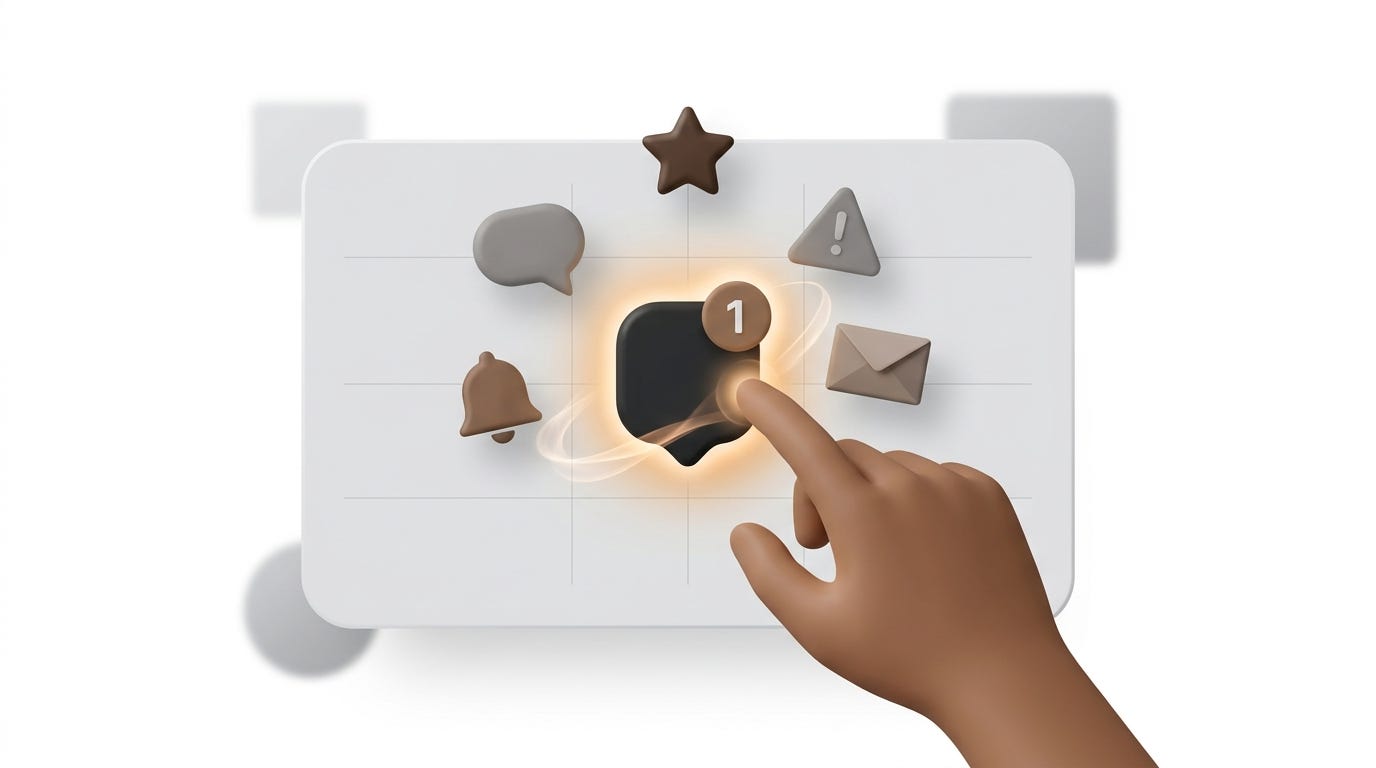
The concept of variable rewards and the slot machine psychology of notification badges.
We have talked about the immediate effects of the red dot. We have discussed the Zeigarnik effect, the biological response to color, and the dopamine loop of variable rewards.
But the true danger of the red dot is not what it does in the first five minutes. The true danger is what it does over weeks, months, and years.
Human beings are remarkably adaptable. We can tolerate a certain amount of friction, stress, and distraction in the short term. But when a stressor is persistent, it compounds. It weaves itself into the fabric of our daily lives. It changes our baseline state of mind.
This is the compounding effect of micro-anxieties.
When a user interacts with an interface that constantly throws red dots at them, they do not just experience a series of isolated distractions. They develop a chronic, low grade state of anticipatory anxiety. They start to associate the application with a feeling of being behind, of being overwhelmed, of having unfinished business.
I witnessed this compounding effect during a long term study of a sales CRM platform. The platform was notorious for its aggressive notification system. Every time a lead changed status, every time a manager left a note, every time a deal stalled, a red dot appeared.
In the first week of using the platform, new sales reps felt motivated. The red dots felt like a game. They felt like they were making progress. They were clearing the dots, closing the loops, feeling productive.
But by week four, the tone had completely shifted.
I sat down for a deep dive interview with a rep named David. He had been using the platform for three months. He looked exhausted. He kept glancing at his phone, even though it was turned face down on the table.
He told me that he had started dreading logging into the CRM. He said that whenever he saw the dashboard, his chest felt tight. He confessed that he had developed a habit of checking his personal email and social media just to get a hit of positive dopamine, to counteract the negative feeling the CRM gave him.
He was experiencing notification fatigue, but it was deeper than just ignoring alerts. He was experiencing learned helplessness. The sheer volume of red dots had convinced his brain that he could never truly get on top of his work. The open loops were permanent. The unpaid bills were piling up faster than he could pay them.
This is the paradox of notification fatigue. When you use red dots to signal urgency, you initially get high click through rates. But over time, the user’s brain realizes that the volume of dots is unmanageable. To protect itself from cognitive overload, the brain simply stops processing the dots. This is called banner blindness.
But the blindness does not erase the anxiety. The user still knows the dots are there. They still feel the weight of the unfinished tasks. They just stop clicking.
The business impact of this compounding anxiety is severe. In our study of the CRM platform, we found that users who experienced high notification fatigue had a churn rate three times higher than users with a clean dashboard. They were not leaving because the product lacked features. They were leaving because the product made them feel anxious and incompetent.
Looking back, I realize that we often measure the success of a notification system by its click through rate. We look at how many people opened the message. But we rarely measure the emotional cost of that click. We rarely measure the cumulative cognitive load.
What I have learned is that user behavior is not just about what they do in a single session. It is about how the product makes them feel over time. A product that causes compounding micro-anxieties will eventually destroy the user’s trust and their mental well-being.
The practical takeaway here is to think about the long term emotional trajectory of your user. Do not just optimize for the click. Optimize for the user’s peace of mind.
Implement notification decay. If a red dot is ignored for three days, it should automatically fade to gray, or disappear entirely. This signals to the user’s brain that the open loop has been closed by the system. It relieves the cognitive tension.
Give users the ability to batch process notifications. Allow them to clear all red dots with a single action. Give them back a sense of control over their digital environment.
When you design for long term cognitive health, you build products that people want to keep in their lives. You build products that respect the human mind, rather than products that slowly erode it.
Designing for Cognitive Respect: The Earned Dot Framework
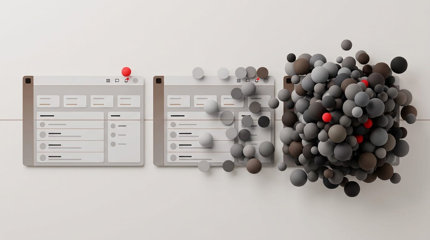
The compounding effect of micro-anxieties and notification fatigue over time.
So, how do we actually fix this? How do we build notification systems that inform users without manipulating them? How do we design for cognitive respect in a world that is obsessed with engagement metrics?
It requires a fundamental shift in how we think about notifications. We have to stop viewing notifications as a way to drag users back into the app. We have to start viewing them as a way to serve the user’s actual goals.
Over the past few years, I have developed a mental model for this called the Earned Dot Framework.
The core philosophy of the Earned Dot Framework is simple. A red dot is a privilege, not a right. It must earn the right to interrupt the user’s attention. If a notification does not meet strict criteria for relevance, urgency, and respect, it does not get a red dot.
The framework consists of four distinct pillars.
The first pillar is Contextual Relevance.
A notification only earns a red dot if it is directly relevant to the user’s current context and goals. If a user is working on a financial report, a red dot about a marketing webinar is not relevant. It is noise.
To implement this, you must map the user’s core workflows. Understand exactly what they are trying to achieve in each section of the application. Only trigger a red dot if the notification directly impacts that specific workflow.
I remember working on a design system where we implemented a strict contextual relevance filter. We stopped sending red dots for general company announcements. We restricted red dots exclusively to task assignments, deadline changes, and direct mentions. The overall volume of red dots dropped by eighty percent. But the click through rate on the remaining dots actually increased, because the users knew that every red dot was genuinely important to their work.
The second pillar is Temporal Decay.
As we discussed earlier, persistent red dots create chronic cognitive tension. The Earned Dot Framework mandates that all notification dots must have a lifespan. They cannot live forever.
We designed a decay logic for our project management tool. When a red dot was triggered, it remained bright red for twenty four hours. If the user did not interact with it, it faded to a muted gray on day two. On day four, it disappeared from the main navigation entirely, moving quietly into a standard inbox.
This simple temporal decay completely changed the user’s relationship with the notifications. The bright red dot signaled immediate attention. The gray dot signaled a backlog. The disappearance signaled closure. The users no longer felt the weight of a permanent, unmanageable list of open loops. They felt a sense of temporal progression.
The third pillar is User Sovereignty.
This is the most critical pillar, and the one most product teams ignore. The user must have absolute control over their notification environment.
If a user cannot turn off a red dot, you are not designing a notification system. You are designing a hostage situation.
You must provide granular controls. Allow users to mute specific categories of notifications. Allow them to set quiet hours. Allow them to choose the visual intensity of the alerts.
When we gave users the ability to completely disable red dots for non critical system updates, we were terrified that they would miss important information. We thought engagement would plummet.
Instead, we found that eighty percent of the users left the red dots turned on. But the twenty percent who turned them off were the most vocal advocates for the product. They felt respected. They felt trusted. And paradoxically, because they were not experiencing notification fatigue, their overall satisfaction with the product was higher than the users who kept the dots on.
User sovereignty builds trust. When users know they have the kill switch, they are much more willing to engage with the notifications when they matter.
The fourth pillar is Semantic Clarity.
A red dot should never be a mystery. The user should know exactly what the dot means before they click it.
We implemented a hover state for our notification dots. When the user hovered their mouse over the red dot, a small tooltip appeared that said exactly what was waiting for them. It said things like, “Three tasks assigned to you,” or “Sarah commented on your design.”
This simple addition of semantic clarity reduced the anxiety associated with the dot. The user no longer had to brace themselves for the unknown. They could assess the importance of the notification without breaking their current flow. If it was not urgent, they could ignore it with peace of mind.
The practical takeaway here is to adopt the Earned Dot Framework in your next design review. Look at every red dot in your application. Ask yourself if it has earned its place.
Is it contextually relevant? Does it decay over time? Does the user have sovereignty over it? Is the meaning semantically clear?
If the answer to any of these questions is no, change the dot. Make it gray. Make it disappear. Or remove it entirely.
Designing for cognitive respect is not just the right thing to do for the user. It is the right thing to do for the long term health of your product. When you respect the user’s mind, they will reward you with their loyalty, their focus, and their trust.
Conclusion
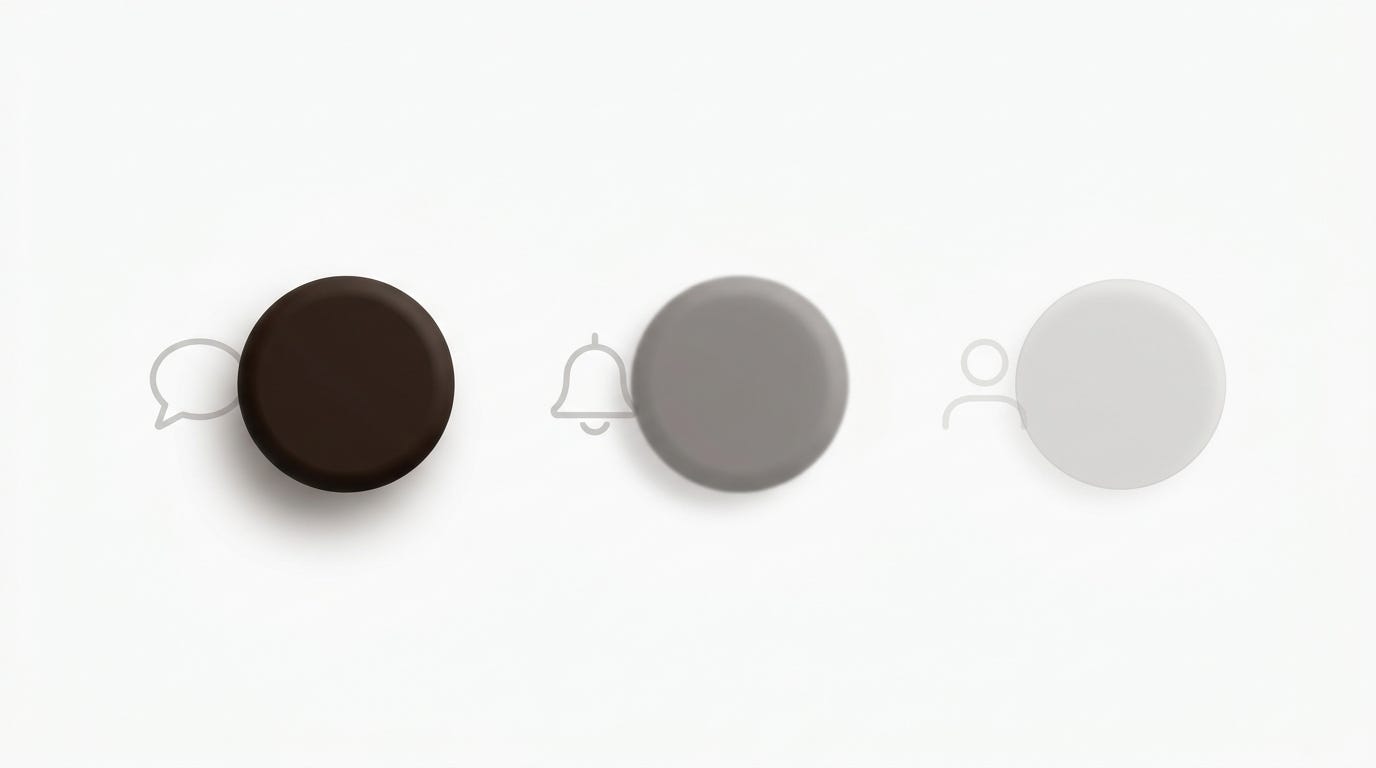
The Earned Dot Framework and the concept of temporal decay in notification design.
I think about that Tuesday afternoon in the glass walled conference room a lot. I think about the product manager and the visual designer, arguing over a six pixel circle.
We did not end up shipping the persistent red dot that day.
Instead, we took a step back. We mapped out the user’s cognitive journey. We looked at the biological impact of the color red. We analyzed the variable reward structure of our notification system.
We ended up designing a notification system based on the Earned Dot Framework. We used a calm blue dot for routine system updates. We implemented a strict twenty four hour decay logic. We gave the users complete control over their notification preferences. And we added semantic tooltips so they never had to guess what the dot meant.
When we launched the update, the engagement metrics for the notification center dropped by thirty percent.
But the overall user satisfaction scores increased by forty percent. The support tickets related to “feeling overwhelmed” dropped to zero. The deep work metrics, the actual core tasks the users were hired to do, increased significantly.
We had sacrificed a small amount of superficial engagement to gain a massive amount of user trust and cognitive well being. It was the best product decision I have ever been a part of.
We spend so much time in this industry obsessing over the macro features. We obsess over the new AI integrations, the complex data visualizations, the massive platform overhauls. We think that impact comes from scale.
But the truth is, the most profound impact often comes from the micro interactions. A single red dot, a subtle color change, a tiny shift in notification logic. These small elements are the ones that touch the user’s brain every single day. They are the ones that shape the user’s emotional state, their stress levels, and their ability to focus.
We are not just designing screens. We are designing the cognitive environment in which our users live and work. We are shaping their behavior, their habits, and their mental well being.
That is a massive responsibility. It requires us to look past the pixels and understand the psychology. It requires us to resist the temptation of short term engagement hacks and design for long term cognitive health.
When you understand the hidden power of the red dot, you stop designing for the screen. You start designing for the human being sitting behind it. And that is when your product stops being just another tool, and starts being a genuine partner in their success.
What is the most difficult notification habit you have had to break in your own digital life, and how has it changed the way you design for others?
메타데이터
- post_id
- 64da43f25f97
- slug
- why-a-single-red-dot-can-hijack-user-behavior-for-weeks-64da43f25f97
- url
- https://medium.com/@Jason-Han/why-a-single-red-dot-can-hijack-user-behavior-for-weeks-64da43f25f97
- canonical_url
- https://medium.com/@Jason-Han/why-a-single-red-dot-can-hijack-user-behavior-for-weeks-64da43f25f97
- author_url
- https://medium.com/@Jason-Han
- status
- ok
- fetched_at
- 2026-08-04 16:19:51