5 Simple UX Principles That Make Any Design Better
UX can sometimes feel complex — full of frameworks, research methods, and design systems.
5 Simple UX Principles That Make Any Design Better
Photo by Pimwipha Ch. on Unsplash
UX can sometimes feel complex — full of frameworks, research methods, and design systems.
But after years of working in UX, I’ve learned something important:
Great user experience often comes down to a few simple principles.
Whether you’re designing an app, website, or product, these fundamentals consistently make experiences clearer, smoother, and more human.
Here are five simple UX principles that can improve almost any design.
1. Make It Obvious What Users Can Do
Users should never have to guess their next step.
A good interface answers these questions instantly:
- What is this?
- What can i do here?
- What happens if i tap/click?
Clear buttons, labels, hierarchy, and visual cues reduce cognitive load.
If users pause to think about how to use your product, the design is already working too hard.
Simple rule: If an action matters, make it visually clear.
2. Reduce the User’s Effort
Good UX removes unnecessary work.
This includes:
- fewer steps
- fewer fields
- fewer decisions
- less typing
- fewer fields
- less remembering
For example:
- Autofill instead of manual entry
- Smart defaults instead of blank states
- Suggestions instead of search-only
Every extra effort is friction. And friction reduces completion.
Simple rule: Don’t make users do what the system can do.
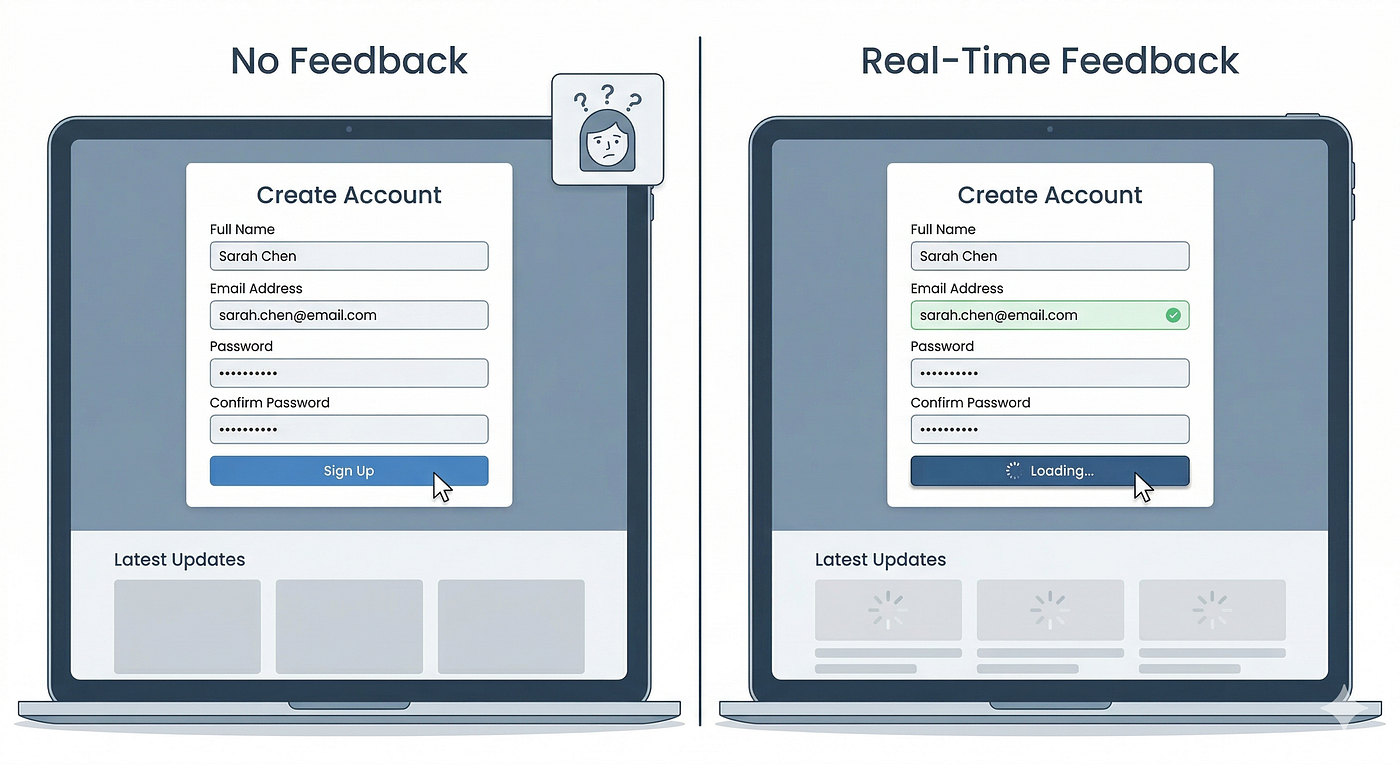
3. Show Feedback Immediately
When users act, they expect a response.
Without feedback, people feel uncertain:
- Did it work?
- Is it loading?
- Was it saved?
Feedback can be small:
- button state change
- loading indicator
- confirmation message
- animation
These signals build confidence and control.
Simple rule: Every action deserves a visible reaction.
4. Prevent Errors Before They Happen
Great UX doesn’t just fix mistakes — it prevents them.
Examples:
- disabling invalid options
- input validation
- constraints
- confirmations for destructive actions
- input validation
- formatting assistance
Preventing errors is better than showing error messages later.
Because errors interrupt flow and create frustration.
Simple rule: Guide users toward success.
5. Keep It Consistent
Consistency reduces learning.
When elements behave the same way across screens, users don’t need to relearn interactions.
Consistency includes:
- button styles
- icons
- spacing
- terminology
- interaction patterns
Inconsistent design forces users to re-interpret meaning repeatedly.
Simple rule: Same thing = same design.
Why Simple UX Matters
Complex products don’t require complicated UX.
In fact, the more complex the system, the more important simplicity becomes.
Users rarely notice good UX directly. But they always feel it:
- ease
- speed
- clarity
- confidence
- speed
That feeling is what keeps people using products
메타데이터
- post_id
- 668c3a939662
- slug
- 5-simple-ux-principles-that-make-any-design-better-668c3a939662
- url
- https://medium.com/@sayalikhutwad/5-simple-ux-principles-that-make-any-design-better-668c3a939662
- canonical_url
- https://medium.com/@sayalikhutwad/5-simple-ux-principles-that-make-any-design-better-668c3a939662
- author_url
- https://medium.com/@sayalikhutwad
- status
- ok
- fetched_at
- 2026-06-27 23:56:40