I’ve Watched 10 UI Trends Rise and Die. Most Designers Still Can’t Name Half of Them.
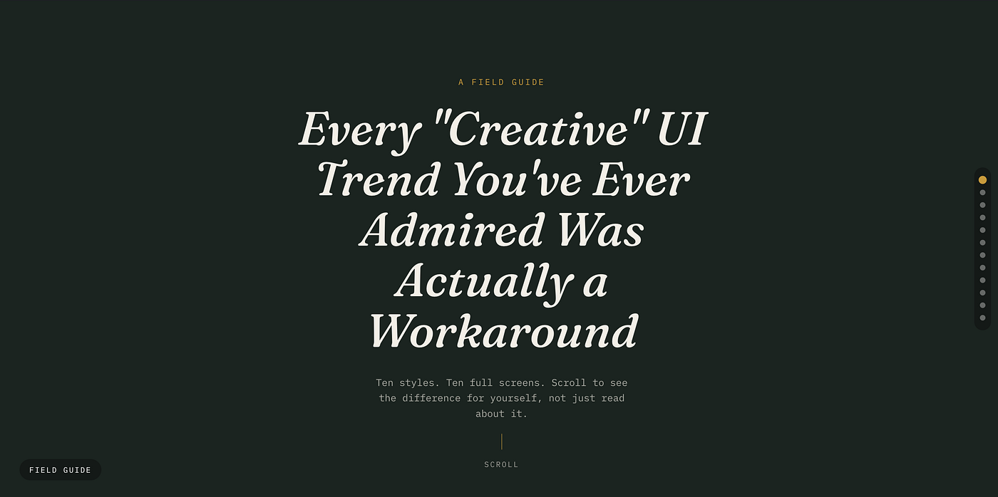
You have touched all ten of these today. Maybe before you even got out of bed.
I’ve Watched 10 UI Trends Rise and Die. Most Designers Still Can’t Name Half of Them.
You have touched all ten of these today. Maybe before you even got out of bed.
The lock screen that blurs the wallpaper behind your notifications? That has a name. The settings toggle that looks pressed into the screen, soft and pillowy, like it’s made of the same material as the background? That has a name too. The raw, ugly, almost broken-looking website that somehow feels more honest than every polished SaaS landing page you’ve seen this year? Also a name, and also intentional.
Link for free (non-member) readers
Most designers can spot these styles instantly but couldn’t label half of them under pressure. So here is the full, accurate breakdown, with real code you can paste into a browser right now and watch each style come alive.
Ten styles. Ten full screens. Scroll to see the difference for yourself, not just read about it.
[embed]
One quick correction before we start. A popular design reel currently circulating lists “Special UI” as one of the ten core styles. That is not an established design term, it does not point to anything specific in design history, and it was likely a mistranscription or a placeholder. The real, well documented tenth style that belongs on this list is Flat Design, the movement that arguably reshaped the entire industry more than any other entry here. We are using the accurate version.
1. Skeuomorphism
Before flat icons took over the world, interfaces tried to look like real objects. A notes app looked like a yellow legal pad. A calculator looked like a calculator. This is skeuomorphism, design that imitates real world materials, textures, and physics so the user instantly understands what something does.
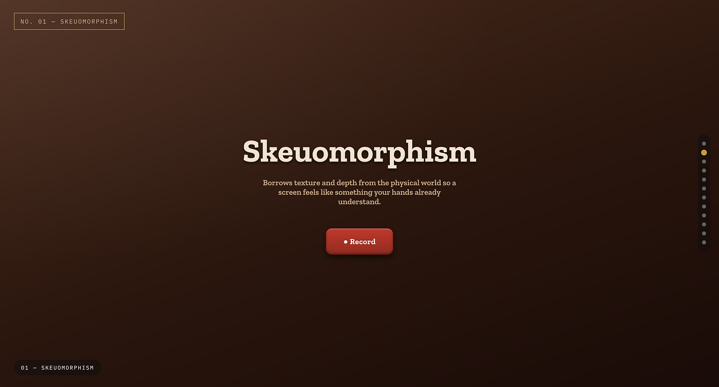
It fell out of fashion around 2013 when Apple shifted to iOS 7, but it never fully died. It quietly survives in audio software, camera apps, and anywhere realism builds trust faster than abstraction.
<button class="skeuo-button">Record</button><style>
.skeuo-button {
background: linear-gradient(180deg, #c0392b 0%, #922b21 100%);
border: 1px solid #6e1f17;
border-radius: 12px;
padding: 14px 28px;
color: #fff;
font-weight: 600;
box-shadow:
inset 0 1px 0 rgba(255,255,255,0.4),
inset 0 -2px 4px rgba(0,0,0,0.3),
0 4px 6px rgba(0,0,0,0.4);
text-shadow: 0 -1px 1px rgba(0,0,0,0.4);
}
</style>2. Neumorphism
Neumorphism, sometimes spelled neomorphism, emerged around 2019 as a quiet rebellion against flat design’s lack of depth. The trick is simple but unforgiving. Elements share the exact background color as their container and gain depth purely from two offset shadows, one light and one dark, simulating a soft light source.
It looks beautiful in mockups and is genuinely difficult to use in production because of contrast and accessibility issues. Most teams that tried it in 2020 quietly walked it back within a year.
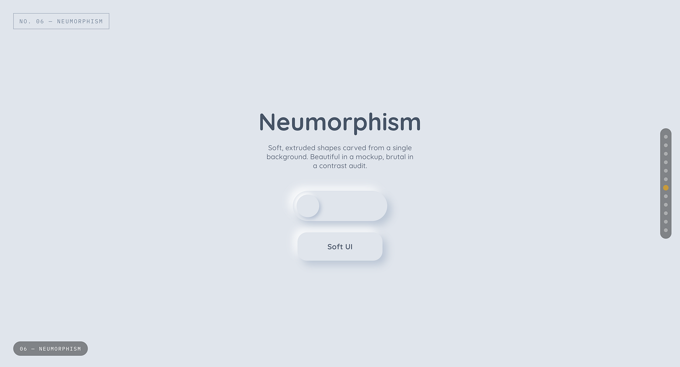
Soft, extruded shapes carved from a single background. Beautiful in a mockup, brutal in a contrast audit.
<div class="neumorphic-box">Soft UI</div><style>
body { background: #e0e5ec; }
.neumorphic-box {
width: 160px;
padding: 20px;
background: #e0e5ec;
border-radius: 20px;
text-align: center;
font-weight: 600;
color: #555;
box-shadow:
9px 9px 16px rgba(163,177,198,0.6),
-9px -9px 16px rgba(255,255,255,0.8);
}
</style>3. Glassmorphism
Not “Classmorphism”, the term that matters here is Glassmorphism. It defines the frosted glass look popularized heavily after iOS and Windows 11 leaned into translucency, layered blur, and soft borders that make panels feel like they are floating above a backdrop rather than sitting flat on it.
The defining CSS property is backdrop-filter: blur(), paired with low opacity backgrounds and a thin, almost invisible border to sell the glass edge.
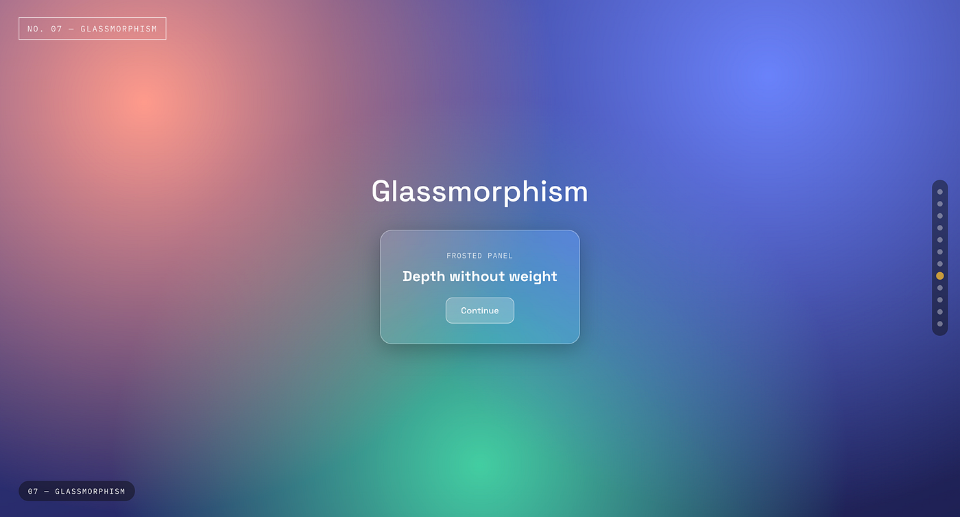
Depth without weight
<div class="glass-card">Glass Panel</div><style>
body {
background: url('https://images.unsplash.com/photo-1557682250-33bd709cbe85') center/cover;
}
.glass-card {
width: 240px;
padding: 24px;
background: rgba(255,255,255,0.15);
border-radius: 16px;
border: 1px solid rgba(255,255,255,0.3);
backdrop-filter: blur(12px);
-webkit-backdrop-filter: blur(12px);
color: #fff;
font-weight: 600;
box-shadow: 0 8px 32px rgba(0,0,0,0.2);
}
</style>4. Minimalism
Minimalism is restraint as a design philosophy. Generous whitespace, a tight color palette, strong typographic hierarchy, and the deliberate removal of anything that does not serve the user’s task. It is not the absence of effort, it is the opposite. Every element left on the screen had to earn its place.
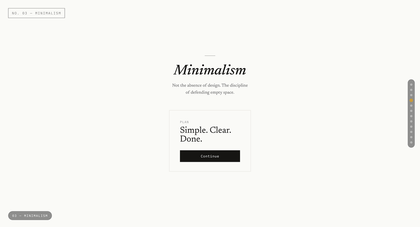
Not the absence of design. The discipline of defending empty space.
Stripe, Linear, and Apple’s own marketing pages are the textbook modern references.
<div class="minimal-card">
  <h2>Plan</h2>
  <p>Simple. Clear. Done.</p>
  <button>Continue</button>
</div>
<style>
.minimal-card {
max-width: 280px;
padding: 40px 0;
font-family: -apple-system, sans-serif;
}
.minimal-card h2 { font-size: 14px; color: #888; margin: 0 0 4px; }
.minimal-card p { font-size: 24px; color: #111; margin: 0 0 24px; }
.minimal-card button {
border: none;
background: #111;
color: #fff;
padding: 12px 20px;
border-radius: 6px;
font-size: 14px;
}
</style>5. Maximalism
The deliberate opposite of minimalism. Bold color collisions, layered typography, dense compositions, and visible personality over restraint. Maximalism works when a brand wants to feel loud, expressive, or rebellious, think music festival sites, fashion brands, or anything trying to feel alive rather than efficient.
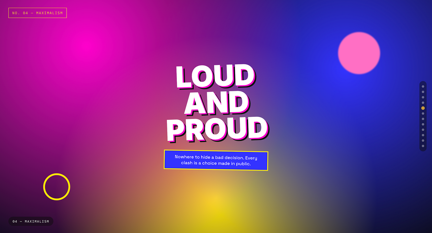
Nowhere to hide a bad decision. Every clash is a choice made in public.
<div class="max-card">
  <h2>LOUD<br>AND<br>PROUD</h2>
</div>
<style>
.max-card {
width: 280px;
padding: 32px;
background: radial-gradient(circle at top left, #ff00cc, #3333ff 70%);
border: 6px solid #ffe600;
transform: rotate(-2deg);
box-shadow: 12px 12px 0 #111;
}
.max-card h2 {
font-family: 'Impact', sans-serif;
font-size: 38px;
line-height: 0.9;
color: #fff;
text-shadow: 3px 3px 0 #ff00cc, 6px 6px 0 #111;
margin: 0;
}
</style>6. Brutalism
Web brutalism borrows from the raw, concrete honesty of brutalist architecture. Default system fonts, harsh borders, unpolished layouts, and an explicit rejection of the smooth, templated look most of the internet has settled into. It is often a reaction against design that feels too safe or too corporate.
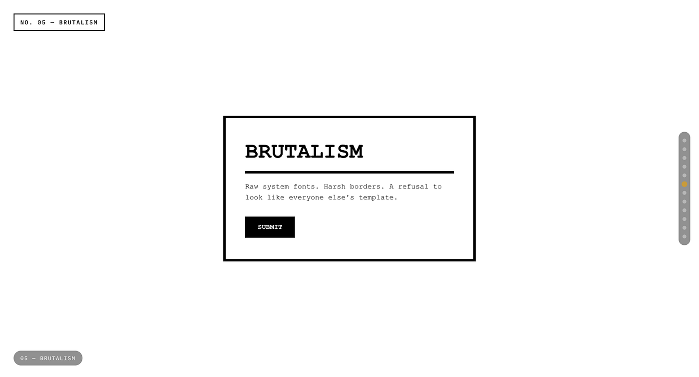
Raw system fonts. Harsh borders. A refusal to look like everyone else’s template.
<div class="brutal-box">
  RAW. UNFILTERED. HONEST.
  <button>SUBMIT</button>
</div>
<style>
.brutal-box {
font-family: 'Courier New', monospace;
background: #fff;
border: 4px solid #000;
padding: 20px;
width: 260px;
font-size: 16px;
}
.brutal-box button {
margin-top: 16px;
background: #000;
color: #fff;
border: none;
padding: 10px 16px;
font-family: inherit;
cursor: pointer;
}
.brutal-box button:hover { background: #ff0000; }
</style>7. Liquid Glass
Not “Liquid Class”. Liquid Glass is Apple’s newer, more fluid evolution of glassmorphism, introduced across recent iOS and visionOS interfaces. It pushes past static blur into something that feels dynamic, refracting and bending light depending on what sits behind it, with elements that morph and respond as the user interacts.
True Liquid Glass relies on real time rendering, but the visual language can be approximated in CSS using layered blurs, subtle hue shifts, and animated highlights.
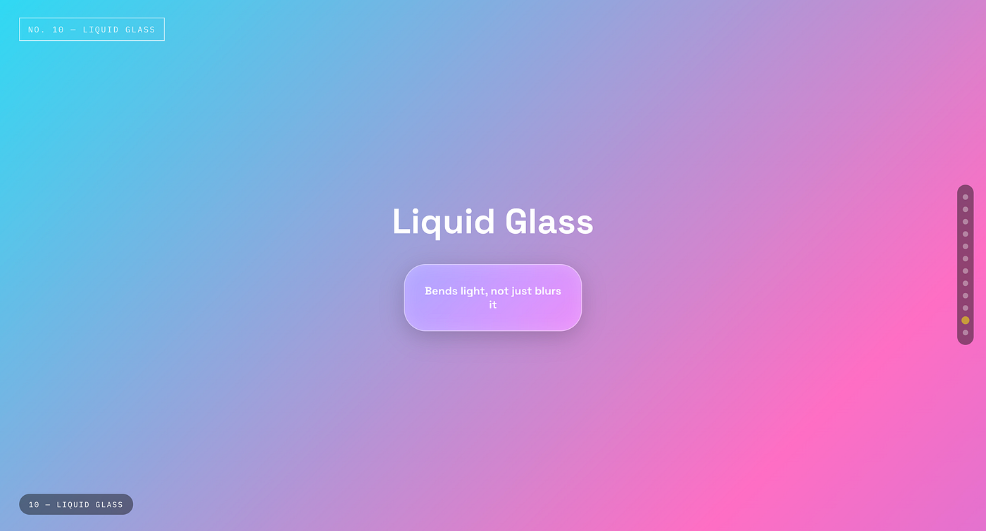
Bends light, not just blurs it
<div class="liquid-glass">Liquid Glass</div><style>
body {
background: linear-gradient(135deg, #4facfe, #00f2fe, #ff6ec4);
background-size: 200% 200%;
animation: bgshift 8s ease infinite;
}
@keyframes bgshift {
0% { background-position: 0% 50%; }
50% { background-position: 100% 50%; }
100% { background-position: 0% 50%; }
}
.liquid-glass {
width: 220px;
padding: 22px;
text-align: center;
font-weight: 700;
color: #fff;
border-radius: 28px;
background: rgba(255,255,255,0.12);
backdrop-filter: blur(20px) saturate(180%);
-webkit-backdrop-filter: blur(20px) saturate(180%);
border: 1px solid rgba(255,255,255,0.4);
box-shadow:
0 8px 32px rgba(0,0,0,0.15),
inset 0 0 20px rgba(255,255,255,0.15);
}
</style>8. Bento Grid
Named after the compartmentalized Japanese lunchbox, Bento Grid layouts arrange content in modular, unevenly sized cards within a clean grid. Apple’s recent product pages made this style mainstream, and it has since become the default way to showcase features, pricing tiers, or dashboard widgets without the page feeling like a boring list.
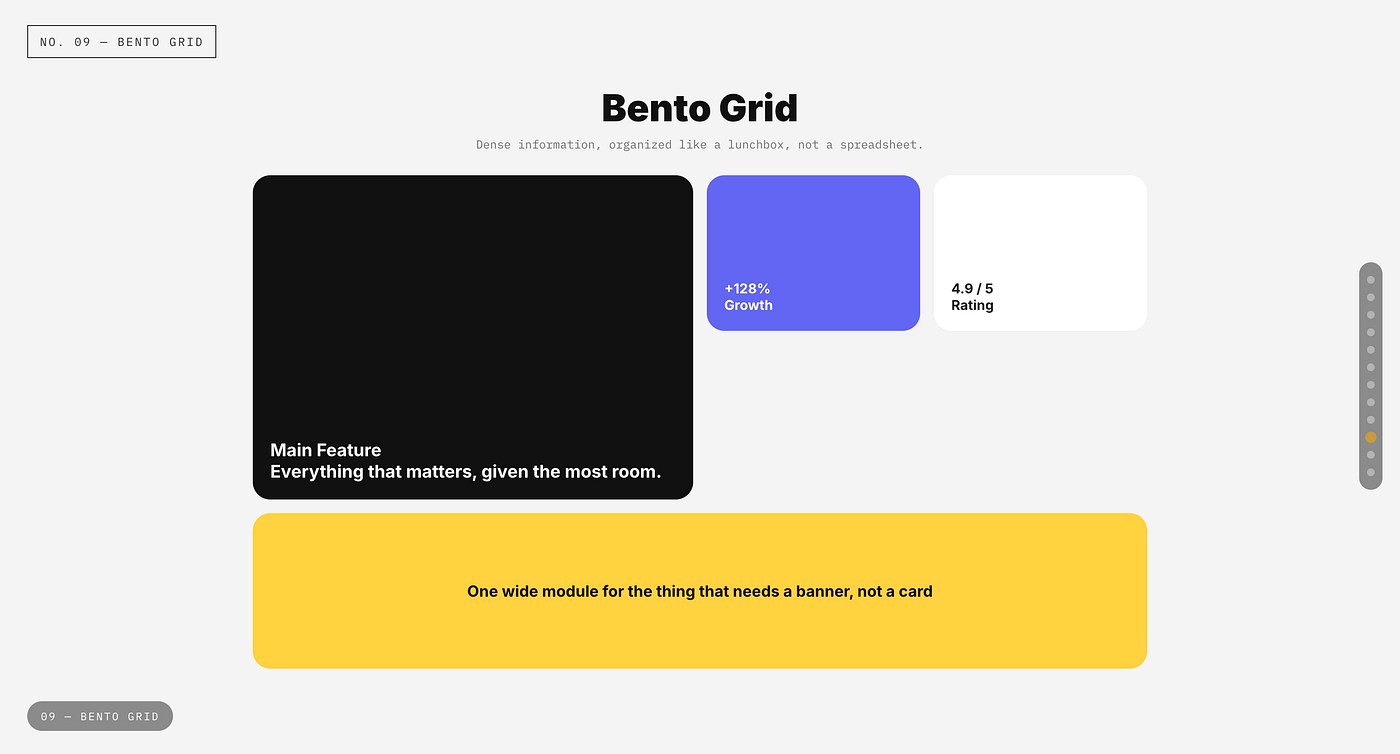
Dense information, organized like a lunchbox, not a spreadsheet.
<div class="bento-grid">
  <div class="bento-item large">Main Feature</div>
  <div class="bento-item">Stat</div>
  <div class="bento-item">Stat</div>
  <div class="bento-item wide">Highlight Banner</div>
</div>
<style>
.bento-grid {
display: grid;
grid-template-columns: repeat(4, 1fr);
grid-auto-rows: 100px;
gap: 12px;
width: 400px;
}
.bento-item {
background: #f3f4f6;
border-radius: 18px;
padding: 16px;
font-weight: 600;
color: #333;
}
.large { grid-column: span 2; grid-row: span 2; background: #111; color: #fff; }
.wide { grid-column: span 4; background: #6366f1; color: #fff; }
</style>9. Claymorphism
Not “Cleomorphism”, the accurate term is Claymorphism. It pushes neumorphism’s soft shadow idea further into a playful, 3D, almost cartoonish territory, oversized border radius, pastel colors, and a layered shadow that makes elements look molded from clay rather than rendered on a flat screen. Duolingo and several fintech onboarding flows lean into this heavily because it reads as friendly and approachable.
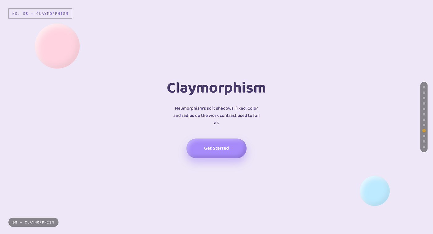
Neumorphism’s soft shadows, fixed. Color and radius do the work contrast used to fail at.
<div class="clay-button">Get Started</div><style>
.clay-button {
width: 180px;
padding: 18px;
text-align: center;
background: #a78bfa;
border-radius: 32px;
font-weight: 700;
color: #fff;
box-shadow:
inset -6px -6px 12px rgba(0,0,0,0.15),
inset 6px 6px 12px rgba(255,255,255,0.3),
0 12px 24px rgba(167,139,250,0.5);
}
</style>10. Flat Design
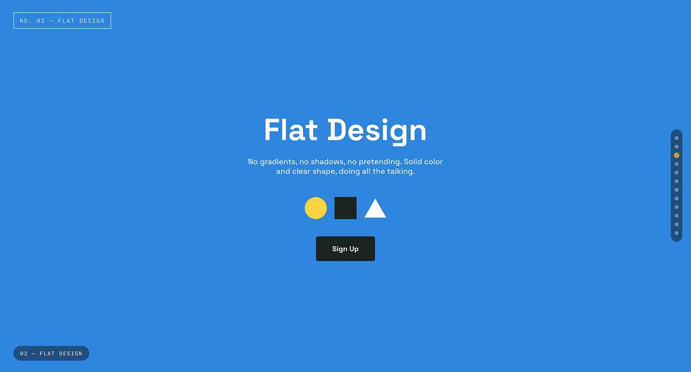
No gradients, no shadows, no pretending. Solid color and clear shape, doing all the talking.
The real tenth style, replacing the inaccurate “Special UI” entry. Flat Design stripped away every shadow, gradient, and texture in favor of solid color, simple iconography, and pure two dimensional clarity. Microsoft’s Metro language and iOS 7 both pushed this into the mainstream around 2013, and it remains the visual baseline most modern interfaces still build on, even after later styles added depth back in.
<button class="flat-button">Sign Up</button><style>
.flat-button {
background: #3498db;
color: #fff;
border: none;
padding: 14px 28px;
border-radius: 4px;
font-weight: 600;
font-size: 15px;
cursor: pointer;
}
.flat-button:hover { background: #2980b9; }
</style>Which One Should You Actually Use
None of these styles are universally correct. The right choice depends entirely on what the product needs to communicate.
Minimalism and Flat Design still dominate B2B software because clarity sells. Glassmorphism and Liquid Glass dominate operating systems and media heavy apps where depth and atmosphere matter. Brutalism and Maximalism show up where a brand wants to feel different on purpose. Claymorphism and Neumorphism work best for playful, consumer facing products aimed at building emotional warmth. Skeuomorphism survives wherever realism builds immediate trust, and Bento Grid has become the default way to organize dense information without it feeling overwhelming.
The designers who stand out are not the ones who pick a trend and apply it everywhere. They are the ones who know all ten well enough to choose deliberately, then defend that choice with a reason beyond “it looked good in the mockup.”
Share this with a designer who needed the accurate names. Follow for more breakdowns like this one.
Did you learn something good today as a designer? Then show some love. © Usman Writes WordPress Developer | Website Strategist | SEO Specialist Don’t forget to subscribe to **Developer’s Journey** to show your support.

메타데이터
- post_id
- 670cfabdf430
- slug
- ui-design-styles-explained-670cfabdf430
- url
- https://uxplanet.org/ui-design-styles-explained-670cfabdf430
- canonical_url
- https://uxplanet.org/ui-design-styles-explained-670cfabdf430
- author_url
- https://medium.com/@pixicstudio
- status
- ok
- fetched_at
- 2026-07-09 05:26:43