I Discovered a One-Word Prompt Trick That Breaks the Typical AI Art Style
Simple contrast method that pushes AI images beyond polished results — a powerful alternative to negative prompts for richer visuals.
I Discovered a One-Word Prompt Trick That Breaks the Typical AI Art Style
While editing my previous article one afternoon, I needed a break from writing and decided to experiment with a very simple prompt. I wasn’t trying to discover a new technique or achieve a specific result — I was just curious.
On a whim, I typed “2D line art,” one of the simplest drawing styles I could think of, and added a single word in front of it.
Seconds later, I was staring at an image that didn’t resemble line art at all.
Instead of a flat illustration, the AI produced an ornate interior filled with depth, texture, perspective, and architectural detail.
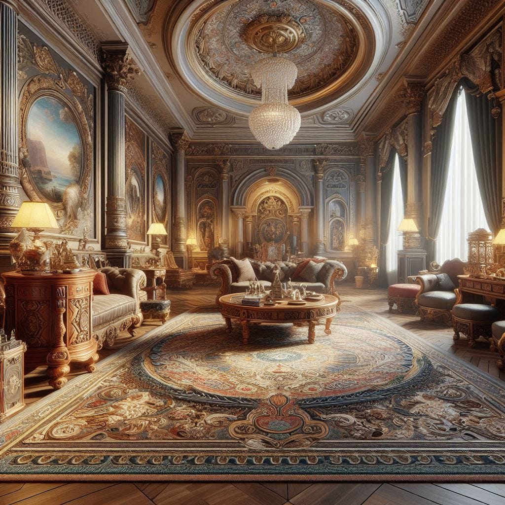
“Opposite of 2D line art” was the entire prompt used to create this complex AI-generated scene— my very first result. One word made a huge difference. Two, if you count “of.”
That unexpected result sent me down a rabbit hole.
The composition itself wasn’t especially unusual. What surprised me was how dramatically a single word had altered the outcome: away from simplicity and toward complexity.
That single result made me wonder whether the same approach could be used to push images away from common tendencies.
I decided to start experimenting further.
Text inputs quickly began producing a wide range of unexpected visual behaviors.
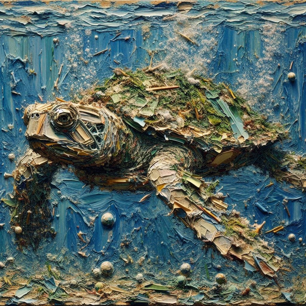
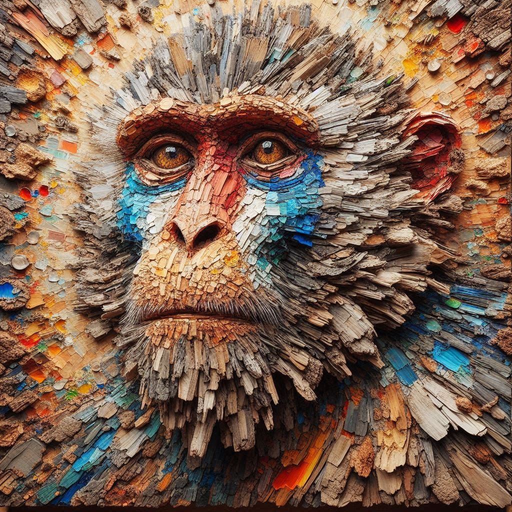
Some prompts yielded thick, chunky impasto textures with highly visible, almost sculptural brushstrokes that looked like heavy physical paint layered on canvas.
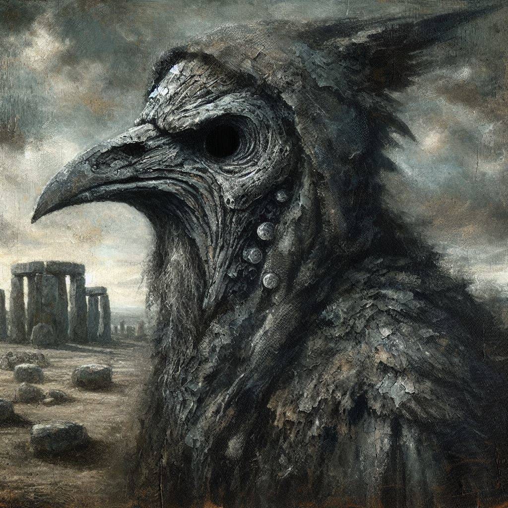
Others produced chaotic, fragmented brushwork, obsessive scribbled or engraved line work, mosaic-like constructions built from visible paint dabs, or swirling, carved wood-grain surfaces.
Even small shifts in wording consistently pushed outputs away from smooth, polished typical outputs and toward more tactile, imperfect, and expressive surfaces.
What began as a break from editing, going through overused words and refining word choice, eventually became one of the most interesting prompting patterns I’ve explored.
An unexpectedly simple way to move beyond the highly finished defaults that often define AI-generated art.
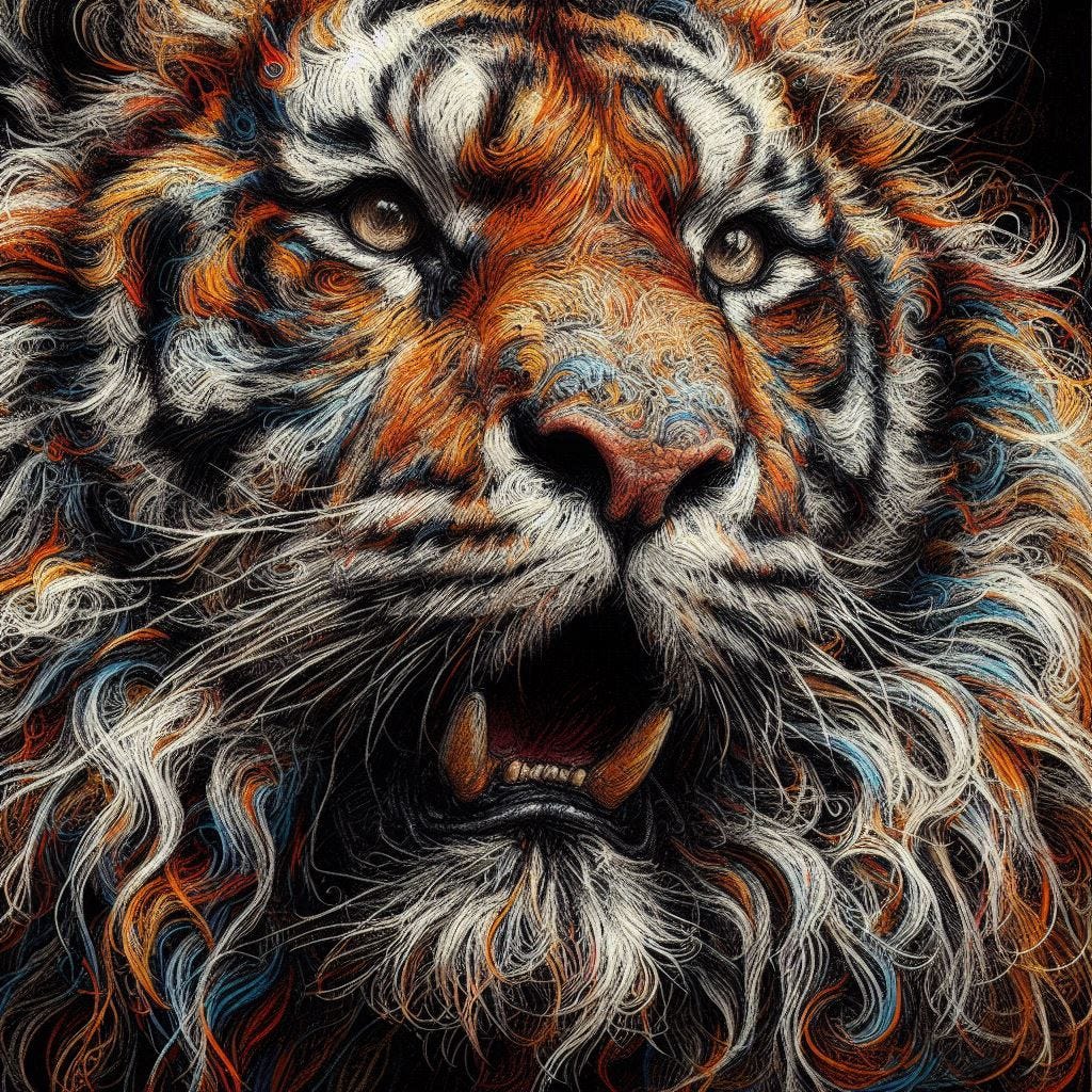
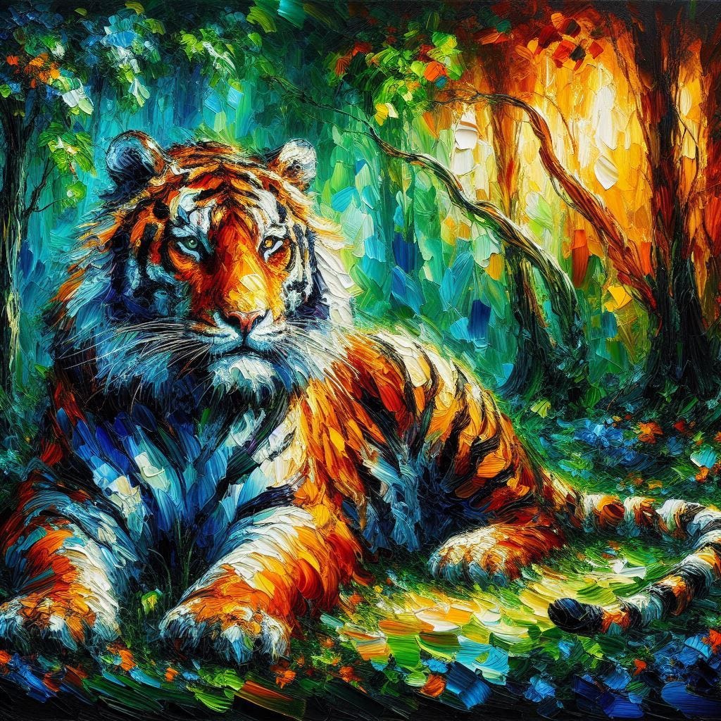
‘conte crayon scribble art, opposite of minimalist, tiger‘→ ‘painting of tiger in woods, opposite of DSLR photograph’: The “opposite of minimalist” AI prompt drives the image into dense, maximalist construction, filling the composition with layered conte crayon scribbles and intricate, overlapping linework. In contrast, the “opposite of DSLR photograph” breaks away from photographic realism entirely, replacing smooth lens-based rendering with thick, expressive paint textures and highly saturated, painterly color transitions.
From a Single Word to Unexpected Masterpieces
Most prompt engineering is additive.
- If you want more texture, you add texture keywords.
- If you want more detail, you add detail keywords.
- If you want a specific artistic style, you describe it explicitly.
The opposite technique works differently.
Instead of adding more descriptions, it introduces a directional constraint against a known trait.
For example:
- painting of a tiger in woods, opposite of polished rendering
- vibrant werewolf painting, in woods, opposite of clean canvas
- outline sketch with charcoal shading, portrait, inverse of perfect
- graphite drawing of a puppy, opposite of precise lines, inverse of refined
Rather than specifying a destination, you introduce a directional constraint layered onto a defined subject.
This allows you to keep control over what is being depicted while disrupting how it is constructed.
Opposite Prompting vs Negative Prompting
At first glance, “opposite” may sound similar to “negative,” but the two approaches behave very differently.
Negative prompts are designed to remove things. They act as exclusions.
For example:
- no text
- no blur
- no distortion
The goal is subtraction — preventing unwanted features from appearing.
Opposite prompting works in a different way. It doesn’t try to remove traits. It redirects how the image is constructed.
For example:
- “no clean rendering” simply discourages a behavior
- “opposite of clean rendering” pushes the model toward roughness, variation, and visible structure
One limits output. The other changes direction.
Instead of filtering what should not appear, opposite prompting introduces a contrasting construction path. The model is no longer just avoiding something. It begins reorganizing how the image is built.
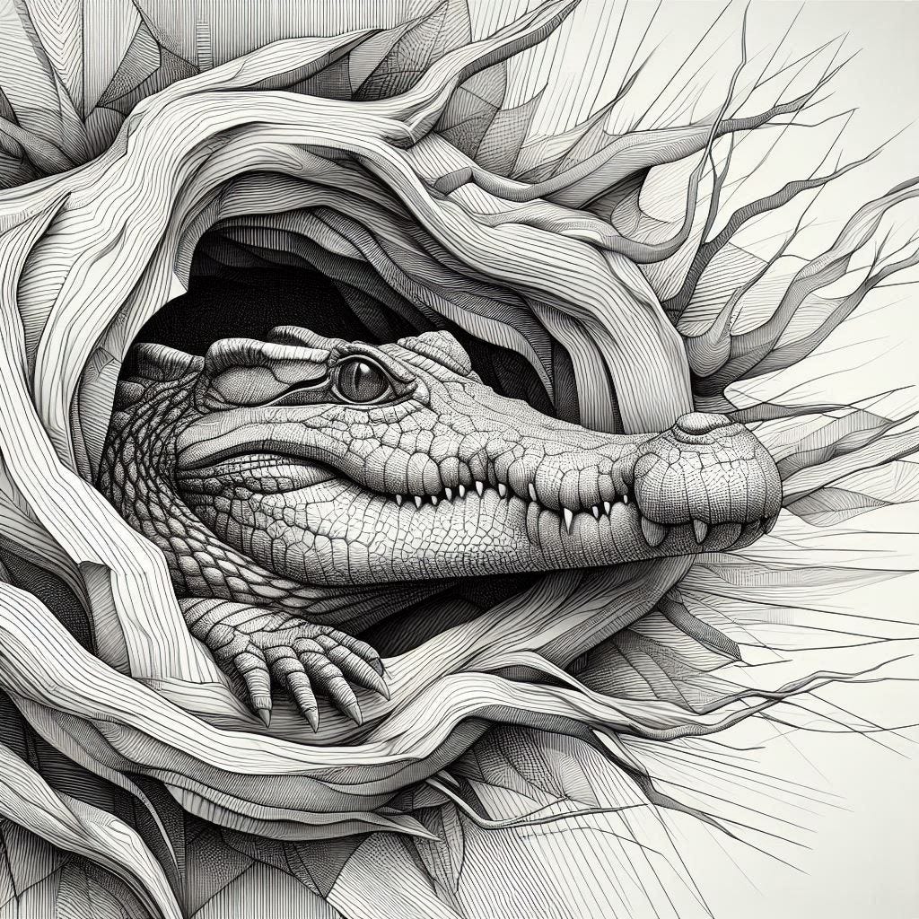
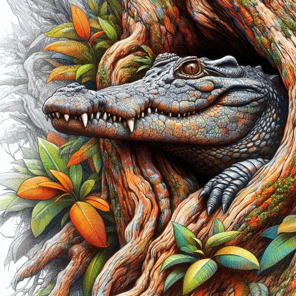
What began as a controlled monochrome line drawing evolved into something far more organic. Additional inversions introduced color, layered textures, and dense cross-hatching, transforming a graphic pattern into a scene with greater depth, materiality, and visual complexity. AI-generated.
Why It Works
The most useful way to think about this technique is as a form of creative inversion.
A normal prompt defines a destination: go here.
An opposite prompt introduces directional pressure:* move away from this*.
That shift is small in wording, but large in effect.
When qualities like “smooth,” “polished,” or “refined” are inverted, the model doesn’t simply remove those traits. It begins exploring alternative construction strategies — visible structure, material variation, imperfect edges, and layered surface logic.
Because no exact endpoint is specified, the system has room to explore different visual solutions instead of collapsing back into its default “finished” aesthetic.
The Technique Simplifies Prompting
One of the most surprising outcomes is how much text input compression this method allows.
A single inversion can sometimes replace a long list of descriptive keywords.
Instead of writing:
- highly textured
- thick paint application
- visible brushwork
- sculptural relief
- layered surface detail
You can sometimes achieve a similar direction with:
opposite of smooth polished rendering
The model appears to internally expand that concept into a broader family of visual alternatives.
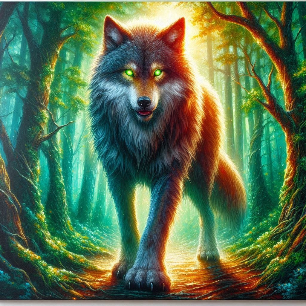
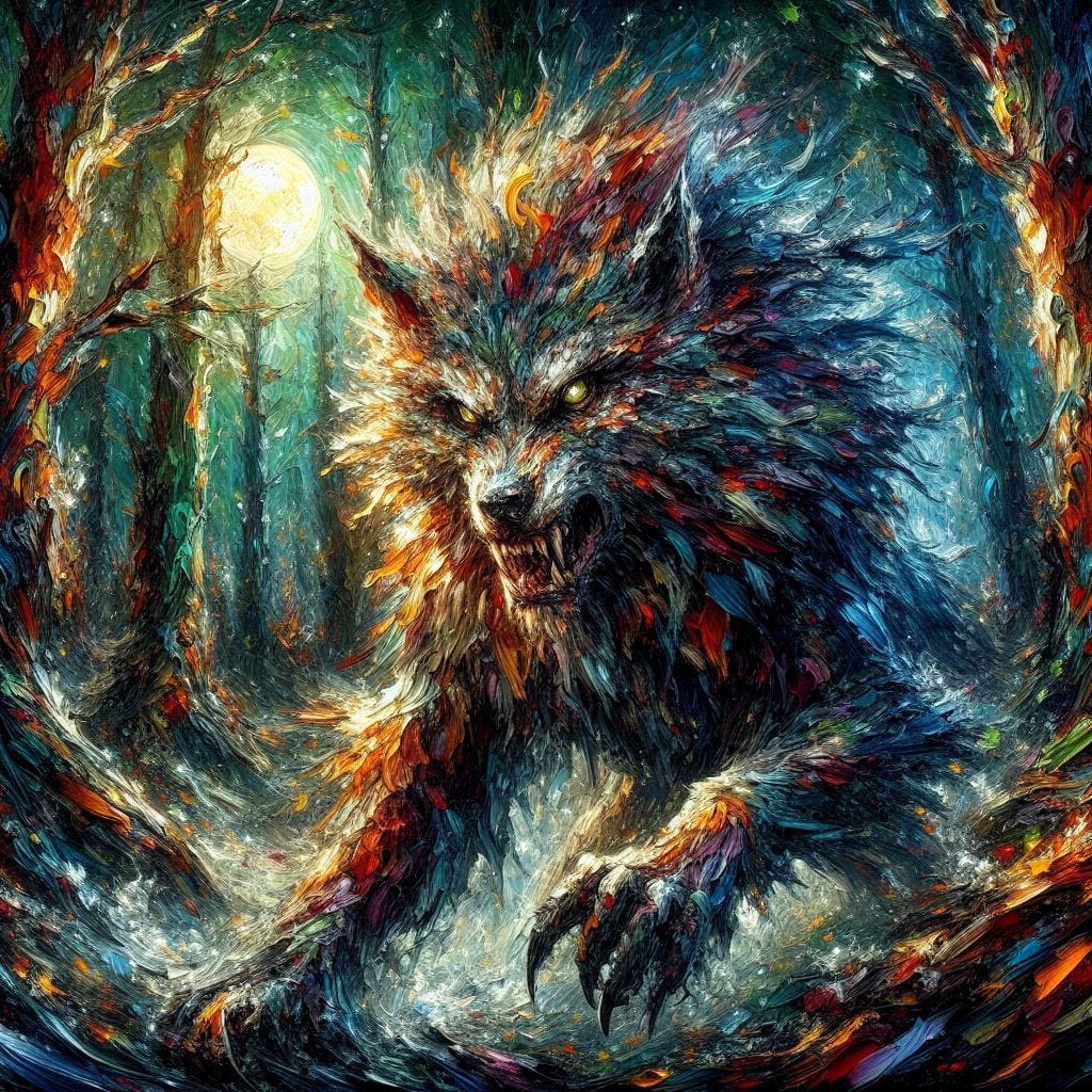
‘vibrant werewolf painting, in woods, clean canvas’ → ‘vibrant werewolf painting, in woods, opposite of clean canvas’: The clean canvas prompt produces a polished, softly lit AI-style illustration with smooth gradients and controlled detail. The other removes that sense of digital cleanliness, shifting the image into heavy impasto paint, broken color transitions, and expressive brushwork that feels more physically constructed than rendered.
A Tool for Exploration
What I enjoy most about this method is that it preserves the subject while destabilizing the expected outcome.
If I ask for a specific type of painting, I usually have a clear mental picture of what I’ll get.
If I ask for a subject combined with an “opposite of…” constraint, the outcome becomes less predictable. That unpredictability becomes part of the process.
In that sense, the technique feels less like a quality enhancer and more like a discovery tool.
Not All Opposites Are Equal
As I continued experimenting, a clear pattern emerged.
Some inversions consistently produced strong outcomes. Others had little effect.
The best results usually came from opposing qualities that describe default output behavior, such as:
- refined
- clean rendering
- opposite of 2D
- flat composition
- perfect finish
- smooth surface
These terms work because they target how the images are typically constructed, not just how they look.
By contrast, some terms were far less effective:
- pixel art
- retro graphics
- digital painting
- over-rendered
- sterile appearance
In many cases, these inversions simply led back to familiar aesthetics rather than producing genuinely new visual directions.
For example, the opposite of pixel art was often interpreted as highly realistic digital render, while the opposite of retro graphics frequently became modern graphics. In both cases, the model returned to the kind of slick, contemporary imagery it often defaults to.
Stronger outputs tended to come from opposing specific behaviors rather than broad artistic genres.
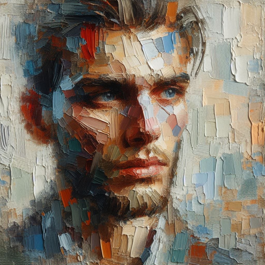
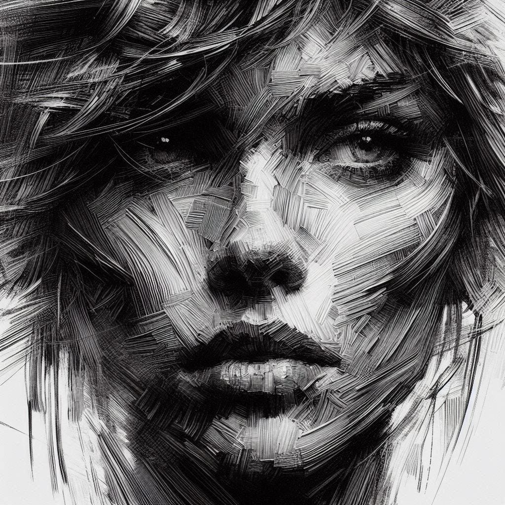
Prompts: ‘portrait, oil painting, opposite of clean rendering’ •’ portrait, opposite of smooth 2D line art’. Two short inversions produce very different forms of visual roughness. The first replaces polished AI portrait rendering with chunky, visible paint structure, while the second abandons smooth digital linework in favor of dense, heavily textured markings reminiscent of charcoal or woodcut techniques.
Why Some Inversions Don’t Work Well
One of the key insights from testing is that not all opposites create meaningful directional force.
If a term is too abstract, too stylistic, or too tied to a broad visual category, the model often fails to move away from anything specific in its construction process.
For example:
“digital painting” often produces standard painting outputs
“over-rendered” is often too subjective to alter structural behavior in a consistent way
“sterile appearance” can be interpreted in multiple ways, leading to inconsistent results
The strongest inversions tend to target specific output behaviors rather than broad styles. Terms such as polished, refined, smooth, or clean rendering give it a clearer direction to move away from, often producing more dramatic transformations.
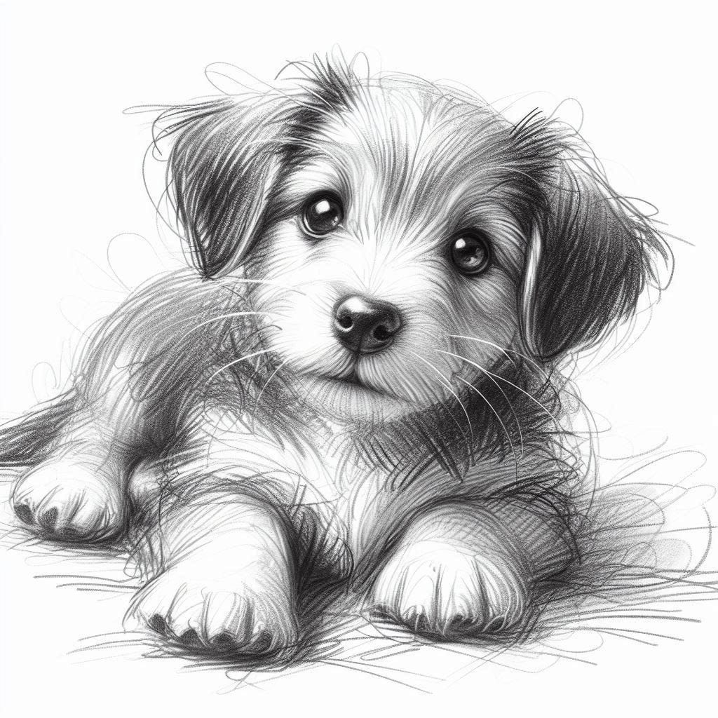
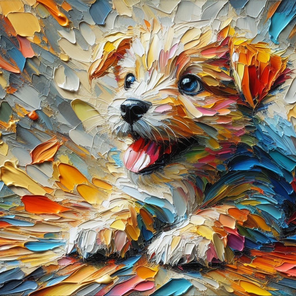
Both images move away from the controlled precision often associated with AI-generated art. The graphite drawing develops loose, expressive linework, while the oil painting relies on thick paint buildup and visible brushstrokes rather than smooth digital blending.
Best Uses for the Opposite Technique
The method becomes most effective when used as a layered modifier rather than a standalone strategy.
Adding Depth and Dimensionality
Used with subjects like portraits, environments, or objects, opposite prompts can encourage:
- stronger perspective
- layered composition
- sculptural or physical presence
Creating Rich Texture and Material Surfaces
Terms like clean mixing, even paint buildup, or smooth blending transitions can push outputs toward:
- thick paint application
- visible brushwork
- rough surface textures
- exposed construction lines
- raw, expressive imperfections
Escaping the Default AI Look
Many generated visuals share similar traits:
- overly smooth surfaces
- clean gradients
- polished lighting
- uniform rendering
Opposing these traits often produces images that feel less manufactured, less predictable, and more distinctive.
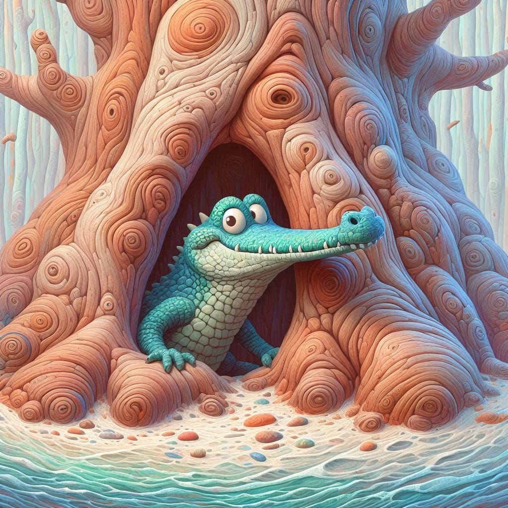
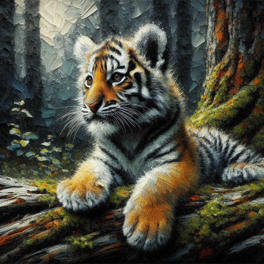
AI Prompts: ‘crocodile looking out of tree hollow, opposite of hyper-realism’ + ‘baby tiger in woods, oil painting, opposite of seamless transitions’. Two short inversions, two very different outcomes: a playful, storybook-style crocodile and a richly textured impasto painting with visible brushwork.
When “Opposite Of” Fails
Sometimes the text-to-image model does not reliably interpret the phrase “opposite of” as a directional constraint. In those cases, the goal is not to expand the prompt manually, but to preserve the same level of compression and ambiguity through rewriting.
The key advantage of opposite prompting is not the wording itself, but what it removes: the need to explicitly describe the destination. It compresses a complex aesthetic shift into a small input while leaving the output space open.
When “opposite of” is unreliable, one workaround is to use an AI chat program like ChatGPT to translate.
Rewrite this prompt for image models that don’t do ‘opposite of’.
- Input: vibrant werewolf painting, in woods, opposite of clean canvas
- Compressed inversion: vibrant werewolf painting in woods, rough unclean canvas, visible paint buildup, unpolished surface
- Balanced inversion: vibrant werewolf painting in a wooded scene, on a rough unprimed canvas with visible texture, messy painterly surface, uneven paint application, imperfect and unrefined finish
- Expanded inversion: vibrant werewolf painting set in a forest, rendered on a raw unprimed canvas with visible weave and imperfections, uneven paint absorption, thick and irregular brushwork, messy layered pigment buildup, no smooth or polished base surface, painterly construction that feels physically unstable and unrefined rather than clean or prepared
Both approaches preserve the same underlying benefit: you are still not designing the image in detail — you are only steering its construction away from what you don’t want.
Final Thoughts
The most valuable lesson from this experiment wasn’t that “opposite of” creates better images.
It was that a single directional constraint can force the system to abandon some of its default assumptions. In response, it begins searching for alternative solutions. That search is often where the most interesting results emerge.
What began as a brief distraction while editing an article turned into a surprisingly effective way to explore new styles, discover unexpected textures, and push outputs beyond their usual visual comfort zone.
Perhaps the most surprising part of this experiment is that the technique feels almost hidden in plain sight. People working with image generators have become so accustomed to using negative prompts, minus signs, and exclusion lists that many never consider asking for the opposite of a trait instead.
Modern systems can understand far more than simple removal instructions. They can often interpret higher-level semantic concepts, including contrasts, antonyms, and reversals — opening up creative possibilities that traditional negative approaches rarely tap into.
One practical use for this approach is fixing common AI art problems. If you notice a recurring trait you don’t like, try placing it after “opposite of”. It is a surprisingly simple solution.
This often sends it from one extreme to another — an overcorrection. But art frequently becomes more interesting at the edges than in the middle. Opposite prompting forces the model away from its typical results and into less explored territory, where unusual surface detail, stronger material qualities, and unexpected artistic choices often emerge.
The result won’t always be better, but it is often more distinctive. A single inversion can transform a familiar aesthetic into something that feels more tactile, expressive, and uncommon.
I‘ve only just started experimenting with this style of “anti-AI” prompting, but the results speak for themselves. Most of these images broke out of the generic, plastic AI mold and developed qualities that felt far less typical of AI-generated art.
The few exceptions would be easy to refine. For testing purposes, I intentionally kept the prompts incredibly short. Even the weaker results showed enough potential that a few additional words could likely have pushed them much further.
Brainstorming with Opposites
For me, this technique has become a way to explore creative directions without over-defining every detail.
Instead of fully engineering a style in advance, I use “opposite of…” as a trigger to break expected patterns, then refine what emerges.
From there, I can identify useful qualities — such as surface texture, lighting behavior, or compositional structure — and reuse them in more controlled text inputs.
It becomes less about producing a single perfect image and more about discovering new visual paths.
Questions to Contemplate
Can a single word like “opposite” disrupt the default “polished AI look”?
What happens when you move away from correcting outputs with negative prompts and instead redirect their construction logic?
Is opposite prompting simply a variation of the negative — or does it function as a fundamentally different kind of control signal?
I found that traditional negative prompting will rarely influence the results as much as opposite prompting. Try replacing the typical negatives you use in your creations and see what happens.
Clap or comment to share your thoughts.
For more inspiration, check out my other articles below, or the full series on Real 3D AI art.
Thanks for reading. I publish weekly AI art experiments. ***Visit my profile*** to follow, or subscribe by email if you prefer updates in your inbox.
If this article sparked ideas for your own AI art, repost it so others can discover it!
메타데이터
- post_id
- 67d094074c4a
- slug
- i-discovered-a-one-word-prompt-trick-that-breaks-the-typical-ai-art-style-67d094074c4a
- url
- https://medium.com/real-ai-art/i-discovered-a-one-word-prompt-trick-that-breaks-the-typical-ai-art-style-67d094074c4a
- canonical_url
- https://medium.com/real-ai-art/i-discovered-a-one-word-prompt-trick-that-breaks-the-typical-ai-art-style-67d094074c4a
- author_url
- https://medium.com/@hadwen
- status
- ok
- fetched_at
- 2026-06-23 03:48:11