Every Brand Feels the Same.
How the pursuit of “aesthetic” is making brands less recognisable.
Every Brand Feels the Same.
Open Instagram.
Beige background. Serif font. Muted colours. Oversized typography. Editorial photography.
Next brand.
Same thing.
Next one.
Same thing again.
Different logos. Different industries. Different audiences.
Same visual language.
Somewhere along the way we became obsessed with making brands look aesthetic, forgetting the most important thing:
They need to feel like themselves.
And that’s the problem. We are not running out of good brands. We are running out of distinctive ones.
The problem isn’t minimalism .
Minimalism can be effective as well.
It can make brands feel sophisticated, confident and intentional.
The problem begins when a visual style becomes a substitute for a brand identity.
We’ve started treating certain design choices as shortcuts for certain emotions.
Beige means premium.
Serif fonts mean sophisticated.
Lots of negative space feels luxury.
And because these choices work, everyone keeps using them.
The results?
A lot of brands with different purposes start looking almost identical on social media.
There’s nothing inherently wrong with beige.
There’s nothing wrong with serif fonts either.
The problem is when everyone reaches for the same visual vocabulary to say something different.
A skincare brand, a luxury hotel and a coffee shop shouldn't automatically look like they’re using the same moodboard.
Aesthetic is NOT Identity
There’s a difference between brands having an aesthetic and a brand having an identity.
An aesthetic is how something looks.
An identity is how something is recognised.
I’ve worked with multiple clients across completely different sectors, but somehow, they all want the same colour palette and the same “aesthetic” vibe. And somewhere along the way, the brand loses it’s identity.
Now think about the brands you can identify without seeing their logo. Something must have popped into your mind.
You might recognise a colour, a typeface, a packaging shape, an illustration style or even a way of writing.
Those things become recognisable because they’re repeated consistently and connected to the brand.
That’s what makes them assets.
A brand shouldn’t just look good.
It should look purposeful.
And that’s exactly where some of today’s “aesthetic” branding falls short.
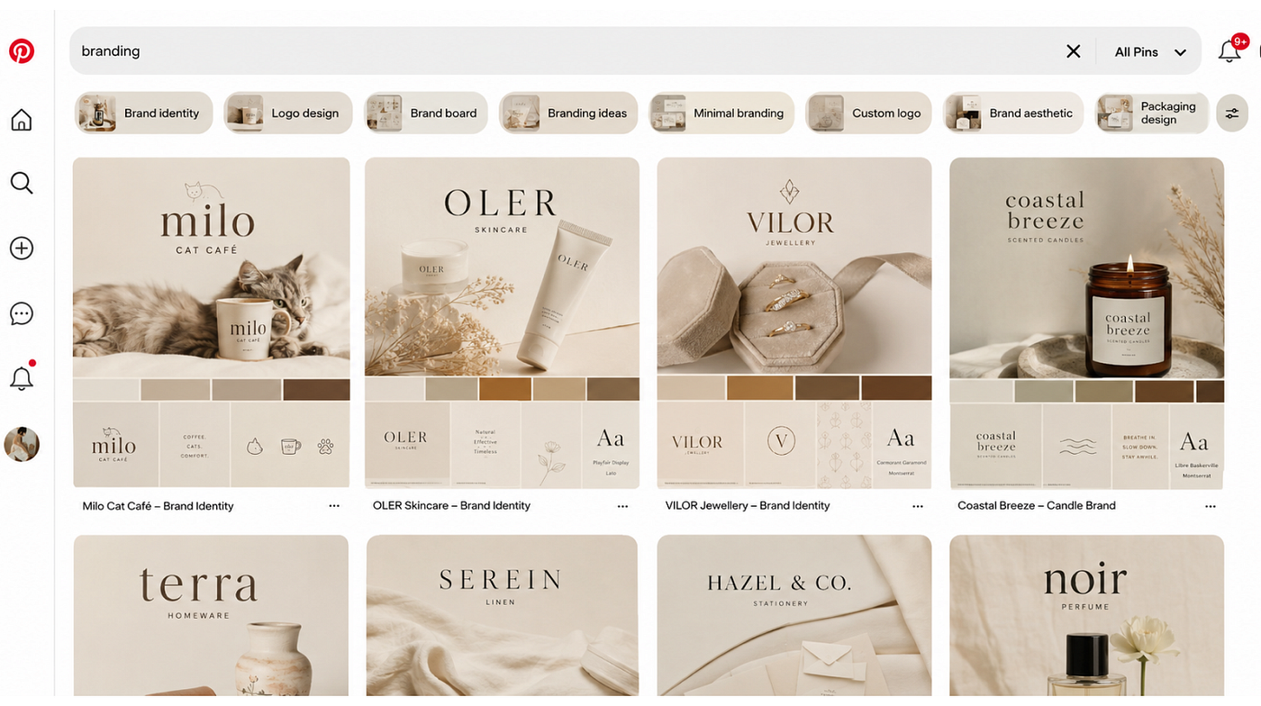
What a pinterest search looks like when all the branding feels same.
When inspiration becomes imitation.
As designers, we’re constantly surrounded by beautiful work.
Pinterest.
Behance.
Instagram.
Dribble.
They all are incredibly useful.
But there’s a trap.
You see a beautiful layout, you save it.
See another. Save it.
See ten more. Save them all.
Eventually, your idea of “good design” starts becoming whatever happens to be popular in your feed.
And without realising it, you stop asking:
“What does this brand need?”
and start asking:
“What would look good on Pinterest?”
That’s when inspiration turns into imitation.
When I first started consuming design content on Pinterest, I thought everything looked incredible.
Beautiful typography. Beautiful illustrations. Beautiful layouts.
I kept saving references because I genuinely loved them.
But the more designs I consumed, the more I started noticing something.
They were all starting to look the same.
The same bubbly fonts. The same playful illustrations. The same rounded shapes. The same minimal layouts.
Individually, they looked great.
But when you put them all together, they started feeling almost identical.
And that’s when I realised something:
A design can be beautiful and still be boring.
I’ve caught myself doing this too. Sometimes you find a reference that looks so good that you want to recreate the feeling of it.
But the better question isn’t:
“How do I make my design look like this?”
It’s:
“Why does this work, and does that reason apply to my brand?”
That’s a completely different way of designing.
Trends aren’t the enemy either.
I’m not against trends.
They exist for a reason.
They reflect what people are interested in, how visual culture is changing and what designers are experimenting with.
The problem is following them without asking whether they make sense.
A trend should be a tool.
It shouldn’t become the brand.
Because trends have a shelf life.
What’s fresh today can become overused tomorrow.
And if the only thing making a brand feel modern is the current design trend, the brand has nothing to fall back on once the trend disappears.
Good branding should be able to evolve without completely losing itself.
Think of it this way:
A trend can tell you what’s happening now.
A brand identity should tell you who you are.
Those aren’t the same thing.
Think about the brands you recognise instantly.
Think about Coca-Cola.
You don’t always need to see the logo to know it’s Coca-Cola.
The red, the distinctive script, the bottle silhouette and the way the brand uses its visual language have become so deeply associated with it that the name almost feels secondary.
You could take away the logo and still leave behind enough visual clues for people to make the connection.
That’s what strong brand assets do.
They create recognition beyond the name.
And then there’s Levi’s.
During the 2026 FIFA World Cup, FIFA’s branding rules required non-sponsor commercial branding to be covered at host stadiums. At Levi’s Stadium in Santa Clara, the famous Levi’s signage was covered with large white tarps.
But here’s the interesting part:
Even with the logo covered, you could still tell it was Levi’s.
The familiar Batwing-shaped outline remained recognisable.
Instead of treating the situation purely as a restriction, Levi’s leaned into the joke. The brand posted about the covered sign and even changed its Instagram profile picture to a version of the covered-up logo.
Something intended to hide the brand ended up becoming the brand’s story.
And that’s what makes this such a good branding example.
Not simply because the marketing response was clever.
But because the joke only worked because people could recognise what was underneath.
The covering didn’t erase the brand.
It made people notice how recognisable the brand already was.

Levi’s Stadium signage covered during the 2026 FIFA World Cup, with Levi’s turning the covered logo into a social media marketing moment.
The lesson isn’t that every brand needs a clever marketing stunt.
It’s much simpler than that.
The goal is to become recognisable beyond your logo.
Not just:
“Can people recognise our logo?”
But:
“Can people recognise us when the logo isn’t there?”
That’s the difference between having a logo and having an identity.
These brands aren’t memorable because every piece of content is wildly experimental.
They’re memorable because they’ve built recognisable elements and used them consistently over time.
And that’s an important distinction:
Consistency isn’t about making everything look identical.
It’s about making everything feel like it belongs to the same brand.
I’ve started asking a different question.
I’ve noticed this changing in the way I look at design too.
Earlier, I’d sometimes judge a design by one simple question:
“Does this look good?”
Now I think there’s a better question:
“Does this look like the brand?”
Because a beautiful design isn’t automatically good branding.
A visually stunning post can still communicate the wrong personality.
A perfect colour palette can still feel generic.
A trendy typeface can still say nothing about the business.
And sometimes, the strongest design decision isn’t adding another beautiful element.
It’s choosing the one thing that makes the brand different and giving it room to exist.
Maybe that’s a colour.
Maybe it’s a shape.
Maybe it’s an illustration style.
Maybe it’s a strange little visual detail that nobody else in the category is using.
Maybe it’s simply the way the brand talks.
Whatever it is, you need something that belongs to you.
So what should designers do?
Before opening Pinterest, Behance or even Figma, start with the brand.
Ask:
Who are we talking to?
What should they feel?
What makes this brand different?
What should people remember?
What can we own visually?
Then build from there.
Maybe the answer is minimalism.
Maybe it’s loud colours.
Maybe it’s weird illustrations.
Maybe it’s an unconventional typeface.
Maybe it’s photography that feels raw instead of polished.
Maybe it’s something that doesn’t fit neatly into the current definition of “aesthetic” at all.
That’s okay.
Because the goal isn’t to make the brand fit the trend.
The goal is to make the trend fit the brand.
And sometimes, that means doing less.
Sometimes it means doing more.
Sometimes it means breaking the rules entirely.
The point is that the decision should come from the brand, not the moodboard.

Four questions designers should ask when developing a distinctive brand identity.
Beautiful isn’t enough.
I think we’re entering a point where simply making something “aesthetic” isn’t enough anymore.
There are too many beautiful brands.
Too many perfect Instagram feeds.
Too many carefully curated moodboards.
Too many brands that look like they were designed from the same Pinterest board.
The brands that stand out won’t necessarily be the ones with the prettiest design.
They’ll be the ones with something of their own.
Something recognisable.
Something consistent.
Something human.
Because trends can make a brand look current.
But identity is what makes people remember it.
And maybe that’s what good branding should have been about all along.
Not being the most aesthetic brand in the room.
But Being the one people remember after they’ve left it.
메타데이터
- post_id
- 692b72e4eddc
- slug
- every-brand-feels-the-same-692b72e4eddc
- url
- https://medium.com/@aafraabdulhameed/every-brand-feels-the-same-692b72e4eddc
- canonical_url
- https://medium.com/@aafraabdulhameed/every-brand-feels-the-same-692b72e4eddc
- author_url
- https://medium.com/@aafraabdulhameed
- status
- ok
- fetched_at
- 2026-08-12 11:23:03




