Financial Health & Cash Flow Performance Dashboard
Understanding financial performance, spending patterns and savings growth
Financial Health & Cash Flow Performance Dashboard
Understanding financial performance, spending patterns and savings growth
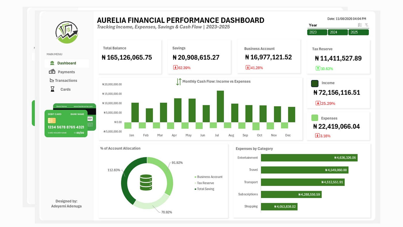
The Aurelia Financial Performance Dashboard provides an overview of the company’s financial position, income, expenses, savings, business account balance, tax reserve, cash flow and spending patterns.
Aurelia Financial Services
Project Overview
Aurelia Financial Services is a fictional financial services company used for this analytics project. The company manages income, operating expenses, business funds, savings, and tax reserves across its financial activities.
This project analyses Aurelia’s 2023–2025 transactional records to provide a clear view of its financial position, cash-flow patterns, spending behaviour, savings performance, and fund allocation. The analysis is designed to support data-driven financial monitoring and decision-making.
The dashboard was designed to answer key financial questions such as:
- How much money is currently available?
- How much income has been generated?
- How much has been spent?
- How is money distributed across business accounts, savings, and tax reserves?
- Which expense categories consume the most resources?
- How is monthly cash flow changing?
- How are key financial indicators performing compared with the previous period?
The solution was developed in Microsoft Excel using Power Query, PivotTables, PivotCharts, calculated fields/custom columns, slicers, and a dedicated Calendar Table.
Business Scenario
Aurelia Financial Services maintains transactional records covering income, expenses, savings, business account movements, tax reserves, payment methods, transaction statuses, and other financial activities. However, the raw transactional data was not initially suitable for direct analysis. It contained common real-world data quality issues such as: inconsistent formatting, missing values, negative and positive financial values, inconsistent date formats. Management therefore required an interactive dashboard that could transform the transactional records into meaningful financial insights.
Project Objectives
The main objectives of the project were to:
- Clean and standardise three years of financial transaction data.
- Create KPI indicators for key financial metrics.
- Analyse monthly income and expenses.
- Identify the organisation’s major expense categories.
- Analyse the allocation of funds across accounts.
Dataset
The underlying dataset represents transactional financial activity between 2023 and 2025.

Raw Transactions
Tools & Technologies
The project demonstrates practical use of:
Microsoft Excel
- Power Query
- PivotTables
- PivotCharts
- Slicers
- Timeline
- Custom Columns
- Data Cleaning
- Data Modelling
- Conditional Formatting
- Dashboard Design
The project also demonstrates fundamental data analytics concepts including:
- Data transformation
- Data quality management
- KPI development
- Time-series analysis
- Variance analysis
- MoM analysis
- Financial storytelling
Data Cleaning & Transformation
Data preparation was performed using Power Query in Excel.
The cleaning process included:
Data Type Standardisation
Date fields were converted to proper Date types, while monetary fields were converted to appropriate decimal-number formats.
Amount Cleaning
The Amount field was examined for errors, missing values, currency symbols, commas, and other inconsistencies.
Negative values were retained where they represented expenses because they are useful for cash-flow analysis.
New Amount
A new New Amount field was created to standardise the financial direction of transactions:
Income  → Positive
Expense → Negative
The transformation logic was:
if [Transaction_Type] = "Expense"
then -[Amount]
else [Amount]
KPI Columns
Additional custom columns were created for:
- Total Income
- Total Expense
- Total Balance
- Business Account
- Total Savings
- Tax Reserve
These fields were subsequently aggregated using PivotTables.
Date Table
A separate Date Table was created in Power Query to support time-based analysis.
The Date Table begins from:
1 January 2023
and dynamically extends to the current date.
The table supports analysis by:
- Year
- Quarter
- Month
- Year-Month
- Date
This enables the dashboard to support both YoY and MoM analysis.
The dynamic date-list logic used was:
= List.Dates(
    #date(2023, 1, 1),
    365,
    #duration(1, 0, 0, 0)
)
This means the date table can automatically extend when the workbook is refreshed.
Dashboard Design
The dashboard was designed around a simple financial storytelling structure:
Key Performance Indicators
The dashboard contains six major financial indicators.
Total Balance
Represents the net financial position derived from the transaction records.
It provides a high-level answer to:
How much money is available after considering financial inflows and outflows?
Savings
Shows the current value associated with the organisation’s savings account/activity.
The dashboard also displays a percentage change indicator to provide context on savings performance.
Business Account
Represents the balance associated with the business operating account.
This helps management understand the funds available for operational activities.
Tax Reserve
Shows funds allocated to the tax reserve.
This provides visibility into money set aside for future tax obligations.
Income
Shows total successful income transactions.
The percentage indicator provides additional context about income performance relative to the comparison period.
Expenses
Shows total successful expenses.
The dashboard uses positive presentation for the expense KPI, while expenses remain negative in the cash-flow visual to clearly distinguish money leaving the organisation.
Monthly Cash Flow: Income vs Expenses
The central chart presents monthly income and expenses using a clustered column chart.
Income is displayed above the zero line, while expenses are displayed below the zero line.
This visualisation allows users to quickly identify:
- months with strong income
- months with higher spending
- changes in cash-flow patterns
- periods where expenses increased significantly
- the relationship between financial inflows and outflows
The visual answers the key management question:
“Are we generating sufficient income relative to our expenses?”
The monthly analysis also makes it easier to identify unusual periods that may require further investigation.
Expenses by Category
The horizontal bar chart provides a breakdown of expenses by category.
This visual answers:
“Where is the organisation spending the most money?”
From the dashboard, categories such as Entertainment, Travel, Transport, Subscriptions, and Shopping can be compared directly.
The horizontal orientation makes it easier to rank categories and identify the largest expense drivers.
Account Allocation
The doughnut chart is intended to show how funds are distributed between:
- Business Account
- Tax Reserve
- Total Savings
This gives management a visual overview of where financial resources are being held.
It answers:
“Where is the organisation’s money currently allocated?”

Aurelia Financial Performance Dashboard
Key Insights from the Analysis
1. Strong income position
Aurelia recorded ₦73.09 million in total income compared with ₦22.74 million in expenses. This indicates that income substantially exceeded recorded expenditure during the reporting period.
2. Positive overall financial position
The dashboard reports a Total Balance of ₦50.45 million, indicating a strong financial position based on the transactions captured in the analysis.
3. Savings experienced a significant decline
The Savings balance is ₦21.28 million, but the dashboard shows a 63.21% decrease compared with the previous month. This is the largest negative movement among the displayed KPIs and requires further investigation.
4. Business Account balance declined
The Business Account balance stands at ₦17.48 million, representing a 50.50% decline versus the previous month. This could indicate significant withdrawals, transfers, or increased operating expenditure.
5. Tax Reserve is improving
The Tax Reserve stands at ₦25.90 million and increased by 5.64% compared with the previous month. This suggests that Aurelia is strengthening funds allocated toward future tax obligations.
6. Expenses represent a relatively small proportion of income
Expenses of ₦22.74 million represent approximately 31% of total income. This indicates that recorded expenditure is considerably lower than income, leaving a substantial financial surplus.
7. Expense levels are relatively evenly distributed
Entertainment, Travel and Transport are the largest expense categories, while Subscriptions and Shopping follow closely behind. No single category overwhelmingly dominates spending, suggesting that expenditure is spread across several areas.
8. Monthly cash flow remains positive
The cash-flow chart shows income consistently above expenses across the displayed months. However, income varies considerably throughout the year, with some months generating noticeably stronger inflows than others.
9. Funds are distributed across multiple financial purposes
The account allocation shows approximately 40.48% in Savings, 33.74% in the Business Account and 25.78% in the Tax Reserve. This indicates that funds are not concentrated in a single financial area.
[embed]A video walkthrough
Recommendations
Based on the analysis of Aurelia Financial Services’ 2023–2025 transaction data, the following recommendations are proposed:
1. Investigate the decline in Savings
The 63.21% decline in Savings should be investigated at transaction level to determine whether it resulted from planned transfers, withdrawals, investments, or unexpected expenditure. Aurelia should establish a minimum savings threshold and maintain consistent monthly contributions.
2. Review Business Account movements
Management should investigate the 50.50% decline in the Business Account and reconcile the transactions responsible for the movement. The review should distinguish between operational expenses, transfers, withdrawals and other account movements.
3. Maintain the Tax Reserve strategy
The positive movement in the Tax Reserve should be maintained. Aurelia should continue making regular allocations and periodically compare the reserve with projected tax obligations.
4. Introduce expense controls
Management should pay particular attention to Entertainment, Travel and Transport, which are currently the largest expense categories. Monthly budgets and spending limits can help control discretionary expenditure.
5. Monitor the expense-to-income ratio
Aurelia should monitor its expense-to-income ratio regularly. The current ratio of approximately 31% can serve as a baseline for future comparisons. Significant increases should trigger further investigation.
6. Investigate unusual monthly fluctuations
Months with unusually high or low income or expenses should be examined at transaction level to determine whether they represent seasonal activity, one-off transactions, transfers or potential data anomalies.
Connect with me on LinkedIn:
메타데이터
- post_id
- 6a96dc9d255d
- slug
- financial-health-cash-flow-performance-dashboard-6a96dc9d255d
- url
- https://medium.com/@adeyemi.da/financial-health-cash-flow-performance-dashboard-6a96dc9d255d
- canonical_url
- https://medium.com/@adeyemi.da/financial-health-cash-flow-performance-dashboard-6a96dc9d255d
- author_url
- https://medium.com/@adeyemi.da
- status
- ok
- fetched_at
- 2026-08-16 17:58:25