Descriptive Statistics: How I Learned to Understand Data Before Machine Learning
When I first started learning data science, I believed that becoming a data scientist meant learning machine learning algorithms, writing…
Descriptive Statistics: How I Learned to Understand Data Before Machine Learning
When I first started learning data science, I believed that becoming a data scientist meant learning machine learning algorithms, writing Python code, and collecting certificates.
But as I went deeper, I realized something very important:
👉 Before teaching machines to learn, I must learn to understand the data myself.
That is where Descriptive Statistics completely changed my thinking.
Descriptive statistics is not about heavy formulas. It is about understanding what the data is trying to say and being able to explain it clearly to others. In this blog, I’m sharing how I understood descriptive statistics as a beginner, in my own learning journey.
1️⃣ Measures of Central Tendency — Finding the Center of Data
What does “center” of data mean?
Finding the center of data means identifying a value that represents the dataset. Most of us casually call it the average, but while learning statistics, I understood that this word can sometimes be misleading.
That’s why we use mean, median, and mode instead of trusting just one value.
🔹 Mean — The Balance Point of Data
The mean is calculated by adding all values and dividing by the number of values. I like to think of the mean as the balance point of the data.
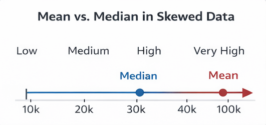
Mean vs Median in Skewed Data One extreme value pulls the mean away from where most data lies.
This image helped me understand why mean can be misleading.
When mean works well:
- Data is evenly distributed
- No extreme values Examples: exam scores, measurements
When mean fails:
- Salaries
- Income
- House prices Because one very high value can distort the result.
🔹 Median — The Most Realistic Center
The median is the middle value after sorting the data.
What I personally liked about the median is that it does not get affected by extreme values. Even if one person earns a huge salary, the median still represents the majority.
That’s why businesses prefer median for:
- Salary reports
- Income surveys
- Property prices
📌 This made me understand why median gives a more honest picture when data is skewed.
🔹 Mode — The Most Common Choice
The mode represents the most frequently occurring value.
Mode is extremely useful when dealing with categorical data, where mean or median makes no sense.
Examples:
- Most popular mobile brand
- Most purchased product size
- Most used payment method
Mode helps businesses understand customer preferences.
2️⃣ Measures of Dispersion — Understanding Data Spread
Initially, I thought knowing the average was enough. But I learned that two datasets can have the same mean and still behave very differently.
That’s why dispersion is important.

Same Mean, Different Spread Same average, but very different risk and stability.
This image clearly shows why spread matters.
🔹 Range — Simple but Weak
Range is calculated as maximum minus minimum.
It is easy to calculate, but I learned that it is unreliable because one extreme value can change it completely.
🔹 Variance — Measuring How Scattered Data Is
Variance measures how far values are from the mean.
In simple words, variance answers: 👉 How much does the data differ from the average?
High variance means data is scattered and uncertain.
🔹 Standard Deviation — The Most Practical Measure
Standard deviation is the square root of variance and is easier to understand because it uses the same unit as the data.

Standard Deviation — Low vs High Spread Low deviation means consistency, high deviation means uncertainty.
This helped me clearly visualize stability vs risk.
Businesses use standard deviation to analyze:
- Stock price volatility
- Delivery time reliability
- Quality consistency
🔹 Quartiles and Interquartile Range (IQR)
Quartiles divide data into four equal parts:
- Q1 → 25%
- Q2 → Median
- Q3 → 75%
The IQR (Q3 − Q1) focuses on the middle 50% of data.

Quartiles and IQR Visualization IQR ignores extreme values and focuses on the core data.
Businesses use IQR to:
- Create salary bands
- Group performance levels
- Detect outliers safely
3️⃣ Measures of Shape — Understanding Data Distribution
While working with real data, I realized something important:
👉 Data is rarely perfectly symmetric.
Understanding shape prevents wrong conclusions.
🔹 Skewness — Which Side Has the Tail?

Left Skewed vs Right Skewed Data Position of mean and median changes based on skew.
- Right skewed data: Income, delivery delays Mean > Median
- Left skewed data: Easy exams Mean < Median
- Skewness explains why mean and median sometimes tell different stories.
🔹 Kurtosis — Why Extreme Values Matter
Kurtosis explains how heavy the tails of data are.
Heavy-tailed data produces extreme values more often, which is very important in:
- Finance
- Fraud detection
- Risk analysis
Ignoring extremes can lead to serious mistakes.
4️⃣ Measures of Relationship — Understanding How Variables Connect
Once I understood individual variables, the next step was learning how variables move together.
🔹 Covariance — Direction Only
Covariance tells whether two variables move in the same or opposite direction, but it is hard to interpret directly.
🔹 Correlation — Clear and Standardized
Correlation fixes that problem by giving values between -1 and +1.

Types of Correlation Positive, negative, and no correlation visualized.
- Positive correlation → move together
- Negative correlation → move opposite
- Zero correlation → no relationship
📌 One of the most important lessons I learned: Correlation does NOT mean causation.
🔹 Rank Correlation — When Order Matters
Spearman’s rank correlation works with ranked data instead of actual values.
It is useful when:
- Relationships are non-linear
- Only ranking matters
Examples: ratings, ranks, preferences.
🔚 Final Thoughts
Descriptive statistics taught me that data science is not just about building models — it is about understanding and explaining data.
Before machine learning:
- We explore data
- We summarize it
- We understand behavior
Models predict outcomes. Statistics explains reality.
Certificates show that we studied. Blogs show that we understood.
메타데이터
- post_id
- 6aef3cb23a14
- slug
- descriptive-statistics-how-i-learned-to-understand-data-before-machine-learning-6aef3cb23a14
- url
- https://medium.com/@dasarichandu2309/descriptive-statistics-how-i-learned-to-understand-data-before-machine-learning-6aef3cb23a14
- canonical_url
- https://medium.com/@dasarichandu2309/descriptive-statistics-how-i-learned-to-understand-data-before-machine-learning-6aef3cb23a14
- author_url
- https://medium.com/@dasarichandu2309
- status
- ok
- fetched_at
- 2026-08-18 13:17:32