How a 3 second moment made our app a single touchpoint for our guests
Why our guests skipped the app and queued at the front desk instead — and how we fixed it.Inside the goSTOPS app: how we lifted two…
How a 3 second moment made our app a single touchpoint for our guests
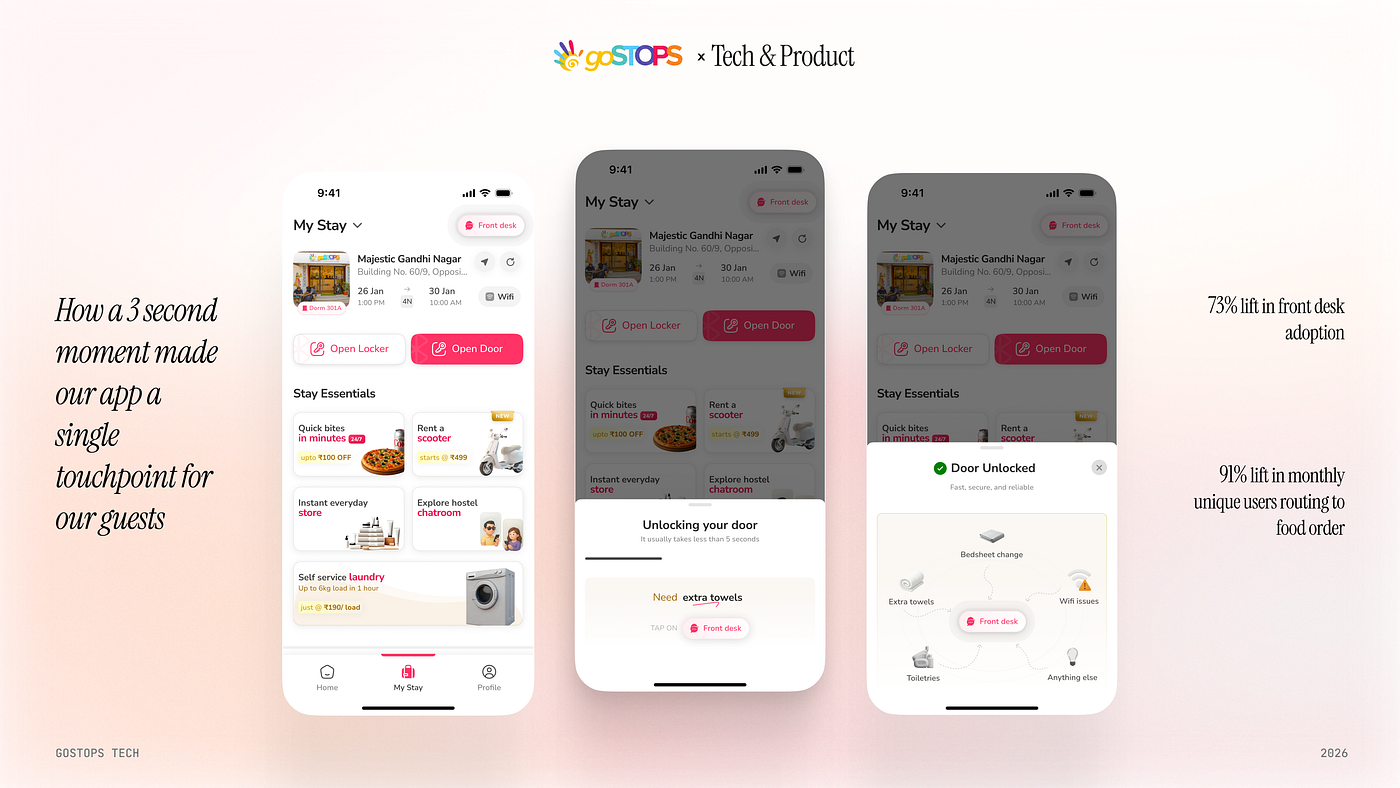
Why our guests skipped the app and queued at the front desk instead — and how we fixed it.Inside the goSTOPS app: how we lifted two features by 73% and 91% in six months.
Our hostel guests had the app. They still walked downstairs to ask for towels.
The Problem
A guest checks into one of our hostels in Udaipur. Hour three of a four-day stay. The Wi-Fi in the dorm is slow. She has the goSTOPS app on her phone — she used it to unlock her room — and inside that app, one tap away, is a button that would send her message to support in under a minute. BUT she doesn’t open the app. She walks downstairs and joins the queue at the physical front desk.
In mid-2025, 26% of in-stay guests with our app had ever tapped that button.
The other 74% weren’t fine. They were queuing at the physical front desk for things that took 30 seconds in the app. They were writing it up in a post-stay review when it was too late to fix. Most often, they were sitting with the problem — because the idea that the app might be the answer never crossed their mind.
We could have called this a discoverability problem and redesigned the screen one more time. We didn’t, because the more we looked at it, the more we saw the gap wasn’t visual. It was a literacy gap. Travel accommodation isn’t yet a category where guests instinctively open an app for every need, the way they do for cabs or food delivery. The capability was there. The mental model that said this is where I come when something is wrong — that hadn’t formed yet.
This is the story about what happened when we tried to close that gap. Front Desk feature adoption is the most visible result. It is not the most important one.
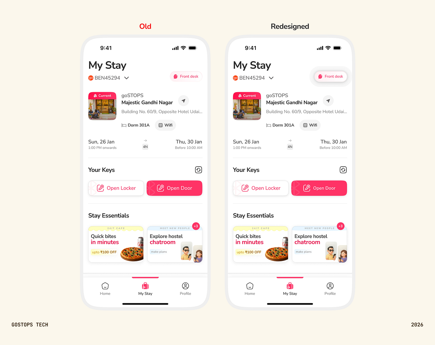
The starting point MyStay, mid-2025. Everything was there. Almost no one knew. (Old, left — vs the redesigned screen, right.)
The diagnosis
Quick context for anyone outside the building. goSTOPS is a hostel chain across India. Our app is what guests use during their stay — to unlock their room with a digital key, order food, raise an issue, talk to staff. The in-stay home screen is called MyStay. The feature inside it that routes any guest issue to the right person is called Front Desk.
Tap Front Desk, type “AC isn’t working” or “I need an extra towel,” and the message routes through our in-app chatbot to the central team. The whole loop takes under a minute. It had been live for months.
The feature wasn’t the problem. The pattern was.
Food orders told the same story in a different shape. Guests who had ordered food once tended to order again — but the share who ordered at all was lower than it should have been for a captive audience inside a property that ran its own kitchen. Events and experiences, where they existed, were barely discovered at all.
The shape was consistent across every surface in the app. We weren’t short on capability. We were short on guests, knowing the capability was theirs.
The bet: teach in context, not at onboarding
The default move at this point is to build a better onboarding flow. A welcome carousel. A first-time tooltip tour. We did not do that.
Onboarding is a one-time event. The behaviour we needed to teach was not. A guest could open MyStay on day one, breeze through whatever we showed them, and then forget all of it by the time the AC stopped working on day three. Teaching a guest how to use the app isn’t a problem you solve once at onboarding. It is a thing the app has to do at every meaningful moment of the stay, forever.
That belief led us to one specific bet. The door unlock.
Every guest unlocks their door at least once a day, often many times. Mixpanel shows roughly 14,000–19,000 successful unlocks a month, against 11,000–17,000 failures. Smooth or not, the unlock wait is the single moment in the entire app where the guest’s full attention is on the screen, with intent. We decided to treat that moment as the most valuable real estate we had — not just to confirm that the door opened, but to teach the guest what else the app could do.
The full story of how that played out is the section below. It’s the part of this work we’re proudest of.
The unlock animation that felt faster
The door unlock isn’t instant. There’s a backend handshake between the app and the lock, and it takes what it takes. We couldn’t compress that time. We could only compress how long it felt.
The original loader was a generic inline spinner under the Open Door button. It worked, and it gave the guest nothing to look at. Three seconds of staring at a spinner reads as a long time when you’re standing in a corridor with a backpack on. The bottleneck was perception, not engineering.
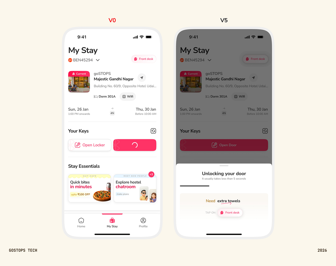
V0 vs V5 loader Same actual unlock time. Different experience of the wait.
We went in with three goals. Perceived wait time during unlock had to drop below the inline-loader baseline. After unlocking, the guest had to find the Front Desk button on MyStay at a glance. And the guest had to walk away understanding what Front Desk actually does. The early decision was to pull the unlock out of an inline spinner and into a dedicated bottom sheet — a contextual loader with room to carry content beyond itself. The wait wasn’t dead time; it was the most consistently viewed surface in the product.
What took five rounds of user testing — 5 to 6 users per round — was figuring out exactly what should sit inside that bottom sheet, and what shouldn’t.
V1 packed visuals, copy, and motion into the wait. Perceived time came back worse than the inline loader. Too much was happening; the eye had nowhere to rest. Processing reads as duration.
V2 stripped the visuals back. Perceived time dropped, but motion across the remaining elements was still doing too much. The wait still felt long.
V3 got the wait time right. The loader was quiet, the copy was tight, and users described the unlock as fast. But when we asked them afterwards what Front Desk could do, they couldn’t say. We’d solved for speed at the cost of the teaching.
V4 brought the value props back as an orbital map of use cases — bedsheet change, extra towels, toiletries, Wi-Fi, anything else — surrounding the Front Desk button in the success sheet. Users could now name three or four things Front Desk handled after a single unlock. But a new gap opened: when they went back to MyStay, they couldn’t spot the Front Desk button at a glance. The unlock had taught them what Front Desk does. It hadn’t taught them where it lives.
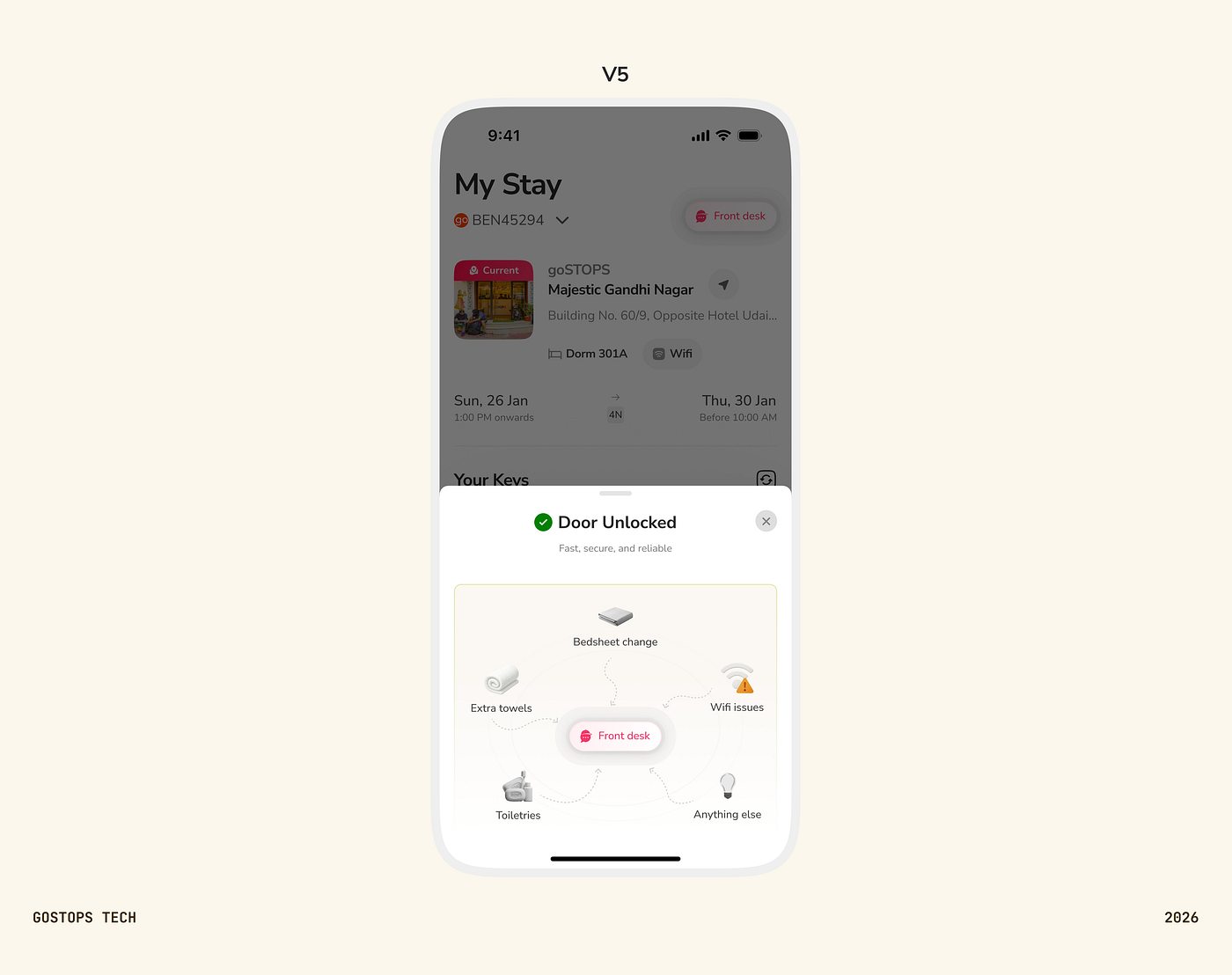
Success sheet — orbital map V4. The unlock taught what Front Desk does. It didn’t teach where it lives.
V5 — what shipped — resolved all three goals. During the unlock, exactly one element moves: the value prop next to “Need” cycles through what Front Desk handles. One static loader, one moving line of copy. That’s the entire visual surface. The same use cases appear in the success sheet as the orbital map. And to close the discoverability gap, we added a blipping spotlight on the Front Desk button when the guest opens MyStay, and the same spotlight again the moment they dismiss the success sheet. The unlock teaches what Front Desk does. The spotlight teaches where it lives.
The same instinct shaped how we handled the failure case. When the lock-app handshake breaks, the old version left the guest in a corridor with a useless screen. We replaced it with a bottom sheet that reads “Oops! Something went wrong — no worries, we can help,” and a one-tap CTA that opens the chatbot with the issue pre-filled. The wait is real estate. The failure is real estate. Both should teach the guest the app is where this stuff gets handled.
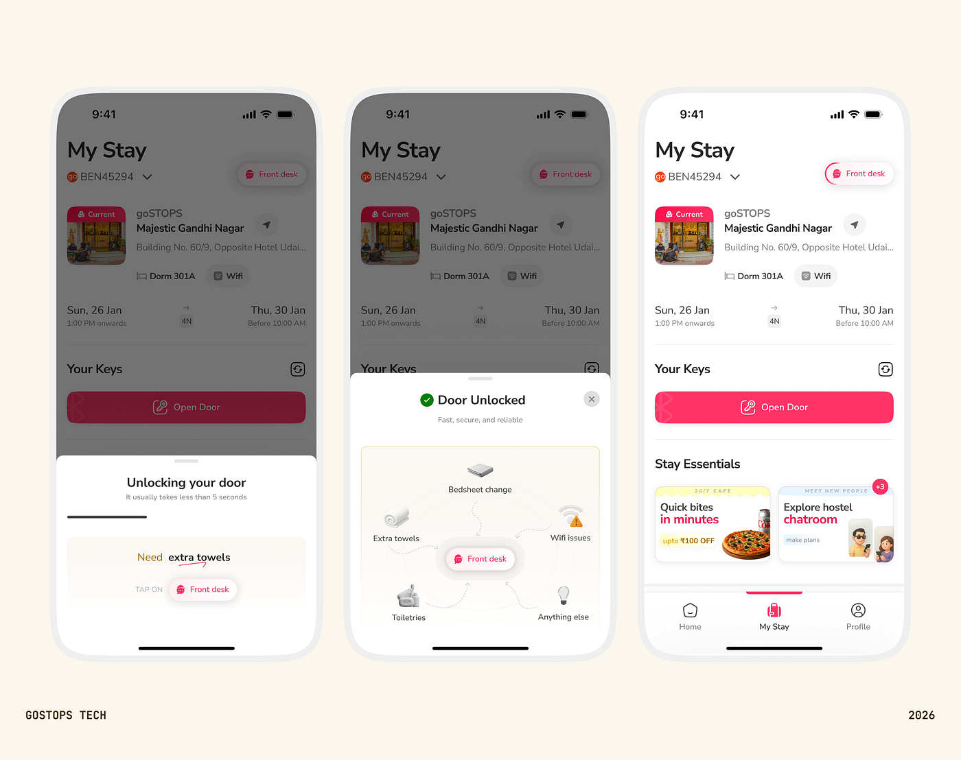
V5 sequence V5. One loader, one moving line of copy. Then the spotlight closes the loop.
Across the rounds, the lesson kept sharpening. More on screen meant more perceived wait. Less on screen meant less learning. The final version isn’t the busiest or the quietest — it’s the one where every moving element earns its place.
A fourth outcome fell out of V4 testing, and it changed how we thought about the wait entirely. Once guests were comfortable with the loader carrying contextual content, the wait stopped being a loader and started being real estate. Food, events, services — surfaced at the moment of highest attention in the entire app. The 91% lift in monthly food orders from MyStay, which we’ll come back to, is in part this surface doing its work.
Perceived time is its own product. The unlock got no faster; the wait got better. And once the wait got better, the space inside the wait got valuable.
What happened
The Front Desk number is the one we set out to move, so let’s start there.
From November 2025 to April 2026, monthly unique users tapping Front Desk grew from 2,864 to 4,968 — a 73% lift. On a weekly basis, the same trend shows up as a climb from roughly 1,100 to 1,800 unique users a week. The largest share of that lift comes through the unlock teaching loop — the loader, the success sheet, and the MyStay spotlight that closes the discoverability gap. The spotlight alone is seen by 14,000–18,000 unique users a month and converts about a quarter of them. It’s the most efficient teaching tool we built.
But the more interesting result is what happened to the rest of the app.
Food orders from MyStay nearly doubled in the same window. Monthly unique users routing to food order from MyStay climbed from 2,412 to 4,605 — a 91% lift. That’s not a side-effect. That’s the same number of guests as Front Desk, going to food, through the same screen, taught by the same reinforcements. The system we built to fix one number lifted a second number we hadn’t directly touched.
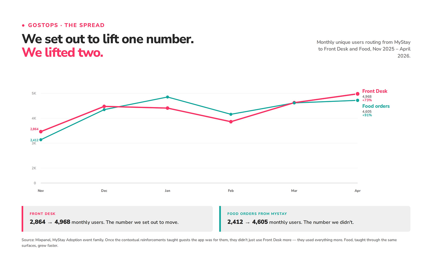
Growth · Nov 2025 — Apr 2026 : Set out to lift one. Lifted two.
Events & Experiences and the hostel Chatroom — surfaces we tied into MyStay almost as an afterthought — went from essentially zero engagement to small but real engagement. Events went from a single user in November to 35 in April. The Chatroom went from 6 to 84. Small numbers in absolute terms. The shape of the change is what matters.
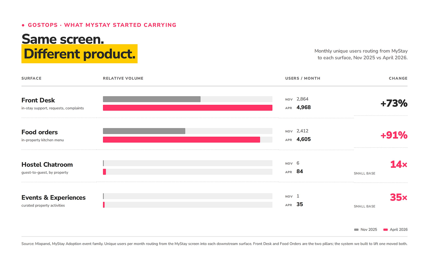
Surface-by-surface lift : Same screen. Different product.
The point isn’t any one of these numbers. The point is the pattern. We thought we were building a system to fix Front Desk adoption. What we built was a system that taught guests the app was for them. Once they learned that, they didn’t just use Front Desk more — they used everything more.
MyStay stopped being a screen guests passed through on their way to unlock a door, and started being the screen guests came to. That is a different product than we had six months ago — and a different commercial surface. A near-doubling of food order traffic in six months tells us guests are open to being offered something inside a context they trust. Property services, partner experiences, curated promotions — none of these surfaces existed when MyStay was a screen guests didn’t open. A help screen is a cost centre. A surface guests return to is a product.
What didn’t work, and what’s next
Not every nudge worked. Our 3PM housekeeping prompt — a proactive day-two ping asking guests whether their room needed attention — sees roughly 3,500–4,000 unique users a month and is actively dismissed by about 1,800 of them. Click-through sits at 1.7%. The dismiss-to-tap ratio is 25 to 1. The lesson is single-sentence: contextual reinforcement works when it matches a need the guest already has. It fails when it invents one on the guest’s behalf. “Is your room clean enough?” wasn’t a question most guests were asking themselves. We left the prompt running because the lesson is more useful than killing it. The next version will trigger on a signal, not a clock.
There’s more left to do than we’ve done. MyStay is being rebuilt as a single coherent screen rather than the patchwork of spotlights and banners we shipped feature by feature. The monetization surfaces are hypotheses, not products. And the hardest question of all — whether this behaviour holds as our property base grows and our guest demographic widens — is a year of work ahead of us.
None of that worries us as much as it probably should. Every guest who, at hour three of a stay, opens MyStay because they remembered that’s where the help button lives — and then orders dinner from the same screen, and then taps the Wi-Fi icon when the connection drops — is a small reminder that the question we started asking was the right one.
The app is not a feature. It is the interface for the stay. For more guests now than six months ago, it actually is.
Shoutouts
This was a small team that punched above its weight.
Anudeep & Vardan — on product. They framed the problem as a literacy gap rather than a discoverability one, which is the call the entire project hinges on, and held the scope honest the whole way — turning down the bigger redesign in favour of teaching at the unlock, and pulling each surface back to what actually earned its place. The bet that the wait was real estate, not dead time, started here.
Prateek — on design. Prateek understood the problem at a level the PRD didn’t capture, ran genuine rounds of user testing instead of phoning them in, and came back with a design language that worked on the first guests who saw it. The unlock animation that everyone now thinks of as obvious wasn’t obvious. It was iterated to.
Sameer — on frontend. Sameer shipped the surface every guest actually touches, and shipped it cleanly. The spotlight pulse, the bottom sheets, the cycling copy inside the loader — every one of them feels native to the app because of how he built them.
Vasu — on backend. Vasu built the plumbing that makes any of this routable. A tapped icon to a live agent, a pre-filled chatbot, an unlock failure caught by the right error state — none of that exists without the architecture underneath, and Vasu built it without flinching.
We’re still asking what comes after.
메타데이터
- post_id
- 6e2653e15d64
- slug
- how-a-3-second-moment-made-our-app-a-single-touchpoint-for-our-guests-6e2653e15d64
- url
- https://medium.com/@tech_56647/how-a-3-second-moment-made-our-app-a-single-touchpoint-for-our-guests-6e2653e15d64
- canonical_url
- https://medium.com/@tech_56647/how-a-3-second-moment-made-our-app-a-single-touchpoint-for-our-guests-6e2653e15d64
- author_url
- https://medium.com/@tech_56647
- status
- ok
- fetched_at
- 2026-06-09 15:37:30