The End of the Dashboard: Why AI Is Making Visualization Obsolete for Most Users
When you can ask a question and get a direct answer, who needs a chart? What that means for the BI industry.
The End of the Dashboard: Why AI Is Making Visualization Obsolete for Most Users
When you can ask a question and get a direct answer, who needs a chart? What that means for the BI industry.
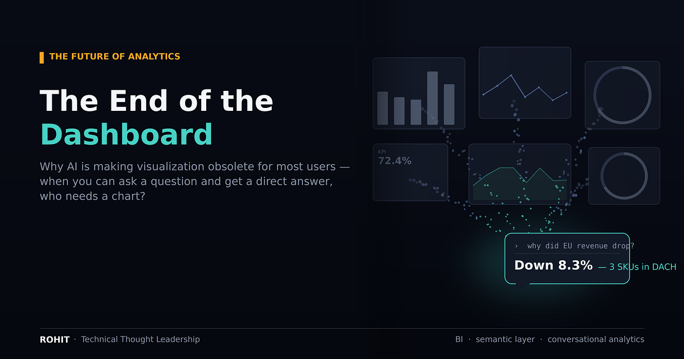
Here is the uncomfortable truth the business intelligence industry has spent twenty years not saying out loud: almost nobody ever wanted a dashboard.
They wanted an answer. The dashboard was the compromise we shipped because getting the answer required someone who could write SQL — so analysts pre-built grids of charts to cover the questions they guessed leadership might ask, and everyone learned to navigate them. A dashboard is a cache. It’s a set of pre-computed answers to anticipated questions, arranged on a screen, waiting for you to scan it and do the interpretation yourself.
That compromise is ending. And the reason is simple: when a non-technical user can type “why did EU revenue drop last quarter?” and get a governed, correct, plain-English answer in five seconds, the pre-built grid of charts stops being the product. It becomes the thing you used to need.
The dashboard was always structurally doomed for most people
Three failures were baked into the model from the start.
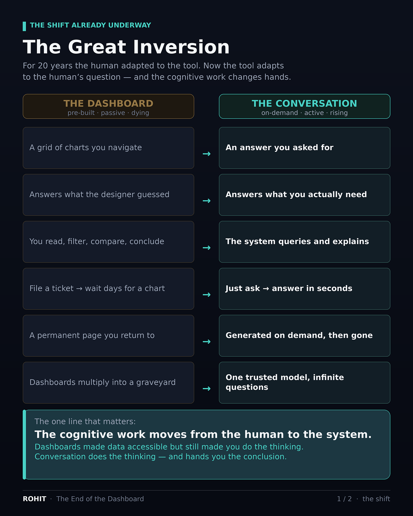
It answers the question you anticipated, not the one you have. Every dashboard encodes a designer’s bet about what users will want to know. The moment your actual question falls outside that grid, you file a ticket and wait days for a new chart — or you give up. New question, new dashboard: a treadmill that never catches up to curiosity.
The cognitive work sits entirely on the human. With a dashboard you arrive on a page, pick filters, read five charts, compare them, and form the conclusion yourself. The tool is passive. It shows you what happened and leaves the why — the part you actually care about — as an exercise for the reader.
It metastasizes. Walk into almost any mature BI environment before a migration and you’ll find hundreds, sometimes thousands, of half-built dashboards — each created to answer one narrow question, most untouched in months. The industry has a name for it: the dashboard graveyard. “Death by dashboard” is a documented pathology, not a hot take.
For the roughly 90% of “users” who are consumers rather than analysts — the exec checking one number, the ops manager asking “are we on track?”, the account rep wondering which deal is at risk — the dashboard was never a good fit. It was the only fit available.
What actually changed
Natural-language query isn’t new; it was promised in 2018 and it was terrible. What changed is two things arriving at once.
First, text-to-SQL got good. Frontier models can now translate a messy business question into a correct query with genuine reliability — a threshold that made production use viable rather than a demo trick.
Second — and this is the part that matters — the semantic layer grew up. Tools like the dbt Semantic Layer and Cube let you define, once and centrally, what “revenue,” “active customer,” and “churn” actually mean in your data. Give a model that governed context, and it stops guessing. Ask a question, and the system generates the query, runs it, interprets the result, and writes back an explanation — often with a chart it generated on the spot to make its point.
The interface inverts. For decades the human adapted to the tool: learn the dashboard, master the filters, memorize where the numbers live. Now the tool adapts to the human’s question. This is why every major vendor is racing to cannibalize its own dashboard business — Power BI Copilot, Tableau Pulse and the agentic Tableau Next, Databricks Genie, ThoughtSpot’s Spotter agents, Google rebuilding Looker around agentic BI, Microsoft embedding data agents into Fabric. When incumbents knife their own flagship product category on purpose, the direction of travel is settled. Gartner projects that 40% of enterprise applications will embed task-specific AI agents by the end of 2026, up from under 5% a year earlier.
Now the precise version — because “visualization is obsolete” is too lazy
Here’s where most takes overshoot, so let me be exact.
The chart is not dying. The dashboard is.
Some things really are faster to grasp with your eyes than in a sentence. A revenue line trending down is understood instantly, no words required. Distributions, correlations, outliers, geospatial patterns, “shape over time” — these are genuinely visual, and no paragraph replaces them. Visualization as a cognitive tool is safe.
What dies is the pre-built dashboard as a destination you navigate. Visualization stops being a page you go to and becomes an ephemeral rendering of an answer — generated per question, shown when it’s the clearest way to make a point, and then gone. The chart survives; the chart graveyard doesn’t. And a few genuinely glanceable, always-on cases — the NOC wall, the trading screen, the factory line — stay as dashboards, because they’re ambient monitoring, not question-and-answer.
So the honest headline isn’t “visualization is obsolete.” It’s: for most users, most of the time, the answer replaces the interface — and the visualization becomes a supporting character the AI casts on demand.
The catch that decides everything
An answer is only as trustworthy as the meaning layer underneath it — and this is exactly where the shift gets dangerous.
A dashboard, for all its faults, forces a single standardized view. Everyone reads the same chart. A conversational system does the opposite: it will confidently answer using whichever definition it inferred. If “customer” means one thing to sales and another to marketing — and it always does — the model has no way to know which you meant. It picks one and hands you a fluent, authoritative, wrong number. You can’t sanity-check a sentence the way you can eyeball a chart. Conversational BI doesn’t remove the governance problem. It removes your ability to see it.
This is the real story of the transition, and it’s the one the “dashboards are dead” crowd keeps skipping. The value of an analytics stack is migrating away from the visualization layer — the pixels — and into the trust layer: the governed semantic definitions, the certified metrics, and the lineage that lets you answer “where did this number come from, and were we allowed to compute it that way?” The single strongest predictor of whether your AI analytics are trustworthy or merely fluent is whether you built that layer before you bolted on the agent.
Fluent is easy. Correct is governance.
What this means for the BI industry
The BI market is not $20 billion anymore — depending on how you scope it, it’s north of $30–40 billion in 2026 and forecast toward $60–120 billion by the mid-2030s. But the more important number is where inside that market the value sits, because it’s moving.
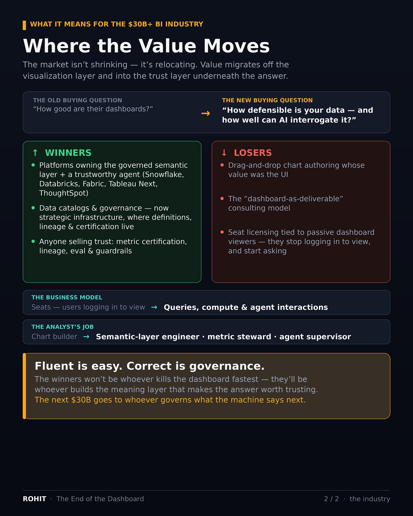
Value migrates from the visualization layer to the trust layer. The old buying question was “how good are their dashboards?” The new one, as investors have already noticed, is “how defensible is their data, and how well can AI interrogate it?” Nobody will pay a premium for beautiful chart-authoring. They’ll pay for a governed metrics layer they can trust an agent to reason over.
Winners: platforms that own the governed semantic layer and wrap a trustworthy agent around it — the lakehouse and cloud-data incumbents (Snowflake, Databricks), Microsoft via Fabric, Salesforce via Tableau Next, ThoughtSpot. Quietly, data catalogs and governance tooling become strategic infrastructure rather than back-office hygiene — they’re where the definitions, lineage, and certification that make answers trustworthy actually live.
Losers: tools whose core value was drag-and-drop chart building; the “dashboard-as-deliverable” consulting model; and — most consequentially — seat-based licensing tied to passive dashboard viewers. When 90% of consumers stop logging in to view and start asking, you don’t sell them a dashboard seat. The business model shifts from seats toward queries, compute, and agent interactions; from “how many dashboards did we build” to “how many questions did we answer correctly.”
And the analyst? Not obsolete — promoted. The job moves up the stack: from building charts to engineering the semantic layer, stewarding metric definitions, writing the evals that catch a hallucinated query, and supervising agents. The people who thrive are the ones who can audit a machine’s reasoning as rigorously as they once reviewed a junior’s SQL. Fewer chart builders; more semantic-layer engineers, metric stewards, and AI-governance specialists. That’s a better job — and a scarcer one.
The bottom line
The dashboard is dying for most users, and honestly — good riddance to the graveyard. The pre-built grid was a twenty-year workaround for a problem AI just dissolved: you can finally ask your actual question and get your actual answer.
But “ask a question, get an answer” is only an upgrade if something trustworthy sits under the answer. The winners of the next decade won’t be whoever kills the dashboard fastest. They’ll be whoever builds the meaning layer that makes the answer worth trusting — and can prove where it came from.
The chart isn’t obsolete. The unquestioned chart is. And the industry’s next $30 billion is going to whoever governs what the machine says next.
If you run a BI or data team: are you investing in the semantic and governance layer before the agent, or bolting the agent onto whatever definitions you happen to have? I think that single sequencing decision separates the winners from the merely fluent — curious whether you’re seeing the same.
메타데이터
- post_id
- 6e40a7572d4c
- slug
- the-end-of-the-dashboard-why-ai-is-making-visualization-obsolete-for-most-users-6e40a7572d4c
- url
- https://medium.com/signal-structure/the-end-of-the-dashboard-why-ai-is-making-visualization-obsolete-for-most-users-6e40a7572d4c
- canonical_url
- https://medium.com/signal-structure/the-end-of-the-dashboard-why-ai-is-making-visualization-obsolete-for-most-users-6e40a7572d4c
- author_url
- https://medium.com/@dnanatihor
- status
- ok
- fetched_at
- 2026-07-09 09:01:30






