10 Claude code frontend design skills, plugins, and CLIs
Claude Code can build a frontend. Making it look like a human designed it is the harder part.
10 Claude code frontend design skills, plugins, and CLIs
Claude Code can build a frontend. Making it look like a human designed it is the harder part.
There is a monster inside Claude Code, and it is called AI slop.
Purple gradients. Inter everywhere. Glowing cards arranged in the same predictable grid. Glassmorphism added for no clear reason. Every SaaS landing page slowly becoming the same website.
Claude Code is very good at writing frontend code. It is much less reliable at visual judgment. Tell it to “make the design modern” and you will probably get the exact design you were trying to avoid.
The usual frontend design skill helps a little, but vague instructions like “don’t make it look AI-generated” are not enough. Claude needs stronger references, clearer constraints, and sometimes a completely different workflow.
These are ten tools that give it a better chance.
Image Credits: Jack (Me)
1. Impeccable
Impeccable is one skill containing 18 design commands.
What makes it useful is that it does not just tell Claude to improve the page. It breaks the work into specific design problems: clarification, hierarchy, responsiveness, error states, typography, spacing, and more.
It also directly identifies common AI design anti-patterns.
Accent borders on every card. Random spark lines. Excessive glass effects. Decorative gradients doing absolutely nothing. Instead of politely asking the model to avoid bad design, Impeccable shows it what bad design actually looks like.
That is a much better approach.
The before-and-after examples are also useful because design descriptions can be vague. Seeing what a command changes is easier than hoping Claude interprets a paragraph correctly.
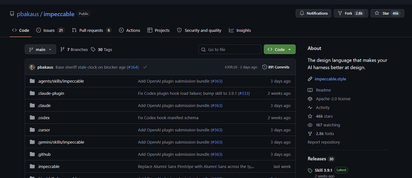
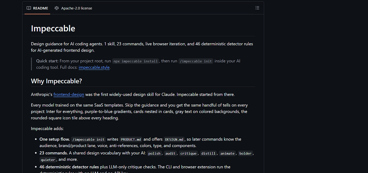
Image Credits: Jack (Me)
2. SkillUI
SkillUI takes an existing website and turns its design system into a Claude-ready skill.
Point it at a site such as Stripe or Notion, let it analyse the layout and interactions, and it generates a reusable design reference for your project.
This is not the same as telling Claude, “Make it look like Stripe.” That usually produces a weak imitation with vaguely similar colours.
SkillUI examines more of the actual system behind the site. Its Ultra mode uses Playwright to capture scrolling, screenshots, hover behaviour, and other interactions instead of relying only on the HTML.
It still will not reproduce custom illustrations or complex branded graphics. Obviously. But as a starting point for layout, spacing, component structure, and general visual direction, it can get surprisingly close.
The uncomfortable question is whether this encourages everyone to copy existing sites. Probably. But developers were already doing that manually.
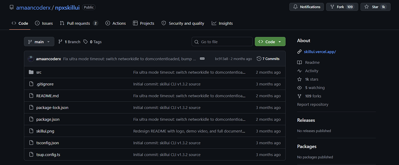
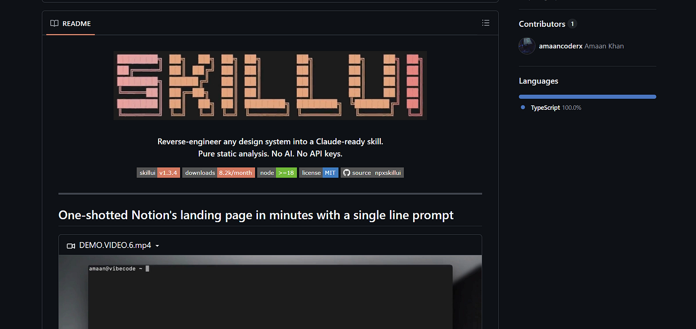
Image Credits: Jack (Me)
3. WebGPU skills
WebGPU sits in a different category from the other tools here.
It lets websites interact more directly with the GPU, which makes advanced graphics, shaders, simulations, and highly interactive visual effects possible.
This is closer to the world of WebGL experiments and custom shader-heavy websites than normal landing-page design. A WebGPU skill gives Claude instructions for setting up renderers, materials, nodes, and shaders without expecting you to understand the entire graphics pipeline first.
You are not going to create an award-winning interactive experience with two prompts. The output may also take more time to debug than a normal React component.
Still, this is one of the few tools on the list that can move a page beyond changing card corners and button shadows.
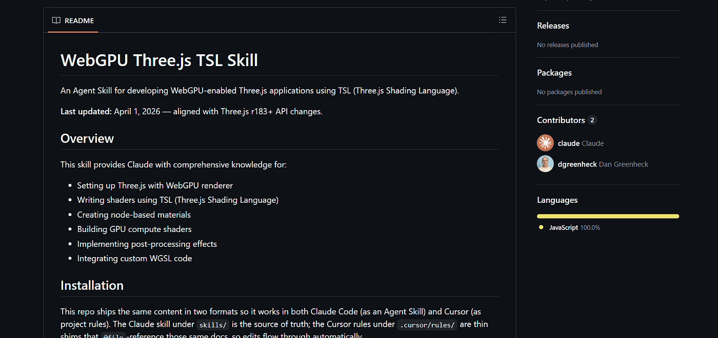
Image Credits: Jack (Me)
4. Awesome Design
Awesome Design provides detailed design-system prompts based on existing websites and brands.
Instead of a generic instruction such as “use a premium dark theme,” you get a structured design document covering typography, colours, buttons, form elements, cards, layout behaviour, and the overall visual direction.
That level of detail matters.
Claude performs better when it has concrete rules. “Make it elegant” means almost nothing. A defined type scale, spacing system, colour palette, and component behaviour gives it something it can actually follow.
The repository covers technology products as well as brands outside the usual SaaS bubble. That alone helps. Not every site needs to resemble a project-management dashboard.
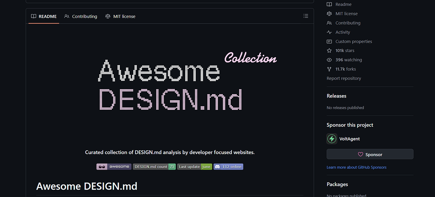
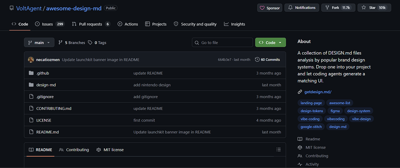
Image Credits: Jack (Me)
5. Google Stitch
Stitch is useful when writing code is not yet the main problem.
You describe the interface you want, optionally add screenshots, and it generates a visual design system along with several page variations. You can compare those variations before committing to one direction.
This is faster than repeatedly asking Claude Code to rewrite the frontend, restarting the development server, checking the browser, deciding it still looks wrong, and doing the whole thing again.
Visual comparison is underrated. It is easier to reject three weak options at once than to review them one by one after each rebuild.
Stitch can also expose the generated code and transfer designs into tools such as Figma. There is an MCP integration, although the visual interface may be the more useful part. Automating everything through a terminal is not automatically better.
Sometimes you should look at the design.
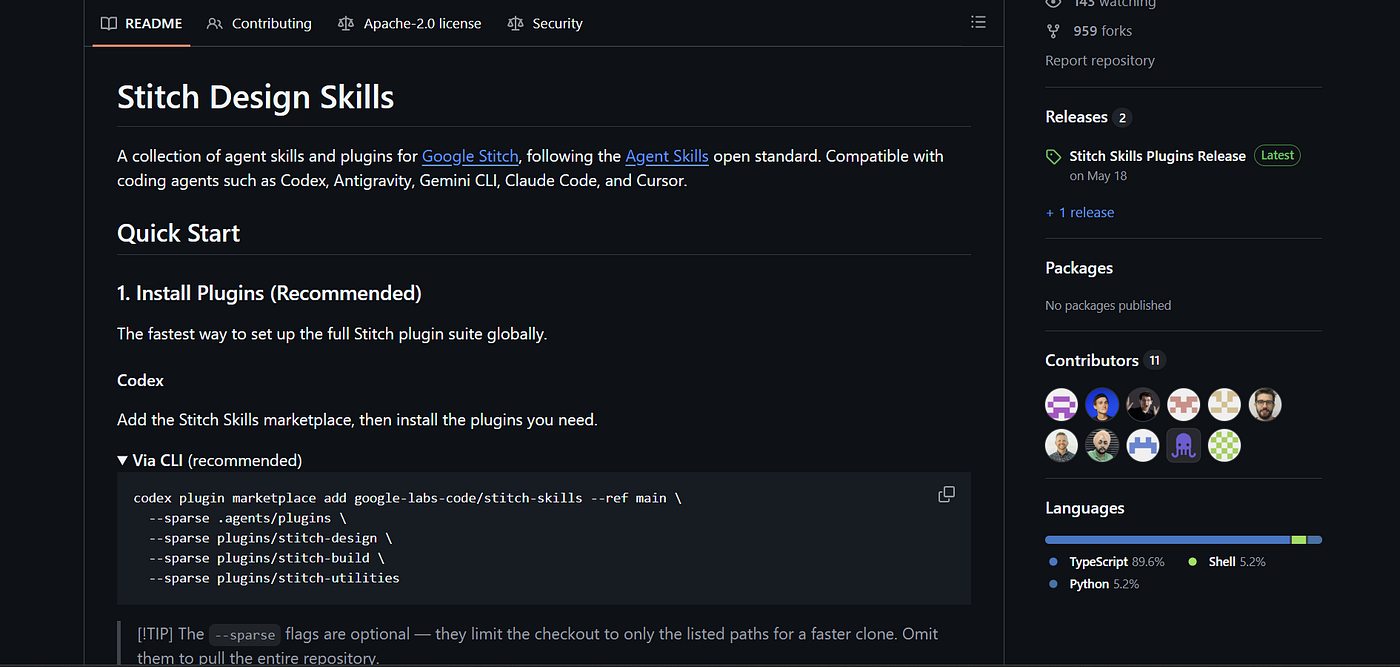
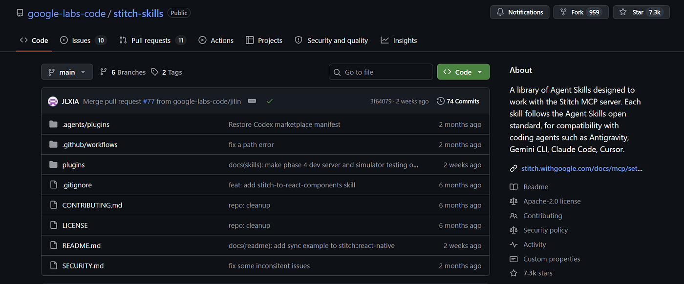
Image Credits: Jack (Me)
6. UI/UX Pro Max
UI/UX Pro Max is probably the closest thing to the frontend design skill Claude Code should have had from the beginning.
It does not assume every project should follow the same startup aesthetic. It uses industry-specific reasoning rules and asks what the product is actually for before selecting a visual direction.
That sounds obvious. Apparently, it is not.
A healthcare interface, restaurant site, developer tool, portfolio, and luxury product page should not share the same component system with different text pasted into it.
The skill also includes stack-specific guidance instead of pushing every project towards the same React setup. It is a useful option when you have no reference website and only a rough idea of what the product should feel like.
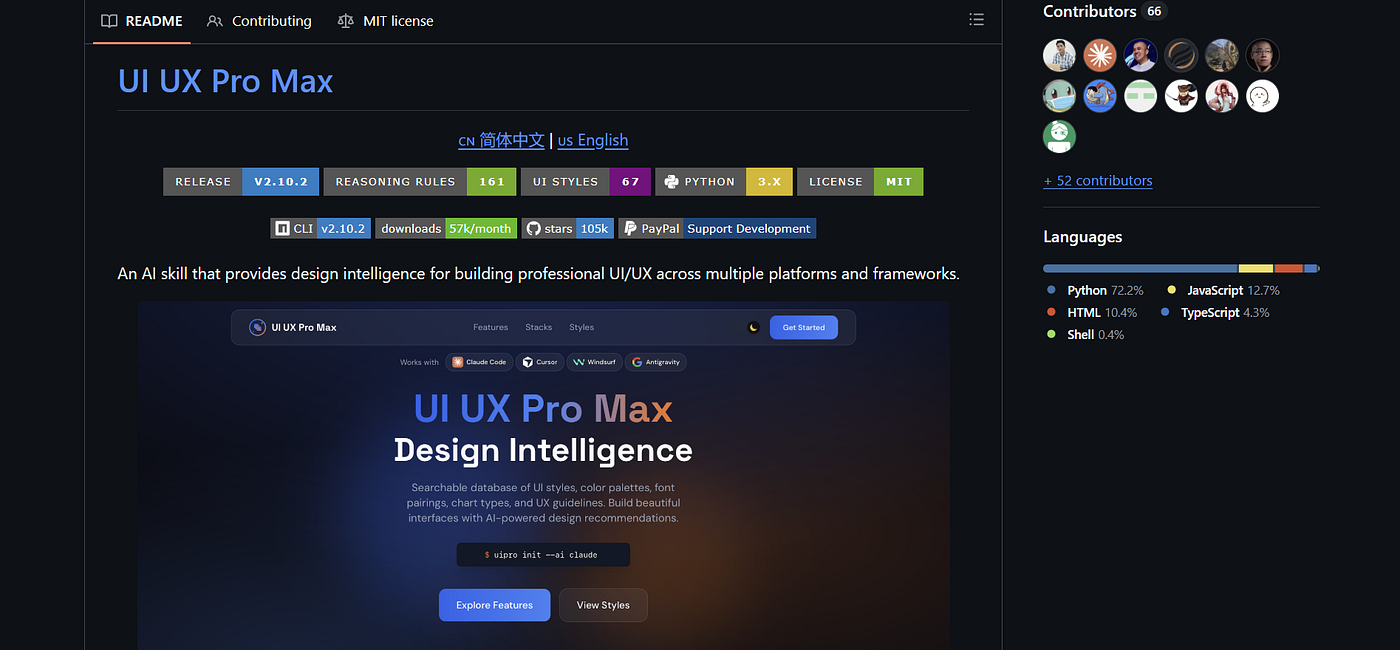
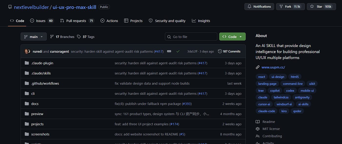
Image Credits: Jack (Me)
7. 21st.dev
21st.dev is a large collection of frontend components that can be copied or brought into a project through prompts.
The obvious temptation is to grab a dramatic hero section with a 3D object following the cursor. That may work, but it can also force the rest of the website to support an aesthetic you did not really plan.
The smaller components are often more valuable.
A button with a subtle lighting effect. A card with a responsive hover state. A border treatment that does not look like the default Tailwind example. These details can make a basic interface feel considered without turning it into a graphics demo.
It is also useful as a reference library. Many developers do not have bad taste. They simply have not seen enough alternatives.
Claude cannot choose from options it does not know exist. Neither can we.
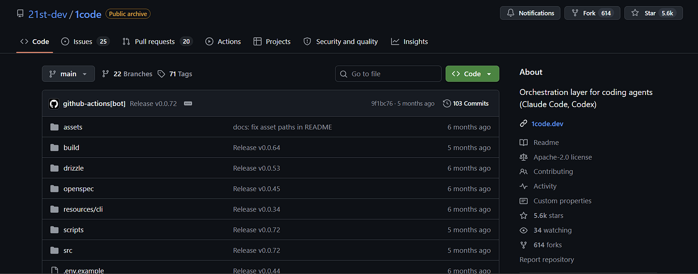
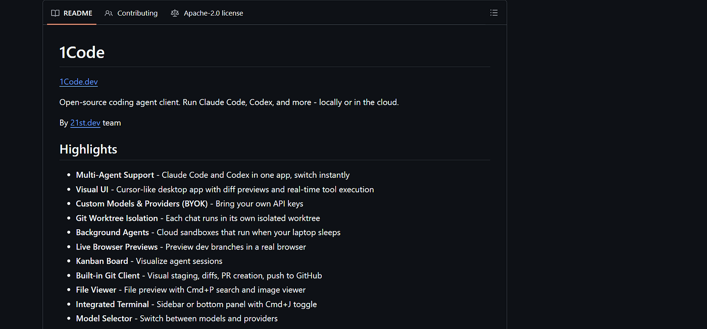
Image Credits: Jack (Me)
8. Taste
The Taste repository is a collection of skills intended to make Claude produce less predictable visual work.
“Taste” is becoming one of those words people use until it stops meaning anything, but the basic goal is sensible: move away from default SaaS templates and introduce more variation in composition, motion, typography, and layout.
The results are not automatically brilliant. Different is not always good.
But different can still be useful when the baseline is another centred heading above a four-card grid. Some of the skills also let you control how experimental the output becomes, which is better than asking Claude to “be creative” and seeing what breaks.
I would treat this as an additional influence, not a complete design process.
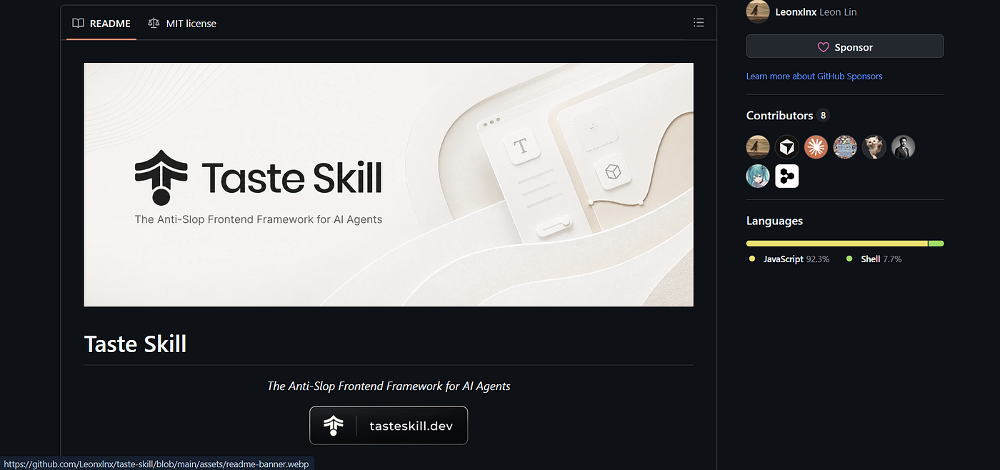
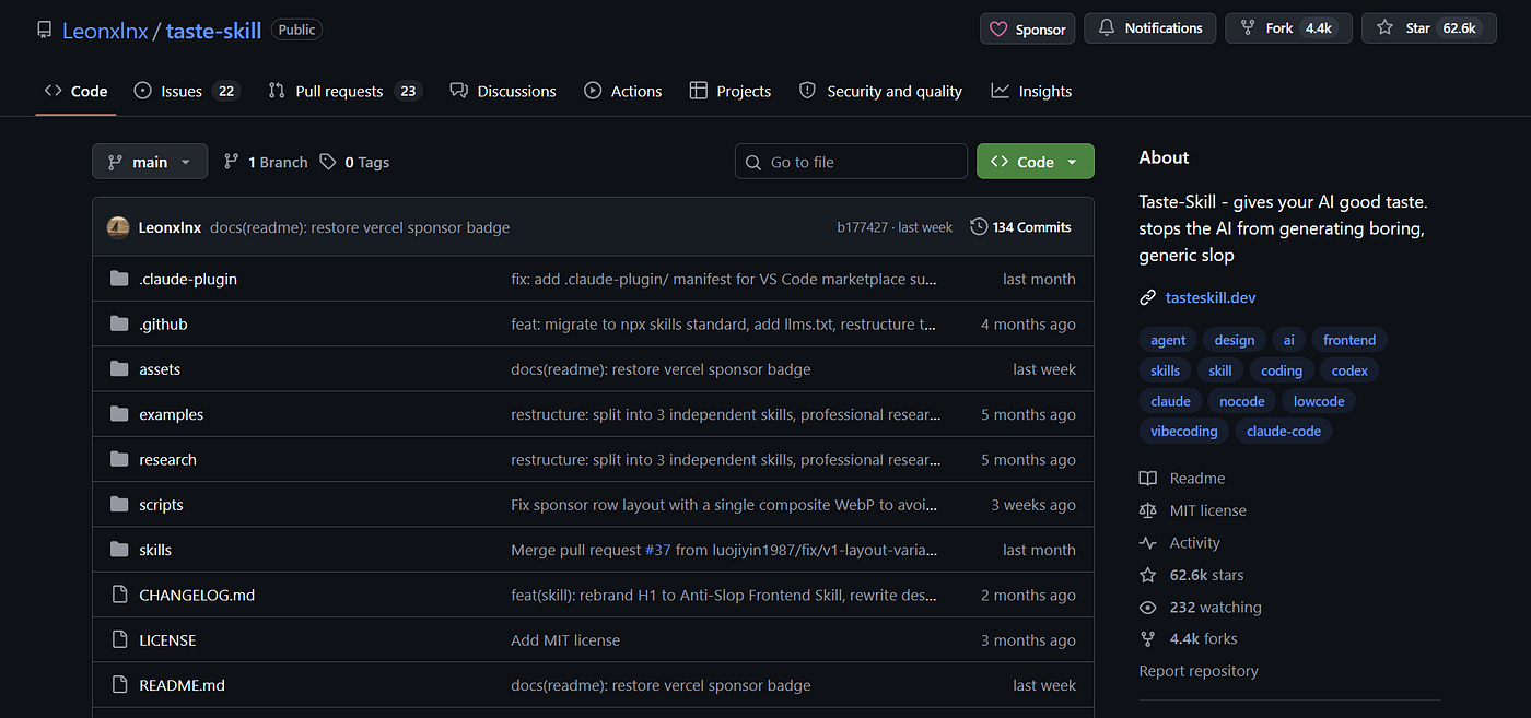
Image Credits: Jack (Me)
9. Google Fonts
Google Fonts sounds too basic to include here. It is not.
Typography controls a huge part of how a website feels, and Claude Code tends to return to the same small set of safe fonts. Usually Inter. Sometimes another font that looks almost exactly like Inter.
Google Fonts gives you a large free library that can be filtered by family, style, width, mood, and language support.
You can also ask Claude to suggest several fonts based on the product and then review them yourself. Do not let the model silently choose typography as if it were an implementation detail.
Changing the font will not rescue a bad layout. But using the same font as every AI-generated dashboard certainly will not help.
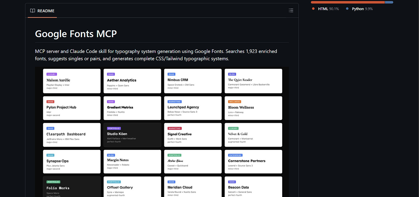
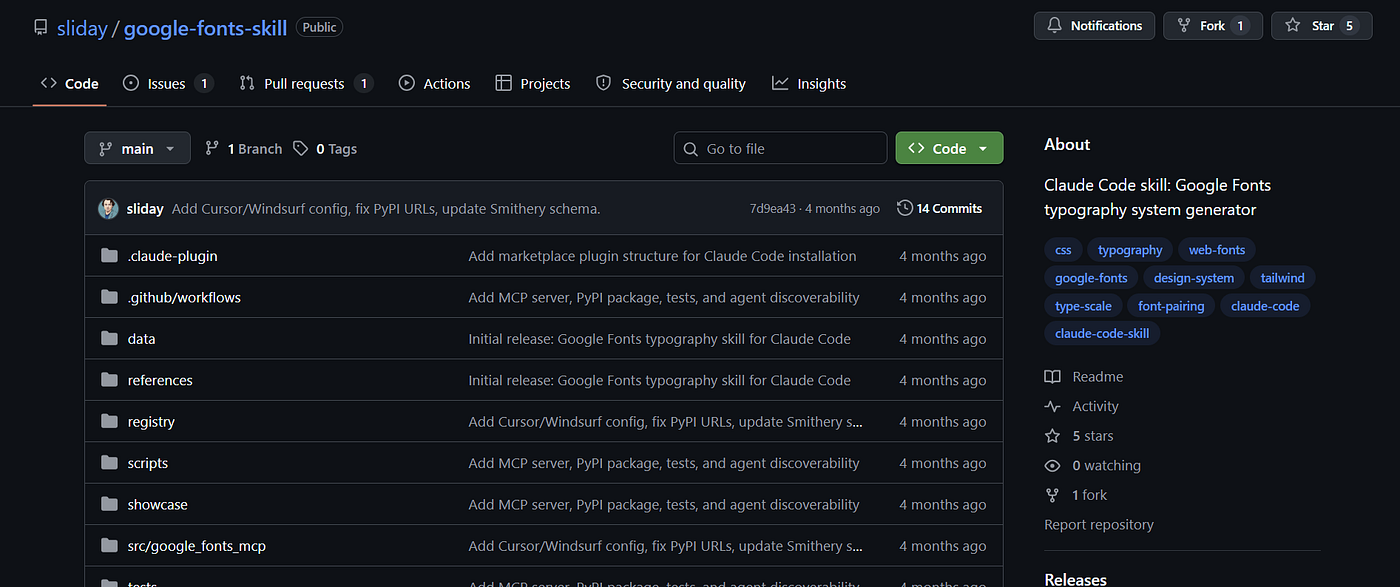
Image Credits: Jack (Me)
10. Playwright CLI
Playwright CLI is not really a design tool. It belongs here because a frontend that looks good but does not work is still bad frontend work.
Once the interface is built, Claude can use Playwright to test buttons, navigation, forms, validation states, responsive behaviour, and other interactions across browser sessions.
This becomes especially useful for forms. Developers usually test the normal path: enter valid information, press submit, done.
Users do not behave like that.
They leave fields empty, paste strange values, click twice, resize the browser, go backwards, and somehow discover a state nobody considered. Playwright gives Claude a way to test more of those cases without manually clicking through everything.
Use the CLI rather than assuming an MCP integration is always the better option. The CLI is direct, scriptable, and generally easier to inspect when something fails.
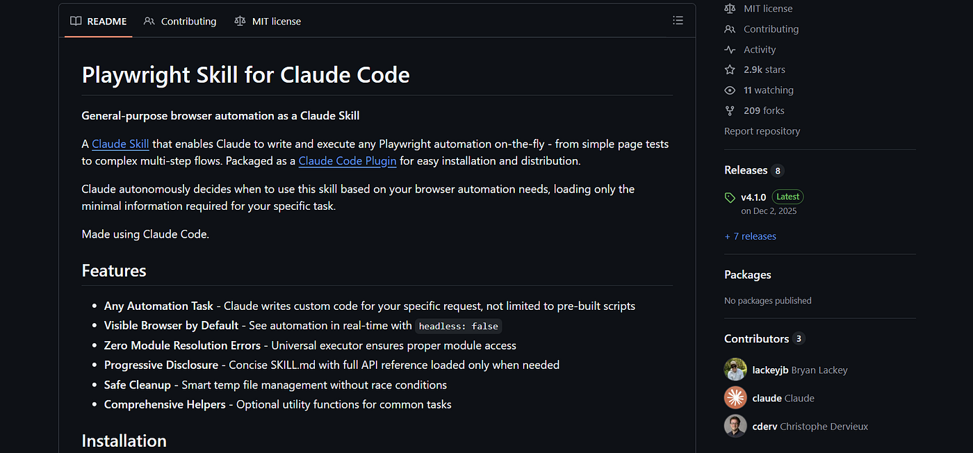
Image Credits: Jack (Me)
The tools are not the taste
None of these tools fixes the problem by itself.
You can combine three design skills, import expensive-looking components, add custom fonts, and still produce an ugly website. More tools can even make things worse because Claude starts mixing unrelated visual systems together.
The useful part is having better constraints and more ways to inspect the output.
Use a design reference when you have one. Generate alternatives before writing the entire page. Borrow small components instead of importing somebody else’s whole aesthetic. Test the interface after it looks finished.
Claude Code being weak at frontend taste is frustrating, but it also leaves room for developers who are willing to look at the result and say, “No, this still looks like AI slop.”
The model probably will not notice on its own.
메타데이터
- post_id
- 6f202b88763d
- slug
- 10-claude-code-frontend-design-skills-plugins-and-clis-6f202b88763d
- url
- https://medium.com/design-bootcamp/10-claude-code-frontend-design-skills-plugins-and-clis-6f202b88763d
- canonical_url
- https://medium.com/design-bootcamp/10-claude-code-frontend-design-skills-plugins-and-clis-6f202b88763d
- author_url
- https://medium.com/@jackhenrys
- status
- ok
- fetched_at
- 2026-07-13 22:03:30








