Redesigning Clera’s Matches: A Product Teardown
Clera’s whole pitch is trust: hand the AI your profile, and it quietly screens hundreds of startups on your behalf so you only see what’s…
Redesigning Clera’s Matches: A Product Teardown
Clera’s whole pitch is trust: hand the AI your profile, and it quietly screens hundreds of startups on your behalf so you only see what’s worth your time. I wanted to know if the interface actually earns that trust, so I used the product end to end.
I logged into Clera and landed on a dashboard that told me two different things in the same breath: a pulsing “matchmaking in progress” banner, sitting directly above a “you’re set — 100% complete” bar.
I couldn’t tell if I was done or not.
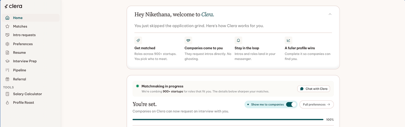
Clera’s home page hero
How I’d improve Clera if I joined them today?
I deliberately focused on 2 prime areas: Home page and Matches page.
To be fair, Clera does one thing really well: every match card explains why it’s a good fit in a single clear sentence — I never had to guess why each company showed up in my list. Let’s dig into the rest of the experience and whether it lives up to that clarity.
Problems I found:
1. Home contradicts itself
What’s confusing: “matchmaking in progress” and “you’re set, 100%” shown at once, then the entire Preferences form duplicated inline below the fold.
Impact: I can’t tell whether to wait or act, setup keeps resurfacing as if it’s unfinished, and I still don’t know if matchmaking runs continuously in the background or only when I trigger it myself.

Is the matchmaking a continuous process?
2. “We’ll make the intro” is a dead end
What’s wrong: cards I’d already said yes to still showed “Undo / We’ll make the intro,” as if there was still a decision to make. No word on whether Clera had actually reached out, or when to expect a reply. Impact: a confirmed intro reads exactly like a pending one — no way to tell “done” from “waiting.”

Clera’s Matches page
3. Proof of work is a footnote
What’s wrong: “screened 2,265 roles, evaluated 60, 5 matches” — the strongest evidence Clera did anything — is one grey line at the very bottom of the page, under ten cards.
Impact: the single best trust signal in the product is also the easiest thing to miss — and buried with it is the answer to whether matches happen automatically or only when I ask for them.

Proof of work hidden at the bottom
The Redesign
Live link: https://www.itsmenike.com/tools/clera-matches-prototype

Interactive prototype where you can switch between the ‘Before’ and ‘After’
Change 1: Home says one thing now Collapsed the contradiction into a single card — how many matches are active, one line of context, one action. Preferences moved off the dashboard into its own surface.

Change 2: Matches, regrouped Split the flat grid into Needs your decision, Intro requested, Not a match, and Closed — using the same stage names as Clera’s own pipeline diagram. Dead cards recede into a plain list, a few at a time, with a quiet “+more” instead of an accordion.
Change 3: The scan stat, promoted Moved “screened / evaluated / matched” into a persistent strip at the top of Matches — the receipt for the product’s entire promise, not a footnote.

Change 4: Real status, not a repeated yes Replaced the dead confirmation with actual state: intro sent, reaching out, or viewed by the hiring manager, plus a plain-language expectation like “typically 3–5 business days.”

Impact
The redesign turns a page that requires reading ten identical-looking cards into one that answers “what needs me right now” in about two seconds, and it makes the AI’s work legible instead of implied.
A product built on trust doesn’t get to hide its receipts — it has to lead with them.
This teardown reminded me that the hardest part of designing an AI-mediated product isn’t the AI, it’s making an invisible process feel accountable. Clera has the harder problem solved. The interface just hasn’t caught up to it yet.
P.S: If you’re on the Clera team and want to talk about this, I’d love to continue the conversation. You can find me at itsmenike3@gmail.com.
Portfolio: itsmenike.com
메타데이터
- post_id
- 717ee7377af1
- slug
- redesigning-cleras-matches-a-product-teardown-717ee7377af1
- url
- https://medium.com/@nike_thana/redesigning-cleras-matches-a-product-teardown-717ee7377af1
- canonical_url
- https://medium.com/@nike_thana/redesigning-cleras-matches-a-product-teardown-717ee7377af1
- author_url
- https://medium.com/@nike_thana
- status
- ok
- fetched_at
- 2026-08-04 17:36:51