Flexbox vs. CSS Grid: How to Use Them Together in Modern Web Layouts
For years, developers have argued over whether to use Flexbox or CSS Grid. However, modern frontend engineering has moved past this binary…
Flexbox vs. CSS Grid: How to Use Them Together in Modern Web Layouts
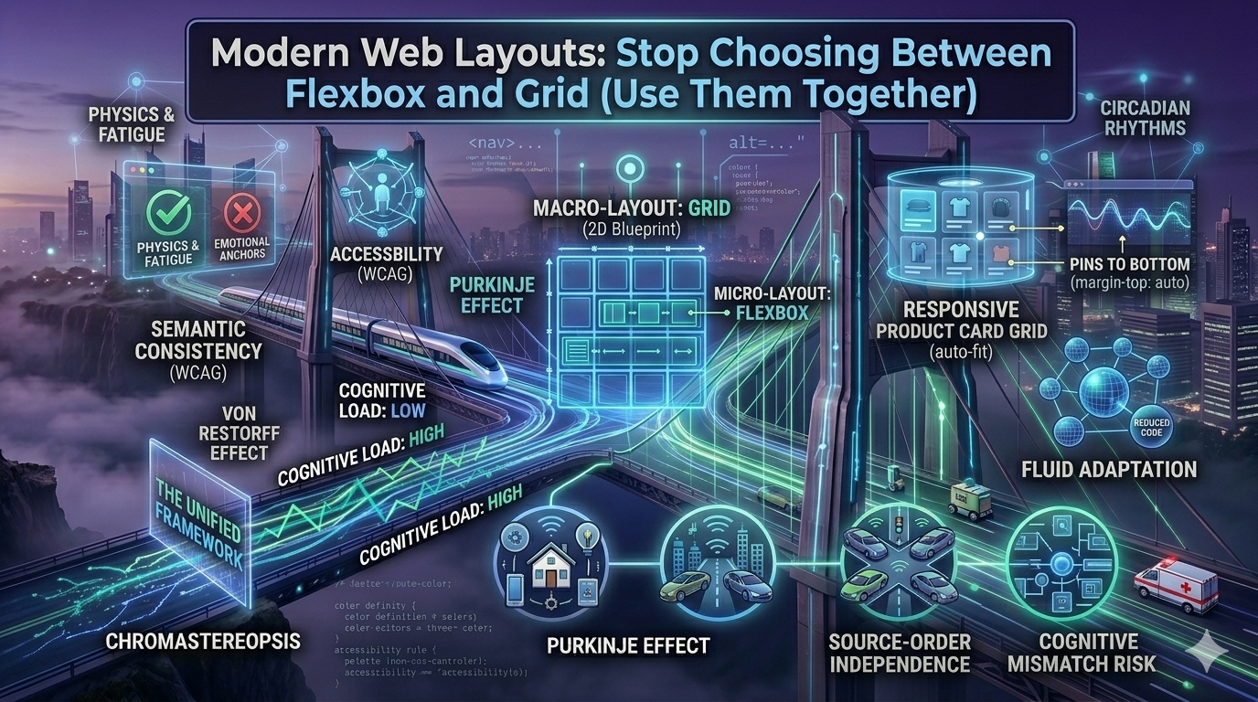
For years, developers have argued over whether to use Flexbox or CSS Grid. However, modern frontend engineering has moved past this binary choice. Top-tier UI engineers don’t choose between them — they use them together.
Here is the quick guide on how to orchestrate both systems to build clean, lightweight, and bulletproof layouts.
1. The Core Philosophy: 1D vs. 2D
To combine them effectively, you must understand their structural strengths:
- Flexbox is One-Dimensional (1D): It operates along a single axis (either a row or a column) and is inherently content-driven. Elements space themselves based on their own size.
- CSS Grid is Two-Dimensional (2D): It manages rows and columns simultaneously and is layout-driven. You define the master blueprint first, and content flows into it.
The Golden Rule: Use CSS Grid for the macro-layout (outer structural shell) and Flexbox for the micro-layout (inner components).
2. The Macro Layout: Outer Shell (Grid)
When setting up the global skeleton of a web app (like a dashboard with a sidebar and header), CSS Grid is unmatched. It keeps your global structure rigid without complex margin or float calculations.
CSS
.dashboard-shell {
  display: grid;
  grid-template-columns: 260px 1fr;
  grid-template-rows: 80px 1fr;
  grid-template-areas:
    "sidebar header"
    "sidebar main-content";
  height: 100vh;
}
3. The Micro Layout: Component Alignment (Flexbox)
Once Grid maps out the layout cells, use Flexbox inside those cells to handle dynamic content. For example, aligning a logo, search bar, and profile icon linearly inside the .header grid item is a textbook Flexbox scenario:
CSS
.header {
  grid-area: header;
  display: flex;
  justify-content: space-between;
  align-items: center;
  padding: 0 24px;
}
4. Real-World Synergy: The Product Card Grid
Think of an e-commerce page. You want a responsive container holding cards, and inside each card, you want the “Buy Now” button perfectly pinned to the bottom regardless of varying title lengths.
- The Container (Grid): Handles responsive wrapping flawlessly without media queries
CSS
.product-container {
  display: grid;
  grid-template-columns: repeat(auto-fit, minmax(280px, 1fr));
  gap: 24px;
}- The Card Inside (Flexbox): Controls the vertical alignment of the card’s inner content:
CSS
.product-card {
  display: flex;
  flex-direction: column;
  height: 100%;
}
.buy-button {
  margin-top: auto; /* Pushes button cleanly to the absolute bottom */
}
Key Takeaways for Developers
- Cleaner DOM: Combining both eliminates the need for deeply nested helper divs (
<div class="row">). - Source-Order Independence: Rearrange mobile vs. desktop layouts entirely via CSS properties (
grid-template-areasororder) without touching the HTML. - Fluid Architecture: Grid excels at dividing screen real estate, while Flexbox excels at handling unpredictable user content lengths.
Conclusion
CSS Grid outlines the architectural grid lines of your digital canvas, while Flexbox aligns the items sitting on it. Stop treating them as rivals — pair them together and let your CSS do the heavy lifting.
메타데이터
- post_id
- 72bff0562292
- slug
- flexbox-vs-css-grid-how-to-use-them-together-in-modern-web-layouts-72bff0562292
- url
- https://medium.com/@gideonsivak2007/flexbox-vs-css-grid-how-to-use-them-together-in-modern-web-layouts-72bff0562292
- canonical_url
- https://medium.com/@gideonsivak2007/flexbox-vs-css-grid-how-to-use-them-together-in-modern-web-layouts-72bff0562292
- author_url
- https://medium.com/@gideonsivak2007
- status
- ok
- fetched_at
- 2026-06-17 08:20:12