Evaluating SIRA’s UI Design — What Works, What Needs to Change
Why Evaluate With Heuristics?
Evaluating SIRA’s UI Design — What Works, What Needs to Change
Why Evaluate With Heuristics?
Usability testing gives us numbers. Heuristic evaluation gives us why something doesn’t work and what direction to fix it in.
After completing our Maze usability test with 10 participants (overall score: 72/100), we ran SIRA’s entire interface through Nielsen’s 10 Usability Heuristics. This wasn’t a replacement for the UT data — it was a complement. The UT told us where people struggled. The heuristic evaluation told us why.
This post documents both: the genuine strengths of SIRA’s current design, the six heuristic violations we identified with file-level evidence, the qualitative feedback from real users, and five concrete alternative design directions to resolve them.
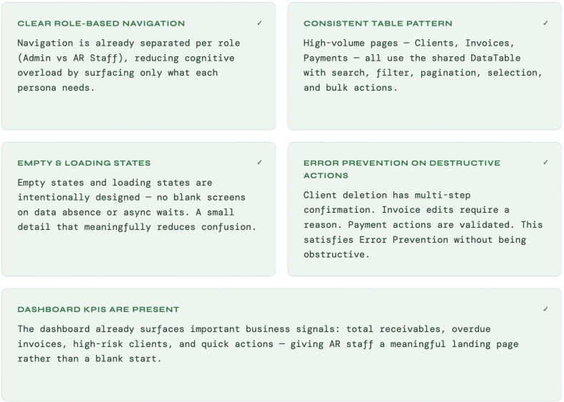
The Strengths Worth Keeping
Before addressing problems, it’s important to name what SIRA already gets right. These patterns should be preserved and extended — not accidentally undone — in the redesign.
Six Violations, Diagnosed
Of Nielsen’s 10 heuristics, SIRA demonstrates clear violations in 5. Each is traced to a specific file reference and rated by severity based on the Maze UT data.
Heuristics 1 — Visibility of System Status
The system should always keep users informed about what is going on, through appropriate feedback within a reasonable time.

Heuristics 2 — Match Between System and the Real World
The system should speak the user’s language, using words and concepts familiar to the user, rather than system-oriented terms.

Heuristics 4—Consistency and Standards
Users should not have to wonder whether different words, situations, or actions mean the same thing. Follow platform conventions

Heuristics 7 — Flexibility and Efficiency of Use
Accelerators — unseen by the novice user — may often speed up the interaction for the expert user, allowing the system to cater to both inexperienced and experienced users.

Heuristics 8 — Aesthetic and Minimalist Design
Dialogues should not contain irrelevant or rarely needed information. Every extra unit of information competes with relevant information and diminishes their relative visibility.

What Real Users Said
These are verbatim responses from 7 participants in the Maze usability test’s open-ended feedback section. Each maps to one or more Nielsen heuristics — the users named the problems; the heuristics give us the framework to fix them.

Five Design Alternatives From the Evaluation:
Each alternative maps directly to a heuristic violation identified above. These are not cosmetic changes — they are structural redesigns of how information is prioritized and how users move through workflows.
Dashboard as a work queue, not a summary
H7-Efficiency, H8-Minimalist design
KPI counts with no path to action force users to navigate away to do anything. Restructure into actionable queue sections — each section has a direct CTA, not just a number.

- Queue sections: “Butuh tindakan hari ini”, “Invoice lewat jatuh tempo”, “Klien risiko tinggi”, “Pengingat gagal terkirim”, “Pembayaran butuh bukti”
- Each row has a direct CTA: Kirim pengingat, Catat pembayaran, Ajukan approval
- Original KPI stat cards demoted below queue sections — smaller type, less visual weight
Standardize reminders to DataTable pattern
H4-Consistency
Reminders uses custom native <select> filters while every other list page uses the shared DataTable. One inconsistent page breaks the interaction contract users build from the rest of the app.

- Replace custom filter/table with shared DataTable component
- Header: title + count + primary action. Toolbar: search left, filter chips center, overflow right
- Sticky bulk action bar when rows selected. Pagination default 20, options [10, 20, 50, 100]
Restructure invoice detail action hierarchy
H5-Error Prevention, H8-Minimalist design
Destructive actions (“Batalkan Invoice”) sit visually level with everyday actions. Users encounter irreversible options without any signal that they carry more consequence.

- Top panel: Sisa tagihan (prominent), Sudah dibayar, Jatuh tempo, Status badge
- Primary CTA conditional by status: OVERDUE/UNPAID → “Catat pembayaran” | PAID → “Lihat riwayat”
- Destructive actions moved below <hr> divider, labeled “Tindakan destruktif”, styled as red text button — never filled red alongside routine actions
System status & language consistency
H1-System Status
English process labels like “Generating PDF…” break the language contract of an otherwise Indonesian interface. Long-running operations also lack progress context — users don’t know if something is running or stuck.

- “Generating PDF…” → “Membuat PDF… mohon tunggu sebentar” with Loader2 spinner, button disabled during generation
- All async operations: spinner + Indonesian label while in progress, success/error toast on completion
- Full audit of English-language user-facing strings across apps/web/src — replace all with Indonesian equivalents
Explicit bulk selection control
H3-User control & freedom
Selecting rows only selects the current page, with no way to extend to all results or explicitly clear the selection. Users making bulk actions have no control over their actual scope.

- Bulk bar shows: count label + “Pilih semua {n} hasil” text button + “Hapus pilihan” ghost button
- Page-only state: “5 baris dipilih di halaman ini”. All-results state: “128 baris dipilih (semua hasil)”
- DataTable exposes new props — applies to all pages using it: Clients, Invoices, Payments, Reminders
Strong Foundation, Sharper Priorities
SIRA is not broken — it’s 70% of the way to excellent. The data patterns, role-based navigation, and error prevention are all well-considered. What’s missing is a sharper point of view about what AR staff need to accomplish, and a design that makes that easier rather than just more complete.
The five alternative directions above don’t require a full redesign. They require restructuring priorities — moving from “show everything” to “show what matters next.”
메타데이터
- post_id
- 739ec8a803da
- slug
- evaluating-siras-ui-design-what-works-what-needs-to-change-739ec8a803da
- url
- https://medium.com/@darwinisfish/evaluating-siras-ui-design-what-works-what-needs-to-change-739ec8a803da
- canonical_url
- https://medium.com/@darwinisfish/evaluating-siras-ui-design-what-works-what-needs-to-change-739ec8a803da
- author_url
- https://medium.com/@darwinisfish
- status
- ok
- fetched_at
- 2026-06-09 15:37:30