10 Folium/Altair Map Tricks That Pop in Python
Practical, copy-pasteable patterns to turn raw coordinates into clear, fast, and interactive analytics — without fighting your stack.
10 Folium/Altair Map Tricks That Pop in Python
Practical, copy-pasteable patterns to turn raw coordinates into clear, fast, and interactive analytics — without fighting your stack.
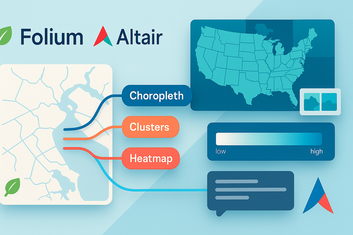
Ten Folium and Altair map tricks for stunning Python analytics: fast clustering, clean choropleths, tile choices, tooltips, projections, and small-multiple views.
Let’s be real: most map charts fail not because of code, but because the defaults are… fine, not fantastic. The good news? With Folium (Leaflet under the hood) and Altair (Vega-Lite), you can get beautiful, insightful maps without a GIS degree. Below are ten field-tested patterns you can reproduce today.
Ground rules (so your results match mine)
- Use Folium for “explore and share” HTML maps; use Altair for “explain and compare” analytic views.
- Keep geometry light: simplify polygons, sample points, and cache transforms for speed.
- Always add units, projection notes, and legend text — your future self will thank you.
1) “Hello, Beautiful Basemap” — Set Tiles With Purpose
When to use: You want visual contrast and legibility out of the box.
import folium
m = folium.Map(location=[37.7749, -122.4194], zoom_start=10,
               tiles="CartoDB positron")  # quiet, analytic-friendly base
folium.LayerControl().add_to(m)
m.save("01_basemap.html")
Tip: “Positron” for analytics, “Stamen Toner” for print-like contrast, “OpenStreetMap” for general context. Quiet tiles make your data pop.
2) Million-ish Points, Actually Usable — MarkerCluster + HeatMap
When to use: You have lots of points and a slow browser.
import folium
from folium.plugins import MarkerCluster, HeatMap

m = folium.Map([40.7, -74.0], 11, tiles="CartoDB positron")
cluster = MarkerCluster(name="Events").add_to(m)

for lat, lon in sample_points:  # sample_points = [(lat, lon), ...]
    folium.Marker([lat, lon], icon=folium.Icon(color="blue", icon="dot")).add_to(cluster)

HeatMap(sample_points, name="Density", radius=12, blur=18, max_zoom=13).add_to(m)
folium.LayerControl(collapsed=False).add_to(m)
m.save("02_cluster_heat.html")
Why it works: Clustering for click interaction, heat for pattern perception. Toggle between them to compare stories.
3) Clean Choropleths Without Shapefile Pain
When to use: Area comparisons (rates, shares, indexes) with a color legend you can defend.
import folium, json, pandas as pd

geo = json.load(open("counties_simplified.geojson"))  # simplified!
df = pd.read_csv("rates_by_county.csv")               # columns: fips, rate

m = folium.Map([37.8, -96], 4, tiles="CartoDB positron")

folium.Choropleth(
    geo_data=geo,
    data=df,
    columns=("fips", "rate"),
    key_on="feature.properties.fips",
    fill_color="YlGnBu",
    fill_opacity=0.8,
    line_opacity=0.2,
    nan_fill_opacity=0,
    legend_name="Rate (per 100k)"
).add_to(m)

m.save("03_choropleth.html")
Trick: Simplify polygons ahead of time (topojson → geojson, 10–20% tolerance) and match keys precisely. Your map will render instantly.
4) Popups People Actually Read — HTML Tooltips With Micro-Layouts
When to use: You want a popup that feels like a miniature card, not a wall of text.
popup = folium.Popup(
    html="""
    <div style="font: 12px Inter,sans-serif; width:160px">
      <b>Station {{name}}</b><br/>
      PM2.5: <b>{{pm}}</b> μg/m³<br/>
      <span style="color:#888">{{time}}</span>
    </div>
    """.replace("{{name}}", row["name"])
       .replace("{{pm}}", f"{row['pm25']:.1f}")
       .replace("{{time}}", row["timestamp"][:16]),
    max_width=180
)
folium.Marker([row.lat, row.lon], popup=popup).add_to(m)
Tip: Use a fixed width and short labels. Readers scan; help them.
5) Altair for Small Multiples — Compare Without Panning
When to use: You need to compare regions side-by-side at the same visual scale.
import altair as alt, pandas as pd, json

counties = alt.Data(url="counties_simplified.topojson", format=alt.TopoDataFormat(feature="counties"))
rates = pd.read_csv("rates_by_county.csv")  # fips, metric, month

base = alt.Chart(counties).mark_geoshape(stroke="#eee").properties(width=360, height=240)

ch = (base.transform_lookup(
        lookup="id", from_=alt.LookupData(rates, "fips", ["metric","month"]))
      .encode(color=alt.Color("metric:Q", scale=alt.Scale(scheme="blues"), title="Rate"))
      .project(type="albersUsa"))

grid = ch.facet(column=alt.Column("month:N", header=alt.Header(labelOrient="bottom")))
grid.save("04_small_multiples.html")
Why Altair here: Faceting and consistent color scales make month-over-month shifts obvious — no zooming required.
6) “Before vs After” Without Drama — Layer Toggle & Opacity
When to use: A/B maps for policy changes, outages, or remodels.
before = folium.FeatureGroup(name="Before", show=True)
after  = folium.FeatureGroup(name="After", show=False)

folium.GeoJson(geo_before, style_function=lambda f: {"fillColor":"#9ecae1","fillOpacity":0.6}).add_to(before)
folium.GeoJson(geo_after,  style_function=lambda f: {"fillColor":"#fc9272","fillOpacity":0.6}).add_to(after)

before.add_to(m); after.add_to(m)
folium.LayerControl().add_to(m)
Pro move: Use complementary palettes and the same legend title so viewers aren’t decoding color and meaning at once.
7) Fast Centroids & Labels — Keep Text Sharp, Not Loud
When to use: You need labels that don’t fight the data.
import shapely.geometry as sg
import shapely.ops as so

# `polys` is a GeoDataFrame of polygons
polys["centroid"] = polys.geometry.simplify(0.01).centroid  # cheap & stable

for _, r in polys.iterrows():
    folium.map.Marker(
        [r.centroid.y, r.centroid.x],
        icon=folium.DivIcon(html=f"<div style='font:11px Inter;color:#334'>{r['abbr']}</div>")
    ).add_to(m)
Why: DivIcon labels render crisp. Keep color muted; the data should still win.
8) Altair Point Maps That Don’t Lie — Project, Bin, Aggregate
When to use: You’re summarizing events and want density without overlap tricks.
import altair as alt, pandas as pd

points = pd.read_parquet("events.parquet")  # lon, lat, count

chart = (alt.Chart(points)
         .transform_aggregate(cnt="sum(count)", groupby=["lon","lat"])
         .mark_circle(opacity=0.7)
         .encode(
             longitude="lon:Q", latitude="lat:Q",
             size=alt.Size("cnt:Q", legend=None, scale=alt.Scale(range=[10, 800])),
             color=alt.Color("cnt:Q", scale=alt.Scale(scheme="orangered"))
         )
         .project(type="mercator")
         .properties(width=680, height=420))

chart.save("08_altair_points.html")
Why it works: Explicit aggregate → stable sizes; explicit projection → correct geometry; continuous color with a readable legend.
9) Drive-Time Polygons (Isochrones) the Simple Way
When to use: “What’s reachable in 10, 20, 30 minutes?” — great for site planning.
import folium, requests

def isochrone(lat, lon, mins=10):
    url = f"https://iso.api.example/drive?lat={lat}&lon={lon}&minutes={mins}"
    gj = requests.get(url).json()         # returns GeoJSON polygon
    return gj

m = folium.Map([lat, lon], 12, tiles="CartoDB positron")
for t, color in [(10,"#9bd"), (20,"#68a"), (30,"#357")]:
    folium.GeoJson(isochrone(lat, lon, t),
                   name=f"{t} min", style_function=lambda f, c=color: {"fillColor": c, "color": c, "fillOpacity":0.25}).add_to(m)
folium.LayerControl().add_to(m)
Note: Cache responses. Isochrones feel magical but APIs can be rate-limited; a local cache makes the map snappy.
10) Tell a Story in One Screen — Altair “Legend as Filter”
When to use: Let readers click categories to toggle visibility without extra UI.
import altair as alt, pandas as pd

df = pd.read_csv("stores.csv")  # lon, lat, kind

selector = alt.selection_point(fields=["kind"], bind="legend")

map_ = (alt.Chart(df)
        .mark_circle(opacity=0.75)
        .encode(
            longitude="lon:Q", latitude="lat:Q",
            color=alt.Color("kind:N", legend=alt.Legend(title="Store type")),
            tooltip=["kind","lon","lat"]
        )
        .add_params(selector)
        .transform_filter(selector)
        .project(type="mercator")
        .properties(width=720, height=440))

map_.save("10_click_legend.html")
Why: This is the lowest-effort interactivity that still feels premium. Readers control the story; you keep the layout clean.
Performance & polish checklist
- Geometry diet: Simplify polygons and remove unused columns before shipping.
- Consistent scales: Reuse color palettes across maps in the same article.
- Meaningful legends: Title with a unit (“per 100k”, “% change”).
- Hover text discipline: 3–4 fields max, human labels, fixed width.
- Export sanity: For print, render a high-dpi PNG from Altair; for browse, Folium HTML is perfect.
Wrap-up
Great map analytics are the opposite of flashy. They’re quiet layouts, smart defaults, and a small set of interactions that respect attention. Folium gives you fast, shareable canvases; Altair gives you honest comparisons. Combined, they’re a tidy power pair for Python data storytelling.
CTA: Want a repo with all ten examples wired to tiny CSV/GeoJSON samples? Drop a comment and I’ll share a cookiecutter you can run in minutes.
메타데이터
- post_id
- 73ee98e1897b
- slug
- 10-folium-altair-map-tricks-that-pop-in-python-73ee98e1897b
- url
- https://medium.com/@Modexa/10-folium-altair-map-tricks-that-pop-in-python-73ee98e1897b
- canonical_url
- https://medium.com/@Modexa/10-folium-altair-map-tricks-that-pop-in-python-73ee98e1897b
- author_url
- https://medium.com/@Modexa
- status
- ok
- fetched_at
- 2026-07-16 20:55:37