Font Pairing Tool — Perfect Typography for Blog Posts
Why Font Pairing Makes or Breaks Your Blog’s Success
Font Pairing Tool — Perfect Typography for Blog Posts
Why Font Pairing Makes or Breaks Your Blog’s Success
Typography isn’t just about making words look pretty. It’s the silent salesperson working 24/7 on your blog, either drawing readers in or pushing them away before they’ve read a single sentence.
Think about the last time you landed on a website with Comic Sans headlines paired with tiny, cramped body text. You probably hit the back button faster than you could say “unprofessional,” right? That’s the power of typography working against you.
The Science Behind Font Psychology
Fonts carry emotional weight. Serif fonts like Times New Roman whisper “traditional” and “trustworthy.” Sans-serif fonts like Helvetica shout “modern” and “clean.” Script fonts murmur “elegant” but can scream “hard to read” if overdone.
Your font choices send subliminal messages about your brand before visitors process your actual content. A financial advisor using playful fonts might seem unreliable. A creative agency with stuffy, corporate fonts might appear boring.
Common Font Pairing Mistakes That Kill Readability
Most bloggers make the same typography mistakes. They pick fonts based on personal preference instead of reader experience. They choose fonts that look identical, creating zero visual hierarchy. Or they go overboard with decorative fonts, making their content harder to read than a doctor’s prescription.
The biggest mistake? Using more than two font families. Your blog isn’t a font showcase. It’s a communication tool.
The Golden Rules of Professional Font Pairing
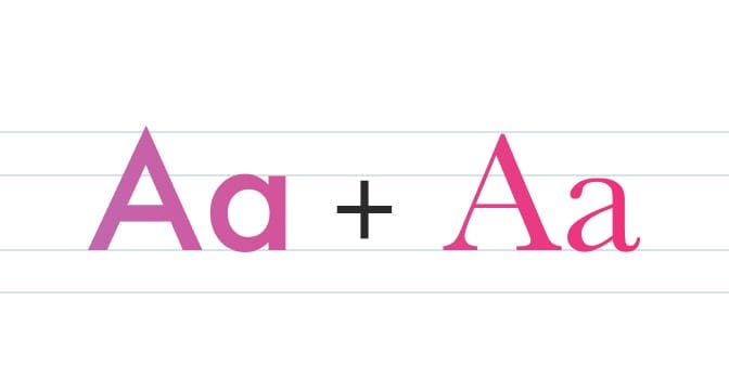
Successful font pairing follows simple principles. Create contrast between your headings and body text. If your headings use a serif font, pair it with a clean sans-serif for body text. This combination gives you the elegance of traditional typography with the readability of modern design.
Stick to fonts from the same time period or design philosophy. Pairing a classical serif with a futuristic sans-serif creates visual tension that distracts from your message.
Consider your audience and niche. Tech blogs work well with modern, geometric fonts. Lifestyle blogs shine with more organic, friendly typefaces. Legal or financial sites benefit from conservative, trustworthy fonts.
Technical Considerations for Blog Typography
Web fonts affect your site’s loading speed. Google Fonts offers a sweet spot between variety and performance. Limit yourself to two font families with only the weights you actually use.
Think about mobile readers. Over 60% of blog traffic comes from mobile devices. Fonts that look great on desktop screens might become unreadable on smartphones. Test your choices across devices.
Line spacing matters more than font choice sometimes. Dense paragraphs with tight line spacing exhaust readers’ eyes. Aim for line heights between 1.4 and 1.6 for optimal readability.
Building Your Font Strategy
Start with your content’s personality. Is your blog authoritative and professional? Try pairing Merriweather headings with Open Sans body text. Want something more approachable? Lora and Inter create a friendly yet credible combination.
Consider your industry standards. While creativity matters, straying too far from reader expectations can backfire. Financial blogs rarely use handwritten fonts because they undermine credibility.
Test different combinations with your actual content. Lorem ipsum doesn’t reveal how fonts perform with your writing style and article length. Use your own blog posts to evaluate legibility and aesthetic appeal.
Beyond Basic Pairing: Advanced Typography Tips
Font weight creates hierarchy without changing typefaces. Use bold headings, medium subheadings, and regular body text to guide readers through your content structure.
Color affects font readability more than size sometimes. Pure black text on white backgrounds can strain eyes. Try dark gray (#333333) for body text. It's easier on the eyes while maintaining excellent contrast.
White space is your typography’s best friend. Generous margins, paragraph spacing, and line height make even mediocre font choices look professional.
Making Typography Work for SEO
Search engines care about user experience signals. High bounce rates from poor readability hurt your rankings. Good typography keeps readers engaged longer, sending positive signals to Google.
Proper heading hierarchy (H1, H2, H3) using consistent font families helps search engines understand your content structure. This improves your chances of earning featured snippets and better rankings.
Mobile-friendly typography isn’t just user-friendly — it’s essential for Google’s mobile-first indexing. Fonts that work well on smartphones help your SEO performance. **Readmore…**
This article was originally published on (**MicroSEO Toolkit**)
메타데이터
- post_id
- 760e6ceb5df6
- slug
- font-pairing-tool-perfect-typography-for-blog-posts-760e6ceb5df6
- url
- https://medium.com/@microseotoolkit/font-pairing-tool-perfect-typography-for-blog-posts-760e6ceb5df6
- canonical_url
- https://medium.com/@microseotoolkit/font-pairing-tool-perfect-typography-for-blog-posts-760e6ceb5df6
- author_url
- https://medium.com/@microseotoolkit
- status
- ok
- fetched_at
- 2026-06-09 14:34:10