Readability in Design Is a Spectrum.
A conversation changed how I think about legibility, context, and what “readable” even means.
Readability in Design Is a Spectrum.
A conversation changed how I think about legibility, context, and what “readable” even means.
You can read this for free here.
“You can’t just say something is readable or not. It doesn’t work like that.” A week back I met up with my senior, he currently works at Meta as a Product Designer II and we had a little argument about readability in design. His point was that readability is not something you can categorise: you can’t draw a line and say this is readable and this is not. My point was the opposite -of course you can. You can look at something and tell if it’s readable or not. That felt obvious to me.
But when I got home and actually sat with it, I started second guessing myself. Maybe he was right. When I thought about it more carefully, about all the examples I know from design history, all the “unreadable” things that became industry standard, it started to make a lot of sense. Readability isn’t binary. It never was.
This piece is me working through that conversation. And the deeper I went, the more I realised: the design world has been arguing about readability wrong this whole time. We keep trying to resolve it as a question with a yes/no answer, when it’s actually a question that shifts depending on who’s reading, what they’re reading, on what device, in what light, with what cultural background, and for what purpose.
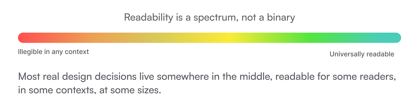
Readability is not a property a design has. It’s a relationship between a design and its reader.
First, what do we actually mean by “readable”?
When designers talk about readability, they usually mean one of two things and often conflate them. Legibility is whether individual characters can be distinguished from each other. Readability is whether the text flows comfortably as a sustained reading experience. Both are real problems. Neither has a universal solution.
The reason my senior’s argument hit me: every “unreadable” design decision I initially thought of, reverse type, low contrast, display fonts used for body copy, had at least one real-world context where it was exactly right. Not just defensible. Beloved. Adopted by entire industries.

Real products that were “unreadable”, until they weren’t
These aren’t niche experiments. These are products you’ve used, studied, or been influenced by without even knowing it.
→ Apple’s ultra-light UI typography (iOS 7 onwards)
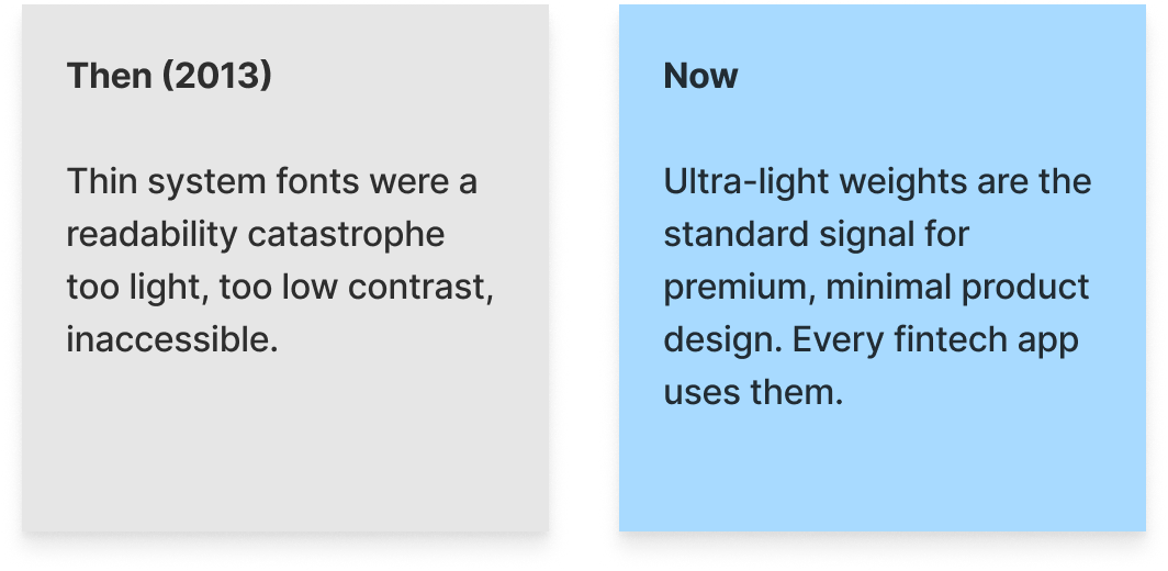
When Apple shipped iOS 7 in 2013, the design community erupted. Jony Ive’s use of Helvetica Neue in ultra-light weights, paper-thin strokes on a white background was called dangerous for anyone with even mild vision difficulties. Accessibility experts wrote open letters. Forum threads called it “the most unreadable major OS redesign in memory.”
→ Spotify’s dark-mode-first interface (2009–2013)
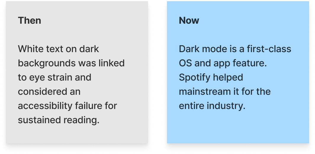
Spotify launched in an era where every major software UI was light-coloured. Dark interfaces were associated with media players for teenagers and “hacker aesthetics.” Early design reviewers flagged Spotify’s dark background with grey text as poor readability practice conventional wisdom firmly stated that dark text on light was always more readable than the reverse.
→ Medium’s 21–22px body text when it launched (2012)
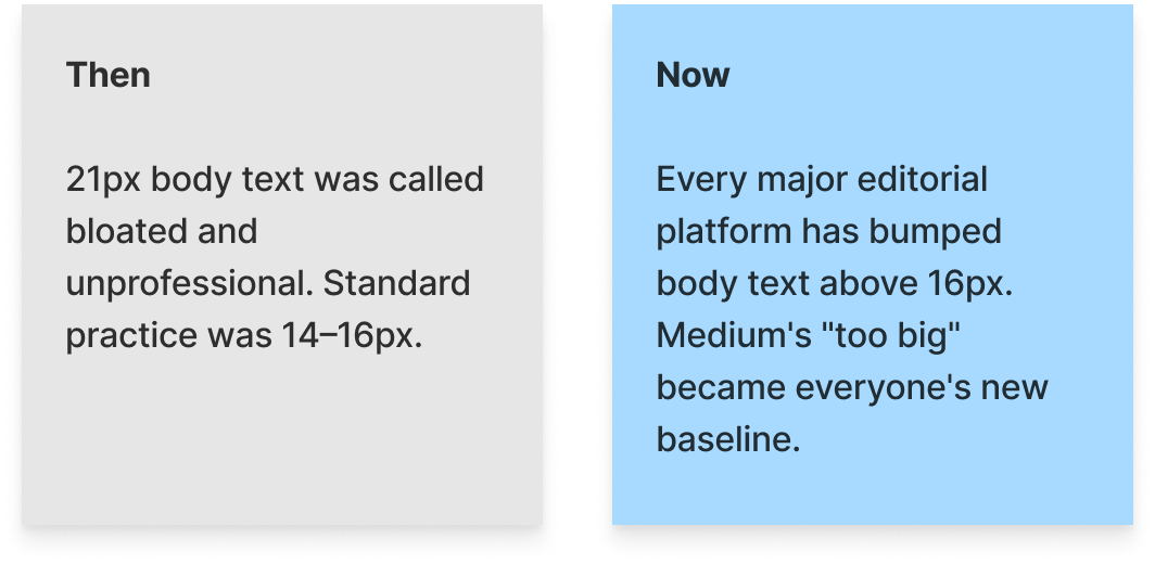
Ironic that this article lives on Medium because when Medium launched with 21–22px body text (enormous by 2012 web standards), plenty of designers called it excessive. The standard was 14–16px. Critics said it felt childish, like a site for people who couldn’t read. It made pages scroll more. It felt “wrong.”
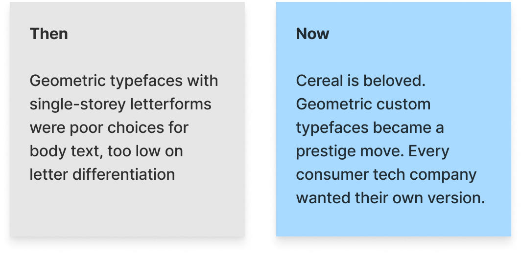
→ Airbnb’s Cereal typeface (the “too geometric” backlash)
When Airbnb released Cereal in 2018, the typographic community split sharply. The extreme geometric precision especially the single-storey lowercase ‘a’ was flagged as a readability hazard. Typographers noted the single-storey ‘a’ is harder to distinguish from ‘o’ in body text. The consensus: don’t use geometric sans-serifs for body copy at scale.
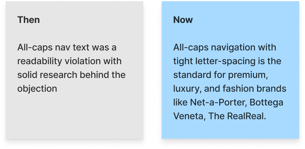
→ All-caps navigation labels
For decades, typographic orthodoxy was clear: do not set navigation labels in all-caps. The rule was backed by research showing all-caps text removes the ascenders and descenders that help readers pattern-match word shapes making reading slower, especially for users with dyslexia. Any designer who proposed all-caps nav would get shot down in review.
Key observation
In every single case above, the “unreadable” design element became industry standard, not because readability stopped mattering, but because the context changed, users adapted, and the design community updated its understanding of what “readable” actually meant in that specific situation.
So why can’t we categorise it?
Here’s the core problem with saying “this is readable” and “this is not”: readability is not a fixed property of a design artifact. It’s a relational property, it exists only in the relationship between a piece of design and its specific reader, context, and purpose.
1. The reader’s biology and experience
A user with 20/20 vision in their 20s reads 14px light-weight text with zero difficulty. A 60-year-old with early cataracts cannot. Neither reader is wrong. The text did not change. Readability did.
2. The device and environment
White text on deep black is genuinely harder to read at 100% brightness on an OLED screen (halation around letterforms). It’s genuinely easier in a dark room at 40% brightness. Same design, two opposite readability outcomes. That’s measurable, not philosophical.
3. The duration and intent of reading
A display headline in a condensed typeface is perfectly readable when you’re scanning a billboard for one second. Reading 3,000 words of body copy in the same face is a completely different experience. “Readable at a glance” and “readable at length” are different questions but we treat them as one constantly.
4. Cultural familiarity and convention
Readers in Japan read vertically-set text with ease. Most Western readers find it disorienting. Convention shapes readability profoundly, and convention changes, which is exactly why all the examples above ended up reversing.
What should we do instead of categorising?
If readability can’t be categorised as binary, how do you make decisions? The answer is to specify the context instead of issuing a verdict. Instead of “this is unreadable,” say: “This is unreadable for a 45 year old user reading on a phone screen in daylight.” That’s falsifiable, testable, and it leads somewhere. “This is unreadable” closes the conversation.
When my senior said you can’t categorise readability, I think what he was really saying is: the moment you draw the line without specifying context, you’ve stopped doing design thinking and started doing design gatekeeping. You’ve substituted a rule for the harder work of actually understanding who you’re designing for.
He was right. I was wrong or at least, I was being lazy with my framing. You can tell when something isn’t working. But you have to say for whom, in what situation, and why. The specificity is the whole thing.
Every “you can’t do that” in design history has a follow-up chapter where someone did it and it worked.
That drive home from cafe did more for my design thinking than most books I’ve read this year. Sometimes the best education comes from a little argument with someone who’s been in the trenches long enough to know what the rules are actually for and what they’re not for.
Readability matters. Deeply. It’s just not a checkbox. It never was.
……
💡 Stay inspired every day with Muzli!
Follow us for a daily stream of design, creativity, and innovation. ***Linkedin | [Instagram](https://www.instagram.com/usemuzli/) | [Twitter](https://x.com/usemuzli)***


메타데이터
- post_id
- 778e56a286e3
- slug
- readability-in-design-is-a-spectrum-778e56a286e3
- url
- https://medium.muz.li/readability-in-design-is-a-spectrum-778e56a286e3
- canonical_url
- https://medium.muz.li/readability-in-design-is-a-spectrum-778e56a286e3
- author_url
- https://medium.com/@ashanviy
- status
- ok
- fetched_at
- 2026-06-17 08:20:12