The City Pop Aesthetic: 5 Premium Retro Summer Fonts You Need in Your Toolkit
When you hear the words “summer,” what is the first thing that plays in your head? For me, it’s a very specific musical landscape — one…
The City Pop Aesthetic: 5 Premium Retro Summer Fonts You Need in Your Toolkit
When you hear the words “summer,” what is the first thing that plays in your head? For me, it’s a very specific musical landscape — one that lives and breathes urban nightscapes, neon lights, and midsummer nostalgia. Yes, I am talking about City Pop.
Picture yourself on a classic summer road trip, cruising down a sun-drenched coastal highway with Yoon Jong Shin’s Highway Dream setting the mood. The sun dips lower as you stroll along the shoreline to the breezy, nostalgic hooks of Anri’s Windy Summer. Finally, you head back into the neon heart of the city, wrapping up the night under the warm streetlights with Miki Matsubara’s legendary Stay With Me ~Mayonaka no Door~ fading out in the background — a bittersweet anthem for a summer love that has already passed. While the first track reimagines this magic for the modern era, the latter two are timeless masterpieces straight from the 1980s. To me, out of all four seasons, summer is the ultimate canvas for retro storytelling.
Capturing that exact, sun-faded nostalgia in modern designs requires more than just standard layout choices — it demands typography with a distinct cultural soul. If you want your creative projects to evoke the effortless groove of a City Pop vinyl jacket or the high-octane energy of a coastal retro campaign, you need assets that turn text into an immediate vibe.
Here are 5 premium retro summer fonts that will instantly upgrade your design toolkit and make your layouts command attention this season.
1. OLDBLUE

OLDBLUE — Playful and Elegant Modern Look Retro Font
**OLDBLUE**, a masterful retro-modern display typeface by Bagerich Type Foundry, feels like a calculated tightrope walk. One wrong move, and it could easily slide into a generic modern font, losing its vintage soul. Yet, with subtle design twists — like the distinct, elevated crossbars on the letters A, B, E, F, H, K, P, and R — OLDBLUE perfectly holds its ground, balancing old-school charm with contemporary edge.
What makes this specific retro-modern aesthetic so powerful for summer marketing campaigns is its sheer versatility. It shifts effortlessly across different design niches, giving you endless mileage out of a single creative asset. Whether you are planning to build clean, functional, Bauhaus-inspired posters this summer or want to craft nostalgic retro badges that trigger an immediate emotional response, OLDBLUE serves as the ultimate anchor for your creative toolkit.
Ready to elevate your design portfolio with a touch of retro summer charm? Download OLDBLUE here.
2. Sidewalk Surf

Sidewalk Surf — Bold & Dynamic 80’s Retrowave Culture Font
Don’t settle for polite, predictable typography if you want your layouts to compete with the blazing summer sun. Bring the high-velocity heat of a sun-soaked California coastline straight onto your artboards with **Sidewalk Surf** — a striking sans-serif deeply rooted in 1980s retrowave aesthetics and West Coast surf culture, masterfully crafted by ikiiko type.
By delivering an instant hit of raw, authentic nostalgia, Sidewalk Surf elevates your projects from just another quiet voice in a crowded summer market into a booming visual statement. It’s loud, sun-faded, and packed with momentum, making it the perfect choice for high-impact streetwear branding, retro event flyers, and vibrant seasonal packaging that needs to jump off the shelves.
Give your typography a thunderous voice — **get Sidewalk Surf here** and make your designs roar today!
3. August Deco Sans
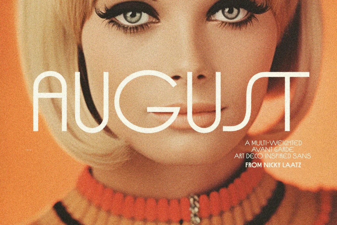
August Deco Sans — A Multi Weighted Avant Garde Art Deco Inspired Sans Serif Font
While she is globally celebrated for her signature, organic handwritten scripts, type designer Nicky Laatz takes a brilliant detour into geometric sans-serif territory with August Deco Sans. But make no mistake — the queen of fonts doesn’t just hand you a standard, predictable typeface. Instead, she delivers a stunning editorial family infused with the bold spirit of 1960s avant-garde mod culture and the timeless, high-fashion glamour of Art Deco.
The commercial value of August Deco Sans lies in its massive, versatile family of 52 fonts. It scales flawlessly from a whisper-thin, elegant weight that feels modern, minimalist, and deeply luxurious, all the way up to a heavy, striking black variant that commands immediate editorial authority. If you are looking to dominate a premium lifestyle niche — from upscale cosmetic packaging and luxury summer resort branding to high-end apparel — adding this powerhouse to your design arsenal is an absolute must.
**Grab your copy of August today** and effortlessly claim your throne as a master of retro luxury.
4. RAMBORS
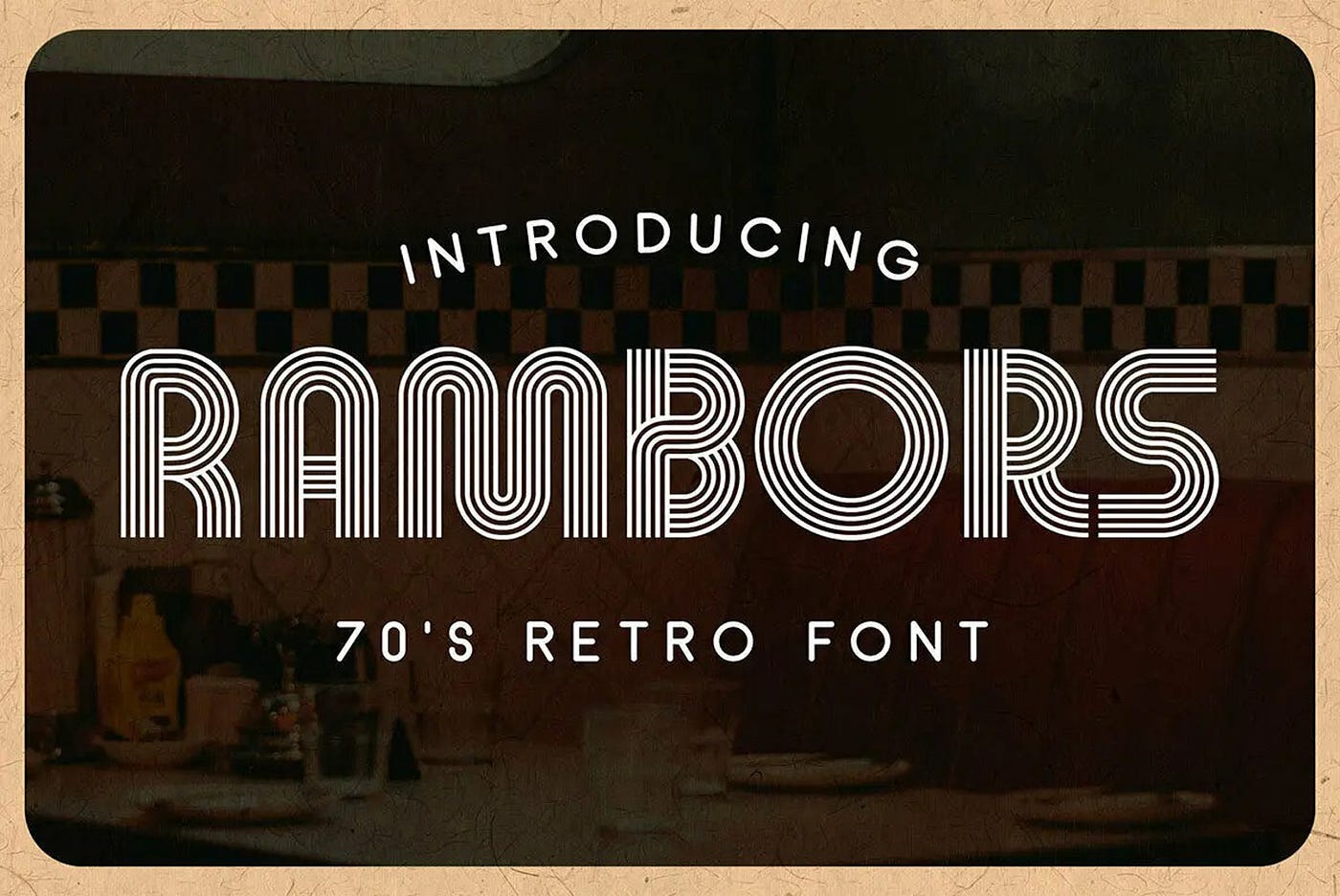
Rambors — A 70’s Style Retro-Futuristic Display Font
If you want your summer layouts to groove with the hypnotic, late-night energy of a 1970s peak disco dancefloor mixed with vintage sci-fi aesthetics, **Rambors** is your golden ticket. Striking a flawless chord between funk nostalgia and retro-futurism, its bold geometric architecture and clean parallel multiline strokes ensure your titles always seize center stage.
Rambors does all the heavy visual lifting for you, making it an incredibly high-converting asset for commercial merchandise. It is the perfect engine for generating hypnotic graphics on acid-washed streetwear hoodies, authentic titles for retro-futuristic space posters, or a standout standalone visual identity for a summer music festival.
**Secure your copy of Rambors today** and let your typography dictate the visual rhythm of the season.
5. STUGGI
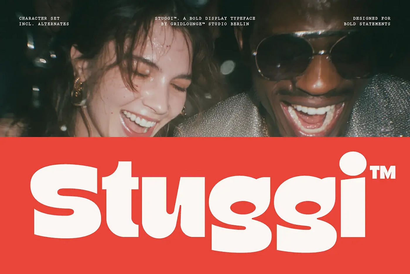
Stuggi — Bold Display Retro Font
Is your current design sitting quietly in the corner, hoping someone notices it? If your project needs to break out of its shell and yell “Hey, look at me!” with absolute confidence, **Stuggi** by Gridlounge Studio is the ultimate typographic cheat code you’ve been looking for.
With its ultra-thick, pillowy letterforms and raw, old-school pop culture aesthetic, this bold retro display font makes zero apologies for taking up space. Deploy Stuggi into your next brand identity deck or fast-food packaging project, and watch it stop being a passive background element. Instead, it steps up to the microphone, cranks the volume, and cuts straight through both physical shelves and digital noise.
Want your client presentations to land immediate approvals and high conversions from the very first slide? Claim Stuggi here.
메타데이터
- post_id
- 7a2f740e3f63
- slug
- the-city-pop-aesthetic-5-premium-retro-summer-fonts-you-need-in-your-toolkit-7a2f740e3f63
- url
- https://medium.com/@brickwell.microstock/the-city-pop-aesthetic-5-premium-retro-summer-fonts-you-need-in-your-toolkit-7a2f740e3f63
- canonical_url
- https://medium.com/@brickwell.microstock/the-city-pop-aesthetic-5-premium-retro-summer-fonts-you-need-in-your-toolkit-7a2f740e3f63
- author_url
- https://medium.com/@brickwell.microstock
- status
- ok
- fetched_at
- 2026-07-09 08:27:28