How to Conduct a UX Audit: A 6-Step Process to Fix Conversion Drop-Offs
A UX audit is a structured, expert-led process to identify friction points in your product, understand why users drop off, and prioritise…
How to Conduct a UX Audit: A 6-Step Process to Fix Conversion Drop-Offs
A UX audit is a structured, expert-led process to identify friction points in your product, understand why users drop off, and prioritise fixes for conversions impact. This guide covers all 6 steps with examples.

Your funnel shows a drop-off. You can see users are leaving, but you don’t know why. You want to fix things, but can’t move ahead because you don’t know what to fix first.
A UX Audit is a structured, data-backed process that identifies the friction points in your product. It shows you where things are falling off, the cause behind it, and what fixes could be made to resolve it and move conversion metrics.
This guide walks you through a 6-step process: practical, easy to follow, and tied to conversion outcomes built for product and growth teams.
TL;DR
- A UX audit is a thorough evaluation of your product to identify friction points, understand why users drop off, and connect these to conversion impact.
- Start by auditing a specific flow or metric rather than the entire product.
- Combine behavioural data (heatmaps, session analysis, funnel drop-off) with heuristic analysis for a complete picture.
- Every finding should be tied to a conversion or metric rather than being a usability observation.
- Prioritise fixes using an impact vs effort framework for a sprint-ready roadmap from the audit rather than a slide deck.
What is a UX Audit?
A UX audit is a detailed evaluation of your product flow and interface to find friction points, conversion blockers, and usability gaps.
Unlike usability testing, which requires users, a UX audit is an expert-led, data-driven process that doesn’t need any users.
Conduct it when the funnel metric stagnates, before a new feature launch, after a redesign, or when you are receiving continuous negative user feedback.
Step 1: Where Should You Start a UX Audit?
The most common mistake in a UX Audit isn’t a bad analysis, but a too broad scope. Auditing the whole product produces a long list of issues nobody acts on.
Instead, focus on a single user journey and connect it to a specific metric—such as sign-up to activation, trial-to-paid conversion, or onboarding steps 1 to 3.
This becomes the lens through which everything in the audit is seen.
Before you start, pull the current conversion rate for that flow — that number is your before, and every recommendation should connect back to moving it.
If you’re not sure where to start, pull a funnel report from your analytics tool. Look for the steps with the steepest drop-off — that’s where you begin.

Funnel chart with 5 steps. Step 3 has the largest drop-off, highlighted in red, indicating it as the starting point for the audit.
Step 2: What Data Do You Need Before a UX Audit?
Before watching even a single session recording, you need numbers. Quantitative data tells you where and how friction happens before you proceed to investigate “why”.
The heatmap shows exactly when users scroll, click, and look at a page. If your CTA is ignored, the heatmap will show you that user attention never reached it.
The gap between where users stop scrolling and where your CTA is actually sitting is the friction signal. And the best part is you can compare the mobile and desktop separately, so what might look like a one-off problem could be a mobile-specific issue.
A heatmap shows exactly what’s happening on a page as users interact, whereas a funnel reveals where users drop off across the entire flow, step by step.
You can filter sessions by device, browser, location, or even specific behaviour, so what looks like a broad problem could be from a device or a specific traffic source.
Rage clicks, and JS errors in the scoped flow are your highest priority signals because they’re not just usability issues– but are broken experiences actively costing you conversions.

FullSession dashboard showing heatmaps, funnels, and user-behaviour analytics
Step 3: How Do You Find Why Users Are Dropping Off?
Numbers tell you where users drop off, but sessions reveal why. So, you watch exactly where users did in the moment before they left.
You’re not watching for reference but for rage clicks, hesitation, and backtracking– to see what made users frustrated or confused.
You don’t need to watch all of the sessions. Just look for 10–15 sessions filtered to the exact step where users dropped off. And if you notice a pattern or behavior more than 3 times, it means it’s worth investigating.
Filter your session tool by rage clicks, JS errors, or the specific drop-off page. This ensures you’re watching users who abandoned at the exact step you’re auditing — not random sessions.
Check that your session recording tool masks sensitive form fields by default and is GDPR and CCPA-compliant. Most reputable tools handle this out of the box.

Session replay dashboard showing rage clicks and behavioural insights
Step 4: How Do You Categorise What You Found?
Now, when you have behavioural data and session observations, you apply a framework to categorise what you found. The UX heuristics are a set of design principles that help identify what kind of friction each problem indicates.
The heuristics that matter most for conversion audits are: visibility of system status, error prevention, and matching between the system and the real world. In other words, checking UI is communicating clearly with users, preventing mistakes, and using the language a user understands.
For every friction moment you logged from the session recordings, note down which heuristics it violates. This will turn your observations into categorised, actionable findings.
If a user paused for a couple of seconds before reaching your primary CTA– that’s a clarity issue; the CTA copy is not able to communicate what happens next, which violates the heuristics match between the system and the real world.
Check that your session recording tool masks sensitive form fields by default and is GDPR and CCPA-compliant. Most reputable tools handle this out of the box.
Here is a quick reference for all 10 heuristics and how each maps to conversion problems:
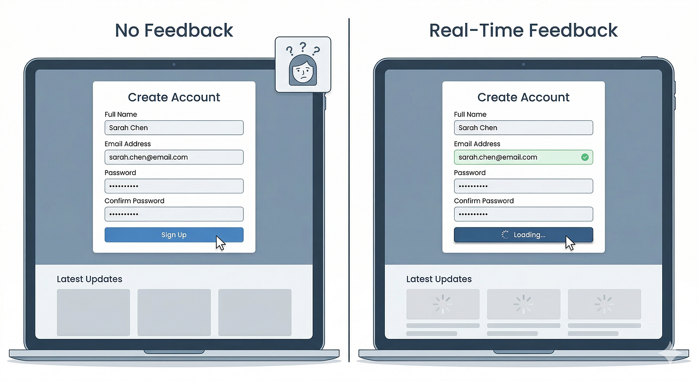
1. Visibility of system status: The UI should always tell users what is happening. Conversion example failure: a form submit button shows no loading state, so users click it multiple times and abandon the form.
2. Match between system and the real world: Language and concepts should match how users think. Conversion example failure: a CTA labelled ‘Proceed’ instead of ‘Start your free trial’.
3. User control and freedom: Users need a clear way to undo or go back. Conversion example failure: no back button on a multi-step checkout flow.
4. Consistency and standards: The UI should behave like other products that users already know. Conversion example failure: a drag-and-drop builder that ignores standard keyboard shortcuts.
5. Error prevention: Stop users from making mistakes before they happen. Conversion example failure: a date field that accepts invalid formats and only shows an error after the user submits the whole form.
6. Recognition over recall: Users should be able to see their options, not memorise them. Conversion example failure: a search bar with no suggestions, filters, or recent history.
7. Flexibility and efficiency of use: Provide shortcuts for experienced users. Conversion example failure: no keyboard navigation in a data-heavy dashboard.
8. Aesthetic and minimalist design: Every element should earn its place. Conversion example failure: a pricing page with four competing CTAs and no visual hierarchy.
9. Help users recognise, diagnose, and recover from errors: Error messages must be specific and tell users what to do. Conversion example failure: ‘Something went wrong. Please try again.’
10. Help and documentation: Provide in-context help where users need it. Conversion example failure: a form field asking for a ‘Merchant ID’ with no tooltip or explanation.
For each friction moment you logged in your session recordings, note which heuristic it violates. A CTA that users ignore almost always maps to heuristic 2 (match between system and real world) or heuristic 8 (minimalist design).
A form that causes rage clicks usually maps to heuristic 5 (error prevention) or heuristic 9 (error recovery).
Step 5: How Do You Turn Findings Into Actionable Data?
After heuristic evaluation, you’ll have a list of friction points across the data: funnel drop-offs, sessions, observations, heatmap signals, and errors. Now turn this data into a structured and organized view.
It’s a simple table in which each row is one friction point with columns for the step in the flow: what you observed, the data evidence, the heuristic it violates, and your hypothesized issue.
For example, see the table below.
[embed]Friction Point Tracking Table
Every finding needs evidence– a funnel percentage, a heatmap observation, or a session clip. Then it needs a cause, not just a symptom. High drop-off is the symptom at step 3, but the cause might actually live at step 2.
A complete row in your friction log looks like this: Step 3 → 61% drop-off observed → heatmap shows CTA below fold on mobile → violates heuristic 8 (minimalist design) + heuristic 1 (visibility) → hypothesised cause: mobile users never see the CTA.
Step 6: How Do You Decide What to Fix First?
A UX Audit is only helpful when it provides something your team will work on. The map from step 5 of the friction points provides the list of things you need to rank.
*Use a 22 framework: impact on your conversion metric on one axis and the engineering effort on the other.**
- High impact, low effort → fix immediately.
- High impact, high effort → plan for next sprint
- Low impact, low effort → batch as quick wins
- Low impact, high effort → skip for now
The deliverable is not a big presentation. It’s a simple ranked list with cause, fix, and evidence expected impact for each finding.
A UX audit is only as valuable as what you do with the findings. The six steps above give you a structured way to move from ‘users are dropping off’ to ‘here’s exactly what to fix and why.’ The output isn’t a slide presentation— it’s a ranked list your team can act on immediately.
Example: Auditing a SaaS Onboarding Flow
To see all 6 steps in practice, here is a condensed walkthrough of a common audit pattern for a B2B SaaS product.
Step 1 — Scope: The team noticed their trial-to-activation rate had stalled at 34%. They scoped the audit to the 4-step onboarding flow: signup → email verification → profile setup → first action.
Step 2 — Data: The funnel report showed a 61% drop-off at Step 2 (email verification). A scroll heatmap on the verification page showed that 74% of mobile users never reached the ‘Resend email’ button — it was below the fold.
Step 3 — Sessions: Watching 12 sessions filtered to Step 2 drop-offs showed a consistent pattern: users arrived, waited a few seconds, then closed the tab. Three sessions showed rage clicks on the inactive ‘Continue’ button before exit.
Step 4 — Heuristics: Two heuristics were violated — Heuristic 1 (visibility of system status: no confirmation that the email had been sent) and Heuristic 5 (error prevention: the resend link was hidden below the fold).
Steps 5–6 — Log and prioritise: Two fixes were logged: (1) add a visible sent-confirmation message above the fold — high impact, low effort. (2) Move the ‘Resend email’ link above the fold on mobile — high impact, low effort. Both were shipped in the next sprint. Activation rate increased from 34% to 49% within three weeks.
What Tools Do You Need for a UX Audit?
The quality of your audit depends entirely on the quality of your behavioural data. You need four tool categories:
• Funnel analytics: Shows step-by-step drop-off. Look for device and traffic-source filtering and date-range comparison. Examples: Mixpanel, Amplitude, FullSession.
• Heatmaps: Show where users click and stop scrolling. Look for: separate mobile and desktop views, click maps vs scroll maps. Examples: Hotjar, Microsoft Clarity, FullSession.
• Session recordings: Shows what individual users did before dropping off. Look for: rage click and JS error filtering, GDPR-compliant field masking. Examples: LogRocket, Hotjar, FullSession.
• Error tracking: Surfaces broken interactions. Look for a direct link to the session replay at the moment of the error. Examples: Sentry, FullSession.
FullSession combines all four in one platform, so you can move from funnel data to heatmap to session replay without switching tools. You can start a free trial at fullsession.io.
Key Takeaways:
- Scope your audit to one flow and one metric, not the whole product
- Start with quantitative data before watching sessions
- Session recordings reveal why users drop off, not just where
- Every finding needs evidence and a cause, not just a symptom
- Deliver a ranked action list, not a presentation
- High-impact, low-effort fixes go first — always
Ready to Run Your Next Audit?
A UX Audit is only good as the data behind it.
FullSession gives you the behavioral data layer that makes every step in this process faster and more precise:
Every feature, including Heatmaps, funnel analysis, and error tracking, leads you back to the session replay. That’s where you confirm what everything else surfaces.
Take the free trial to see exactly where users are dropping off.

FullSession session replay dashboard tracking user behaviour and friction points
FAQs
1. What is a UX audit?
A UX audit is a structured, data-backed evaluation of a product’s user flows to find friction points, conversion blockers, and usability gaps. Unlike usability testing, it does not require recruiting participants — it uses behavioural analytics (heatmaps, session recordings, funnel data) combined with expert heuristic review.
The output is a prioritised list of fixes tied to specific conversion metrics, not a general design critique. Audits are typically scoped to one user journey at a time, such as onboarding or checkout.
2. How do I conduct a UX audit step by step?
To conduct a UX audit:
-
Scope it to one user journey and tie it to one metric, such as trial-to-paid conversion.
-
Collect quantitative data first — funnel reports, heatmaps, and rage click patterns — to identify where drop-offs happen.
-
Watch 10–15 session recordings filtered to the exact drop-off step to understand why users are leaving.
-
Map each friction point to a UX heuristic to categorise the problem type. 5. Build a friction log with evidence for each issue — a funnel percentage, heatmap observation, or session clip.
-
Prioritise fixes using a 2x2 impact-vs-effort matrix and action high-impact, low-effort items first.
3. What’s the difference between a UX audit and usability testing?
A UX audit is an expert-led process that analyses existing behavioural data — session recordings, heatmaps, and funnel analytics — without recruiting any participants. You can run it any time, and it typically takes 3–5 days.
Usability testing involves observing real users completing tasks in real time, which surfaces problems that don’t yet appear in your analytics. UX audits are best for diagnosing known drop-offs quickly; usability testing is better for discovering unknown problems before a launch. Most product teams use both: audits for ongoing optimisation, and usability testing before major redesigns.
4. How long does a UX audit take?
A focused UX audit scoped to one flow, such as onboarding or checkout, takes 3 to 5 working days. Day 1: pull and review quantitative data (funnel reports, heatmaps, error logs). Days 2–3: watch session recordings and map friction points. Day 4: categorise findings against UX heuristics. Day 5: build the prioritised action list. Broader audits covering multiple flows or the full product can take 2–4 weeks.
The 3–5 day estimate assumes the behavioural data already exists — if analytics haven’t been set up, allow an additional 1–2 weeks for data to accumulate before the audit can begin.
5. Can a UX audit improve conversion rates directly?
A UX audit does not move conversion rates on its own — it identifies the friction points that are holding them back. The actual improvement comes from shipping the fixes that the audit surfaces.
That said, audits scoped to high-traffic flows with clear drop-offs routinely produce conversion lifts of 10–30% when findings are acted on systematically.
The key is to prioritise high-impact, low-effort fixes first and measure each change against the baseline metric you recorded at the start of the audit. Without that baseline number, you cannot prove the audit worked.
메타데이터
- post_id
- 7a4eb467ef22
- slug
- 6-steps-to-conduct-a-ux-audit-7a4eb467ef22
- url
- https://medium.com/@writeupbydivyasharma/6-steps-to-conduct-a-ux-audit-7a4eb467ef22
- canonical_url
- https://medium.com/@writeupbydivyasharma/6-steps-to-conduct-a-ux-audit-7a4eb467ef22
- author_url
- https://medium.com/@writeupbydivyasharma
- status
- ok
- fetched_at
- 2026-06-12 07:40:50