Why Most AI Infographics Fail, And What I Built Instead
AI-generated images are everywhere now. Most of them look impressive for about three seconds.
Why Most AI Infographics Fail, And What I Built Instead
AI-generated images are everywhere now. Most of them look impressive for about three seconds.
Then you notice the problem.
The layout is chaotic. The labels make no sense. The information hierarchy collapses. The image looks “smart,” but it doesn’t actually teach anything.
That became the core problem I wanted to solve.
Instead of building generic image generators, I started building a collection of highly specialized GPTs focused on one thing:
Creating structured, educational, production-ready infographic prompts.
The result became a growing ecosystem of infographic GPTs covering:
- wildlife education
- human evolution
- geology
- yoga instruction
- animal anatomy
- nutrition breakdowns
- food diagrams
- product comparison systems
Every GPT followed the same philosophy:
Educational clarity first. Visual quality second. Hype never.
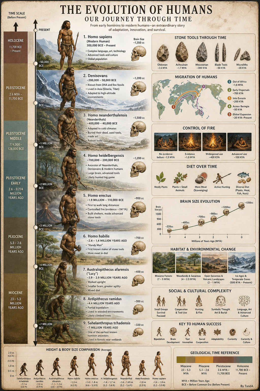
Most AI visuals are optimized for attention. These systems were designed for understanding.
Most AI Infographics Prioritize Style Over Communication
Most AI image prompts optimize for aesthetics.
Very few optimize for:
- information hierarchy
- educational readability
- scientific grounding
- visual scanning behavior
- spacing logic
- annotation structure
- museum-quality composition
That’s why many AI-generated infographics feel exhausting to look at.
They overload visuals with unnecessary detail. They misuse diagrams. They create layouts that feel artistic but impossible to read quickly.
The goal of these GPTs was to reverse that.
Instead of producing random visuals, they generate:
- structured infographic systems
- educational layout frameworks
- reproducible visual hierarchies
- science-focused prompt architecture
That distinction matters more than people realize.
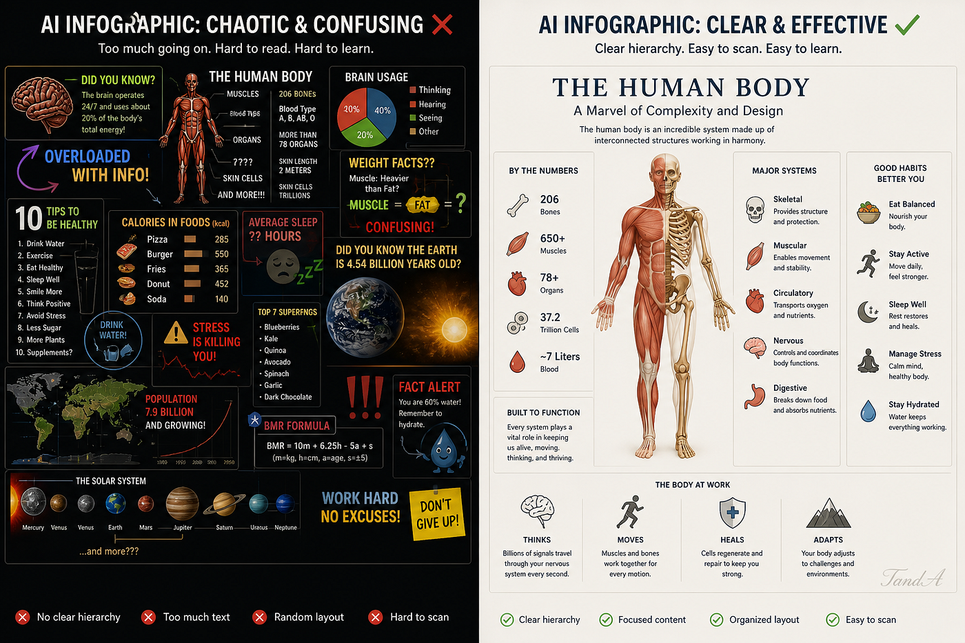
A good infographic guides the eye. A bad one competes with itself.
Designing GPTs Like Real Products
One of the biggest mistakes in GPT design is trying to make one GPT do everything.
I intentionally avoided that.
Every infographic GPT in the suite has:
- a narrow purpose
- strict formatting behavior
- domain-specific rules
- visual constraints
- educational priorities
That dramatically improved consistency.
A wildlife infographic GPT behaves differently from a paleoanthropology GPT because the communication goals are different.
The wildlife system focuses on:
- habitat accuracy
- conservation layouts
- anatomy callouts
- ecosystem structure
- educational readability
It behaves more like a digital science communication designer than a generic image generator.
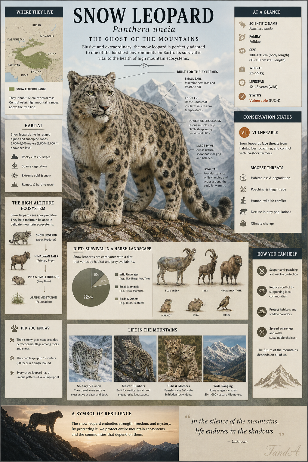
The wildlife systems prioritize educational structure over decorative spectacle.
The Prehistoric System Became Something Bigger
One of the strongest systems in the collection became the prehistoric infographic GPT.
It combines multiple simulated expert perspectives:
- paleontologist
- paleoartist
- museum exhibit designer
- scientific illustrator
- infographic designer
- science educator
The outputs include:
- dinosaur timelines
- fossil evolution charts
- migration maps
- paleoanthropology visuals
- prehistoric ecosystem layouts
One of the most successful outputs was a large human evolution infographic that looked closer to a natural history museum display than movie concept art.
That difference became important.
The goal was never cinematic exaggeration.
The goal was educational trust.
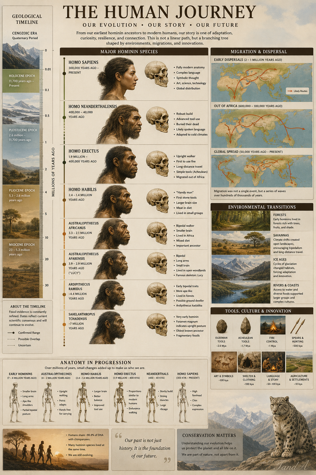
The strongest educational visuals feel closer to museum exhibits than entertainment posters.
Structured Output Changed Everything
A major insight from building these systems:
AI image generation improves dramatically when prompts follow strict information architecture.
Most users underestimate how important layout instructions are.
These GPTs explicitly define:
- typography hierarchy
- panel organization
- spacing behavior
- annotation systems
- icon placement
- visual density
- section flow
The prompts behave more like reusable visual frameworks than one-off image descriptions.
For example:
Generic prompt:
“Create a dinosaur infographic.”
Structured prompt:
“Museum-style educational infographic featuring Tyrannosaurus rex anatomy, labeled skeletal overlays, habitat map, Late Cretaceous ecosystem reconstruction, educational typography hierarchy, scientific panel structure, balanced visual spacing, realistic paleoart style.”
The second prompt communicates intent far more clearly.
That clarity changes the result.
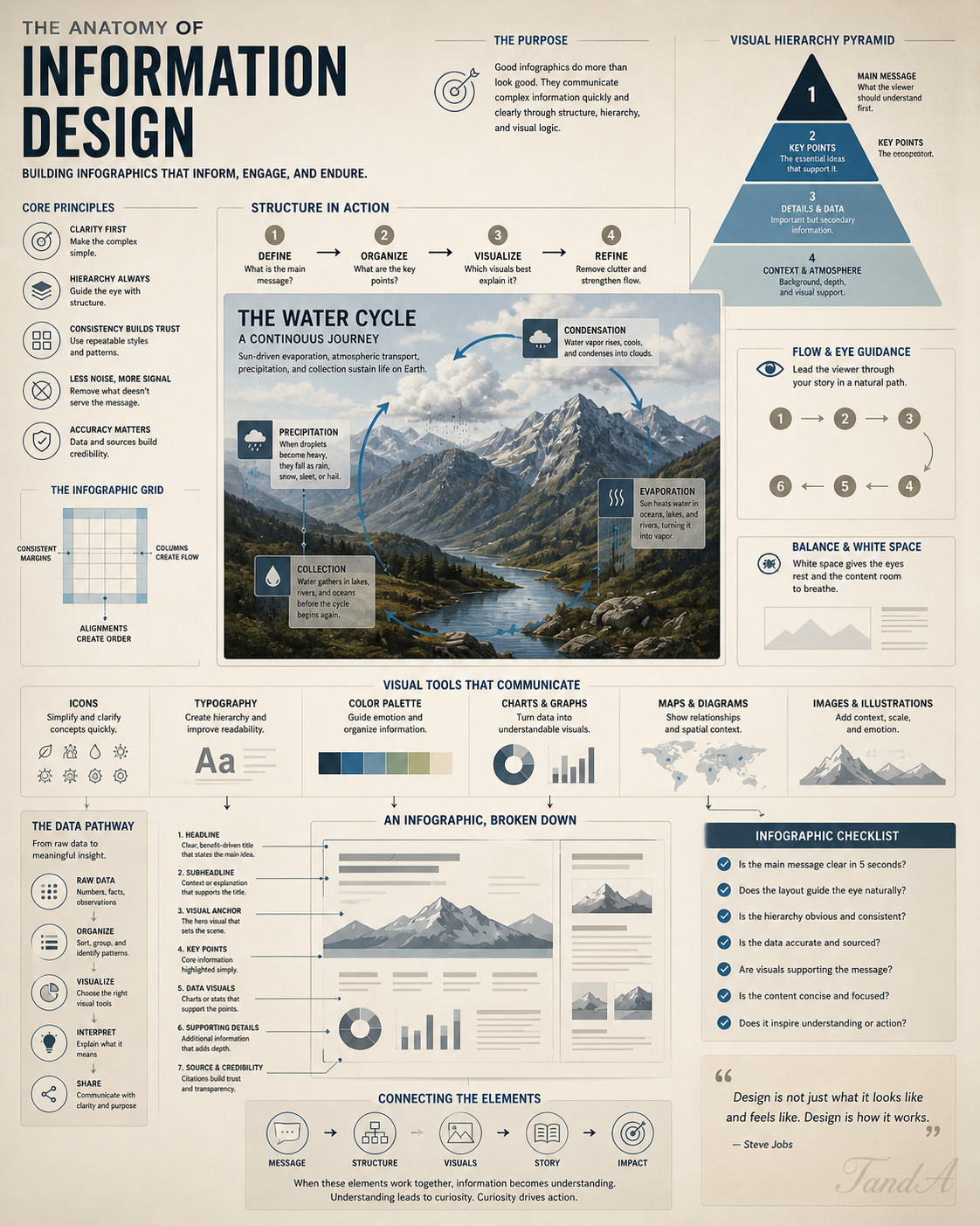
Prompt engineering becomes more reliable when it behaves like information architecture.
Scientific Accuracy Was Non-Negotiable
Educational AI systems become dangerous quickly when they hallucinate information confidently.
So every GPT includes hard constraints such as:
- do not fabricate information
- separate evidence from inference
- prioritize accepted reconstructions
- reduce cinematic exaggeration
- maintain educational clarity
That matters heavily in:
- paleontology
- anatomy
- wildlife education
- geology
- nutrition
The prehistoric system avoids speculative reconstructions when evidence is incomplete.
The wildlife system prevents habitat inaccuracies.
The geology system separates observation from assumption.
Those constraints improved reliability far more than visual polish ever did.
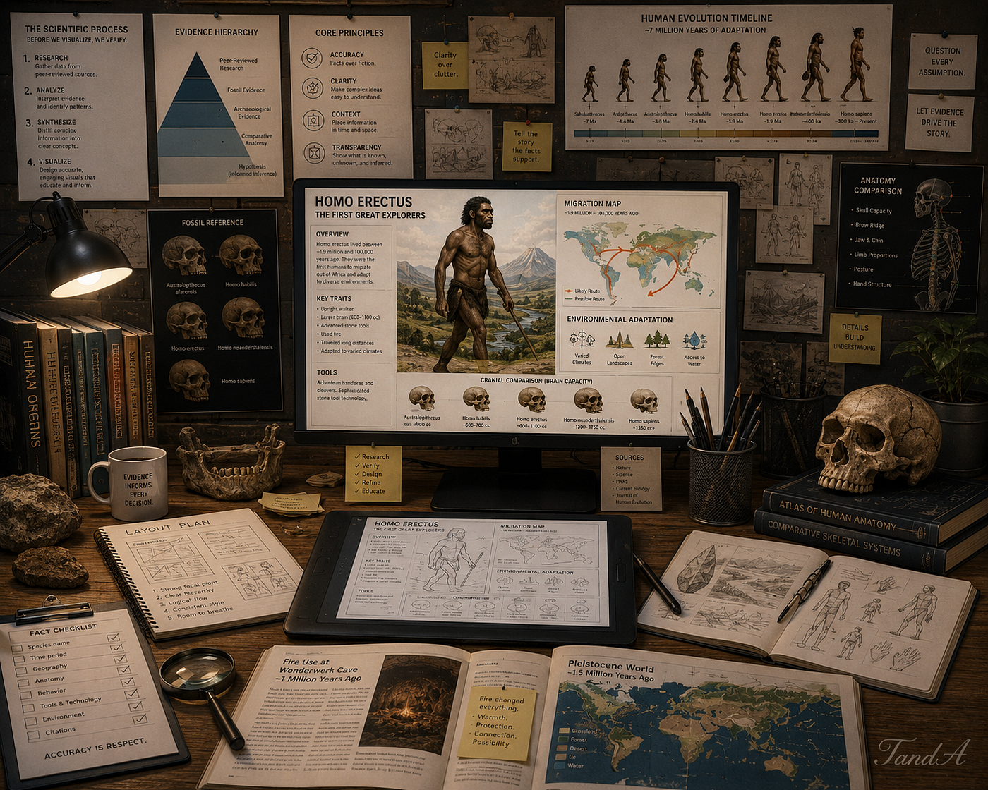
The constraints are not limitations. They are quality control systems.
AI Infographics Are Becoming a New Educational Medium
We are moving into a phase where individual creators can produce museum-style educational visuals without large production teams.
That changes:
- science communication
- classroom resources
- online learning
- educational publishing
- visual storytelling
- social media education
A single creator can now build:
- evolution timelines
- anatomy diagrams
- conservation posters
- geology explainers
- instructional yoga visuals
- nutrition breakdowns
But quality only appears when prompts are treated like systems instead of decorative descriptions.
That became the biggest lesson from this project.
The Bigger Goal
This project was never about generating random AI images.
It was about building educational visual systems.
The most exciting part of generative AI is not replacing artists.
It is giving:
- educators
- communicators
- researchers
- students
- creators
better tools for explaining complex ideas visually.
The best AI visuals are not the loudest. They are the clearest.
And the future of AI-generated infographics will belong to systems that understand:
- structure
- hierarchy
- education
- scientific grounding
- visual communication
Not just aesthetics.
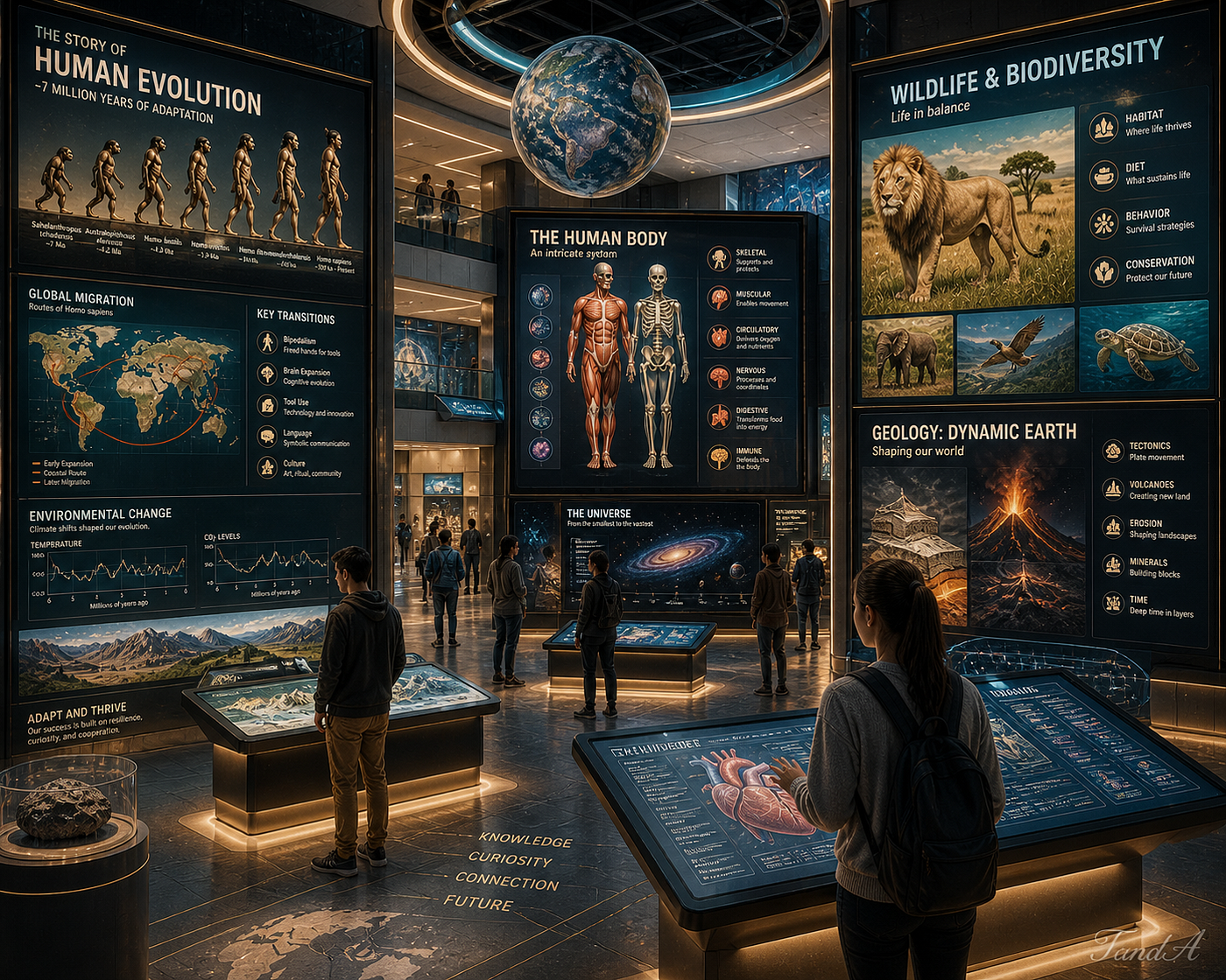
The future of AI visuals may belong less to spectacle and more to understanding.
Final Thoughts
Building specialized infographic GPTs taught me something important:
Constraint improves creativity.
The narrower and more disciplined the system became, the better the outputs were.
A focused educational infographic system consistently outperformed generalized image prompting because it understood the real goal:
Helping people understand something clearly.
That is the real opportunity emerging from AI visuals right now.
Not just image generation.
Visual communication systems.
메타데이터
- post_id
- 7a5c2d458aee
- slug
- why-most-ai-infographics-fail-and-what-i-built-instead-7a5c2d458aee
- url
- https://medium.com/creating-custom-gpts/why-most-ai-infographics-fail-and-what-i-built-instead-7a5c2d458aee
- canonical_url
- https://medium.com/creating-custom-gpts/why-most-ai-infographics-fail-and-what-i-built-instead-7a5c2d458aee
- author_url
- https://medium.com/@ttrimm
- status
- ok
- fetched_at
- 2026-06-09 15:37:30