Figma for Beginners: Wireframes, Components, Auto Layout & Prototypes.
Figma is a popular design tool used to create user interfaces, wireframes, prototypes, and design systems for websites and mobile…
Figma for Beginners: Wireframes, Components, Auto Layout & Prototypes.
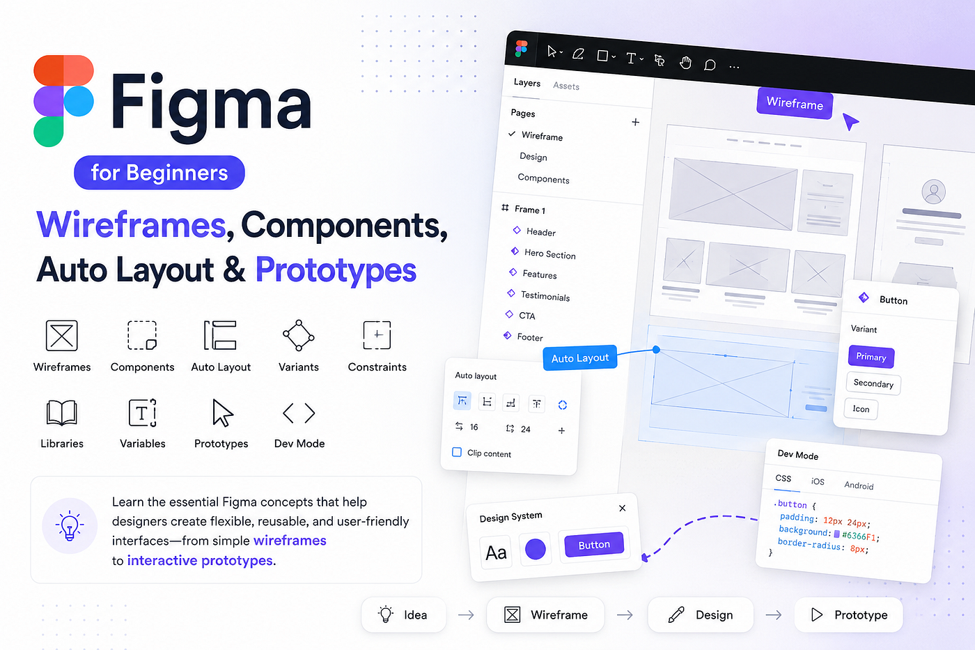
Figma is a popular design tool used to create user interfaces, wireframes, prototypes, and design systems for websites and mobile applications. But learning Figma is not just about learning where the buttons and tools are. It is about understanding how designers use the tool to build flexible, reusable, and user-friendly interfaces.
In this article, I will explore the essential Figma concepts that beginners should understand, including components, Auto Layout, variants, constraints, libraries, variables, prototypes, and Dev Mode.
I will also introduce wireframing, an important step that comes before creating a polished interface. Wireframes help designers organize content, plan navigation, and understand the structure of a product before focusing on colors, typography, and visual details.
By the end of this article, you will have a clearer understanding of how designers move from an initial idea to a structured wireframe and eventually to a complete interactive design.
Let’s start by understanding Figma and why it has become such an important tool in modern UI/UX design.

Figma — The Main UI/UX Design Tool
After learning the fundamentals of UI/UX design, the next step is to start creating actual interfaces. Figma is one of the most widely used tools for this purpose.
Figma is a cloud-based design tool that allows designers to create, organize, prototype, and collaborate on digital products. It can be used for everything from simple wireframes to complete website and mobile app designs.
Unlike traditional design software, Figma is built around collaboration and reusable design elements. This makes it especially useful when working with other designers, developers, and product teams.
Getting Started with Figma: Figma can be used through a web browser or desktop application. Since files are stored online, multiple people can work on the same design and see changes in real time.
Designers use Figma to create:
- Website designs
- Mobile app designs
- Wireframes
- Interactive prototypes
- Design systems
- User interfaces
A basic Figma design is built using different elements such as frames, layers, text, shapes, and components.
Understanding Text Hierarchy: Typography is an important part of interface design. Figma makes it easy to create a clear hierarchy between different types of text.
A simple hierarchy might look like:
Main Heading → Subtitle → Description → Button Text This hierarchy helps users understand which information is most important and makes the interface easier to scan.
For example, a large and bold heading can introduce a section, while a smaller description provides additional information. Button text should clearly communicate the action the user can take.
Components: One of the most useful features in Figma is Components. A component is a reusable design element that can be used multiple times throughout a design.
For example, imagine designing a website with 20 buttons. Instead of creating each button separately, you can create one button component and reuse it.
If you later change the component’s design, the changes can be reflected across its instances.
Components are commonly used for:
- Buttons
- Navigation bars
- Cards
- Input fields
- Checkboxes
- Icons
- Dialog boxes
The main advantage is consistency and efficiency. Reusable components help designers avoid repetitive work and keep interfaces visually consistent.
Auto Layout: Auto Layout helps designers automatically arrange elements within a frame or component.
Instead of manually adjusting the position of every element, Auto Layout manages spacing and positioning based on the content.
For example, consider a button:
[ Submit ]
If the text changes to:
[ Create Account ]
Auto Layout can automatically adjust the button’s width while maintaining the appropriate padding.
It is especially useful for:
- Buttons
- Cards
- Forms
- Navigation bars
- Lists
- Responsive layouts
Auto Layout makes designs more flexible because elements can adapt when their content or size changes.
Variants: Variants allow designers to create different versions of the same component.
For example, instead of creating three separate button components, you can create one button component with different variants
Button
- Primary → [ Submit ]
- Secondary → [ Cancel ]
- Danger → [ Delete ]
This keeps related components organized and makes it easier to switch between different states or styles.
Variants can also be used for different component states, such as:
- Default
- Hover
- Pressed
- Disabled
- Selected
This becomes especially useful when creating larger design systems.
Constraints: Constraints control how elements behave when the size of their parent frame changes. This is particularly useful when designing interfaces for different screen sizes.
For example, imagine a navigation bar containing:
Logo — Menu — Button
When the screen becomes wider, constraints can help maintain the intended positioning:
Logo → stays on the left Menu → remains centered Button → stays on the right
Constraints help designers create layouts that behave more predictably when frames are resized.
Libraries: Figma Libraries allow designers and teams to share reusable design resources.
A library can contain:
- Components
- Colors
- Typography styles
- Icons
- Design assets
For example, a company can create a shared library containing its official buttons, colors, icons, and other components.
Designers can then use these resources across different projects instead of recreating them every time. This improves consistency and makes collaboration easier.
Design Systems: A Design System is a structured collection of reusable design elements, guidelines, and rules used to create consistent digital products.
A design system can include:
- Colors
- Typography
- Components
- Spacing
- Icons
- Buttons
- Forms
- Layout rules
- Usage guidelines
For example, if a company defines a specific blue as its primary brand color, that color can be used consistently across its websites and applications.
Design systems become especially valuable when multiple designers and developers are working on the same product.
Variables: Variables allow designers to store values that can be reused throughout a design.
For example: Primary Color = Blue
Instead of manually changing the color of every button, a designer can connect components to the same variable. If the primary color changes later, the variable can be updated and the connected designs can update accordingly.
Variables can be useful for managing:
- Colors
- Spacing
- Sizes
- Typography values
- Other reusable design values
They are particularly helpful when working with larger design systems and different themes.
Prototypes: A Figma Prototype allows a static design to behave more like a real application. Instead of simply viewing individual screens, designers can connect them together and create interactions. This creates a realistic flow that can be tested before development begins.
Prototypes are useful for:
- Testing user flows
- Demonstrating interactions
- Presenting designs to clients
- Collecting user feedback
- Identifying usability problems
- Showing developers how the product should behave
This connects directly with the UX process discussed in my previous article, where testing and iteration are important parts of creating a better user experience.
Dev Mode: Figma also provides Dev Mode, which helps designers and developers work together more effectively.
Developers can inspect a design and understand important implementation details such as:
- Colors
- Fonts
- Font sizes
- Spacing
- Dimensions
- CSS-related values
- Assets
Instead of guessing how a design should be implemented, developers can inspect the design and obtain the information they need. This makes the transition from design to development smoother and helps reduce misunderstandings between designers and developers.
The goal is not simply to create something that looks good. Figma helps designers create interfaces that are structured, reusable, consistent, flexible, and ready for development.

Wireframing — Turning Ideas into Structure
Before creating a polished interface with colors, images, and detailed components, designers first need to decide how the product should be structured. This is where wireframing becomes an important part of the UI/UX design process.
Wireframing is the process of creating a simple visual structure of a website or application before designing the final interface. You can think of a wireframe as the blueprint of a digital product similar to how an architect creates a blueprint before constructing a building.
A wireframe helps designers decide:
- Where elements should be placed
- How users will navigate
- What information is most important
- How different screens connect
- How users will complete their tasks
At this stage, the focus is mainly on structure, functionality, and user flow, rather than colors, images, animations, or visual details.
What Should a Wireframe Show?: A good wireframe gives a simple overview of how a screen will work.
Does the structure make sense for the user?: By solving structural problems early, designers can avoid spending hours creating a detailed interface that later needs major changes.
Important Elements of a Wireframe
Navigation: Navigation shows how users move through the application or website.
For example: Home → Products → Product Details → Cart → Checkout
A wireframe helps designers decide where navigation elements such as menus, tabs, buttons, and links should be placed. Good navigation should make it clear where users are and where they can go next.
Content Placement: Wireframes also show where important information should appear on the screen. At this stage, designers are mainly concerned with the position and importance of each element rather than its final visual appearance.
User Flow: A user flow shows the steps a user takes to complete a specific task. Creating the user flow before detailed UI design helps designers identify unnecessary steps or confusing parts of the experience.
Low-Fidelity Wireframes: Low-fidelity wireframes are simple and focus mainly on structure.
They may contain:
- Basic sketches
- Boxes and lines
- Placeholder text
- Simple layouts
- Basic navigation
The purpose is to quickly explore ideas without spending time on visual details. Low-fidelity wireframes are especially useful during the early stages of a project because they are easy to change.
High-Fidelity Designs: High-fidelity designs are much closer to the final product.
They can include:
- Colors
- Images
- Typography
- Icons
- Real UI components
- Detailed spacing
- Visual styling
- Interactive elements
From Research to Development: Wireframing is not an isolated step. It is part of a larger UI/UX design process.
A typical process can look like this:
User Research → User Flow → Low-Fidelity → Wireframe → Testing → High-Fidelity → Design → Prototype → Development
Each stage builds on the previous one.
First, designers understand the users and their problems. Then they plan how users will move through the product. Next, they create wireframes to organize the structure.
After testing the structure, designers can move into high-fidelity UI design. The final interface can then be turned into an interactive prototype before being handed over to developers.
This process helps catch problems before development begins, when changes are generally easier and less expensive to make.
Tools for Wireframing
Wireframing does not require advanced software.
Paper and Pencil: For beginners, paper sketching is one of the easiest ways to start.
You can quickly draw:
- Screens
- Buttons
- Navigation
- Content areas
- User flows
The advantage is speed. You can sketch an idea in seconds and change it without worrying about perfect alignment or visual styling.
Figma: For digital and professional wireframing, Figma is a powerful option. You can create wireframes, connect screens, test user flows, and gradually transform low-fidelity concepts into high-fidelity interfaces all within the same design environment.
This makes Figma particularly useful because the wireframe does not have to be recreated from scratch when moving toward the final design.
Final Thoughts
Wireframing is an important step between understanding a problem and designing the final interface. It helps designers focus on the things that matter most in the early stages:
Structure → Navigation → Content → User Flow
Instead of immediately worrying about colors, fonts, or animations, designers can first ask:
Does this product actually work for the user?
Figma makes this process even more powerful by allowing designers to move from simple wireframes to detailed interfaces and interactive prototypes.
Ultimately, learning Figma is not just about learning how to use a design tool. It is about using that tool to apply UX principles, solve real user problems, test ideas, and create better digital experiences.
Wireframes give designers the opportunity to validate their ideas before investing time in detailed UI design and that makes them an essential part of the UI/UX design process.
메타데이터
- post_id
- 7b6d1f7e2f26
- slug
- figma-for-beginners-wireframes-components-auto-layout-prototypes-7b6d1f7e2f26
- url
- https://medium.com/@hirufernando1107/figma-for-beginners-wireframes-components-auto-layout-prototypes-7b6d1f7e2f26
- canonical_url
- https://medium.com/@hirufernando1107/figma-for-beginners-wireframes-components-auto-layout-prototypes-7b6d1f7e2f26
- author_url
- https://medium.com/@hirufernando1107
- status
- ok
- fetched_at
- 2026-08-16 08:01:07