Time Series 5 — ACF and PACF
One of the most powerful ideas in time series analysis is autocorrelation.
Time Series 5 — ACF and PACF
One of the most powerful ideas in time series analysis is autocorrelation.
Time series data often has memory — the past influences the future. Autocorrelation helps us measure how strongly past values affect current values.
1. What is Autocorrelation?
Autocorrelation means correlation of a time series with its own past values.
In simple words:
We measure how similar the series is to itself after shifting it by some time lag.
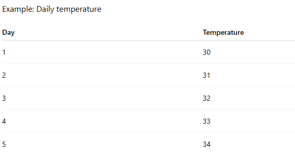
Temperature on Day 5 is likely related to Day 4 and Day 3.
So we compute correlations like:
Correlation between Temperature(t) and Temperature(t−1) → Lag 1
Correlation between Temperature(t) and Temperature(t−2) → Lag 2
Correlation between Temperature(t) and Temperature(t−3) → Lag 3
These correlations tell us how much influence past values have.
2. What is a Lag?
A lag is simply a shift in time.
Example series:

Lag 1 means shifting the series by 1 step.
Original At t1 value is 10, At t2 value is 12, At t3 value is 13, At t4 value is 15
Lag 1 At t1 value is none, At t2 value is 10, At t3 value is 12, At t4 value is 13
We compare these two sequences to compute correlation.
Lag tells us how far back in time we look.
Autocorrelation with Example
Formula

In the below example we will be calculating autocorrelation at lag 2

Autocorrelation values always lie between -1 and +1.
+1 (Perfect positive autocorrelation) The values move in the same direction perfectly.
Example: If today’s value increases, the next value always increases.
Each value strongly follows the previous one.
0 (No autocorrelation) There is no relationship between past and present values.
Example: Today’s value gives no information about tomorrow’s value.
−1 (Perfect negative autocorrelation) Values move in opposite directions perfectly.
Example: If today’s value is high, the next value is always low.
ACF (Autocorrelation Function)
The ACF measures the correlation between the series and its lagged versions.
It calculates correlations for many lags.

This tells us:
- Lag 1 has very strong influence
- Lag 2 also influences the present
- Influence slowly decreases
How is ACF visualized
Autocorrelation — Measures how a time series relates to itself at different lags
ACF answers:
“How similar is the data to its past values?”
from statsmodels.graphics.tsaplots import plot_acf

detrended = df['Value'] - df['Value'].rolling(7).mean()
plot_acf(detrended.dropna())
# plot_acf(df["Value"])
plt.show()
Correlation axis (Y-axis) in the ACF Graph
+1  → strong positive correlation
 0  → no correlation
-1  → strong negative correlation
Case 1: Strong Seasonality
📈 Time Series Plot
We see a wave-like repeating pattern.
📊 ACF Plot
You saw:
✔ Spike at Lag ≈ 12 ✔ Spike at Lag ≈ 24 ✔ Spike at Lag ≈ 36
Meaning:
Season repeats every 12 steps
✔ Clear seasonality

Case 2: Trend Only
📈 Time Series
Smooth upward movement.
📊 ACF
✔ Very high at Lag 1 ✔ Slowly decays ❌ No repeating spikes
👉 Meaning:
Values close in time are similar But no cyclic repetition
✔ Trend detected ❌ No seasonality

Case 3: Pure Noise
📈 Time Series
Random zig-zag
📊 ACF
✔ All bars near zero ✔ Inside confidence band
Meaning:
No structure No memory No seasonality

The Blue Band
The blue shaded area = confidence interval.
Think of it as the “random noise zone”.
If a spike falls:
Inside the blue band
It means:
The correlation could have happened by random chanceSo we treat it as noise.
Example:

Almost all spikes stay inside the band → no pattern.
Outside the blue band
It means:
This correlation is statistically significantThe value is very unlikely to occur randomly.
So it suggests real structure in the data.
Example from the second graph (seasonal data): Some spikes clearly cross the blue band.
How This Reveals Seasonality
Seasonality appears as repeating significant spikes.
Example

Spikes appear at:
Lag ≈ 12
Lag ≈ 24
Lag ≈ 36
This means:
The pattern repeats every 12 stepsSo the seasonal period = 12.
Simple Rule for Reading ACF
Step 1
Check if spikes cross the blue band.
Outside band → meaningful
Inside band → ignore
Step 2
Look for repeating intervals.
Example:
Spike at 12
Spike at 24
Spike at 36
This indicates seasonality = 12.
PACF
PACF stands for Partial AutoCorrelation Function.
It measures:
The correlation between a time series and its lag, after removing the effect of intermediate lags.
This sentence sounds complicated, so let’s simplify it.
First remember what ACF does
ACF measures:
Correlation between a series and its past values.
Example:
Lag 1 → correlation between X(t) and X(t-1)
Lag 2 → correlation between X(t) and X(t-2)
Lag 3 → correlation between X(t) and X(t-3)
But there is a problem.
When we measure Lag 2 correlation, part of that relationship may actually come from Lag 1.
Example:
X(t) → influenced by X(t-1)
X(t-1) → influenced by X(t-2)
So when ACF shows a correlation at Lag 2, it might actually be indirect.
This is where PACF helps.
What PACF Actually Measures
PACF measures:
Direct relationship between the time series and a specific lag, removing effects of shorter lags.
Example:
PACF for Lag 2 removes the effect of Lag 1.
So it asks:
After removing the influence of Lag 1, does Lag 2 still affect the series?
Analogy
Imagine this situation
You want to know who influences a student’s exam score.
Possible influences:
- The student’s own effort
- The parents
- The grandparents
But influence can happen directly or indirectly.


IMPORTANT
In ACF, when we calculate the correlation at lag 2 for time t=10, we are checking whether the data at time 10 behaves similarly to the data at time 8.


The Key difference

PACF Graph
PACF graph looks similar to ACF.
Axis meaning:
X-axis
Lag (1,2,3,4...)Y-axis
Partial correlation (-1 to 1)Important point:
Lag 0 is usually 1, but we mostly focus on Lag ≥ 1.
CODE
import numpy as np
import matplotlib.pyplot as plt
from statsmodels.graphics.tsaplots import plot_pacf

np.random.seed(0)

# generate sample data
data = np.random.randn(100)

# plot PACF
plot_pacf(data, lags=20)

plt.xlabel("Lag")
plt.ylabel("Partial Autocorrelation")
plt.title("PACF Plot")
plt.show()
메타데이터
- post_id
- 7bd569f8fe71
- slug
- time-series-5-acf-and-pacf-7bd569f8fe71
- url
- https://medium.com/@abhishekjainindore24/time-series-5-acf-and-pacf-7bd569f8fe71
- canonical_url
- https://medium.com/@abhishekjainindore24/time-series-5-acf-and-pacf-7bd569f8fe71
- author_url
- https://medium.com/@abhishekjainindore24
- status
- ok
- fetched_at
- 2026-07-12 01:39:19






