My journey of turning campus into D’Frost 2026 at NID Bengaluru
There’s a particular kind of nervousness that hits you when you realise the thing you just said yes to is genuinely, properly big. That’s…
My journey of turning campus into D’Frost 2026 at NID Bengaluru

NID Bengaluru’s Amphitheatre
There’s a particular kind of nervousness that hits you when you realise the thing you just said yes to is genuinely, properly big. That’s roughly how it felt when I became the Visual Head for D’Frost 2026, NID’s annual fest. Not just another college event, but a full-scale corporate fest with companies, sponsors, speakers, performers, and hundreds of people walking through campus, which happened on 27th and 28th February. Big. And it’s NID.
And the theme we were handed? Design Mela. As in, a design-driven Indian carnival. All the colour, energy, nostalgia, and chaos of a real mela, but distilled into a visual identity that would live on social media, banners, a website, mementos, on-ground collaterals, and the people's memories. I remember reading that brief and thinking: okay. This is either going to be incredible or a disaster. Probably both.
Before I get into the work itself, I want to talk about something that usually stays in the background: what it actually feels like to lead a team of 32 people across multiple skill sets and experience levels. It means you can’t afford to be just one thing. You have to be whoever the moment needs. Because this wasn’t just a design project. It was a masterclass in figuring out who you need to be at any given moment. At some points, I was mentoring people through their first real brief. At other points, I was genuinely learning from someone on my team who knew something I didn’t, whether it was a technical skill, a better approach to a problem, or just a fresher perspective on the work. Then there were moments when I had to step back from being the person with the answer and just be a contributor, rolling up my sleeves alongside everyone else.
My first job, before any design work began, was to get everyone on the same page, or rather on the same mood board. I sat down with my counterparts, the heads of other teams, i.e., culturals, talks and workshops, and PR, to fix a clear visual direction. Something that said: this is how Design Mela should feel. Rooted and deeply Indian but contemporary enough to show up on a brand deck.

Moodboard
Once the direction was clear, I divided the 32 people into sub-teams based on skill and availability. Social media, banners, print, website, and mementos each needed the right people, not just whoever was free. That’s a lot of thinking before a single Figma file is even opened.
Before the identity: The PR deck
Our very first deliverable as a visual team wasn’t a logo or a poster; it was a sponsorship pitch document that had to go out to companies before the identity was even finalised. We had to sell the vision before we’d fully built it ourselves, and the further roadmap followed.
10 Feb: Work kicks off. First task: a PR sponsorship deck — before the identity even exists.
Week 1–2: Mood board → Logo ideation
Week 3: Everything at once. Website in Figma. Social media made live. Banner designed. Campus recce done.
Week 4: Begins with the banner drop
Final week: On-ground collaterals- Lanyards, wristbands, brochures, navigation posters. Mementos. Phone website version goes live.
27–28 Feb: D’Frost 2026
Logo: the face of the fest
The next biggest task was: The logo, the identity that defines and become as a the face of the fest.

D’Frost 2026 Design Mela Logo
The logo process was something else. We got into a room, I gave everyone sheets of paper, and we just… sketched. No screens, no references open. Just people drawing logos, brand marks, symbols, whatever came to them. By the end of that session, we had approximately 300 ideations on the table. I’m not exaggerating. Around three hundred.
We narrowed those to the finest 20. Digitised the top 5. And from there, we arrived at our final logo that resembled a pinwheel and also seamlessly held the type of D’Frost Design Mela.
It wasn’t just a pretty choice. The pinwheel is one of those objects that lives in a very specific corner of Indian childhood memory. You see it at every mela, every fair, spinning, colourful, always moving. It carries the energy of a carnival and the joy of crowds. And for D’Frost, an event that’s supposed to feel electric and immersive, that felt exactly right. Dynamic. Joyful. Impossible to ignore.
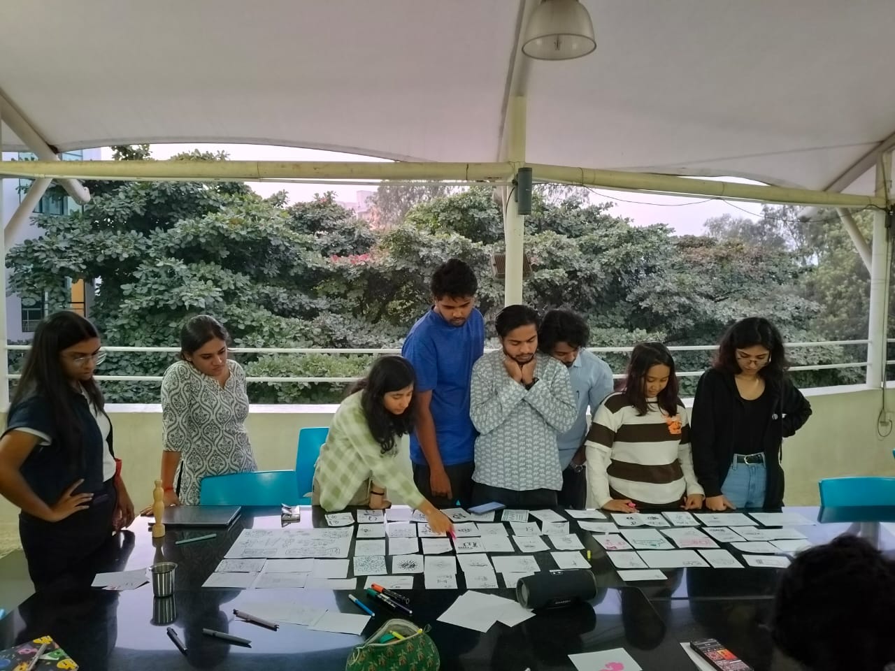

The logo process was something else. We got into a room, my partner Ria and I gave everyone sheets of paper, and everyone just… sketched. No screens, no references open. Just people drawing logos, brand marks, symbols, whatever came to them. By the end of that session, we had approximately 400 ideations on the table. I’m not exaggerating. Four hundred.
We narrowed those to the finest 20. Digitised the top 5. And from there, we arrived at our final logo, a pinwheel.
It wasn’t just a pretty choice. The pinwheel is one of those objects that lives in a very specific corner of Indian childhood memory. You see it at every mela, every fair-spinning, colourful, always moving. It carries the energy of a carnival, the joy of crowds, the restlessness of something alive. And for D’Frost, an event that’s supposed to feel electric and immersive, that felt exactly right. Dynamic. Joyful. Impossible to ignore.
One of the strong contenders during the explorations was the terracotta horse, an object deeply iconic to NID’s own identity and culture. But we had to make a tough call; the terracotta horse didn’t quite fit the energy of a campus that’s tech-forward and kinetic. Looking back, pinwheel was the right call.
Choosing the perfect colors
Once the form of the logo was settled, we moved to colour. We needed a palette that spoke two things at once: design sensibility and mela energy. After going through a lot of options, we landed on purple, pink, and yellow.
Purple defined the slightly elevated, creative quality to it. Pink and yellow are pure mela: loud, joyful, and celebratory. Together, the three of them hit the exact mood we were after. This was followed by icon, typography, and colours, and sub-logos for D’Frost’s different categories: D’Talks, D’Workshops, D’Culture, D’Fire. With the identity set in place, we were ready to take it everywhere.


Social Media- always on the go
The social media team had the highest headcount for a reason: because they were always on their toes. Multiple sponsors were coming in at various stages, each with their own brand guidelines and expectations. Our job was to create brand posts that honoured the sponsor’s identity while maintaining D’Frost’s visual language. That’s a balancing act that doesn’t always have a clean answer. A lot of rounds of changes, a lot of deck revisions, a lot of “one more tweak” messages.
At the same time, the PR team was feeding us a constant stream of sponsor posts while the talks and workshops team gave us speaker reveals and event teasers from the Culturals teams. The social media team had to be nimble enough to produce quality work at pace, and my job was to keep a bird’s-eye view on all of it, making sure everything that went out felt like D’Frost, unique yet cohesive, regardless of how fast it had to move.
[embed]
The website: designing and building the interaction
[embed]Design Mela | D'Frost 2026 Edit descriptionwww.dfrostnid.com
The website was its own full project. The team led by Parag started in Figma, designing the desktop version first, thinking carefully about how the identity and feeling of D’Frost would be translated on just a screen. Every graphic element, every layout decision was run through that filter: does this feel like D’Frost?

Once the designs were ready, the actual build happened on Wix, where Kuldeep led the bandwagon. And somewhere along the way, I also had to figure out how to buy a domain, how to connect it to Wix, how to purchase a subscription, and set everything up. These are things you don’t know you’ll need to know until you need to know them, and suddenly you’re doing a crash course in web hosting at 1 am while three other things are also on fire.
While the Desktop website went live, we realised that we skipped the step to make its responsive version for the phone. While the deadline sitting rigt above our heads and registrations are pouring in, we jumped into creating the phone version, and voila, just a step towards creating the phone increased our unique website visitors per day.
The banner: Campus turns Carnival
In the third week, we did a full recce of the campus to map out banner placement, vertical, horizontal, square, and different dimensions for different spaces. Our main banner was 11 by 37 feet. That’s not a poster. That’s a wall.

The main banner

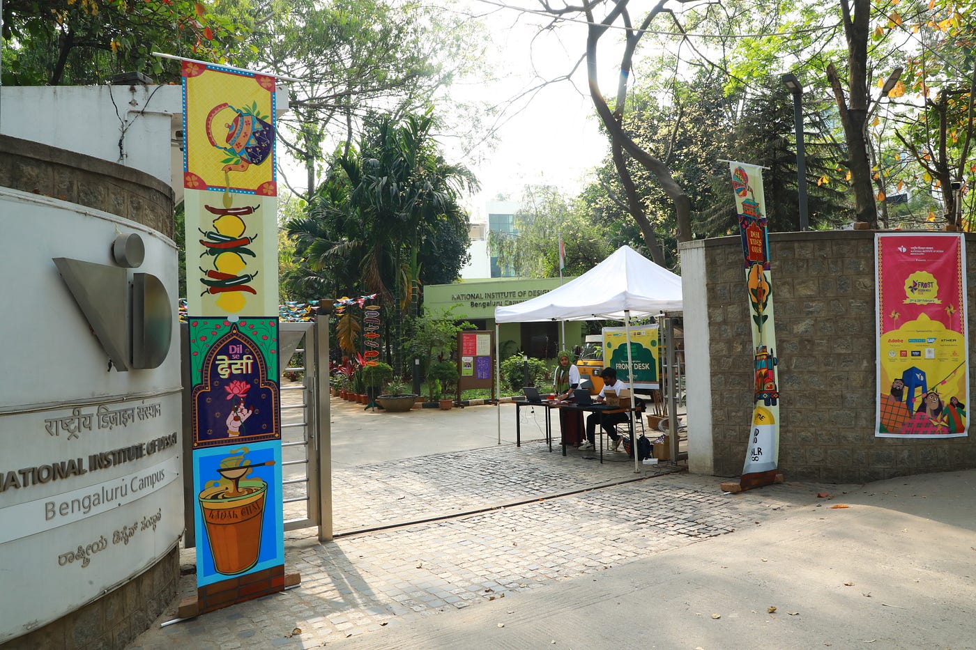
Other banners pasted across the campus
The design of that banner was something I’m particularly proud of because of what it chose to put front and centre: people. The aim was to represent the diverse, dynamic, colourful personalities that make up NID’s campus faces, energy, and the sense that this place is alive and full of different kinds of people.
We finished designing it in two days, sent it to print, and then began a very anxious three-day wait while trying to simultaneously keep everything else moving. The banner drop was announced. And the night before, the printer stopped responding. Tension.
It was Namrata who came forward and handled the situation quite tactfully and with patience. Someone had to go to the shop in person and request, politely but with great urgency, that they please just print the thing. They did. It happened.
One thing I set up very deliberately was a dedicated spellcheck process. Specific people were assigned to it not as an afterthought, but as an actual role. Because if there’s one thing that can undo hours of beautiful design work in a single second, it’s a typo on a printed banner. You can fix a colour. You can repost a social media graphic. You cannot unprint 200 brochures or a 37-foot banner with a spelling mistake on it. The nightmare is real, and we were not going to live it.
Merch: Printing the fest on things that people cherish
Merch is where the identity travels, sometimes far past the event itself. As the Visual POC, I made sure that the illustration and design direction stayed cohesive with the rest of the visual identity. The pieces being worked on covered a good range: tote bags, T-shirts, button badges, diaries, and postcards. The aim was simple: everything needs to speak D’Frost Design Mela.


Merch
On-ground collaterals
This was the phase where the work shifted from digital to physical in a very real way, on the pieces that people would hold, wear, and navigate with on the day itself.


Lanyards and ID cards: For the D’Crew members who managed the fest day preparations. Wristbands: Separate designs for the college students and visitors Brochure: Distributed to all the attendees Navigation posters: Pasted across multiple places to help visitors navigate the campus Talks and Workshops posters: Pasted across the campus at locations where the specific talk/workshop was happening

Talks and Workshops Poster
The brochure was something that all the teams had to come together and provide, as it had the schedule for the whole fest. It was that one collateral which was constituted with confusion, reprints, and a lot of patience from the visual team, as it was characterised by constant changes in the schedule and timings. It also included a campus map specifically designed for navigation with legends and numbering of the spaces, so that anyone walking in for the first time could actually find their way around.


Brochure, tickets and campus map on the brochure
The memento: the outlook of achievement


40 momentos assembled
The mementos were something I’m really proud of. These were to be given to speakers and competition winners, so they needed to feel special, intentional, and reflective of the theme. Rethanya and Bhavagnya took this one and absolutely delivered. Rethanya built a structure that had the pinwheel as its central element, actually rotating on the memento. Bhavagnya took care of the functional aspect of laser-cutting and material procurement. This was a task characterised by constant and quick iterations. My major role at the stage was to bring people, who were a part of the team, as well as those who weren’t, to help assemble the momentos. What emerged at the end was a beautiful piece of craft that embodied the spirit of D’Frost through its form and aesthetic.
The things that went sideways (and we fixed anyway)
- Too many PR sponsors with too many last-minute poster change requests had to dedicate specific team members exclusively to PR work, so every request always had someone ready to turn it around
- The desktop website went live without a mobile version, and the responsive phone version was built under deadline pressure, with registrations already pouring in
- Speaker count increased at the last minute, so we made additional mementos on the day of the event itself, on the spot
- Website missing key information (like campus parking) discovered on event day, scrambled to find someone who could push live changes to Wix while everything else was happening
What it all came together as
All of the visual identity across multiple media came together into something that felt genuinely cohesive. An identity that people could feel across every surface they encountered. 600 people visiting the website daily from the day it launched. Sponsors recognising their brand posts and appreciating how they sat within the D’Frost identity. Faculty stopping at banners on campus. It all happened because 32 people worked really hard and cared a lot about what they were making. There were problems, absolutely, but there’s something that happens when a team genuinely owns what they’re making; the problems start to feel solvable instead of catastrophic.
If there’s one thing I took from this whole experience, it’s the people who matter the most, the team that works things out in the moments of stress and joy. I learnt what it takes to lead a team that comprises people who are equally or more talented than I am, because at the end of the day, understanding every person’s abilities, availability, and their way of working, and then putting them in exactly the right place, is the actual work. Then the design is almost the easy part. Then the smile of relief you have on your face after the successful event.


Blurry but aptly captured
My lovely visual team
(Without whom the event would have been impossible)
Social Media: Megha Keswani, Vedant K, Adithya Vinayak S, Achyuth K, Vaishnavi, Muskan, Saumya, Shivraj
Print Media: Muskan
Merch: Gayatri Jawali, Heeti, Munjuluri Bhavagnya, Shreyasi, Anushna, Anirudh Momento: Rethanya, Bhavagnya
Website: Tanya Shrivastava, Saachi, Rushabh Mahore, Pratik Panda, Abhinav, Nisheeth, Harsh Vara, Aishwarya, Kuldeep, Subrata, Parag Gawade
Thank you, Namrata and Ruchira, for trusting in me.
메타데이터
- post_id
- 7d310ecf2b6d
- slug
- my-journey-of-turning-campus-into-dfrost-2026-at-nid-bengaluru-7d310ecf2b6d
- url
- https://medium.com/@disha.sambhoo/my-journey-of-turning-campus-into-dfrost-2026-at-nid-bengaluru-7d310ecf2b6d
- canonical_url
- https://medium.com/@disha.sambhoo/my-journey-of-turning-campus-into-dfrost-2026-at-nid-bengaluru-7d310ecf2b6d
- author_url
- https://medium.com/@disha.sambhoo
- status
- ok
- fetched_at
- 2026-06-16 19:09:56




